Dokle

Tag

Portfolio

Studio and personal sites that put the work first and explain it second.

24 stories


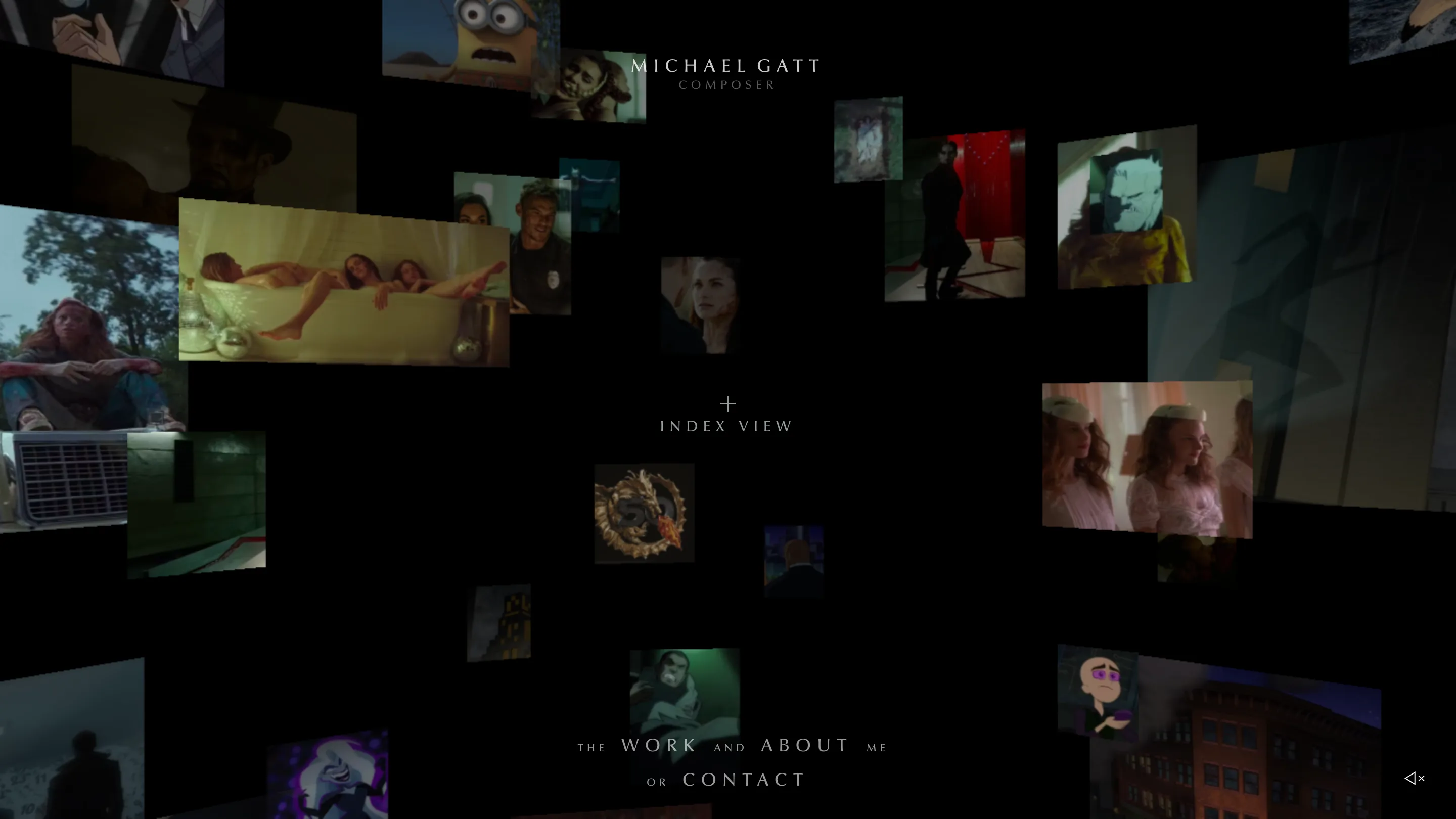
The michaelgatt.com home screen: dozens of film and animation stills floating at different depths in a black WebGL space, with the name Michael Gatt centred in tracked caps

Awards

The composer portfolio that asks for sound first

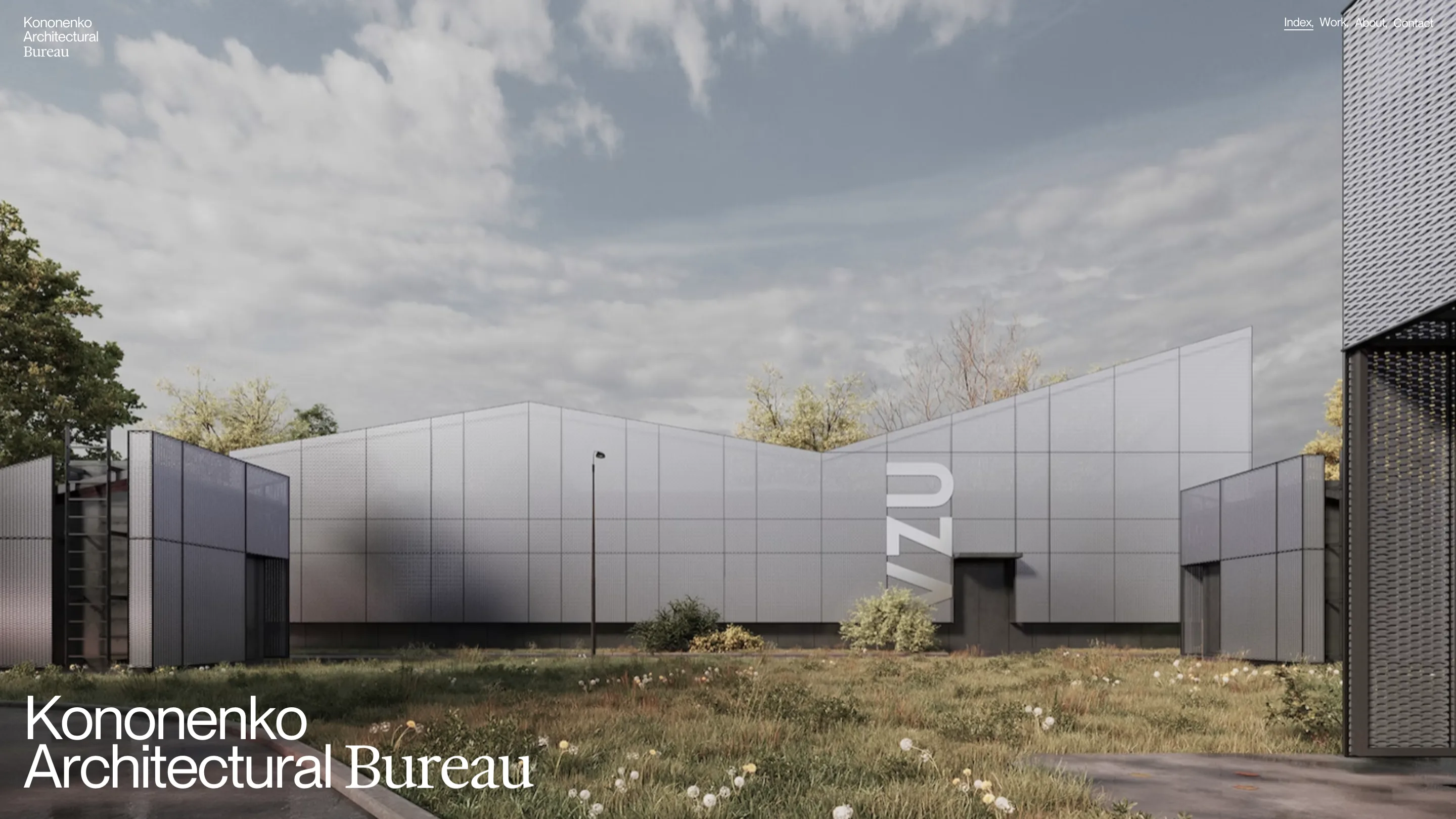
The Kononenko Architectural Bureau homepage: a full-bleed render of a grey perforated-metal facade, with the studio name set bottom left, the word Bureau in serif

Awards

Kononenko sets its square metres in a display serif

The Oimachi homepage in dark mode, with a sans headline whose word Innovation is set in serif italic, and a blurred blue photograph below

Awards

Oimachi runs a studio site on sidebar navigation

Cipher's homepage: around sixteen film stills overlapping in a loose cluster on a near-black background

Awards

Cipher's monochrome portfolio is built on the letter C

Klein-blue hero of haoqi.design: a white all-caps headline reading I bring craft & taste to digital work, behind a glossy 3D script reading hello, with a live clock and cursor coordinates in the corners.

Awards

Haoqi Wen runs his portfolio like an instrument panel

Revelatio's work index: a plain white headline on near-black above two project cards, a magenta Medno gradient and the photographic Obliant tile

Awards

Revelatio opens every page with one plain sentence

Studio K95 homepage: project thumbnails floating in 3D on an electric blue field, with a chrome pixelated object in the center and a RINGS/SPIRAL toggle

Awards

Studio K95 floats its whole portfolio in Klein blue

The Obys about page: one long statement set in the studio's own sans, black type on white at a single weight.

Websites

Obys runs its studio website on one house typeface

'kin's work page: a full-bleed office photo with the project name Flint Glass Works in orange over a ghosted list of other project names

Websites

'kin turns its portfolio website into a hover-swap gallery

Partizan's homepage: a masonry grid of autoplaying video thumbnails on a near-black canvas, the lowercase wordmark centered above.

Awards

Partizan turns its homepage into a wall of playing film

Artem Shcherbakov portfolio home: 'Hey I'm Artem' in fat black rounded type with a green hand-drawn scrawl over it, on white

Awards

The green scrawl that signs every title on this portfolio

The Ueno homepage, reading 'Hi. We're a strategic design and innovation studio' over a scrolling list of past clients

Industry

Ueno is back, and it's staying small on purpose

House of Honey home page: the wordmark HOUSE of HONEY in heavy brown type on a dusty pink field, with a swash script of looping beneath it

Inspiration

House of Honey runs oversized script type over every page

Lama Lama home page: macro photograph of black ink on blue and gold glitter, with the cream headline A CREATIVE DIGITAL AGENCY THAT GOES ALL IN OR NOT AT ALL

Awards

Lama Lama's navbar carries a different slogan on every page

Nudot studio home page: the words STUDIO and DIGITAL pushed to opposite edges of a black screen, with Traditional Chinese service labels set small underneath

Inspiration

Nudot puts bilingual typography in every page header

The Glitch&Grit home page: a full-bleed film still with the words OPENAI: BUSINESS, REIMAGINED set over it in large cyan grotesk type

Awards

Glitch&Grit turns its portfolio filter into the headline

The Oh Nice homepage: a black wordmark on a cream ground with a blue dash for the hyphen and letters sitting on a wobbling baseline

Industry

Flow Creative launched Oh Nice, a design studio built for one kind of client

The home page of hirotos.com: a 3D-rendered street pole on a white background, with a yellow sign reading HIROTO SATO, a blue arrow reading PROJECTS ARCHIVE, a chrome convex mirror and a yellow traffic light with the bottom lens lit cyan.

Awards

Hiroto Sato turns portfolio navigation into a Tokyo street signal

RISK studio home page, a monochrome layout with a running 00:00:00 timecode counter

Awards

The film studio site that keeps a running timecode

Komma Komma home page: a printed poster for the Merla project lying on green moss, with the studio tagline set in white below

Inspiration

Komma Komma turns each case study into scroll-driven storytelling

House of Honey homepage: HOUSE of HONEY set in a fat brown serif with a cursive italic 'of', over a peach background and a photo of a plant-filled living room

Awards

House of Honey pairs a fat-face serif with a running pink script

The hero of Karol Ortyl's portfolio: a hand-drawn wobbly KAROL ORTYL wordmark on a dark gradient, with a marker-highlighted tagline reading fun-doing designer at large

Inspiration

Karol Ortyl's annotated portfolio numbers every project like a figure

Paper Tiger's home page: the words CLARITY FIRST and IMPACT FOREVER in huge black condensed type wrapping a pink photo of a hand holding a disco ball

Websites

Paper Tiger's studio website bets everything on one giant typeface

StageCrew studio homepage: a two-column layout with stacked work images on the left and a project index listing disciplines on the right, near-monochrome with an acid-green accent.

Inspiration

StageCrew's index-style portfolio layout lets the work speak first