Warm & Fuzzy builds a studio site out of broadcast parts
Neutral Studio dressed an LA production company's site in TV furniture: a ticker across the top, a lower-third title band, a pause button on the film.
Awards · The Editors · 4 min read ·
Featured: Neutral Studio
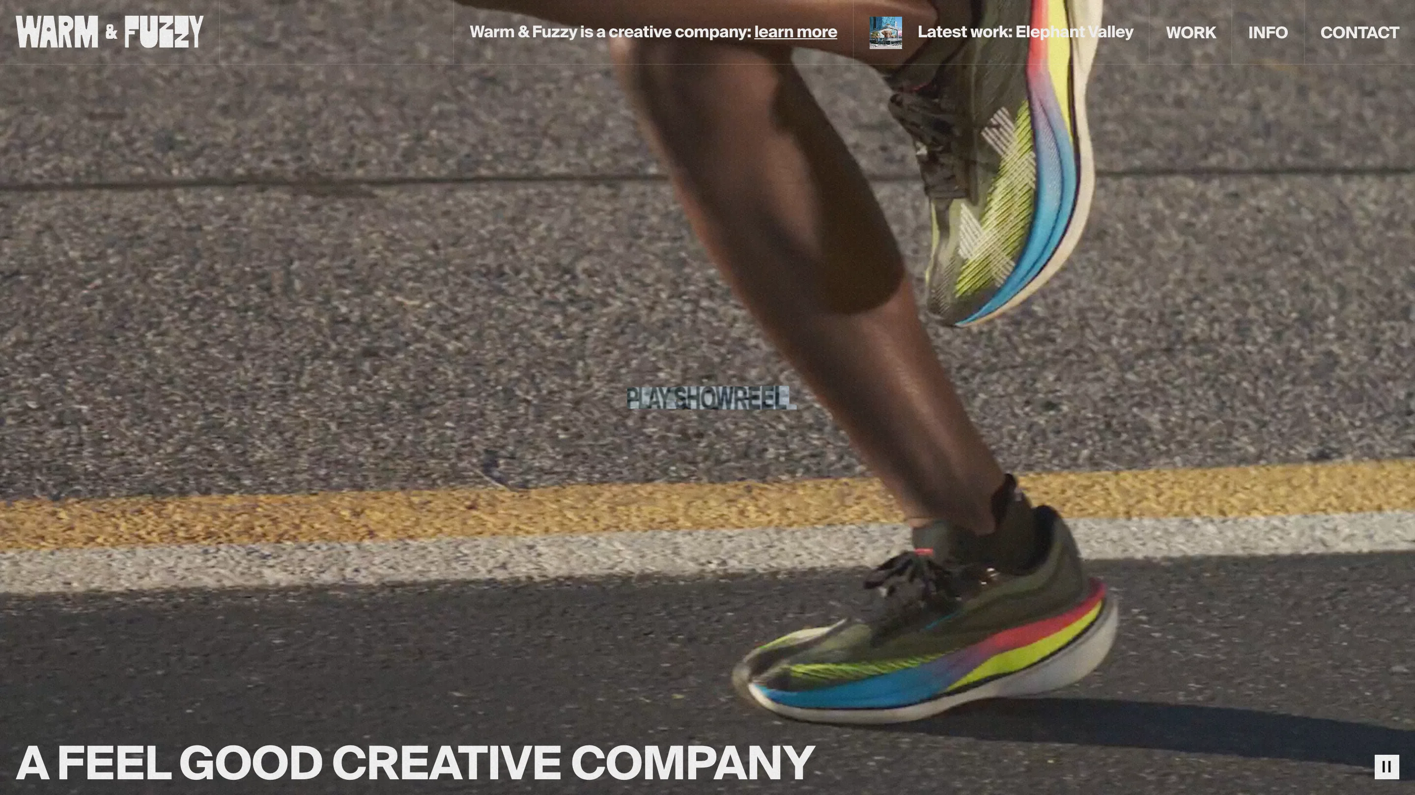
The header on Warm & Fuzzy is a news ticker. Wordmark on the left, nav on the right, and in the middle a running line of copy: "Warm & Fuzzy is a creative company: learn more", then a postage-stamp thumbnail and "Latest work: Elephant Valley". The site took awwwards Site of the Day on 12 September 2026 with a 7.26, and that strip is a large part of why.
Warm & Fuzzy is a production company with rooms in LA, Boulder and New York. Twelve people, founded 2016, work for Dunkin', McLaren F1, Pearl Jam, the San Diego Zoo. Neutral Studio built the site, with Paulo Ferreira Jorge on design, and the idea holding it together is that a company that makes films should get a site assembled out of broadcast parts. Ticker, lower third, pause button. Furniture you already know from a screen you watch.
The broadcast furniture does the navigating
The homepage is one full-bleed showreel and nothing else. No hero card, no stack of headlines, no scroll cue begging you down the page. "A FEEL GOOD CREATIVE COMPANY" sits along the bottom edge in heavy grotesk caps, reading like a caption burned into the footage. A pause button waits in the bottom right corner. The chrome is thin enough that the film gets the full frame, which is the correct call when the film is the product.
Then the video stops and the colour starts
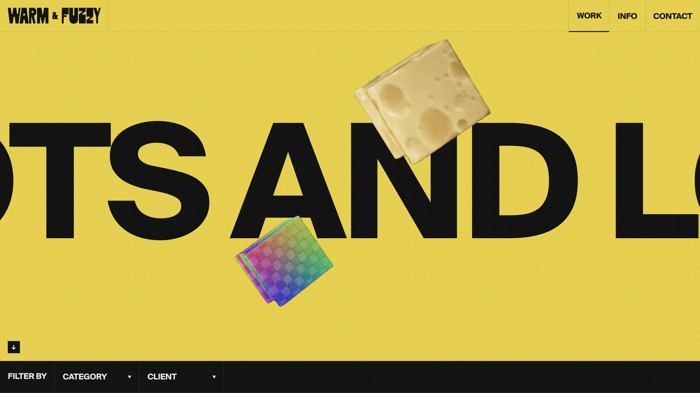
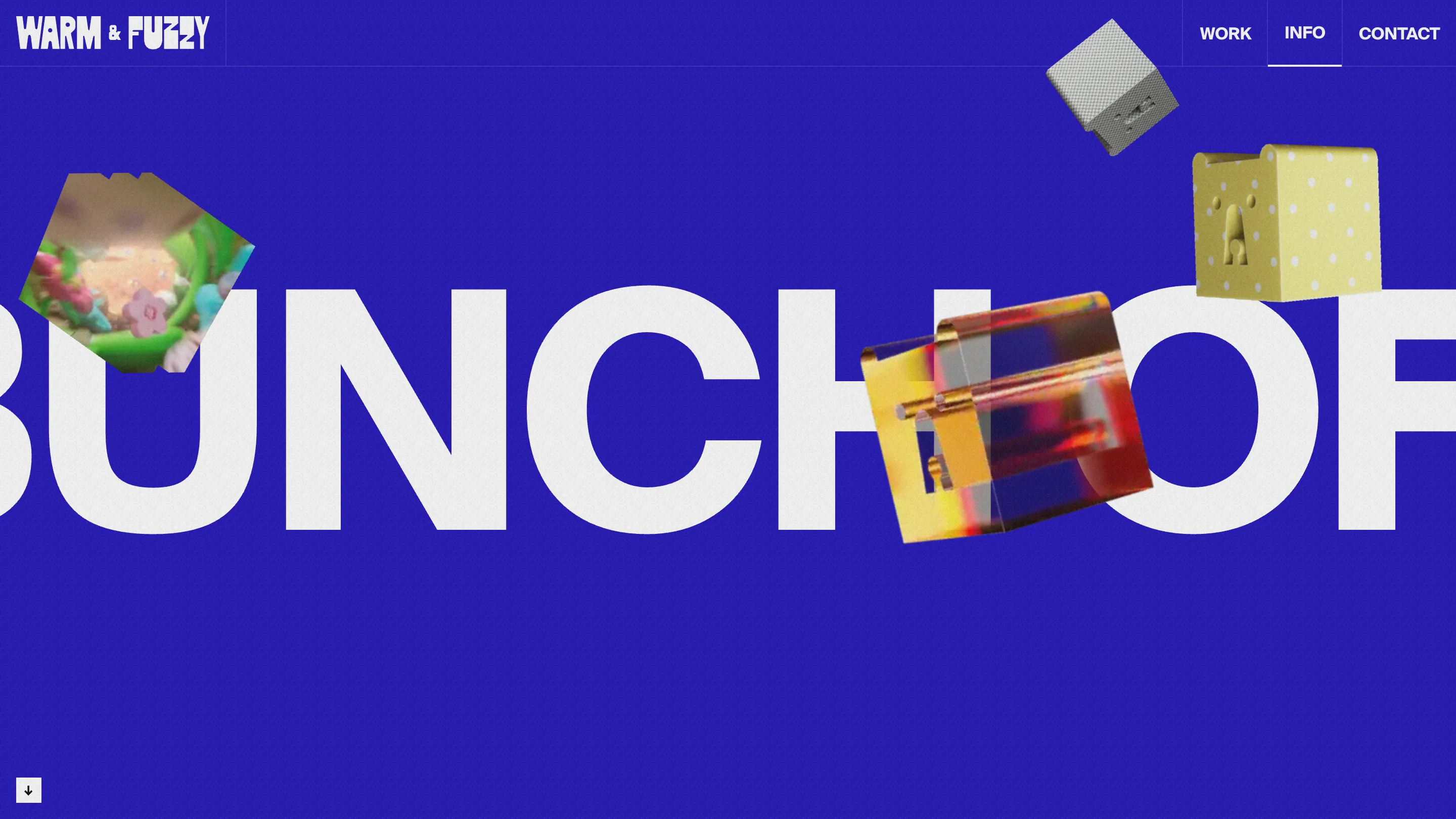
Open /work and the footage disappears. Flat yellow, one giant black sentence running off both edges of the screen, and a couple of rendered cubes drifting across it: a stack of sliced cheese, a checkerboard cube cycling through the spectrum. /info does the same trick in deep blue with white type and a different set of cubes, one cast in concrete, one in polka-dot ceramic with a face pressed into it, one in amber glass. The cubes rhyme with the wordmark, where the letters of FUZZY sag and swell like they were cut out of something soft.
Two colours, one type size, a handful of objects. That is the entire design system for the section pages, and it holds because the switch from moving image to flat field gives your eyes somewhere to land between films.
The project pages are lower thirds
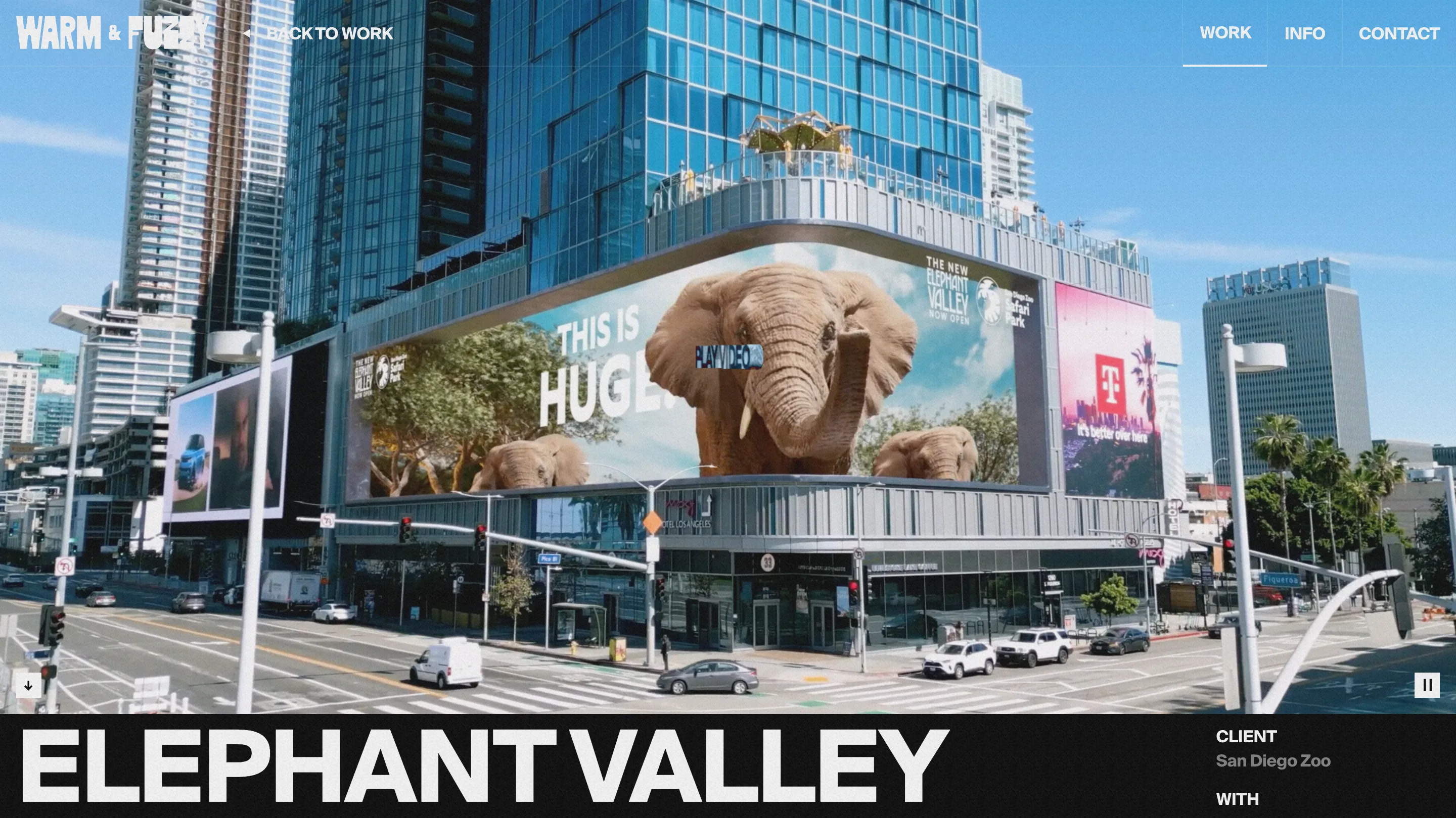
Elephant Valley, an anamorphic billboard the studio made for the San Diego Zoo, plays full-bleed with a black band locked across the bottom. Project title on the left, huge. CLIENT and the credits stacked small on the right. It is a lower third, straight off a broadcast, and it works for the same reason it works on television: the title reads from the sofa and the metadata reads when you lean in. The ticker in the header swaps itself for a single BACK TO WORK, so the bar changes payload per page while keeping its shape.
The page titles are the joke
The work page is titled "Lots and lots of projects". The about page is "a bunch of cool creative people". Both are set at a size where three words fill a monitor. They are throwaway phrases, the kind of thing you say on a call, and blowing them up to poster scale is the funniest move on the site. It also tells you what the company is like before you have watched a single film.
What the scores are telling them
Usability came in lowest at 7.03, under design and creativity at 7.35 and content at 7.4. That reads right. The one control the homepage is built around, the PLAY SHOWREEL label, is set about twelve pixels tall in a semi-transparent chrome face, dead centre over moving footage. On a frame of sunlit asphalt it nearly vanishes. Same problem with PLAY VIDEO on the project pages. Everything else in this package is loud and certain about being read from across the room. The button that starts the reel should be the loudest thing there.