Maria Vasilyeva lays her portfolio out like a musical score
Five-line rules, a track-list menu and handwritten notes: why Maria Vasilyeva's music-inspired portfolio took Site of the Day.

Maria Vasilyeva's portfolio reads like a musical score. Thin horizontal rules run across every page in sets of five, the projects sit on them like notes, and the menu is a track list: Notes, Melody, Overture, Jazz. It took the awwwards Site of the Day on 9 October 2026 with a score of 7.28, and its best mark was creativity, at 7.56.
The visual and interactive designer built it with Surya Aditya, and the music idea holds on every screen. The theme lives in the grid, so it lasts past the intro.
The loader is the first stave
Before anything else, the site shows five lines of tall, condensed serif capitals: "Loading the playlist. It might take some time. Finding the right tune. Be ready to hit play. Enjoy the experience." The lines are stepped across the screen at different offsets, and the block repeats three times down the page, each copy shifted further left.
It looks like a phrase written out on three staves. Letters stutter in from the side as each line resolves, so the text has a beat before you've read a word of it. A percentage counter ticks at the foot. The wait teaches you how to read the rest of the site.
A score for a home page
The home page keeps the rules and hangs the work on them. A cluster of images from her Phantom project bunches up on the left, then a single strip of thumbnails runs off the right edge, every project compressed to one line. The footer counts the piece, "01", names it, and offers "View project".
The frame does the rest. A black rail on each side carries the name and the role set vertically in a typewriter mono, with the menu and two toggles: Sound and Annotations. Sound plays the site's audio. Annotations turns a layer of handwritten notes on and off: a looped "Scroll" circled at the top, a "More details" with a hooked arrow pointing at the link. They read like a teacher's pencil on sheet music, and they're the only thing on the page that isn't set on a grid.
The work index as bars of music
The Melody page is where the score idea pays off. Each project is a row of thumbnails laid on a rule, numbered in brackets at its start, (02), (03), (05), and closed with a small mark at the end. Rows start at different points across the width, so the page has the ragged rhythm of phrases entering at different times.
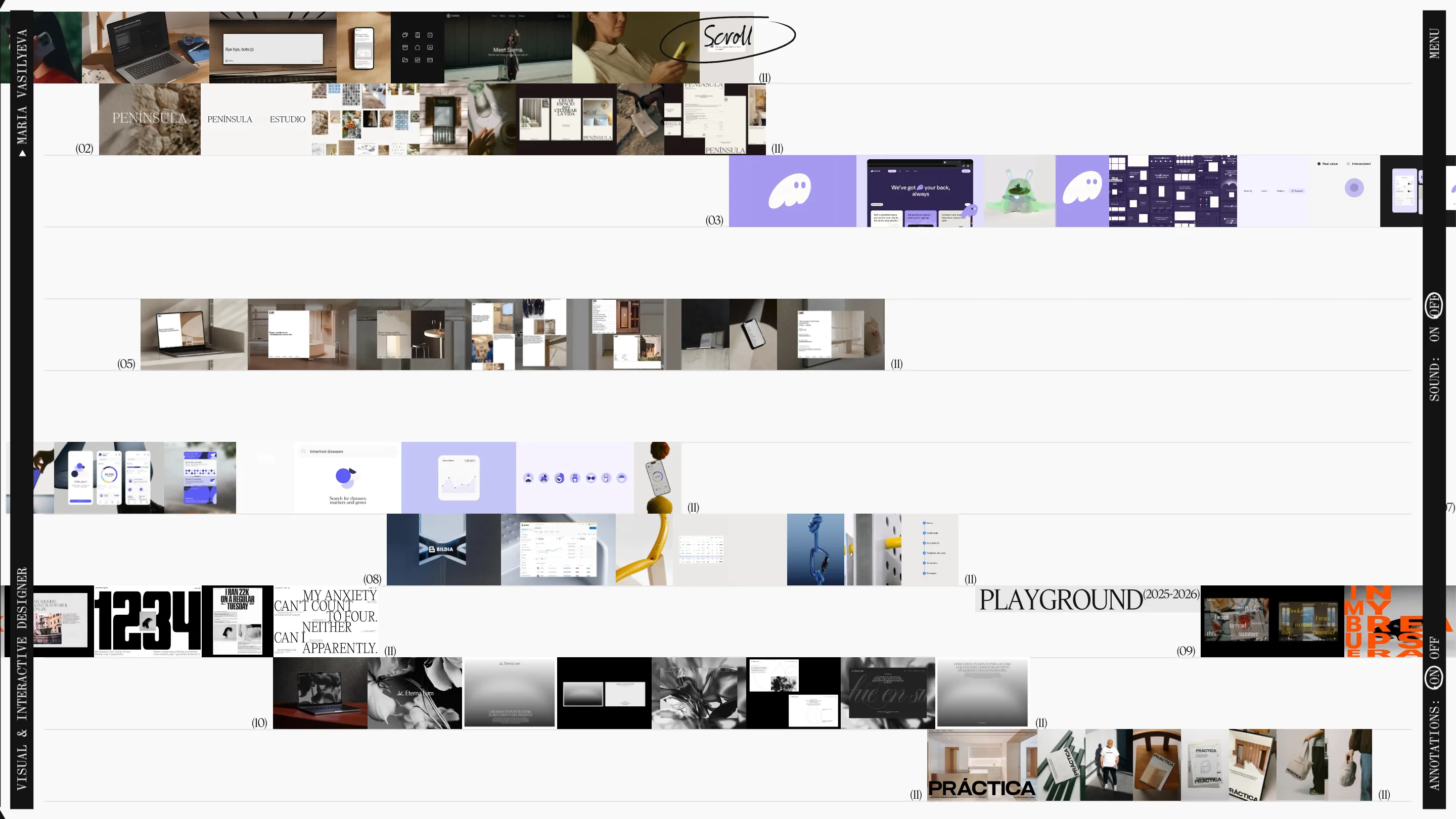
What a judge would rate here is density with order. Eleven projects fit on one screen, Península, Phantom, Klarna, Bildia, Eternalum, Práctica among them, and you can still tell where each one starts and stops. The thumbnails carry the colour. The site itself stays in two values, #131313 and #F9F9F9, so a Phantom lilac or a Práctica orange shows up loud against it.
Restraint on the project pages
Open a project and the instrument goes quiet. The Klarna page sets "KLARNA" in the display serif between two rules, with the years, 2022 to 2024, as a small superscript. One piece of work fills the middle on a dark panel. Under it, in the same hand as the annotations, "(Scroll for more)" and an arrow.
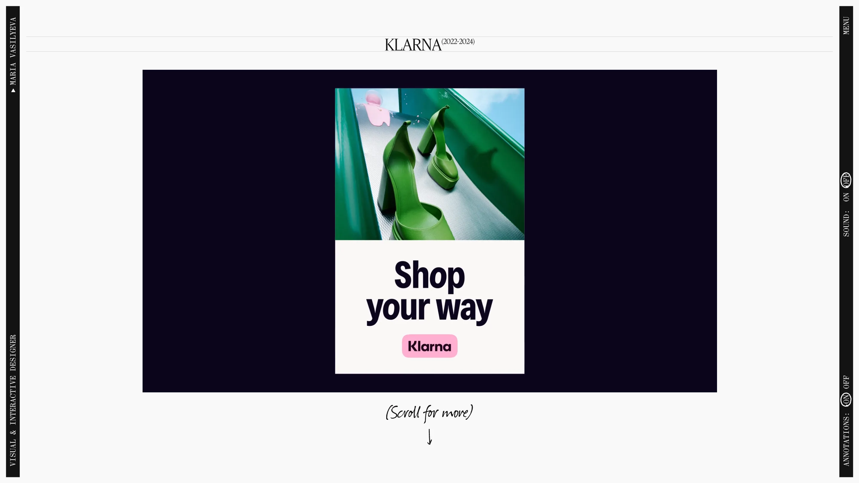
The work gets the stage. The rules, the rails and the handwriting stay at the edges, so the case study reads as hers without the frame competing with the client's brand.
An about page that sets its own line
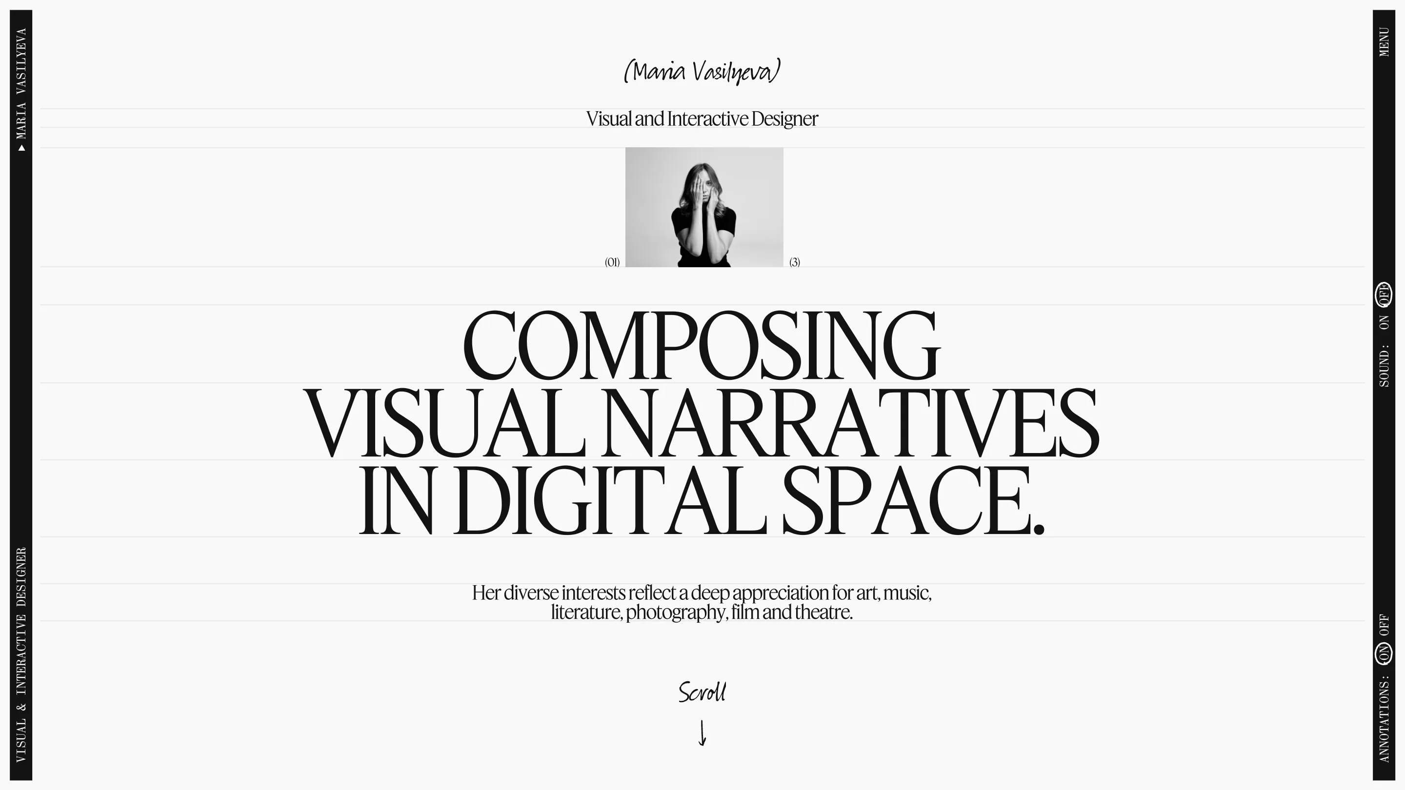
The Overture page puts the claim in the largest type on the site: "Composing visual narratives in digital space." Three lines of capitals, tight tracking, sitting between rules. Above it, a small black and white portrait and her name in the handwritten script. Below, one sentence about art, music, literature, photography, film and theatre.
That's the whole system: one serif for the voice, one mono for the controls, one hand for the asides, and five lines to hold it all. If you're building a designer portfolio with a concept, this is the one to study. The music runs through the grid, the copy, the navigation and the sound, and none of it gets in the way of the work. See it at Maria Vasilyeva.