Aparelho's horizontal scrolling portfolio stays on screen
Aparelho's horizontal scrolling portfolio pins the project rail to the top of every case study, so the rest of the work stays one click away.
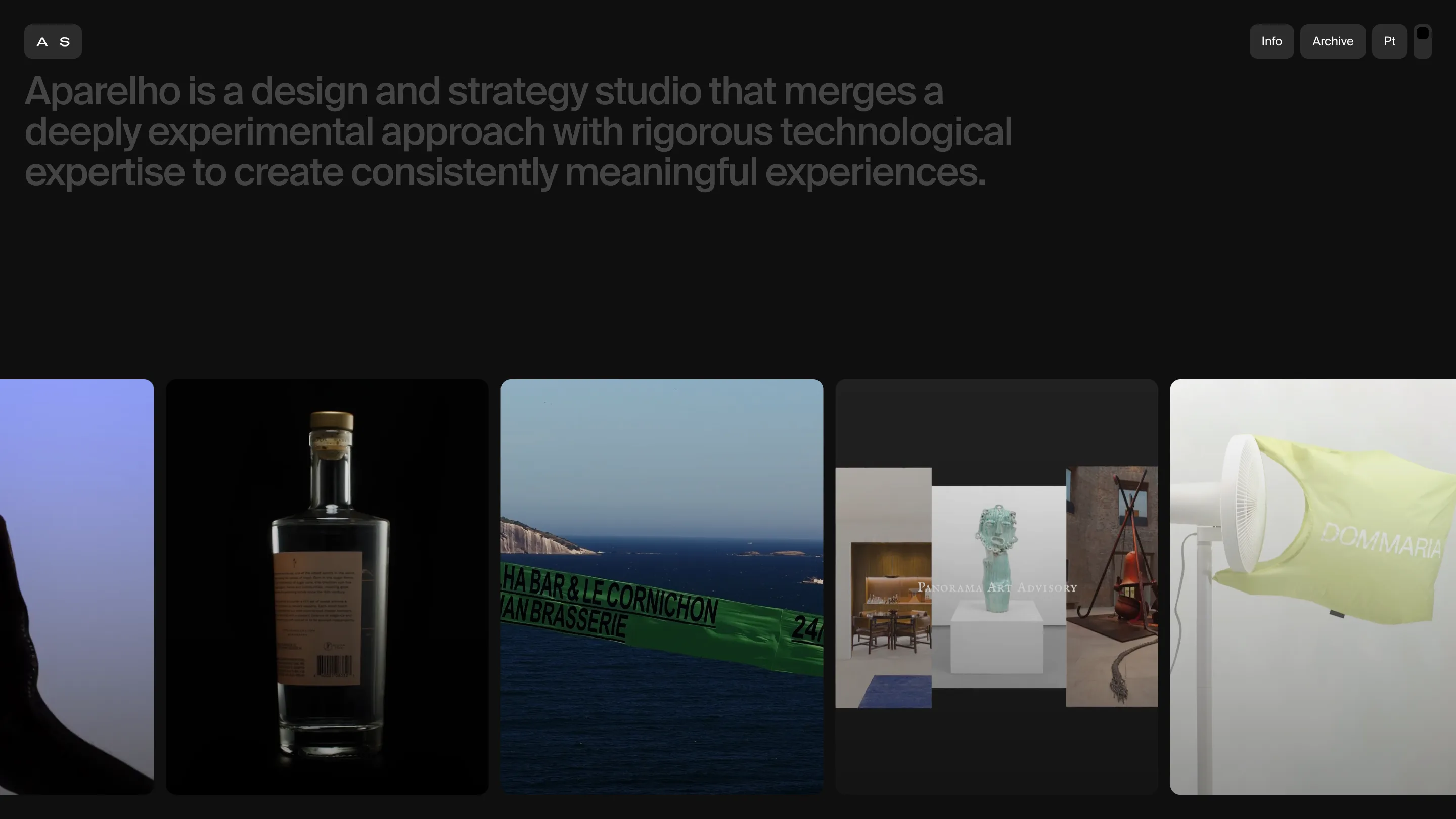
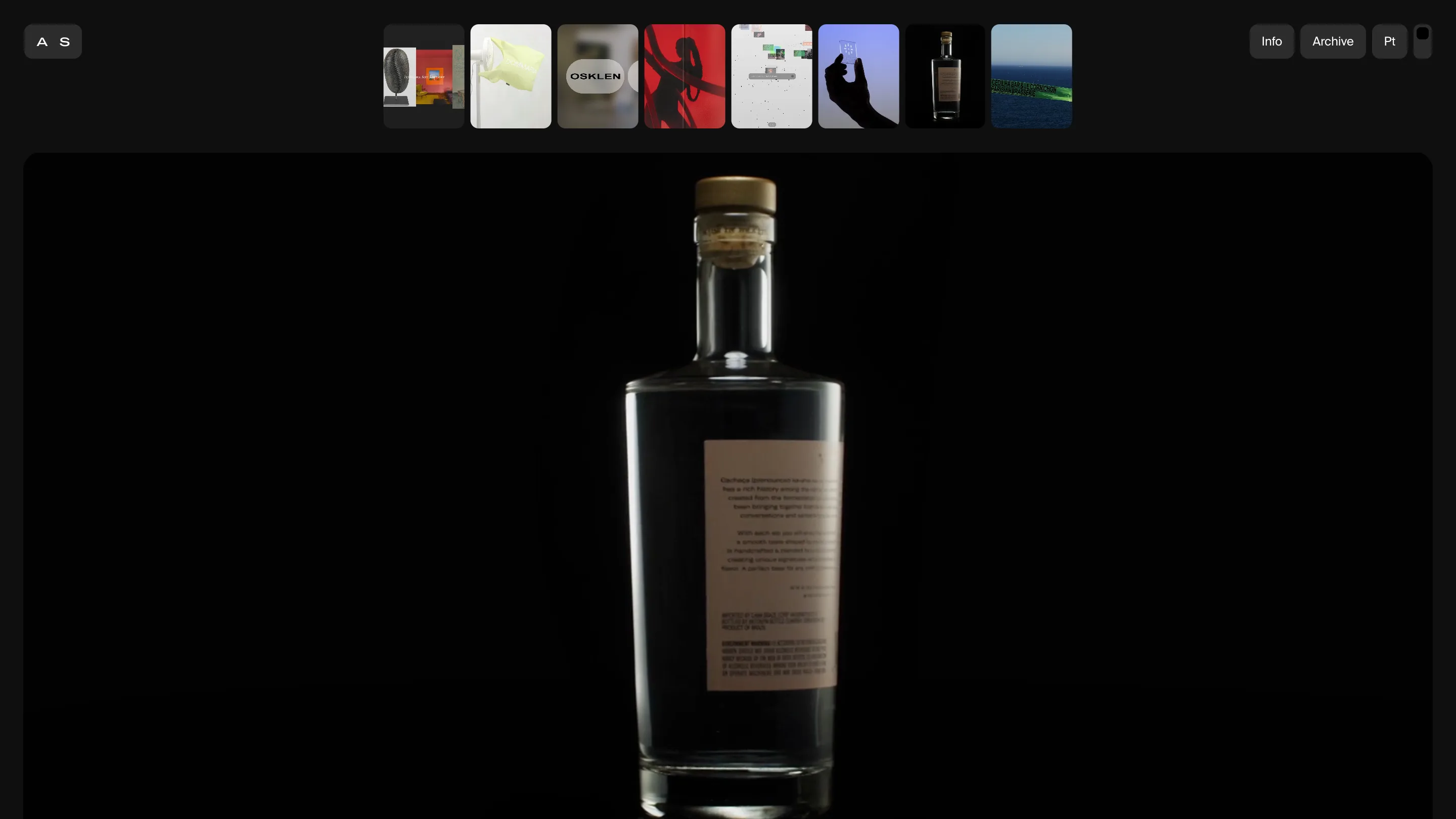
Open Aparelho and the work arrives as one sideways row of full-bleed cards on near-black. A cachaça bottle lit against black. A green banner strung over the water in Rio. A fan blowing a yellow shirt across a white room. No titles, no captions, no hover labels. The picture is the pitch.
Click a card and the row stays with you. It shrinks into a strip of small thumbnails pinned to the top of the case study, same order, the project you opened sitting centred. That is what makes this horizontal scrolling portfolio work: the shelf never gets put away.
The rail is the navigation
A thumbnail grid that vanishes the moment you click it asks you to hold the list in your head and get back with the browser button. Aparelho keeps the list on the glass instead. Halfway through the Osklen Flagship case study, the other seven projects are sitting an inch above the reading, and you can go from an e-commerce build to a cachaça bottle to a Rio brasserie without ever passing back through a home page.
The detail that makes it hold: each thumbnail keeps the crop it had downstairs. The card you clicked is the same photograph in the rail, only smaller. Nothing reframes, so your eye tracks where it came from.
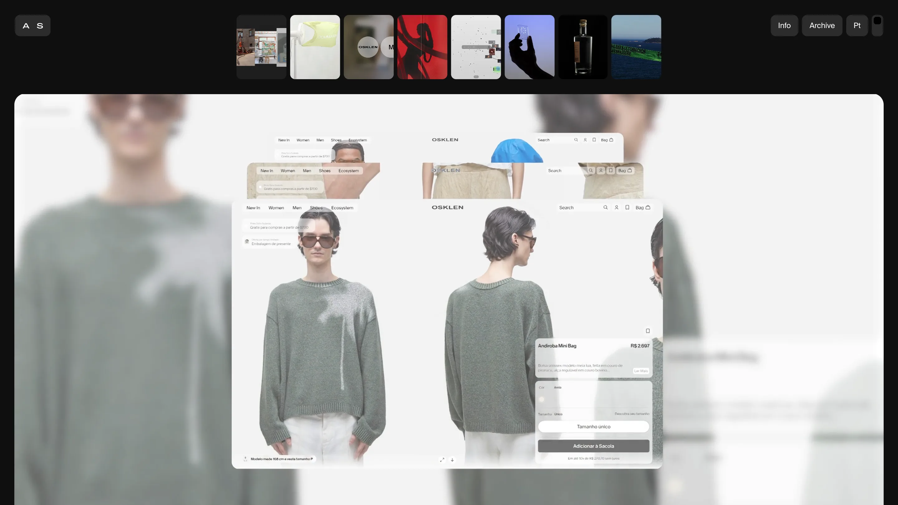
Every page takes its colour from its own work
Behind the case-study card, the site blows that project's imagery up and blurs it into a wash. The Osklen page sits in the soft grey-green of the knitwear. Cãna drops to near-black around the bottle. Kunumi Institute goes red, green and smoke. The chrome stays identical on all of them, so the site changes temperature page to page without changing a single UI decision.
It's a cheap effect done carefully. The blur is heavy enough that nothing behind competes with the sharp card on top, and the card is a light rounded rectangle with real margin on all four sides, so it reads as an object resting on a surface. Depth with no drop shadow anywhere.
The archive previews before you commit
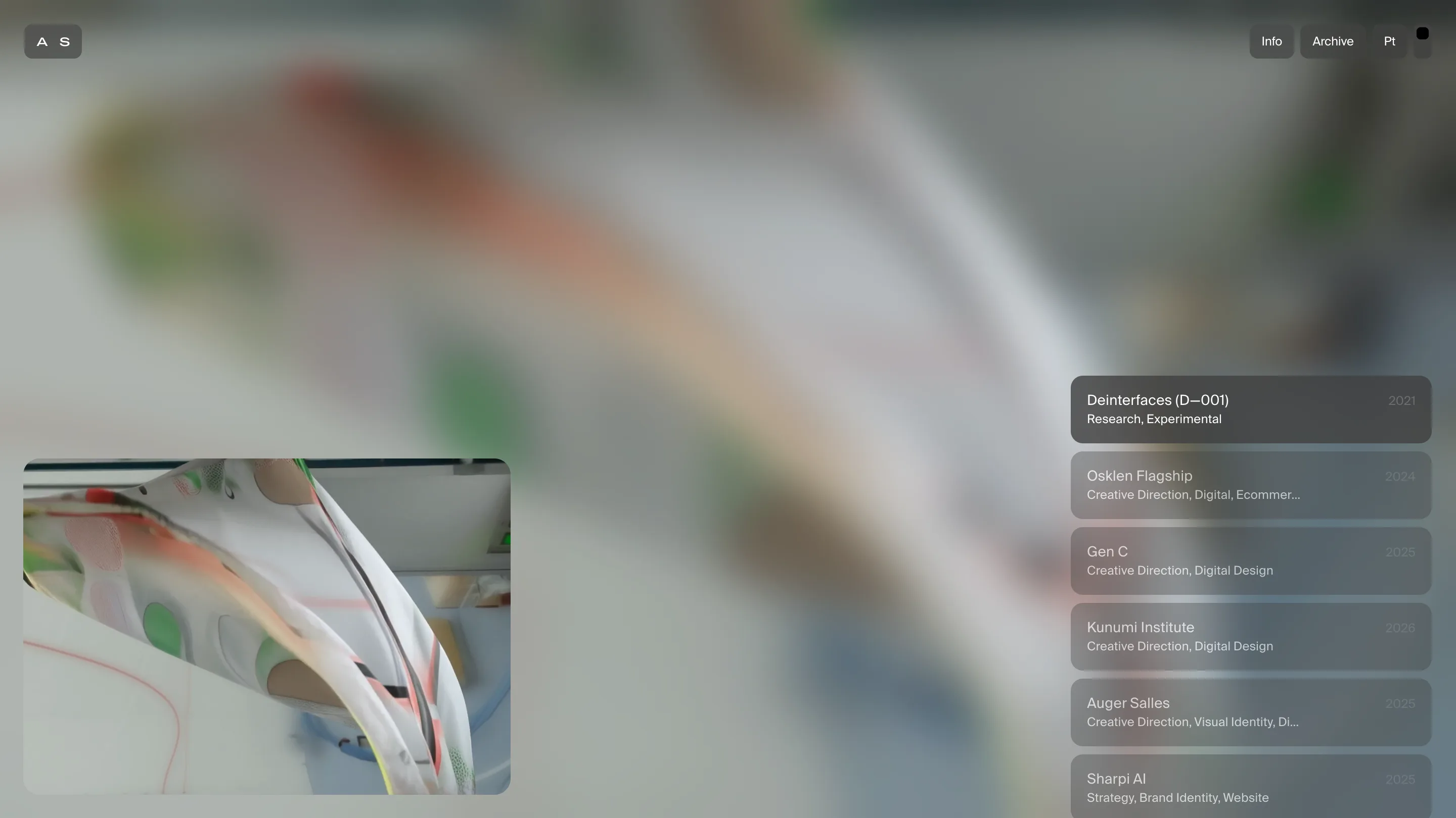
/archive drops the rail and runs a column of translucent rows down the right edge: project name, disciplines, year. Deinterfaces (D-001), Research, Experimental, 2021. Osklen Flagship, Creative Direction, Digital, Ecommerce, 2024. Thirty-odd entries, set small, in the same grotesk as everything else.
Hover a row and two things fire at once. A small moving preview opens in the bottom left corner, and the full-screen backdrop blurs over to that project's imagery. You get the temperature of a project before you spend a click on it, which is what an archive of thirty items needs if anyone is going to read past the first five.
The chrome is four pills and nothing else
Top left, a pill holding two letters, A and S. Top right, three more: Info, Archive, Pt for the Portuguese version, plus a small square for the sound toggle. That is the entire interface. No menu, no footer nav, no scroll indicator, no cookie bar fighting the layout. The studio, working out of São Paulo and Rio de Janeiro, has put everything it wants you to touch into six controls and given the rest of the screen to the work.
There's a lesson in the restraint. A horizontal scrolling portfolio usually earns its keep by feeling like a physical shelf, and shelves get ruined by labels. Aparelho trusts eight images to do the sorting, and keeps them visible so the reader can always change their mind.
Found via siteinspire, which featured it on 7 September. Site by Aparelho Studio.