The composer portfolio that asks for sound first
Michael Gatt's site opens with one question, sound on or off. Synchronized built the composer portfolio around whichever answer you give.
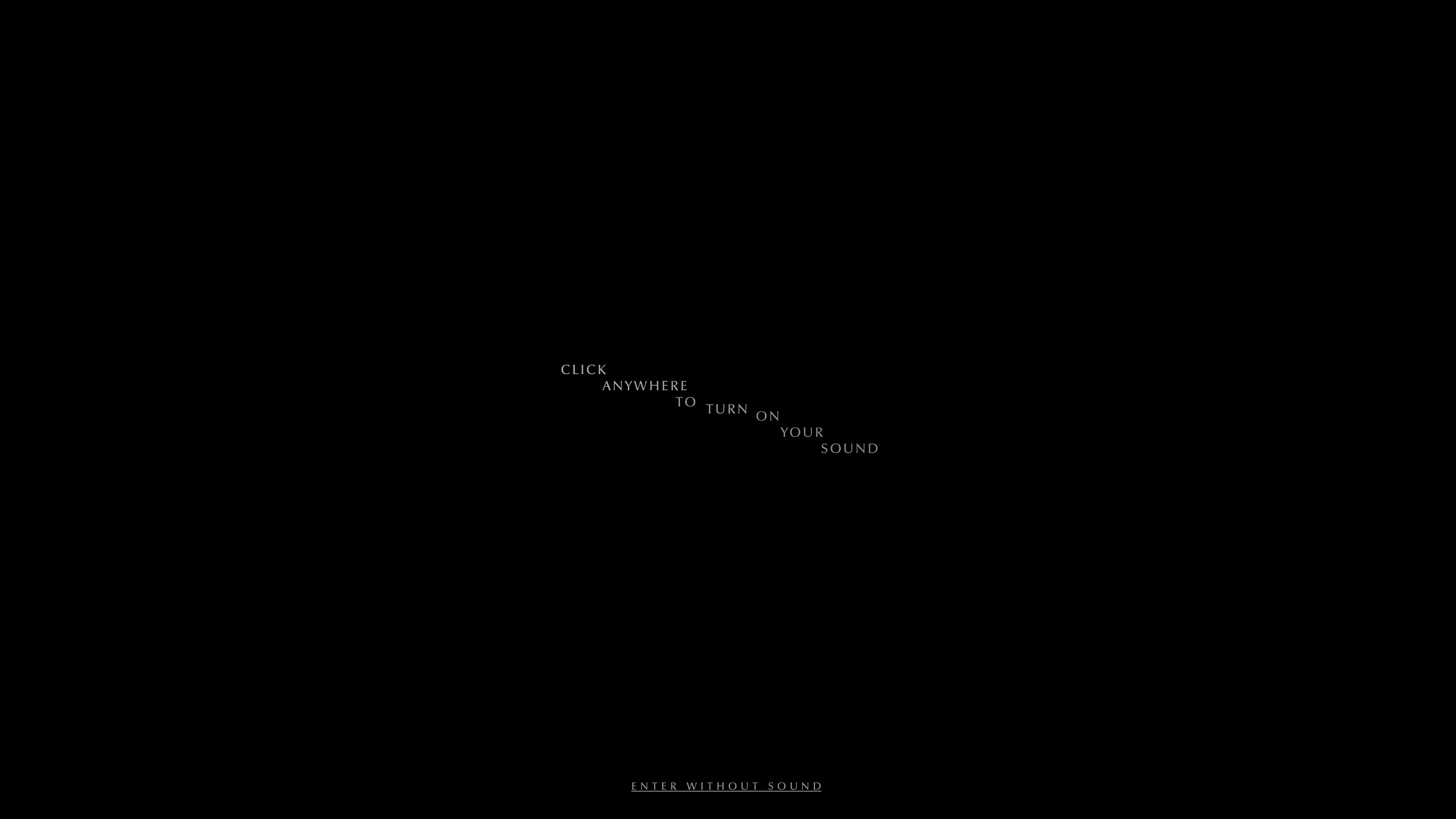
Michael Gatt's site loads black with one line on it: click anywhere to turn on your sound. Underneath, in small tracked caps, the way out: enter without sound. Nothing else happens until you pick. For a composer portfolio that is the whole brief, settled on the first screen. Synchronized built the site and Zhenya Rynzhuk designed it, and awwwards gave it Site of the Day on 18 August with a 7.45.
Sound is the first decision
A muted autoplay would have been easier to build and easier to ignore. This site stops and asks instead, and it writes both answers so either one is fine to choose. After that the mute toggle sits in the bottom right corner of every page, small, at the edge of the frame, in the same place all the way through. You never have to go looking for it.
A room of film stills
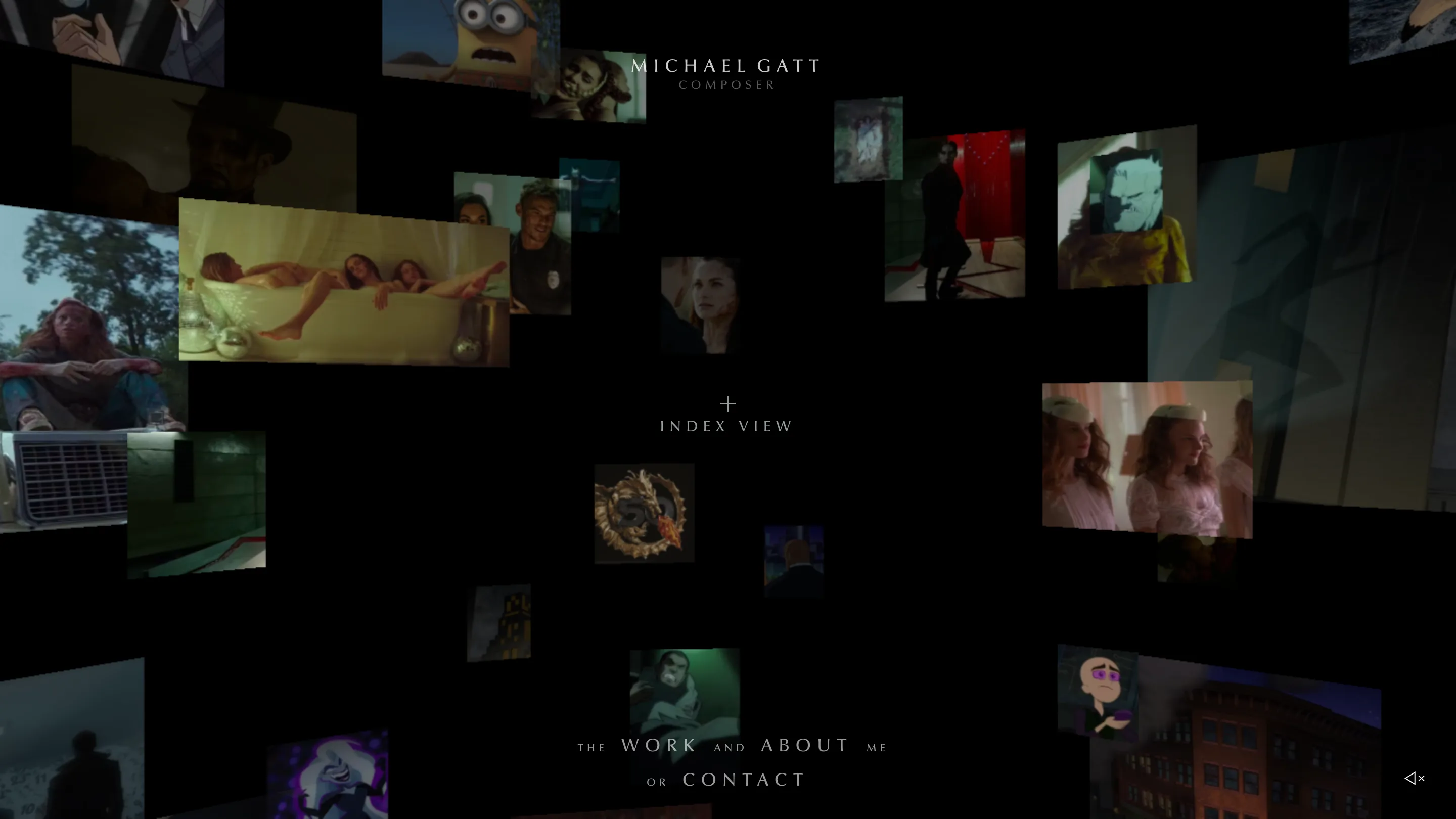
Say yes and the black opens into depth. Dozens of frames from work Gatt has scored hang in a WebGL space at different sizes and distances: an animated Gotham street, a Minions close-up, a gold dragon crest, a couple of TV interiors far off to the left. The name sits dead centre in Zapf Humanist, Bitstream's cut of Optima, tracked out wide enough to read as a title card. One word under it: composer.
The navigation is written as a sentence. "The WORK and ABOUT me or CONTACT", with the connecting words dropped to a smaller size and the three destinations left large. It reads as a line of prose and behaves as a menu.
The index ranks itself with type size
In the middle of the space view there is a plus and the words index view. Click it and the stills clear for a list of nine titles, numbered 001 to 009, set in the same flared caps and graded down the page. Batman: The Long Halloween at the top is close to twice the size of Teen Titans DC Super Hero Girls at the bottom. The scale carries the ranking on its own, with no bold weight and no featured badge to help it.
The project page is a cue sheet
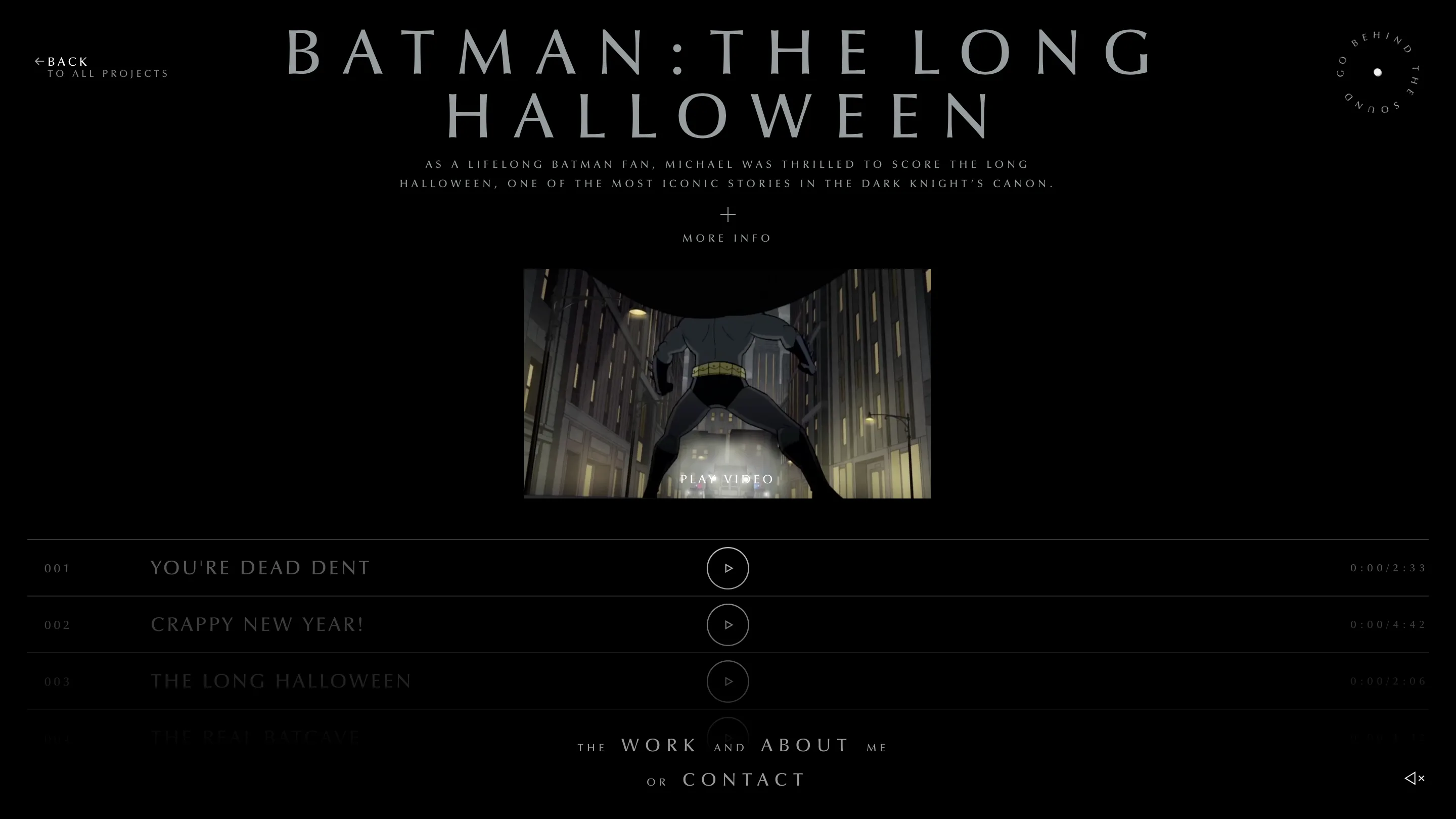
Open a project and the page turns into something a music supervisor would recognise. A trailer at the top, two lines on what the job was, a circular badge in the corner reading go behind the sound. Below that, the cues: 001 You're Dead Dent at 2:33, 003 The Long Halloween at 2:06, 004 The Real Batcave. Each row has a play button in the centre and a timecode on the right that runs while the track plays, and the rows fade a step further into grey as the list goes down.
That is the strongest decision on the site. The work is music, so the portfolio page is built as a player, and the images are there to tell you what the music was for.
Type that walks across the frame
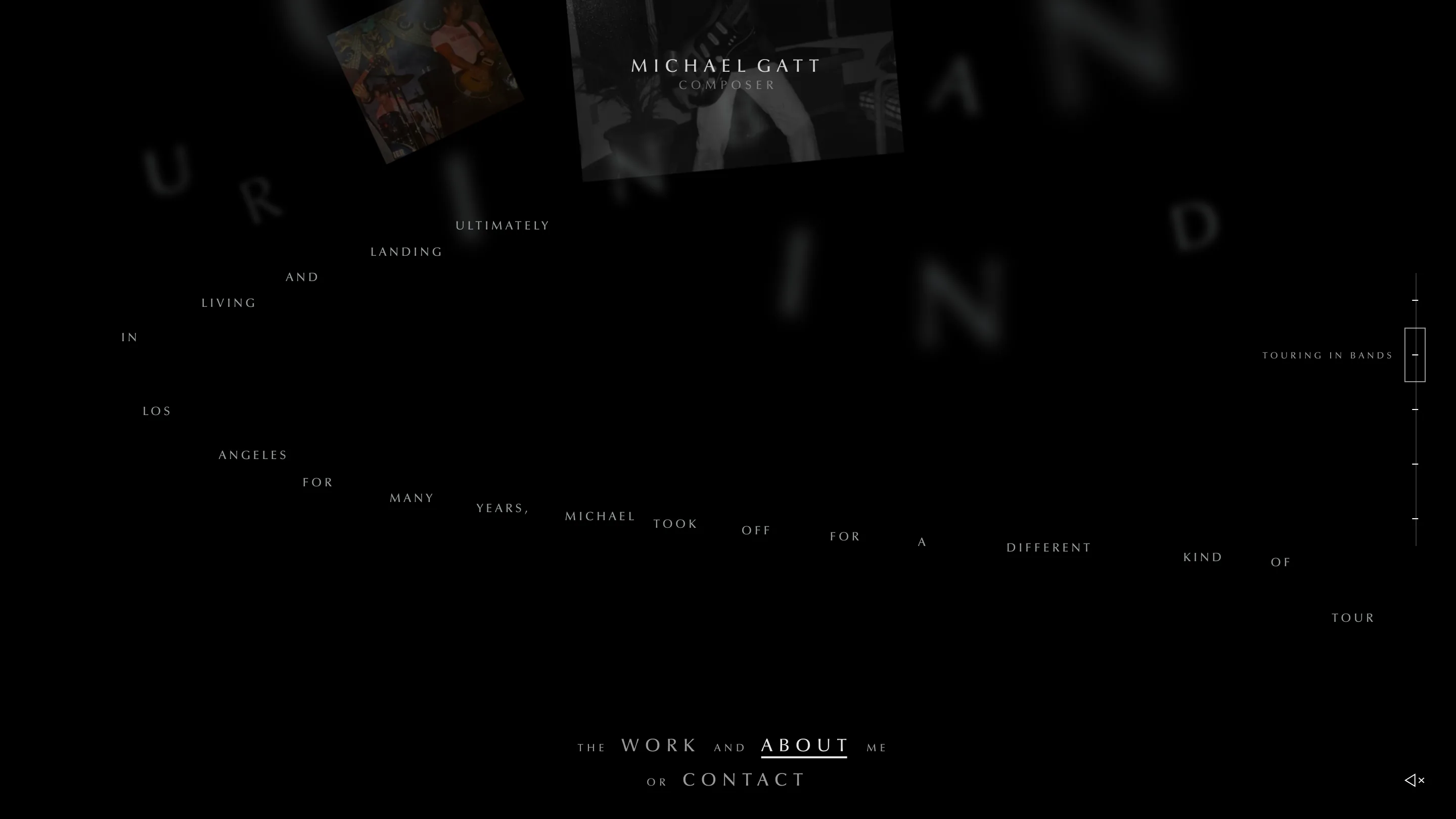
The about page is where the motion budget went. Scroll and a sentence lays itself out along a diagonal, a word at a time, ultimately landing and living in Los Angeles for many years. Behind the words the same letters appear at fifty times the size, thrown out of focus, drifting at their own speed. On the right a thin rail names the chapter you are in, touring in bands, a guitar and a backpack, so a scroll story that could easily lose you keeps telling you where you are.
A chapter later the frame fills with footage of Gatt free diving over a reef, sharks crossing under the letters, everything tinted one flat ocean blue. He sold what he owned and travelled to more than 40 countries, taking location work from Animal Planet and Discovery along the way. Giving that stretch its own chapter, on a site selling scores for Batman and Dungeons & Dragons, takes some nerve.
Why it scores
Restraint holds the whole thing together. One typeface, one near-black, one grey, and film supplying every other colour on the site, which is why the stills read as work rather than decoration. The jury put creativity highest at 7.73 and usability lowest at 7.13, and the development jury scored the animations 8.60 and the accessibility 6.80. That spread is the site itself. A gate you have to answer and a story you have to scroll cost points that a plainer build would have kept.
What earns the award is the fit between the subject and the interface. The site is about sound, so it asks about sound before it shows you anything, then keeps the answer within reach on every screen after that. Have a look at michaelgatt.com with the volume up.