Kononenko sets its square metres in a display serif
The architecture bureau splits its site between a grotesk for navigation and a serif for facts. It took awwwards Site of the Day on 23 August with a 7.27.
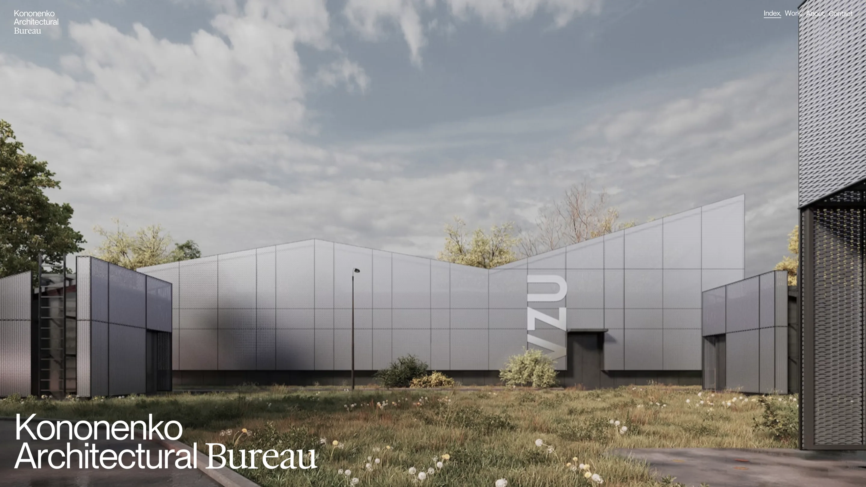
Kononenko Architectural Bureau runs its whole site on two typefaces and gives each one a single job. A grotesk handles anything you click. A high-contrast serif handles anything that states a fact. It took awwwards Site of the Day on 23 August 2026 with a 7.27, plus a Developer Award, for a build by Reksa Andhika and Artem Shcherban.
The wordmark tells you the rule
The mark sits top left, three lines deep. Kononenko. Architectural. Bureau. The first two lines are sans. The third is serif. One word, a different family, no explanation offered.
Once you have seen that, the rest of the architecture portfolio reads as a system. Navigation is sans. Project titles are sans. Square metres are serif. The statement on the About page is serif, set at four lines of display size over a photo of the studio: a team built on ideas and precision.
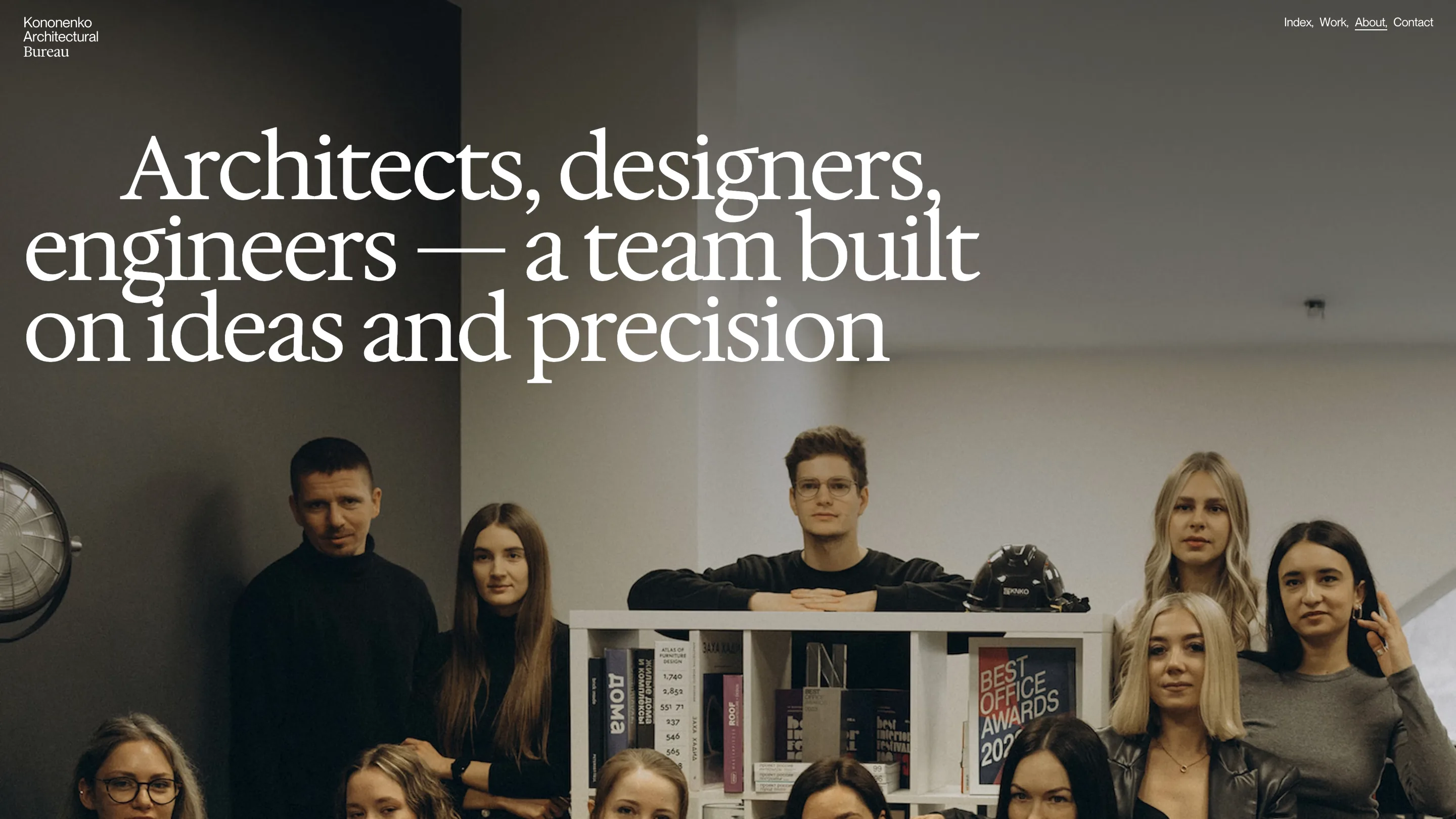
The nav itself is worth a look. Index, Work, About, Contact, each followed by a comma, so four links scan as one line of prose instead of a menu. The current page carries a hairline underline. That is the entire chrome. No hamburger, no sticky bar, no logo animation.
The number is the headline
Open a project and the layout barely changes. A full-bleed render fills the frame, the project name sits bottom left in sans, and the floor area sits bottom right in serif at the size most sites reserve for a hero line. Kotelnaya Kinetics reads 16,488 with a tiny superscript m2 riding above the last digit.
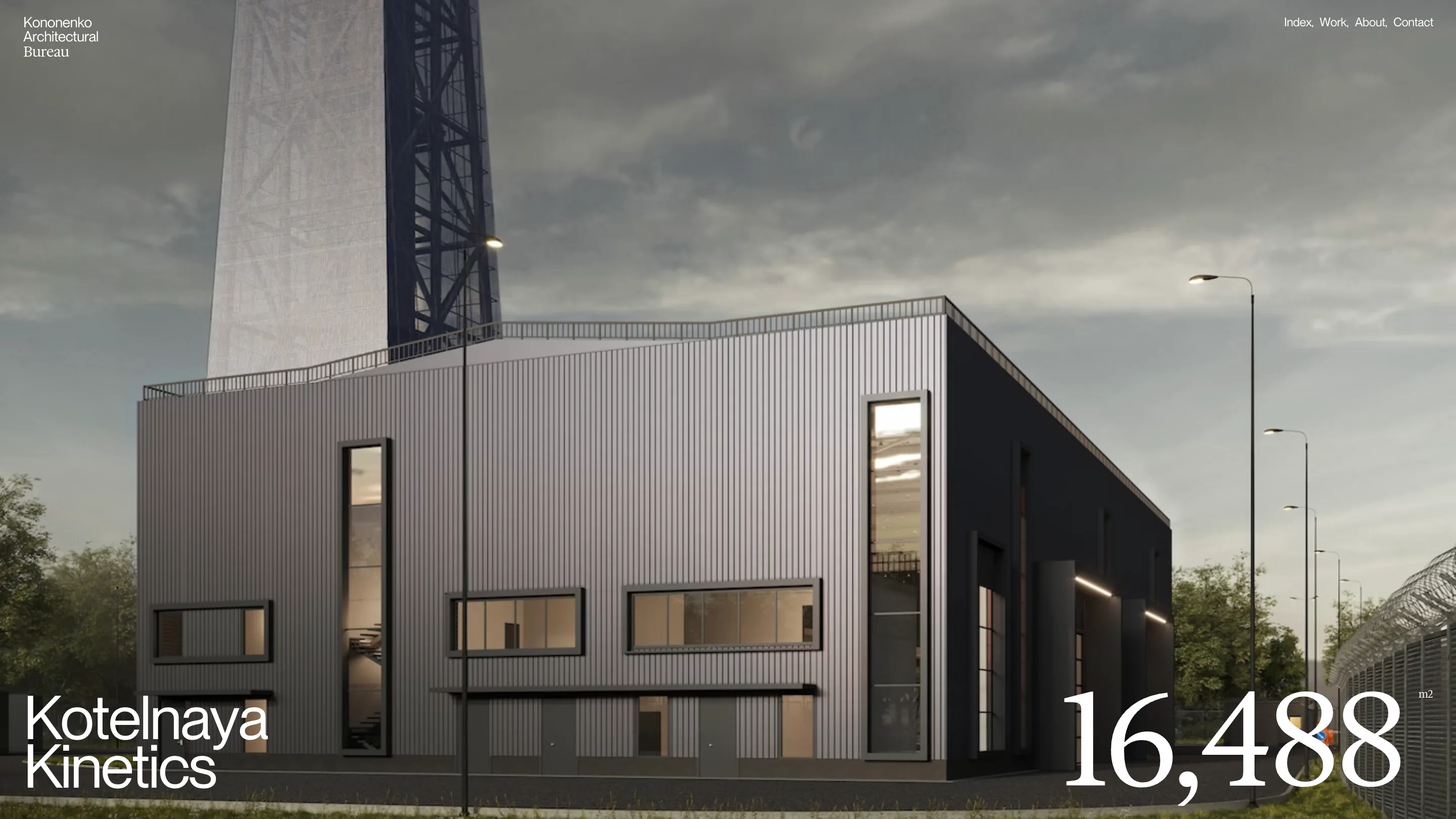
That decision does the work a paragraph of copy would normally do. A boiler house in grey ribbed metal under a grey sky has no colour to sell it, so the site sells the scale instead. The figure is the only thing in the frame with weight, and the serif gives it the authority of a printed spec sheet.
Ten projects, three ways to read them
The work index is a two-column grid with the columns thrown out of alignment, so the second image starts where the first one is already halfway done. Your eye travels diagonally down the page rather than in rows. Each image carries one caption line: name on the left, area on the right, nothing else. No client, no year, no tag list.
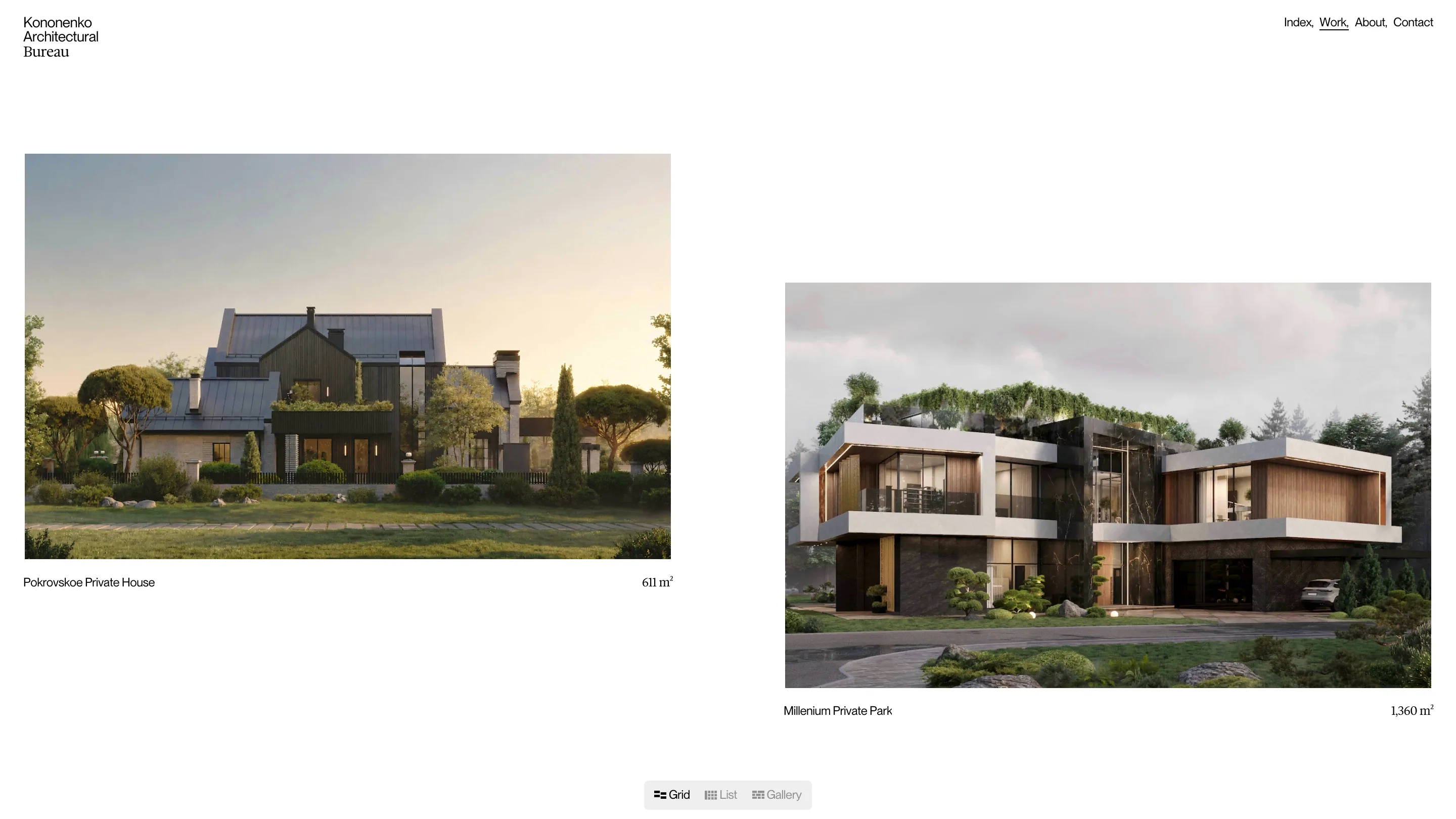
A small pill floats at the bottom of the viewport with three view options: Grid, List, Gallery. It is the only piece of interface on the page that looks like a control, and it stays out of the images. Ten projects, the smallest 334 m², the largest 58,079.
What the jury actually rated
The score breaks down as 7.34 design, 7.2 creativity, 7.48 content, 7.14 usability. Content scoring highest makes sense. The bureau has 490 completed projects, 45 people and 15 years behind it, and the site puts real renders and real areas on screen instead of stock photography and adjectives.
Usability scoring lowest also makes sense. Bottom-anchored controls and full-bleed imagery look excellent and ask the visitor to learn where things live. Nothing here is labelled twice.
The interface uses two colours, black and white. Every other colour on the site belongs to the renders, which is the point: the architects supply the palette, the type supplies the structure. Most studio sites do this backwards.