Gionatan Nese opens his portfolio on a pile of thumbnails
The awwwards Site of the Day for 5 September has no hero line. Its portfolio homepage is twenty small work images scattered on white, and it holds.
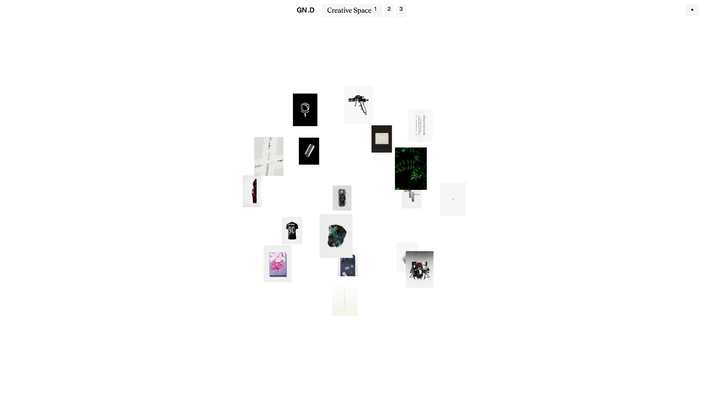
Gionatan Nese's portfolio homepage carries no headline and no grid. It's about twenty small pictures floating on white at four or five different sizes, clustered near the middle of the screen: a t-shirt, a green fern, a spray gun, a lump of raw blue mineral, a car, a book cover. The nav calls the page Creative Space. It took awwwards Site of the Day on 5 September 2026 with an overall 7.32, and creativity was the highest of its four scores at 7.73. Gionatan Nese is a designer in Milan, working here with Yousuf Soomro.
The portfolio homepage works like a pinboard
Nothing is captioned. Nothing sits in a row. The images overlap at some points and leave big empty corners at others, so you read the page the way you'd read a wall of printouts: pattern first, item second. That's a risk on a portfolio, where the usual advice is to name the work in the first second. Nese lets the pile make the pitch instead. It survives because the thumbnails agree on one thing. Every single one is a product shot on a light or a black field, so twenty pictures read as one body of work rather than twenty unrelated JPEGs.
The nav only names the page you're on
Three tabs sit centred at the top. On the home page they read Creative Space with a small 1, then a bare 2, then a bare 3. Open Projects and the middle tab spells itself out while the other two shrink back to numbers. So the only label you can read is the one you don't need. It sounds perverse. It works, because the numbers tell you the site is three pages wide, small enough to hold in your head, and the word that does appear says where you are without an underline, a highlight, or a colour change.
Every title splits across two typefaces
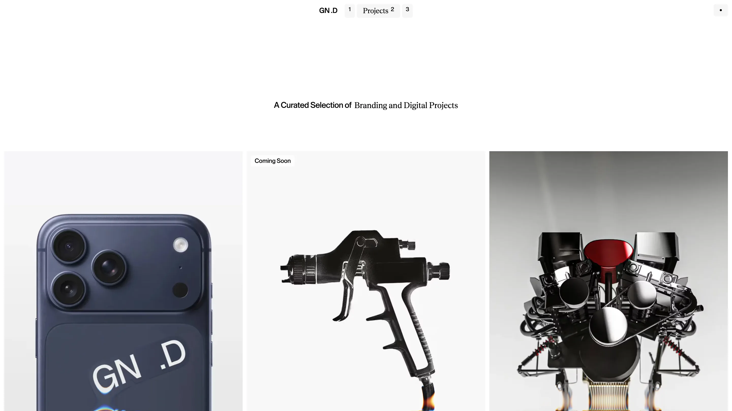
The Projects page opens on a single line: "A Curated Selection of" in a tight grotesk, "Branding and Digital Projects" in a high-contrast serif. The same split runs through the case studies. The Ferrari page stacks "Ferrari" in the grotesk over "Design Exploration" in the serif. The grotesk always carries the label, the serif always carries the subject, and neither one gets a size jump to prop it up. Pairings like this usually go wrong. This one holds because the two roles never swap.
The project pages go full bleed
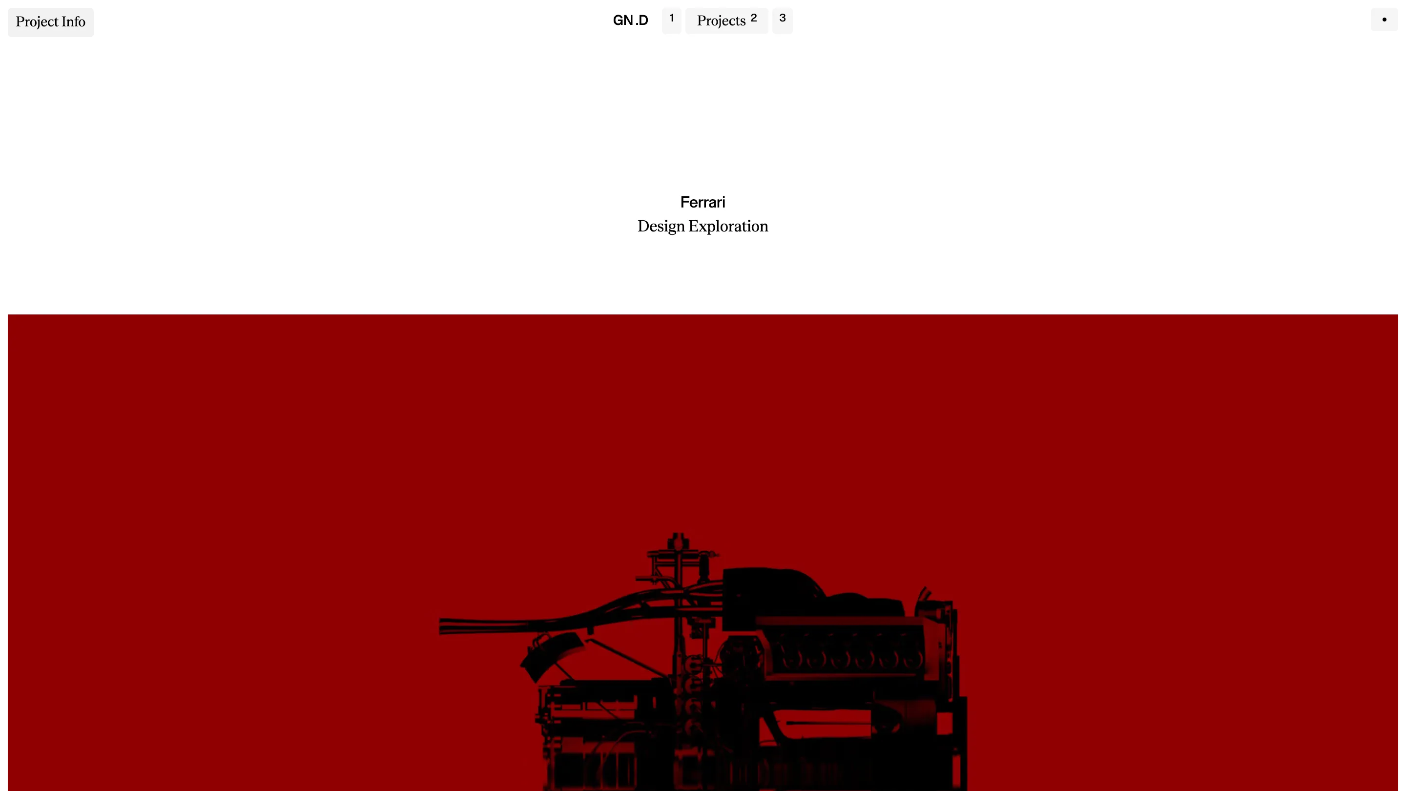
Under the title block, Projects drops into three images edge to edge with no gutter and no captions: a navy iPhone with GN .D printed on the back, a black spray gun, a chrome V12. The Ferrari case study does the same, then floods the screen with Ferrari red and a black silhouette of the engine. After all that white upstairs, the colour hits like a page turn in a magazine. The restraint on the home page is what buys the volume here, and that trade is the clearest craft decision on the site.
Where the taste and the score pull apart
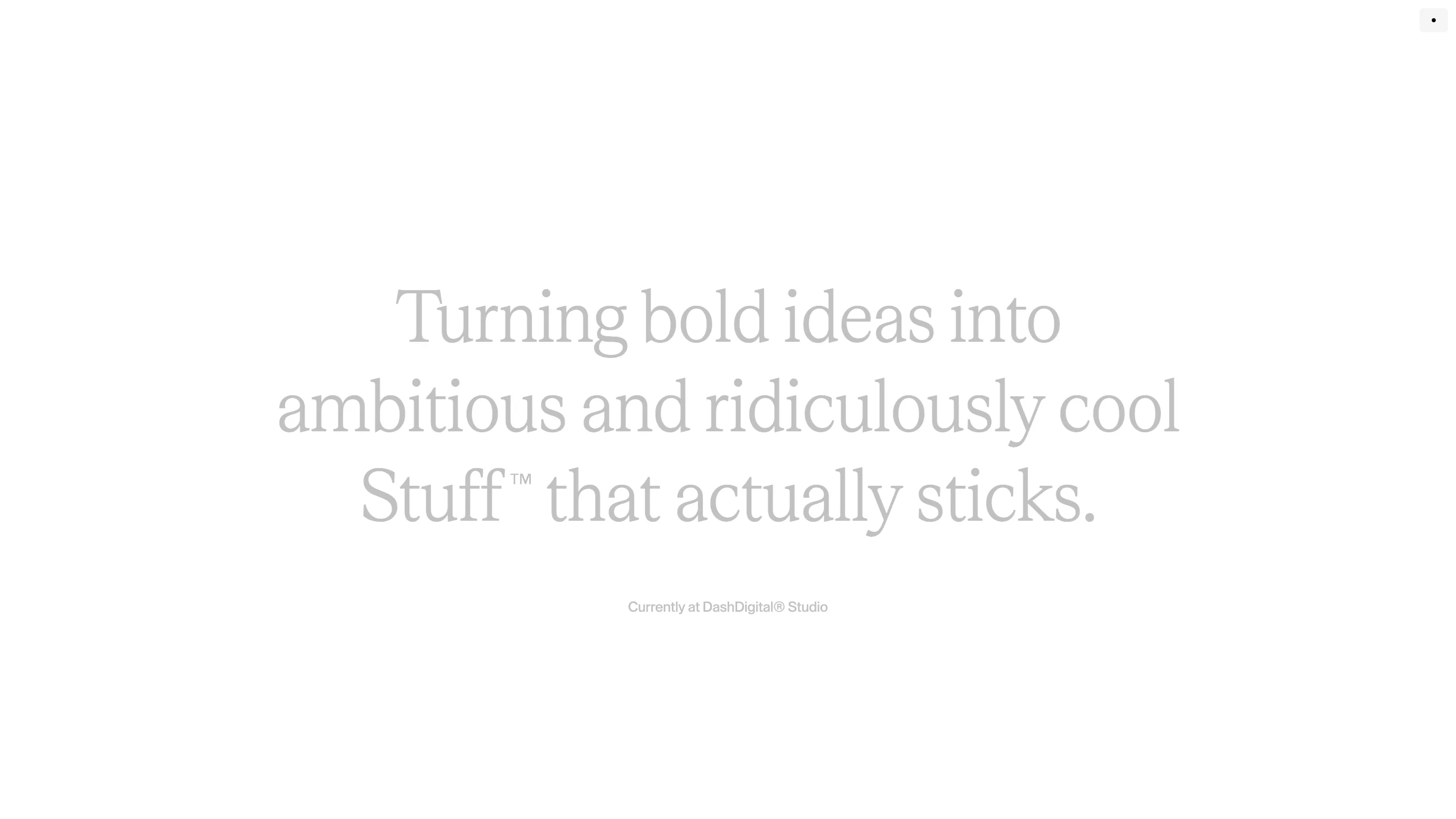
The About page sets one sentence, "Turning bold ideas into ambitious and ridiculously cool Stuff™ that actually sticks", in a large serif at roughly 30% grey on white, with a small line underneath naming the studio he's currently at. As art direction it's a whisper you have to lean toward. As a contrast ratio it's under what any checker will pass, and the site's weakest development sub-score is accessibility at 6.40 against a 7.80 for performance. That's the one place where the taste and the marks disagree.
What a judge is rating here
The scores tell you where the value sat: 7.73 for creativity, 7.09 for usability, the widest gap in the four. That reads about right. A scattered pinboard, a nav made of numbers, and a headline sentence at 30% grey all cost the visitor something. What they buy is a site nobody will confuse with another portfolio, built on three moves you can describe in a sentence each. Most portfolios that score higher on usability are also the ones you can't remember by Friday.