ANDMADE runs a process portfolio next to the finished work
The Tokyo studio gives 11 unfinished studies the same billing as 27 client cases, then changes the page colour every time you change section.
Inspiration · The Editors · 3 min read ·
Featured: ANDMADE Inc.
ANDMADE puts its unfinished work in the top nav. Projects, About, Studies, Contact. The Studies page on the Tokyo studio's site holds 11 entries and opens with a single line: "Where ideas are explored before they become outcomes." That's a process portfolio, given equal billing with the 27 finished client cases, and it's the best page on the site.
The process portfolio is a filmstrip
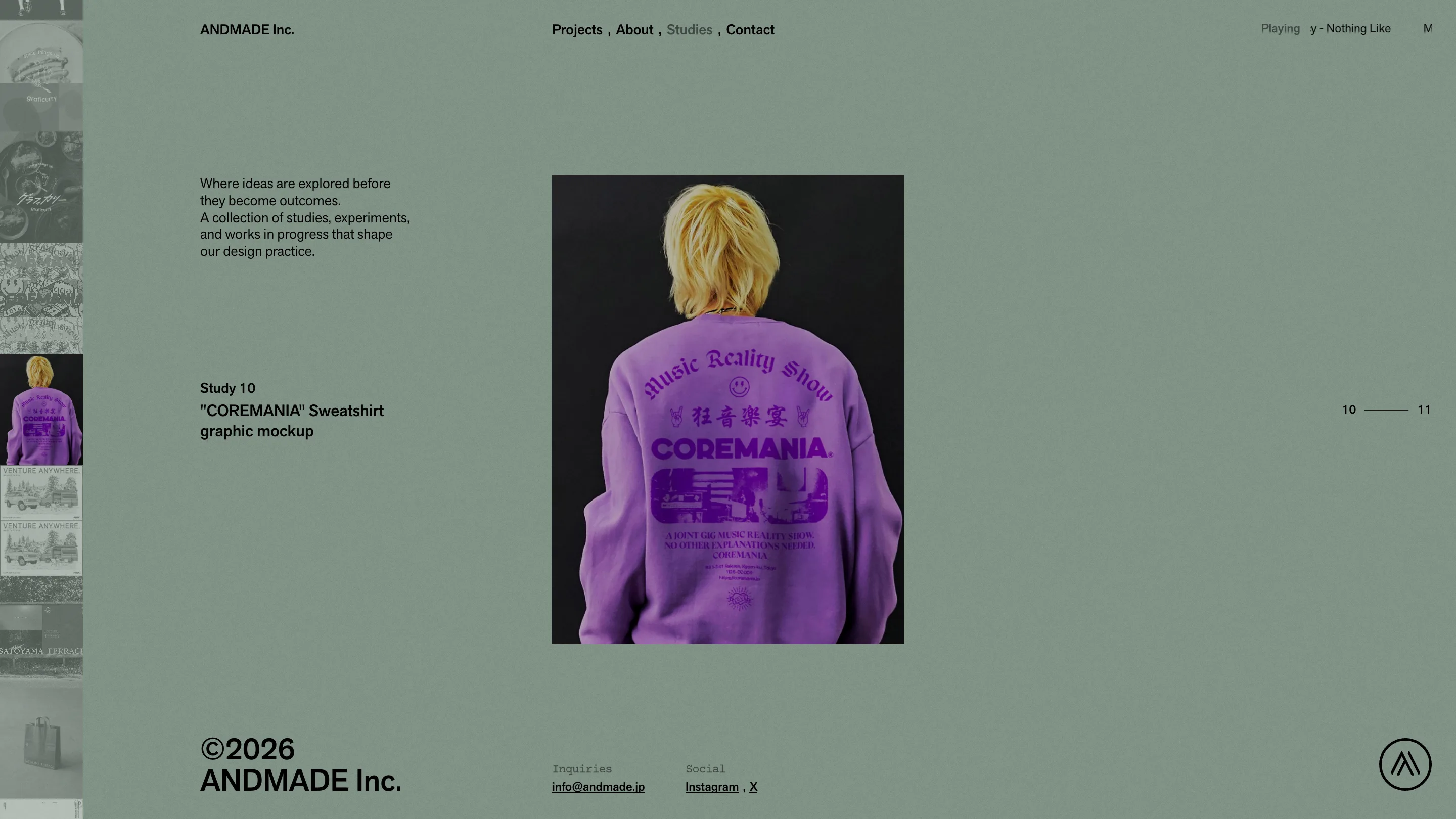
Study 01 is a signboard mockup for SATOYAMA TERRACE. Study 03 is a mockup of ANDMADE's own 2024 site, credited to homunculus Inc. for the build, and it plays as video when you land on it. A thin rail of thumbnails runs down the left edge. A counter in the right margin reads 03 of 11. Under the frame, one instruction: "Tap to zoom."
That's all. No process narrative, no challenge-and-solution, no results slide. Each study gets a number, a caption, and a credit. The restraint is why it holds up: a case study has to argue for itself, so it gets long and defensive. A study only has to exist. Eleven of them together say more about how a studio thinks than three polished write-ups ever do.
Every row on the projects index is a fact
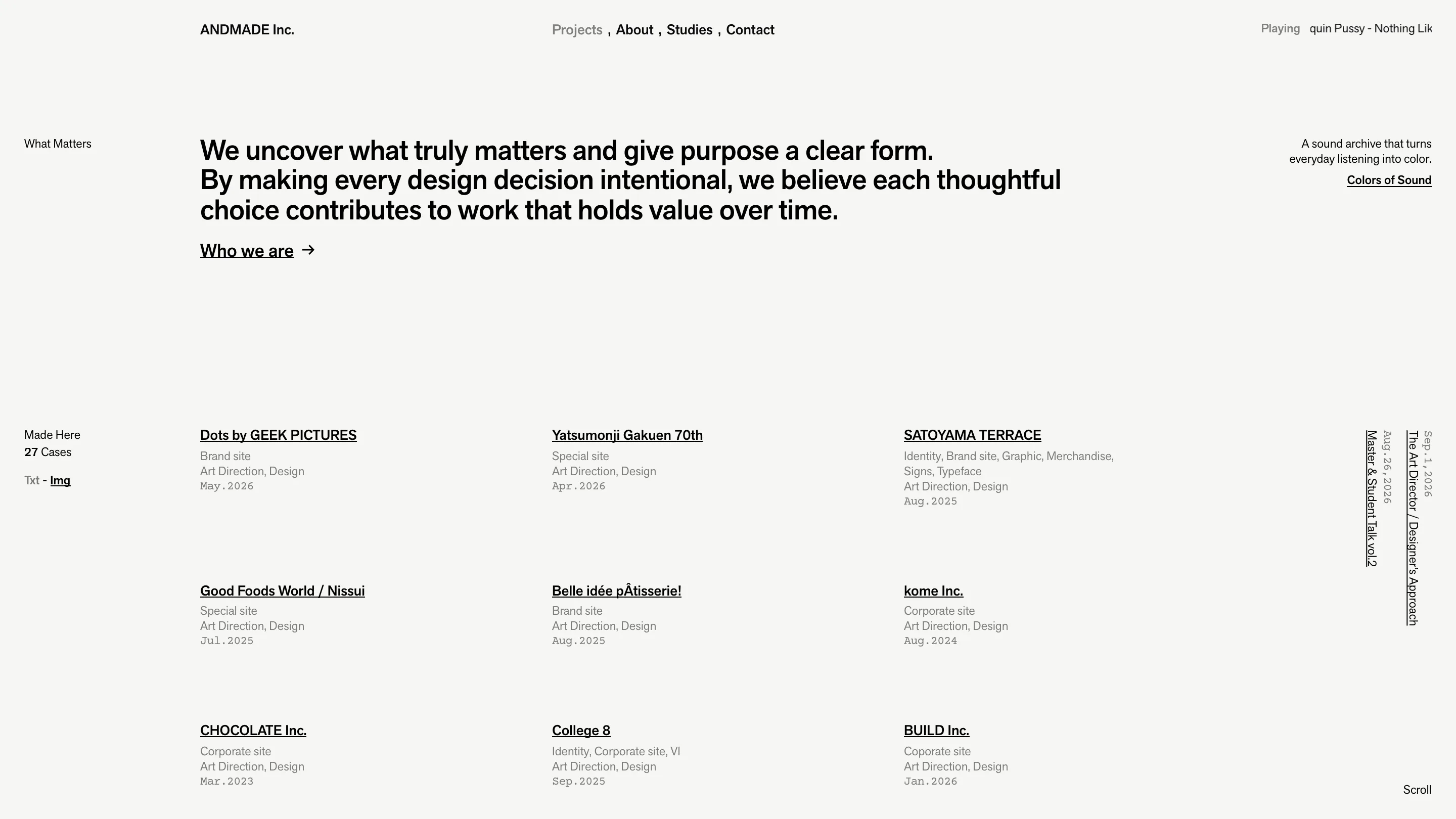
The home page runs project rows in three columns. Each row carries the client name, the kind of site (Brand site, Special site, Corporate site, Identity), the roles ANDMADE took (Art Direction, Design), and the date in monospace: May.2026. No thumbnails by default. A small Txt / Img toggle sits in the left gutter if you want pictures instead.
That gutter is labelled like a technical drawing. "What Matters" annotates the statement at the top. "Made Here, 27 Cases" annotates the index below it. Down the right edge, two news items sit rotated ninety degrees with their dates. Latin type comes off Adobe Typekit, Japanese off Gen Interface JP at weight 300, and dates and micro-labels drop to mono. That's the whole type system.
The colour changes, the structure doesn't
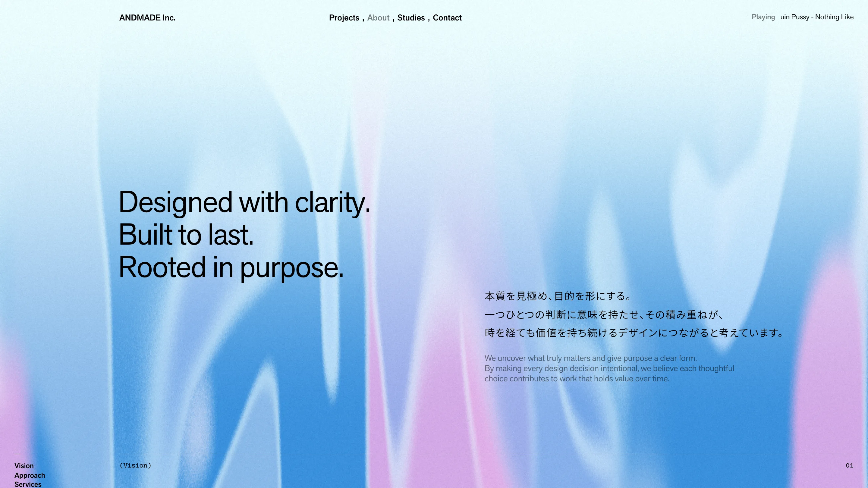
Projects is paper white. About is a grainy blue and pink wash with "Designed with clarity. Built to last. Rooted in purpose." sitting on top in black, the Japanese copy at full size and the English underneath in grey. Studies is sage green. Contact is a dark teal that looks like oil on water.
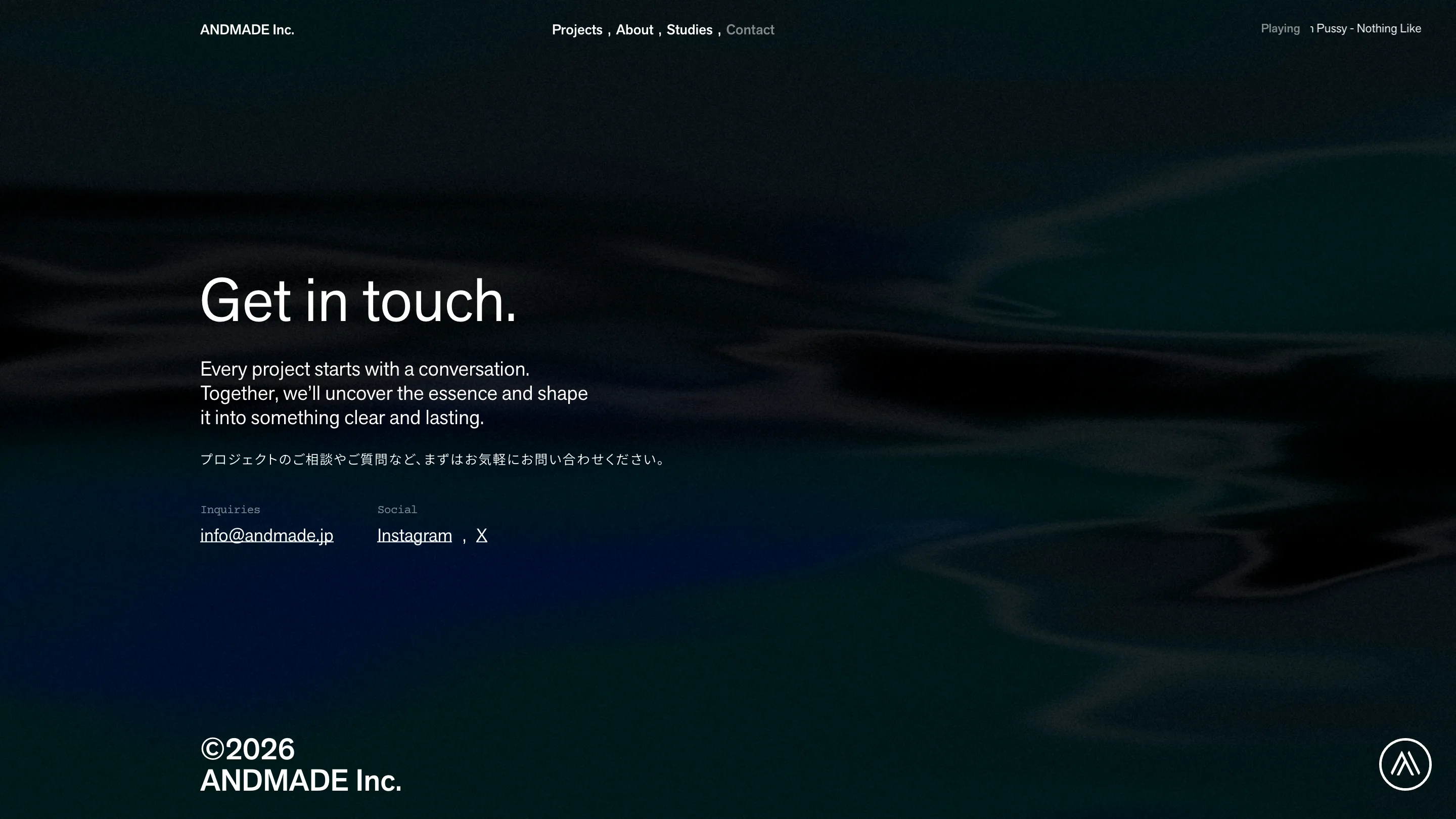
Four pages, four backgrounds, one grid. The header never moves. The type never changes size. The gutter keeps its labels. Because the skeleton holds, each colour reads as a change of room rather than a change of site. Contact goes further and drops the form entirely: an email address, Instagram, X, and two lines of invitation.
The giveaway
Top right of every page there's a small readout. "Playing", then a scrolling track title. Load the site cold and it says "No music playing." A now-playing widget does nothing for a design studio's conversion rate. It's there because someone in the studio wanted it there, which is the same argument the Studies page makes in a longer form.
What to take
If your portfolio looks thin because you only publish finished client work, a process portfolio is the cheapest fix on the table. Mockups, tests, dead ends and signboard comps cost nothing to ship and need no story attached. Number them. Caption them. Credit whoever helped. Then stop.
ANDMADE Inc. is based in Tokyo. Found in Minimal.gallery.