Hobro's headlines collide an outline serif with a grotesk
Hobro Digital took awwwards Site of the Day on 29 August with a 7.29. The move that carries the site: a hairline outline serif parked on a solid grotesk.
Hobro Digital sets "WHAT WE DO" twice. Once as a hairline outline serif, once as a heavy black grotesk, then slides one over the other until the letters cross. The W of WHAT stays legible straight through the W of WE. That overlap is the sharpest thing on the site, and it comes back often enough to read as a system rather than a one-off.
The Calgary agency Hobro Digital took awwwards Site of the Day on 29 August 2026 with a 7.29, plus the Developer Award at 7.35. Design pulled the highest sub-score of the five, 7.6.
Outline type over a grotesk
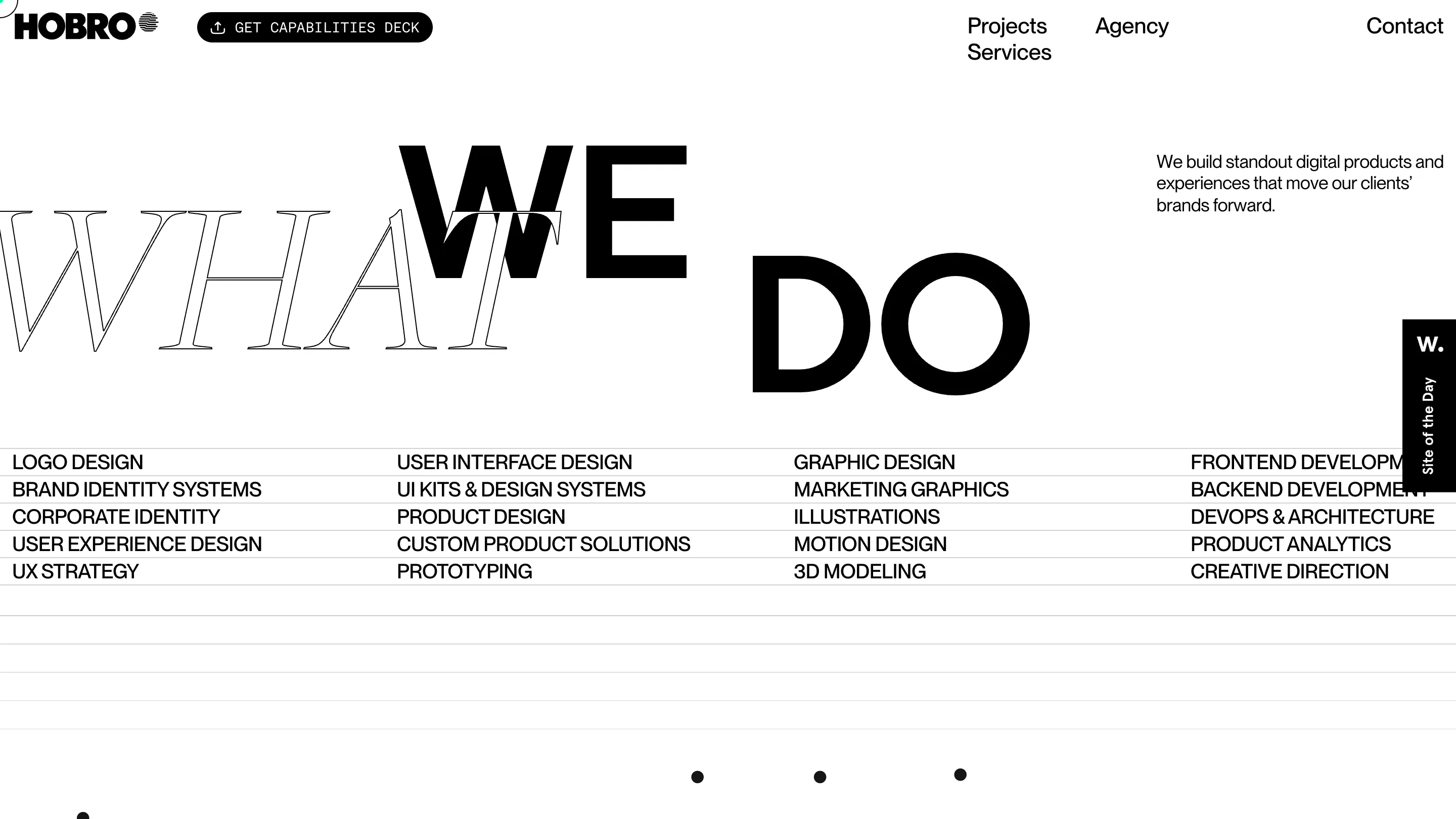
Look at the crossing point. The serif is a high-contrast display face, hairline strokes, drawn as an outline with nothing filled in. The grotesk under it sits in the Helvetica line: closed apertures, flat terminals, solid black. Two faces that would fight anywhere else. One is hollow and one is filled, so they read as two layers instead of mush.
The line does two jobs at once. WHAT is the question, WE DO is the answer, and stacking them turns the section title into one gesture. Under it runs a four-column list in the body face: LOGO DESIGN, BRAND IDENTITY SYSTEMS, UI KITS & DESIGN SYSTEMS, DEVOPS & ARCHITECTURE. Twenty services, no icons, no cards. The type carries all of it.
The same idea, quieter
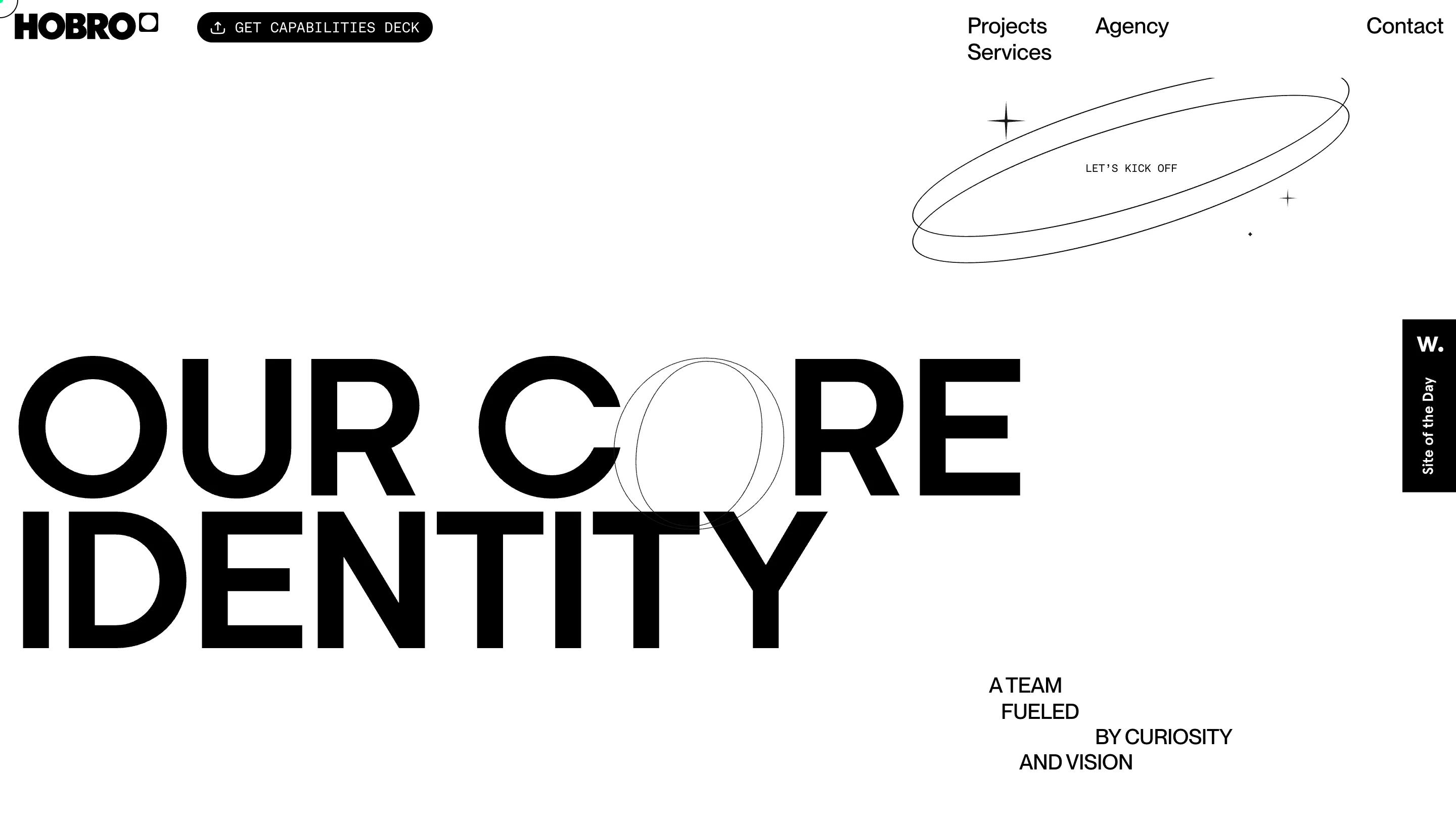
"OUR CORE IDENTITY" runs at close to full viewport width in the same black grotesk. Here the outline is one hairline O, sitting off-register on the O of CORE and big enough to break past the cap height. One letter, one hairline. Same move at a tenth of the volume, which is what separates a system from a party trick.
The small mark next to the HOBRO wordmark keeps changing as well. A striped globe on one screen, an ® on the next, a rounded square after that. Nothing announces it. You catch it or you don't.
The colour comes from the client work
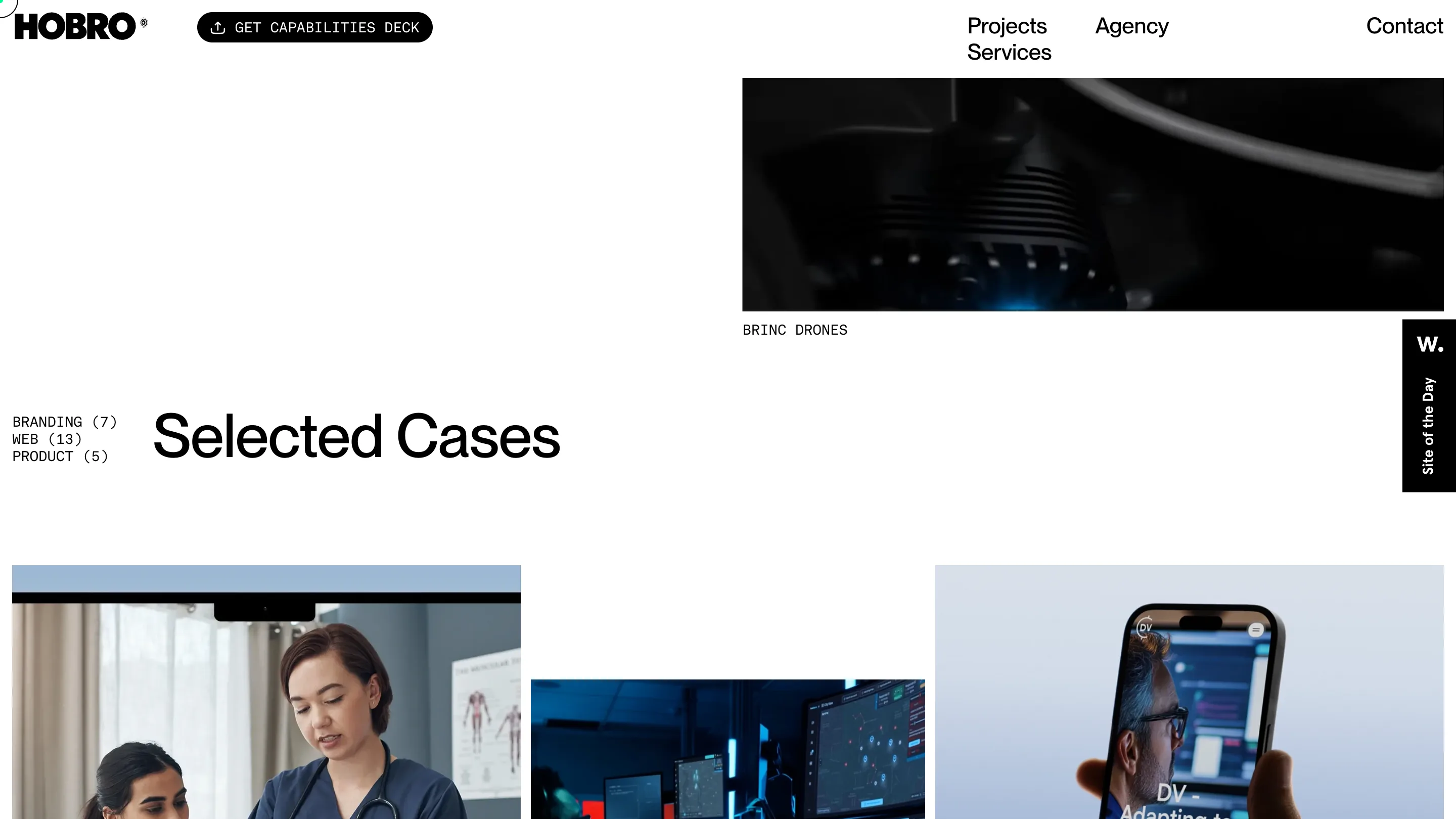
Past the hero the page goes black on white and stays there. Every bit of colour on screen lives inside a case thumbnail: the blue control room of BRINC LIVEOPS, the pink spheres of CAVIAR, the purple slab of BASELAYER. Against that much white they read like slides on a light table.
The grid helps. Thumbnails take different widths and different vertical offsets, so no two rows line up. BRINC DRONES hangs alone at the top right while "Selected Cases" sits low and left. The filter is three lines of mono with counts next to them: BRANDING (7), WEB (13), PRODUCT (5). Naming the number is a small honesty. You know how deep the work goes before you click.
Where a judge takes points off
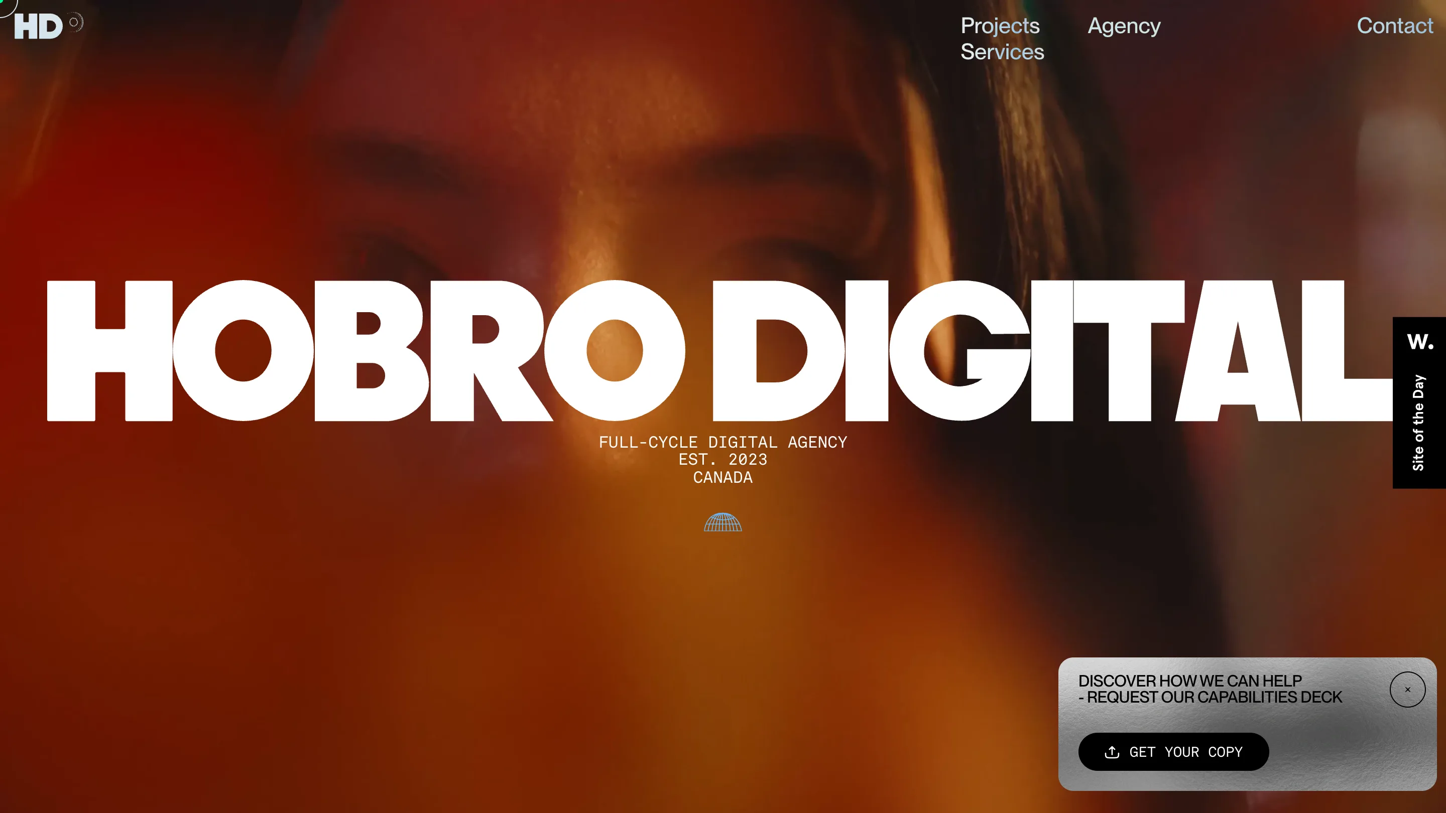
The hero is the loudest screen here and the least like everything after it: white display type across a warm orange video of a face, with a mono block reading FULL-CYCLE DIGITAL AGENCY, EST. 2023, CANADA. It works. The black-and-white system that follows works better, and the join between the two is abrupt.
The jury card says something similar. Design 7.6, creativity 7.1, usability 7.0, then accessibility at 6.60 and WPO at 6.80, the two lowest marks on the sheet. The preloader is part of that. A black screen with a LOADING... bar has to finish before anything appears, on a site whose best moments are type sitting still. The copy leans on stock phrasing too. "Crafting fresh digital presences" is doing less work than the letters around it.
The type holds, though. Anyone building a services page can steal the outline-over-solid headline tomorrow morning.