Léo Parpeix builds a 3D world for each portfolio page
A clay atelier, a full-colour valley and a flat yellow room, all holding the same daisy. Site of the Day on 14 September with a 7.69.
Awards · The Editors · 4 min read ·
Featured: Léo Parpeix
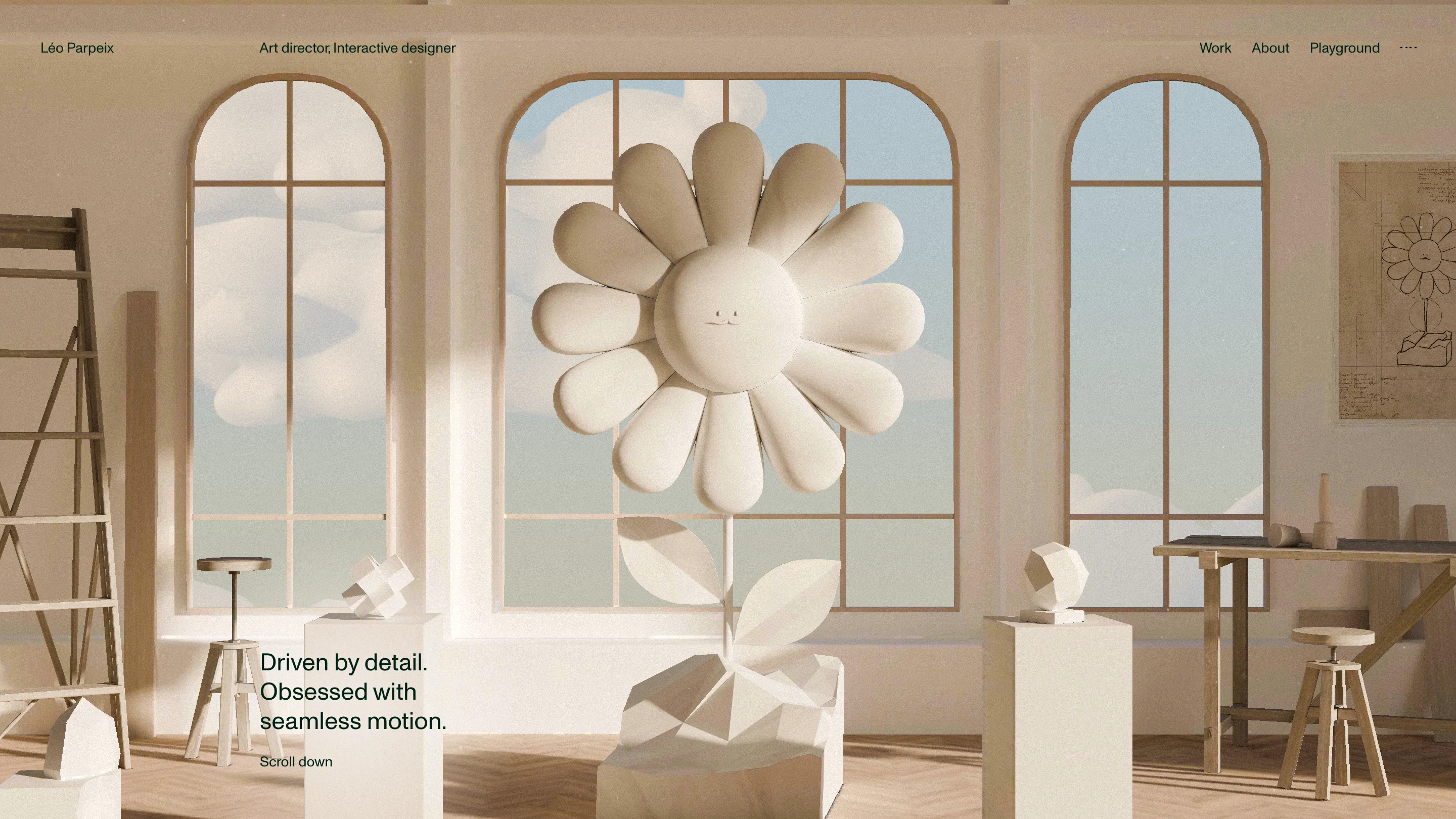
Léo Parpeix's portfolio opens inside a room. Arched windows, a wooden ladder, plinths holding half-finished shapes, and a clay daisy the height of a person growing out of a pot in the middle of the floor. Everything is the same beige. The site took awwwards Site of the Day on 14 September 2026 with a 7.69, and the reason sits in the first viewport: it builds a place before it shows you a single project.
The line in the top left of the header says "World building". He means it literally.
The atelier sets the rules
The home scene is a sculptor's studio rendered in one material. Clay walls, clay clouds through the windows, clay flower, clay offcuts on the plinths. The only things that escape it are the type and the sky.
Pulling the colour out is the decision that makes the rest work. A monochrome hero lets the caption in the bottom left sit at 14px with no scrim, no drop shadow, no box behind it. Most 3D heroes need that furniture to stay readable. This one gets by on dark green, rgb(2, 32, 22), over pale beige, with Monument Grotesk for the interface text and a variable Avantt for the display sizes. Two families, one weight each, nothing else.
Then the colour arrives
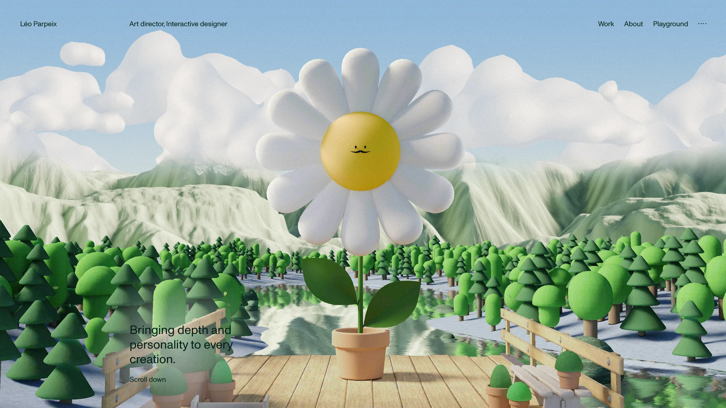
The About page is the same daisy. Same pot, same camera height, same caption slot in the lower left, same "Scroll down". The walls are gone and the flower is out on a jetty in front of a valley, blue sky, spruce trees to the horizon, snow on the peaks behind. The petals have turned white and the centre has gone yellow.
That's the site's whole argument in two screens. The work lives indoors in raw material, the person lives outside in full colour, and the flower walks between them. No copy explains it and none is needed. Continuity of a 3D world across pages is the rare kind of art direction that survives a reload, because you recognise the object before you read anything.
The project rows read like a spec sheet
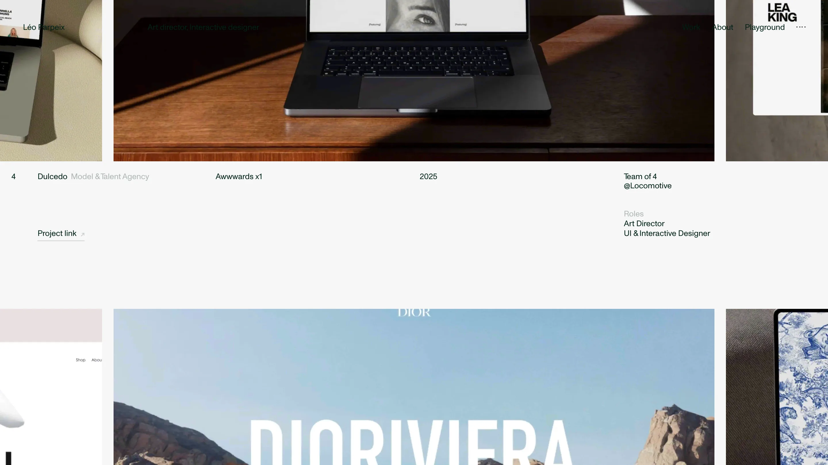
Below the hero the register changes completely. Fourteen projects, numbered, each one a single horizontal line of data: 4, Dulcedo, Model & Talent Agency, Awwwards x1, 2025, Team of 4, @Locomotive, then the roles he held and a project link. The images ride above in a horizontal strip that slides as you scroll, so you read a ledger with the work passing behind it.
It's the most useful part of the site and the least decorated. Team size and studio on every line is uncommon, and it's the number an art director actually wants to know: Dioriviera was five people at Immersive Garden, Unity's design system was Locomotive plus a UX designer and the Unity team, the Issey Miyake experience was freelance. The archive rows below carry two sentences each, written in plain English, about what the job asked for.
A yellow room with a bee in it
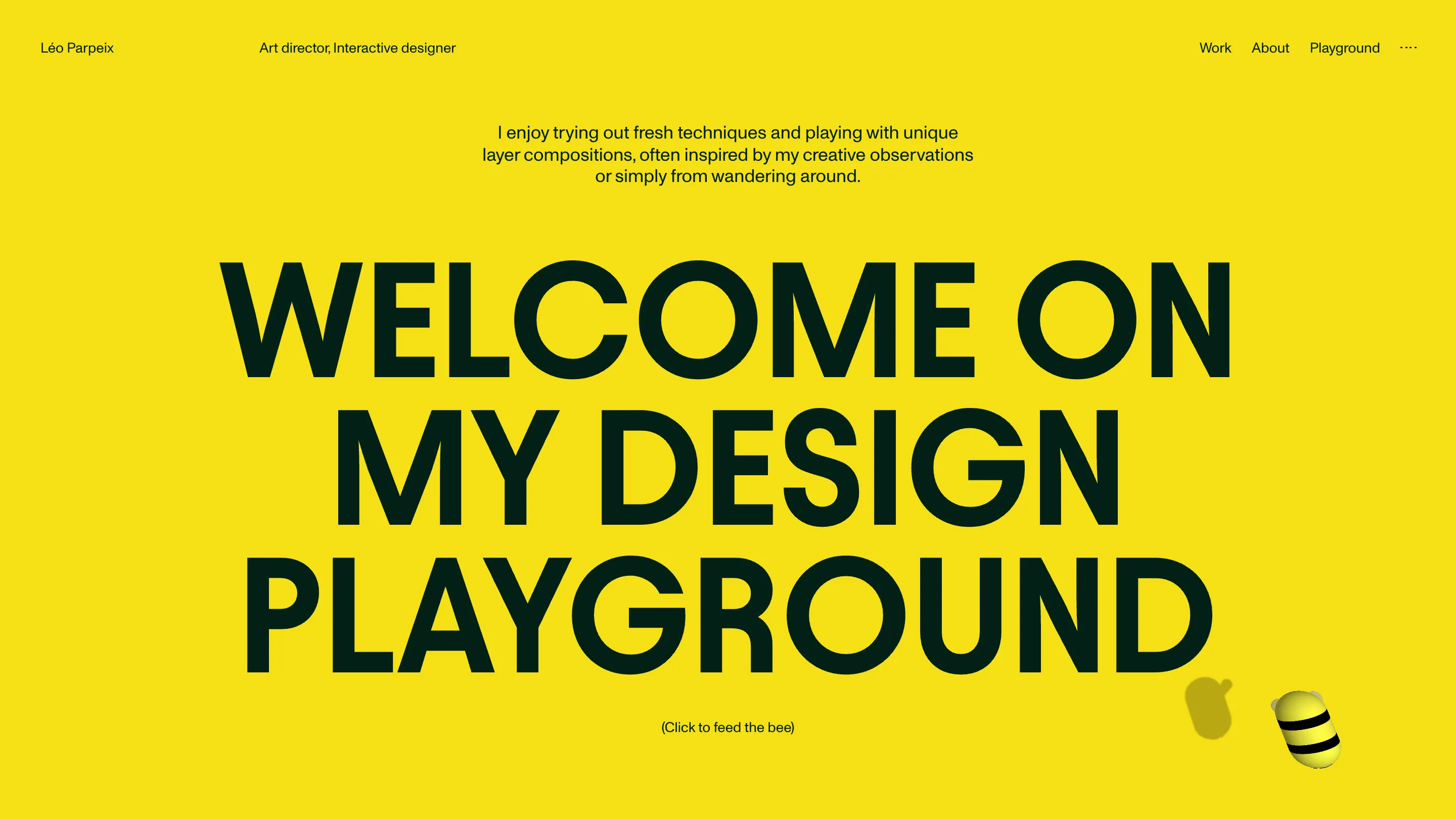
Playground drops the 3D set and floods the screen with a single yellow. "WELCOME ON MY DESIGN https://pub-198272d9cc6f4ac98d3a6c772f449c90.r2.dev/awards/2026-09-15-leo-parpeix-play.webpGROUND" runs across it in dark green Avantt capitals, and a 3D bee hovers in the corner under the line "(Click to feed the bee)". The footer does the same trick in reverse: huge green capitals on off-white with one yellow smiley balanced on a letter.
Three pages, three worlds, one palette logic. Beige for the work, colour for the person, yellow for the experiments.
What the judges rated
Creativity took the high mark at 8.04, usability the low one at 7.34, with design at 7.79 and content at 7.63. The Developer Award landed at 7.47, and animations and transitions scored 8.40, the best number on the card. Thoma Lecornu built it in Vue 3 and Vite with two stacked WebGL canvases, one running the scene and one sitting over the top to cover the page change, which is why the room can dissolve into a valley without a flash of white.
Semantics and accessibility both came in at 7.00, and you can see why. The viewport meta ships user-scalable=no, so pinch zoom is off, and the first thing the header asks for is a click to enable sound. Those are the two places where a site this considered stops being considerate. Everything else earns the score.