Milledollars splits its name across a full-screen reel
Milledollars hangs its name in two corners and splits every caption across the frame, so the brand films own the middle of the screen.
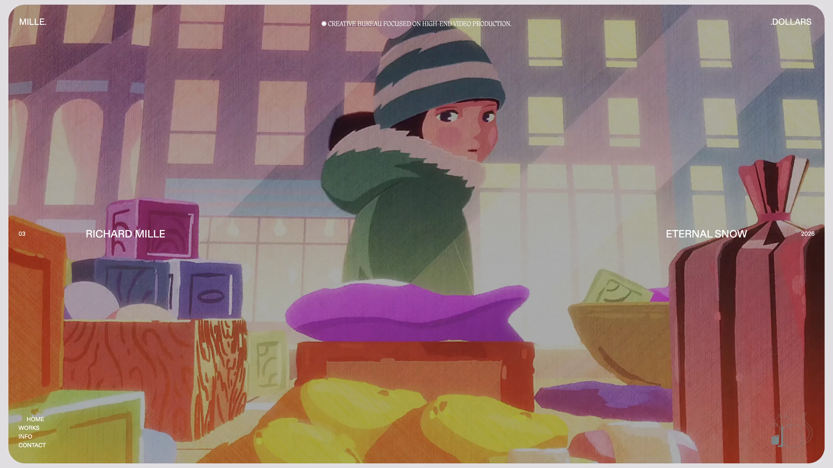
Milledollars splits everything in two. The name sits in the corners, MILLE. at the top left and .DOLLARS at the top right, and every film on the home gets the same treatment: client on the left, title on the right, the footage running between them. It's a showreel with a frame for a layout, and it took awwwards Site of the Day on 2 October 2026 with a score of 7.23, plus a Developer Award.
The site was designed and built by Magnetism, the Paris studio, with credits to Elisa Dubois and Ludovic Boiteux. The client is a creative bureau that makes high-end brand films, most of them for Richard Mille. So the job was to get out of the way of the work and still feel like a house with a point of view.
A showreel home that splits the name
The home is one film at a time, full screen, in a rounded card that leaves a thin grey margin around it. There's no grid of thumbnails and no scroll. A single line runs across the middle of the frame: the number on the far left, the client next to it, the title and the year mirrored on the right. On Eternal Snow it reads 03, RICHARD MILLE, ETERNAL SNOW, 2026. The centre of the line stays empty, so the caption never covers the face or the product.
The split wordmark is the same move at the top of the page. MILLE. and .DOLLARS hang in opposite corners with the full stops pointing at each other, and the middle of the bar holds one line in a small serif: creative bureau focused on high-end video production. Nav sits bottom left in tiny caps. A line drawing of a cat sits bottom right. Four corners, four jobs, and the footage keeps the rest.
The intro stacks the films like a contact sheet
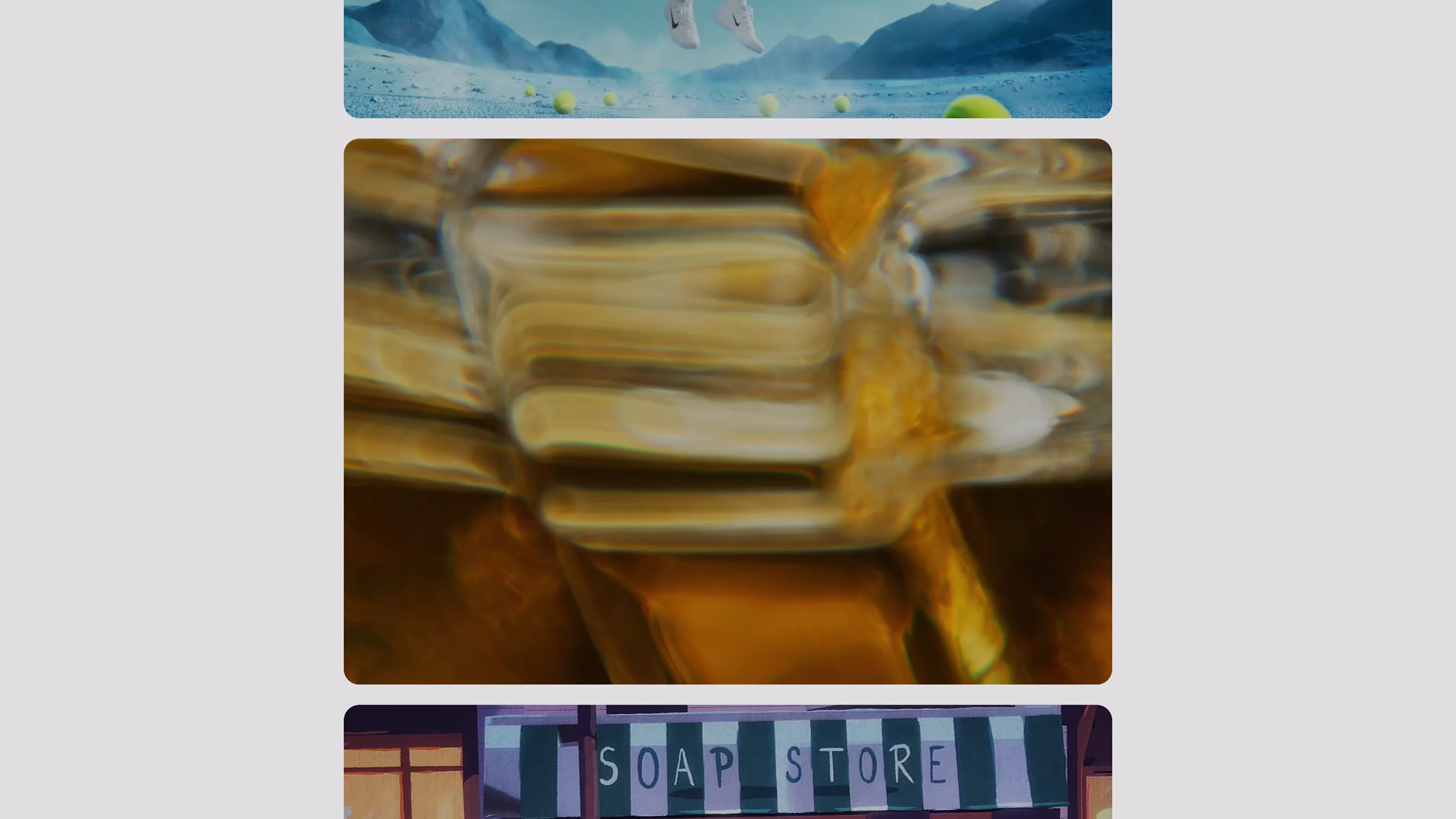
Before the reel settles, the site runs the whole catalogue past you as a column of rounded frames on pale grey: a tennis player over a blue desert, a liquid gold close-up, a painted soap store, a Spanish street corner at night. It reads like a contact sheet scrolling through a loupe. Then the reel settles on one film, full screen, and the captions come in.
It's a good answer to the oldest showreel problem. You get the range of the studio in a few seconds, live action, 3D and hand-drawn animation side by side, and then the site commits to one film. The GSAP work is quiet. Nothing bounces. The frames move at the speed of an edit.
Case studies that start in the shot
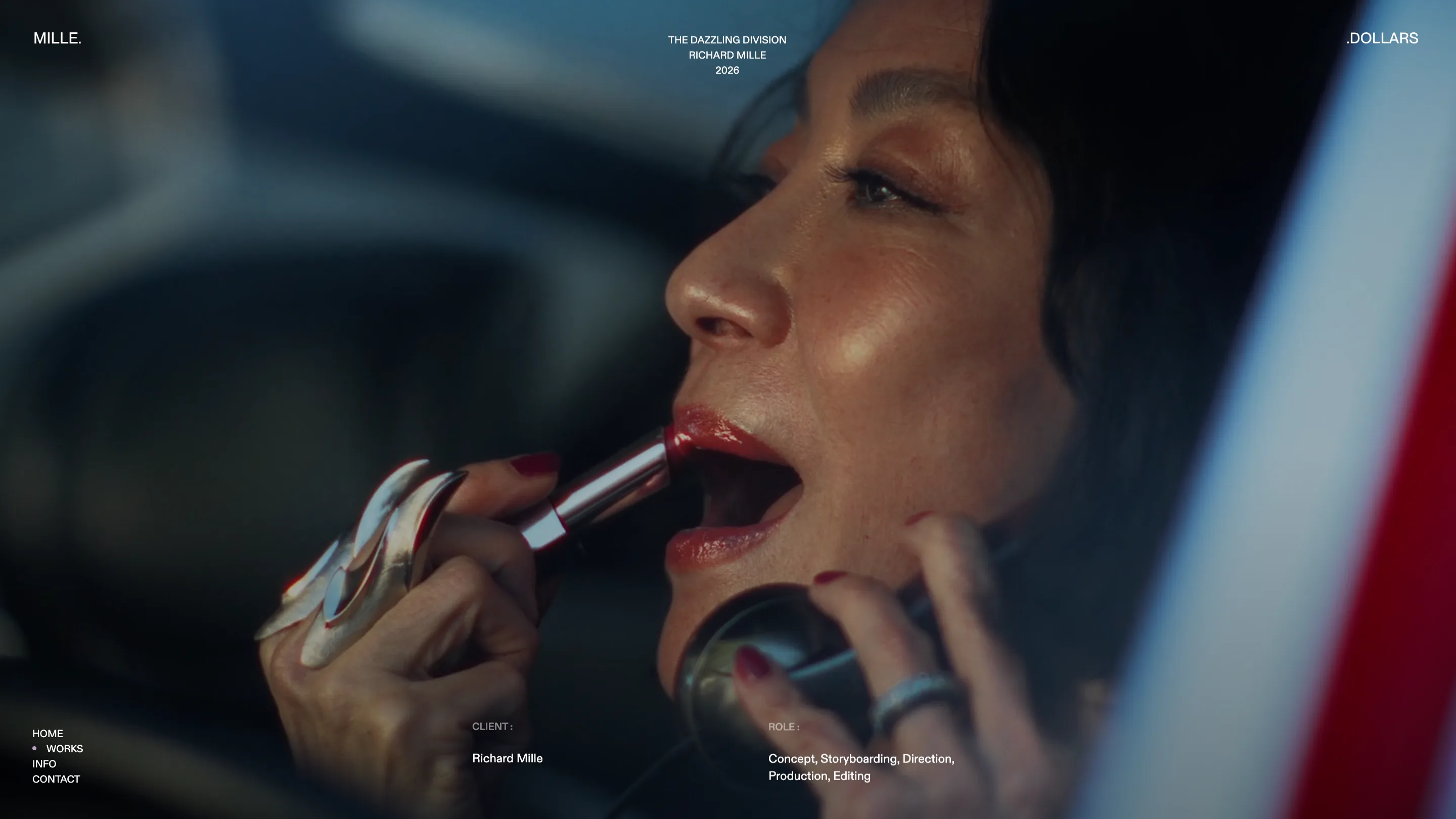
Open The Dazzling Division and you land inside the film. Michelle Yeoh fills the screen, the title, client and year stack in small caps at the top centre, and two labels sit at the foot of the frame: CLIENT, Richard Mille, and ROLE, Concept, Storyboarding, Direction, Production, Editing. That role line is the most useful thing on the page for a brand buyer. It says what the bureau did before any paragraph does.
Below, the page turns into a short essay on the work, with the full film at 3:49 and a section on colour as a narrative device. The type stays in ABC Diatype for everything a reader needs, with Migra, a sharp display serif, held back for the small lines. Two families, used for different jobs.
The info page changes the light
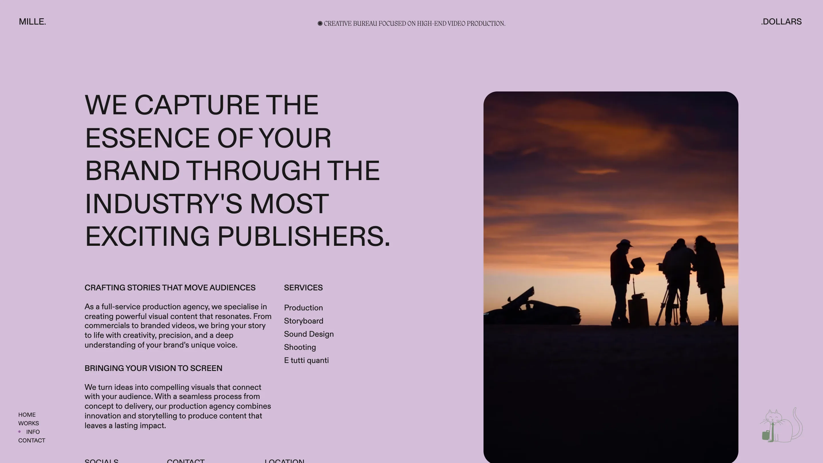
Info is the one page that isn't dark. The whole ground turns lilac, the same colour the site uses for its active dot in the nav, and the statement runs in big uppercase Diatype next to a portrait frame of a crew shooting at sunset. The services list ends with E tutti quanti, and that small joke does more for the voice than the paragraphs above it.
What to take from it
Milledollars shows how far a portfolio can go on a single axis. Split the name, split the caption, keep the middle for the work. If you're designing a site for a film or photo studio, try giving each corner of the screen one fixed job and letting the footage own everything else. The layout stays the same on every film, so the films are the only thing that changes.