Meer Mohsin wears his own logo as a mask
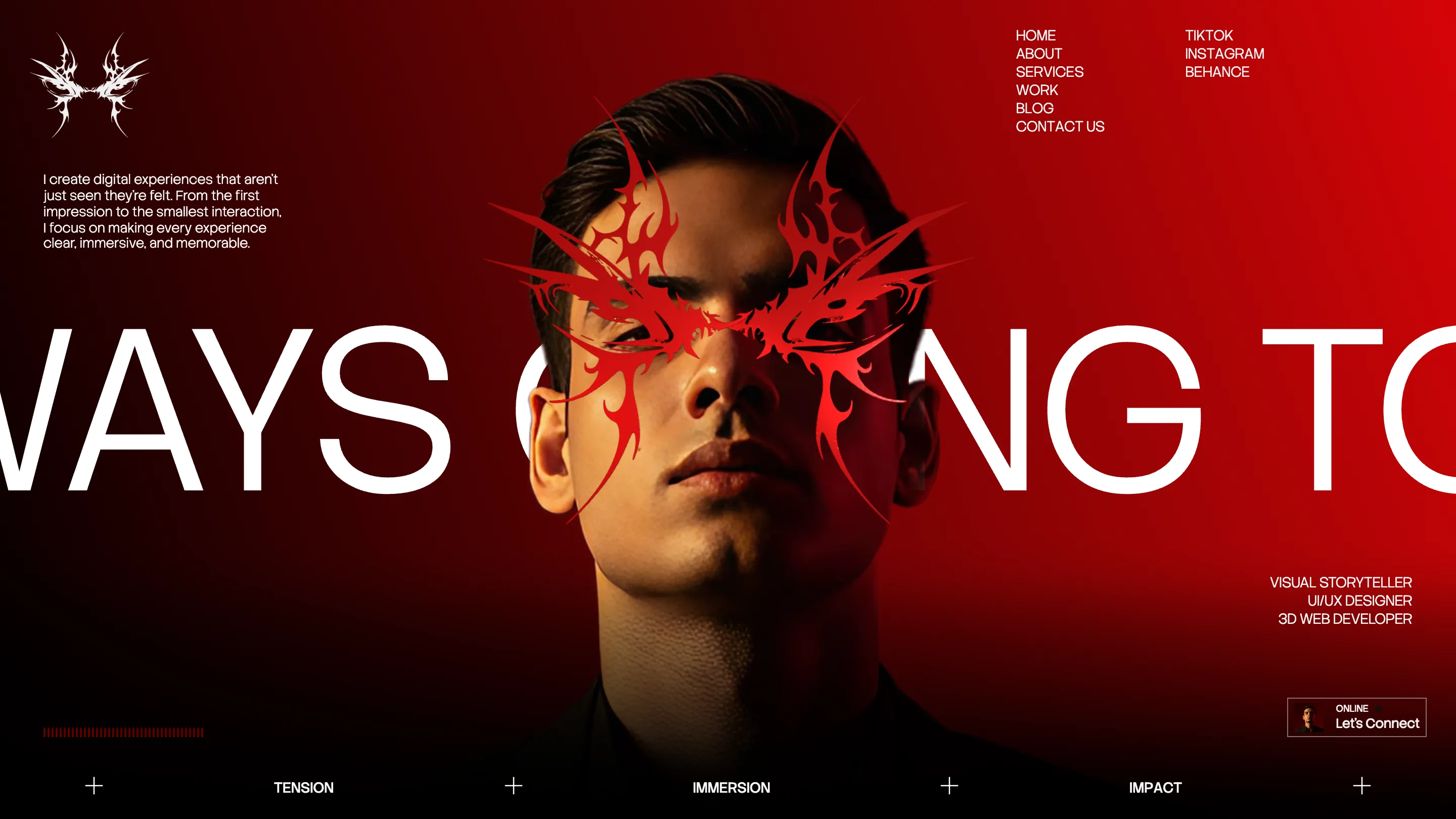
A red tribal mark does three jobs on Meer Mohsin's portfolio: logo, mask over the hero portrait, full-bleed graphic. One drawing holds the art direction.
Awards · The Editors · 4 min read ·
Featured: Meer Mohsin
Meer Mohsin drew one red mark and used it three times. It's the logo, small and white, top left. It's the mask across his own eyes in the hero photograph. And further down the page it comes back at full bleed, a wingspan of red barbs sitting on top of a script headline. One drawing, three sizes. His portfolio took awwwards Site of the Day on 26 September 2026 with a 7.26, plus the Developer Award, and the mark is the reason the site stays in your head afterwards.
The logo as a mask
The hero is a photograph of Mohsin looking up, lit hard from one side, sitting on a red-to-black gradient. The mark lands over his eyes. It reads like tattoo flash, the sort of thing you'd see on a 2000s metal sleeve, and it's set so the two halves meet at the bridge of his nose. Covering the eyes is the whole decision. A portfolio hero normally wants your face. This one hides the part that would turn it into a headshot and leaves you with a graphic instead.
Behind him, IT WAS ALWAYS GOING TO BE THIS WAY runs in a wide grotesk, set so much larger than the viewport that you only ever read four or five letters at once. Cropping a headline past both edges is a risk: the reader has to assemble the line from memory. Here it works because the sentence is short and it repeats later.
Three acts pinned to the bottom
TENSION, IMMERSION, IMPACT sit in a rail along the bottom of every screen, spaced by markers that flip between a plus and a cross as you move. It's a chapter index for the scroll. Naming the acts does two useful things at once. It tells the visitor roughly how long the page is, and it gives the page a reason for its own pacing, so the slow parts read as deliberate rather than as loading. A red waveform ticks away in the bottom left corner the whole time.
One line, set twice
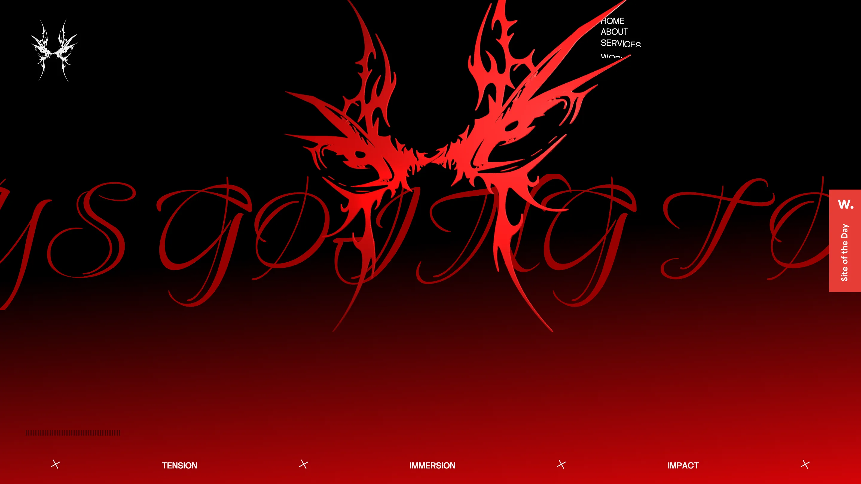
Later the same sentence comes back in a red spencerian script, enormous, with the mark floating above it in high-saturation red. Same words, two faces. The grotesk version is cold and structural. The script version is theatrical and almost romantic. Because it's a repeat rather than a new line, it reads as a refrain, and it lets the art direction change register without introducing another idea.
The work is the only colour
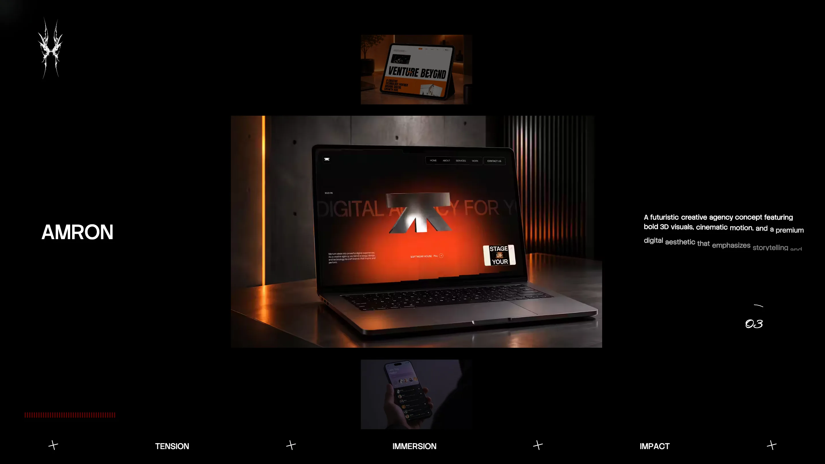
The case studies are laid out as objects floating in black. Project name in white grotesk on the left, a description on the right that reveals word by word as the section scrolls in, a script numeral in the corner for the index. AMRON gets a laptop on a concrete set under orange light. Because the page holds to black, red and white, every piece of client work brings the only other colour on screen, and it does it inside its own frame.
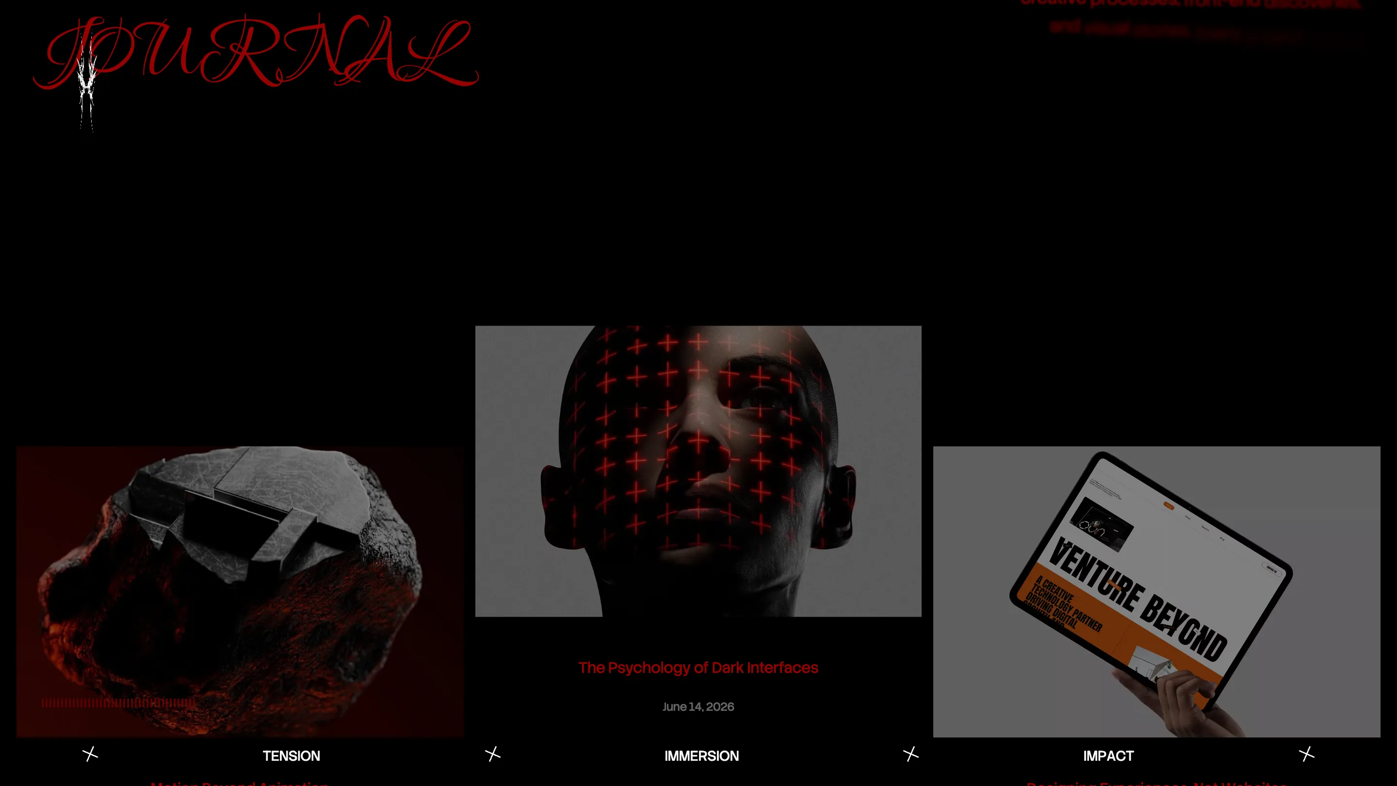
The journal index uses the script face again for its title and then drops to plain grotesk for the article names. Three thumbnails, one date each, nothing else. After twenty screens of art direction, the restraint at the bottom of the page is what makes the top of it look controlled rather than loud.
What the jury actually rated
The sub-scores are worth reading. Creativity came in at 7.75 and animations and transitions at 8.00, the two highest numbers on the card. Usability got 6.94 and accessibility 6.60, the two lowest. That's a fair description of the site. The judges paid for the art direction and the motion, and took points back where the art direction makes the thing harder to use. A headline cropped past both edges of the screen, white text on saturated red, a nav that competes with a photograph: each of those is a real decision with a real cost.
If you're going to borrow one move from Meer Mohsin, borrow the mark. Drawing a single graphic and then trusting it at three different scales is cheaper than a full identity system and it carries further than a logo in a corner.