Unfound Studio built The Salad Project a digital flagship
Unfound Studio rebuilt The Salad Project's site as a digital flagship, structured around how its London and Paris salad bars actually get used.
A 15-shop salad chain now treats its website like its busiest store.
The Salad Project, the London salad bar run by Florian de Chezelles and James Dare, hired Unfound Studio to build a digital flagship. One site carries the brand and takes the order, and the whole thing is built around how people actually eat across a working day. Paris just went live too, which is why a small EN and FR toggle sits in the corner.
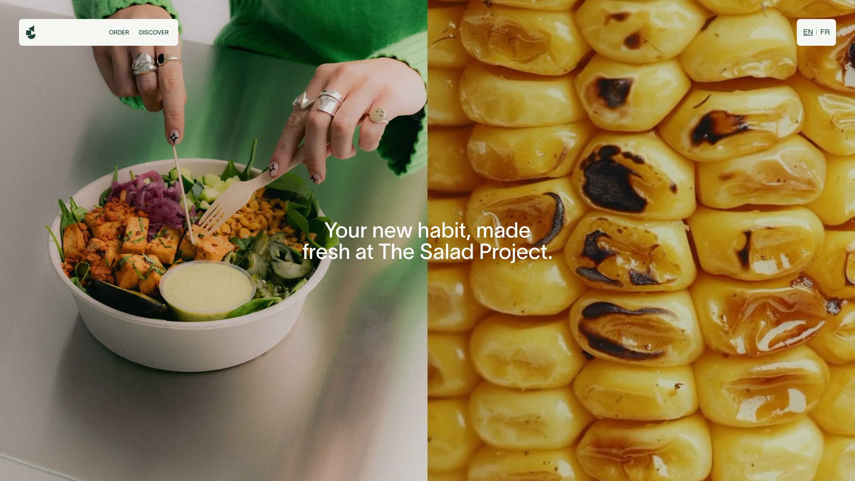
A nav stripped to two words
Look at the top bar and there's almost nothing there. ORDER and DISCOVER. That's the menu. Most restaurant sites bury you in tabs for food, locations, about, catering, careers. Unfound cut the choice down to the one thing a hungry customer wants and the one thing a curious one wants. Everything else lives a scroll away.
The home screen splits in half: a hand lifting a forkful from a loaded bowl on the left, a macro shot of charred corn on the right, the line "Your new habit, made fresh at The Salad Project" set across the seam. It reads more like a fashion lookbook than a lunch order.
Photography shot at the counter
The pictures are the product here, and Unfound shot them on the actual store counters rather than in a studio. You see the wooden fork, the branded can, the keys and carabiner sitting next to a takeaway box on someone's desk. It places the food in a real day instead of on a blank white backdrop.
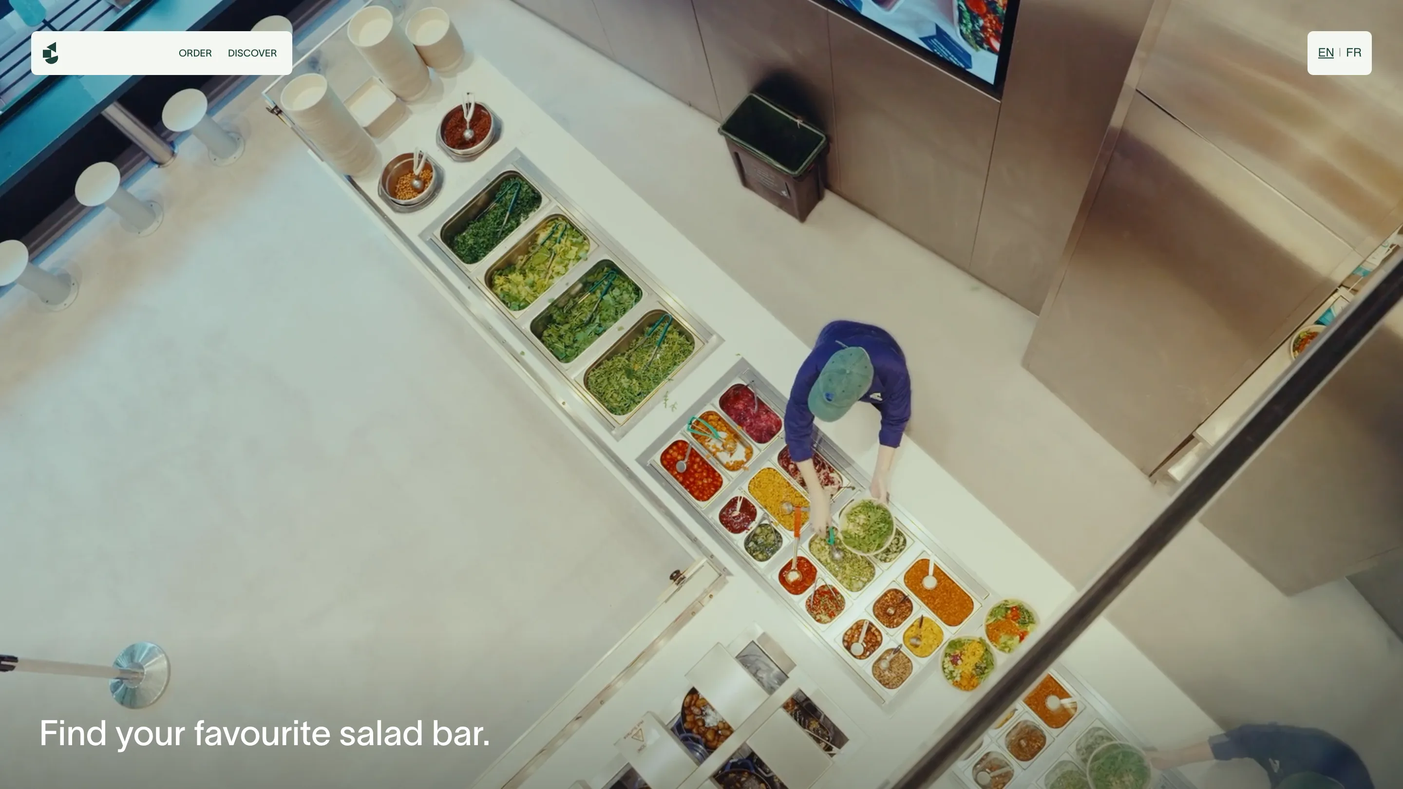
The locations page keeps the same eye. An overhead frame looks straight down at the prep line, tubs of kale and tomatoes and grains in a row, a worker building a bowl. "Find your favourite salad bar" sits in the corner. A store finder usually looks like a map widget and a column of postcodes. This one looks like the inside of the shop.
Built around who's ordering
Unfound based the structure on three customer types the brand kept seeing: the wellness crowd, the gym regulars, the office lunch run. Each one eats at a different time and for a different reason, so the site shows the food in those settings instead of as a flat grid of dishes.
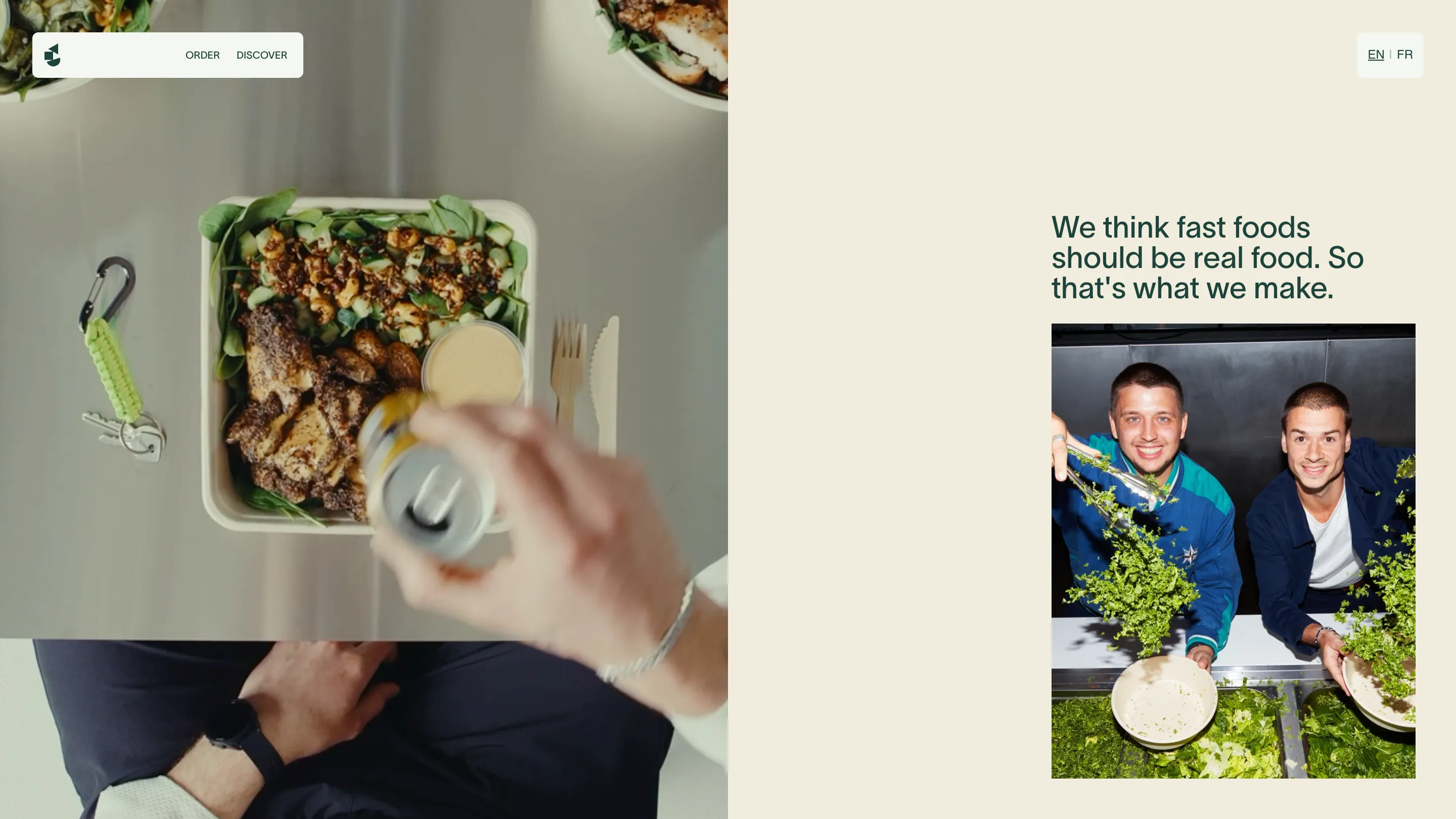
The about page states the idea plainly: "We think fast foods should be real food. So that's what we make." Next to it, de Chezelles and Dare stand at a counter holding fistfuls of leaves. No mission-statement paragraph, no company timeline. A sentence and a photo.
Ordering is the flagship
Behind the calm surface, the site has to feed a lot of mouths. It pushes into the SPAPP+ loyalty app, in-store kiosk pickup, Deliveroo, catering, and a merch shop, and it holds together across all of them.
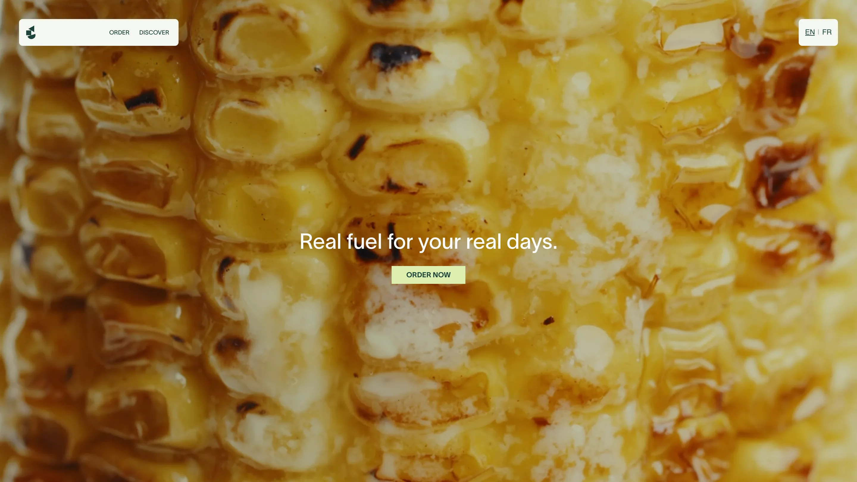
That's the part worth stealing. A salad bar decided its ordering flow deserved the same care as a physical shopfit, so it hired a brand studio to make the buying feel considered. Courtenay Lewis, the company's head of brand, said the work "exceeded what we asked for."
For anyone designing a product that sells something, that's the shift. The order screen is the flagship now. Treat it like one.