McLaren's new logo comes from a 1920s garage sign
McLaren put its car and racing businesses under one wordmark, set in McLaren Sans and drawn from the sign on Bruce McLaren's parents' garage in Auckland.
Industry · The Editors · 4 min read ·
Featured: McLaren
McLaren has a new logo, and it started on a petrol station in New Zealand. On 22 September 2026 McLaren put McLaren Automotive and McLaren Racing under one wordmark for the first time. The letters come from the sign above the service station Les and Ruth McLaren ran in Remuera, Auckland, in the 1920s. Their son Bruce rebuilt a 1929 Austin Seven in that garage before his first race win, on Muriwai Beach.
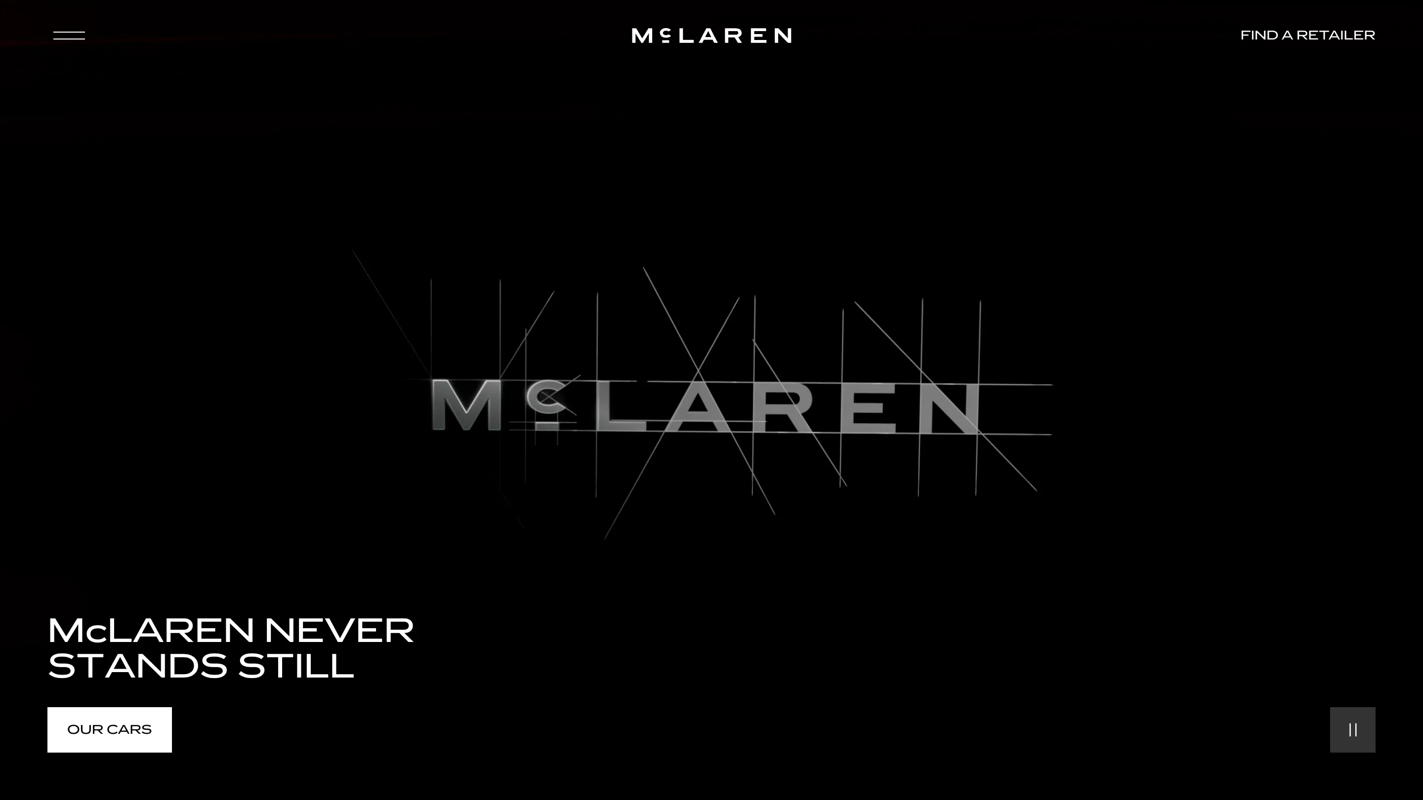
The wordmark is set in a custom typeface, McLaren Sans. It's all capitals, wide and evenly spaced, with a small raised c that sits on a short underline. The raised, underlined c is lifted straight off the old sign.
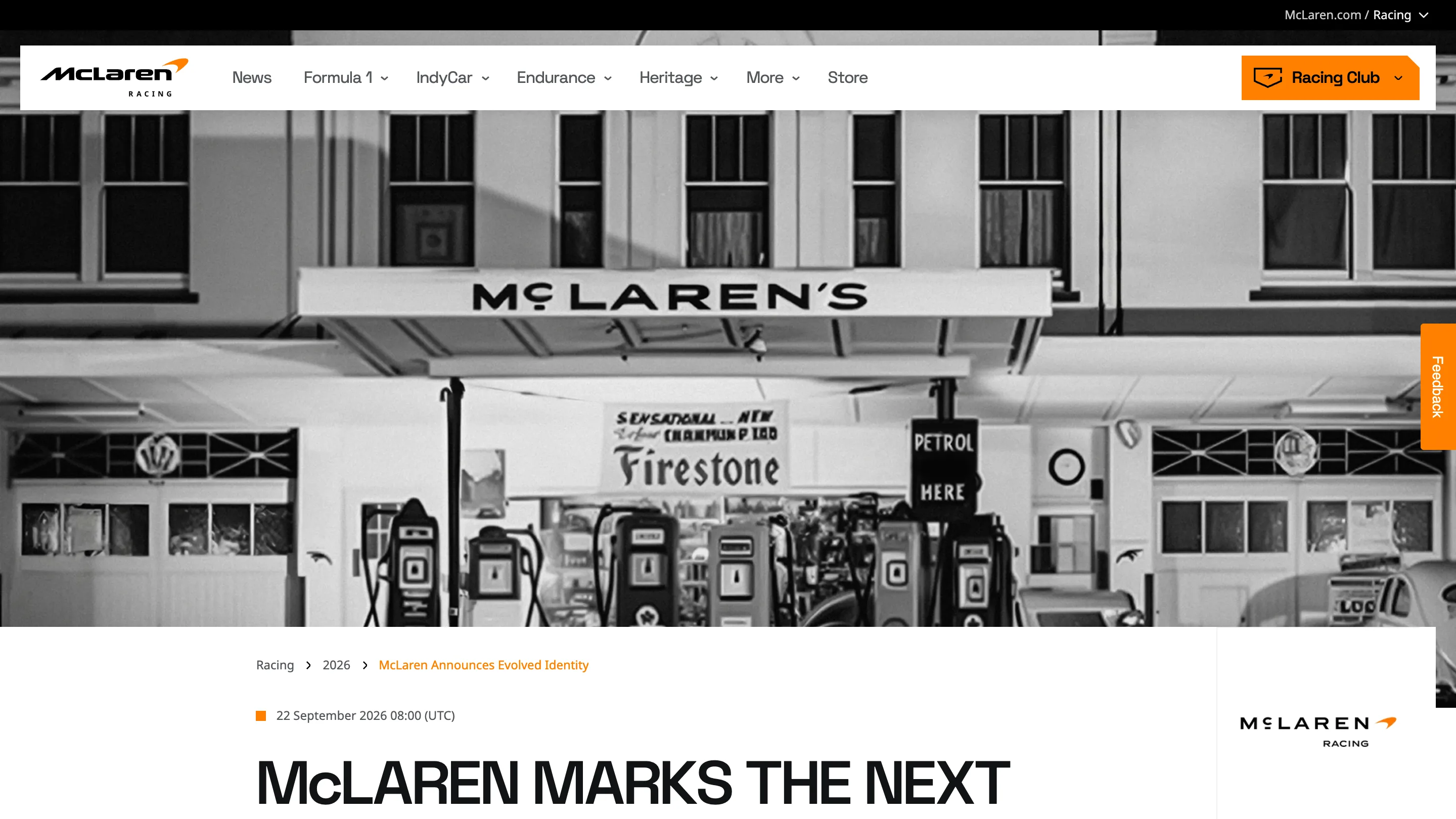
What changed in the McLaren rebrand
The outgoing logo was a mixed-case, slanted wordmark built to look fast. The new one stands upright and lets the letter spacing do the work. The Speedmark, the orange swoosh, stays. So do Papaya orange and the Speedy Kiwi emblem the racing team carries.
The palette grew to seven colours: Papaya, Ember, Midnight, Black, Anthracite, Colnbrook and Mist. McLaren says it pulled them from a photograph of Bruce McLaren. Colnbrook, a silver, is named after the company's first base in England. That's a nice move for anyone who has had to name a token set. Every colour gets a story a marketer can repeat, and the names stay unambiguous in code.
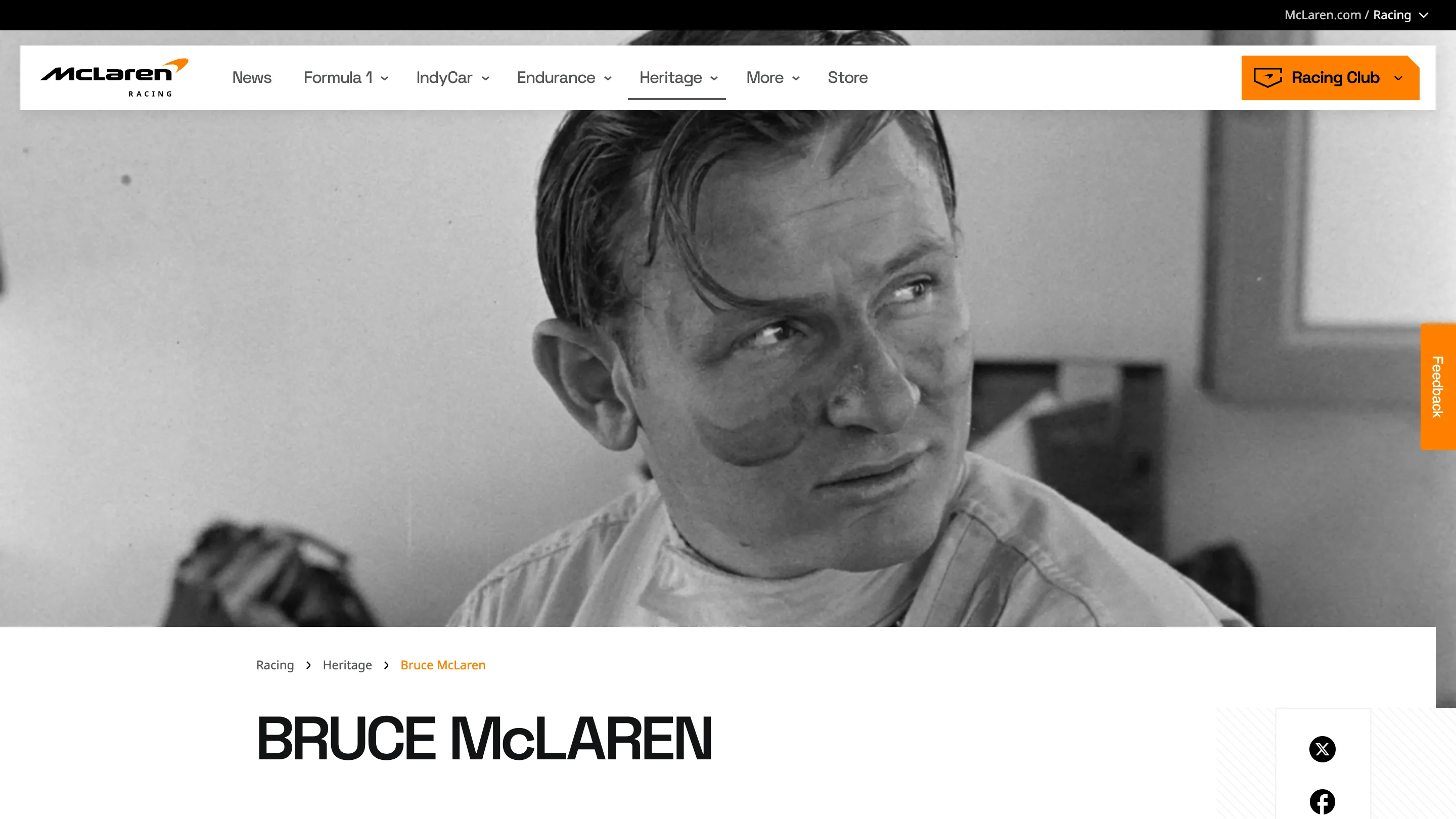
No outside agency is named. McLaren credits the work to its own racing and automotive teams, with David Woodhouse, chief creative officer at McLaren Automotive, and Lou McEwen, chief marketing officer at McLaren Racing, fronting the launch.
One wordmark, two businesses, a staggered rollout
The interesting part for anyone who ships digital products is the rollout, because you can watch it happen on the web right now. The car site at cars.mclaren.com already runs the new identity. Its homepage opens on the wordmark drawing itself out of construction lines, then settles into the uppercase type across the navigation and the calls to action.
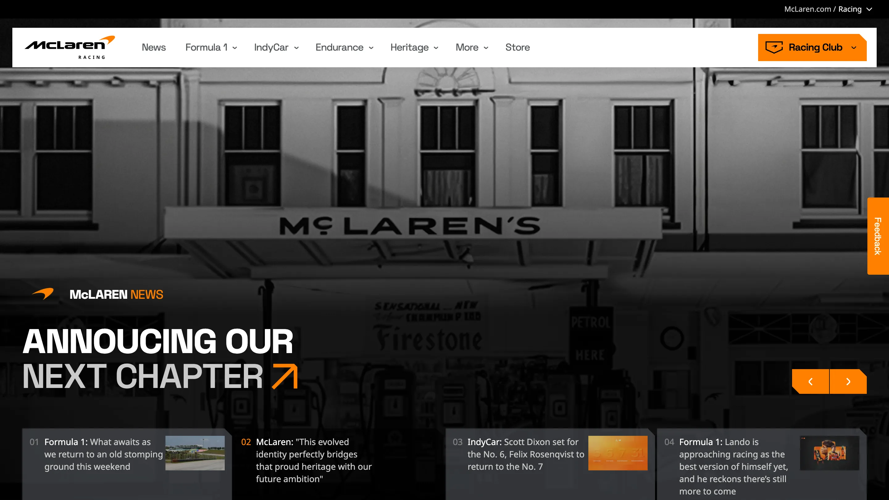
The racing site is halfway there. As of 1 October its header still carries the old slanted logo, while the announcement article and the homepage hero use the new wordmark and the garage photo. Two marks on one screen. Any team that has migrated a design system page by page will recognise the state.
The physical side moved first. The McL 6GT showed McLaren Sans at Monterey Car Week in August, weeks before the announcement, and the F1, IndyCar and WEC team kits are next. The W1 hypercar may be the last model to wear the old logo.
Why it matters if you design digital products
Two businesses with two audiences now share one type system. A Formula 1 fan on the racing app and a buyer configuring a car will meet the same letters, the same seven colours and the same rules. That's a big consolidation, and it lands on the digital teams first, because a website can change overnight and a car can't.
The reaction has been mixed, and the complaints are specific. Some fans say the wide capitals read like a fashion label and lose the speed of the old mark. Others point at legibility at small sizes, where a tracked-out uppercase wordmark gets thin fast. That second point is a real test for the product teams. Favicons, app icons and the corner of a live timing screen are where this logo will be seen most, and none of them are as big as a garage sign.
The story behind the letters is strong. A named place, a named family, a car rebuilt by a teenager. It gives every future design decision something to point back to. Whether McLaren Sans holds up at 16 pixels is the part to watch over the next season.