Zirka's interceptor site is built as a targeting HUD
Qream draws Zirka's drone site as the crew's own display: two typefaces, one orange, and a radar reticle you scroll through spec by spec.
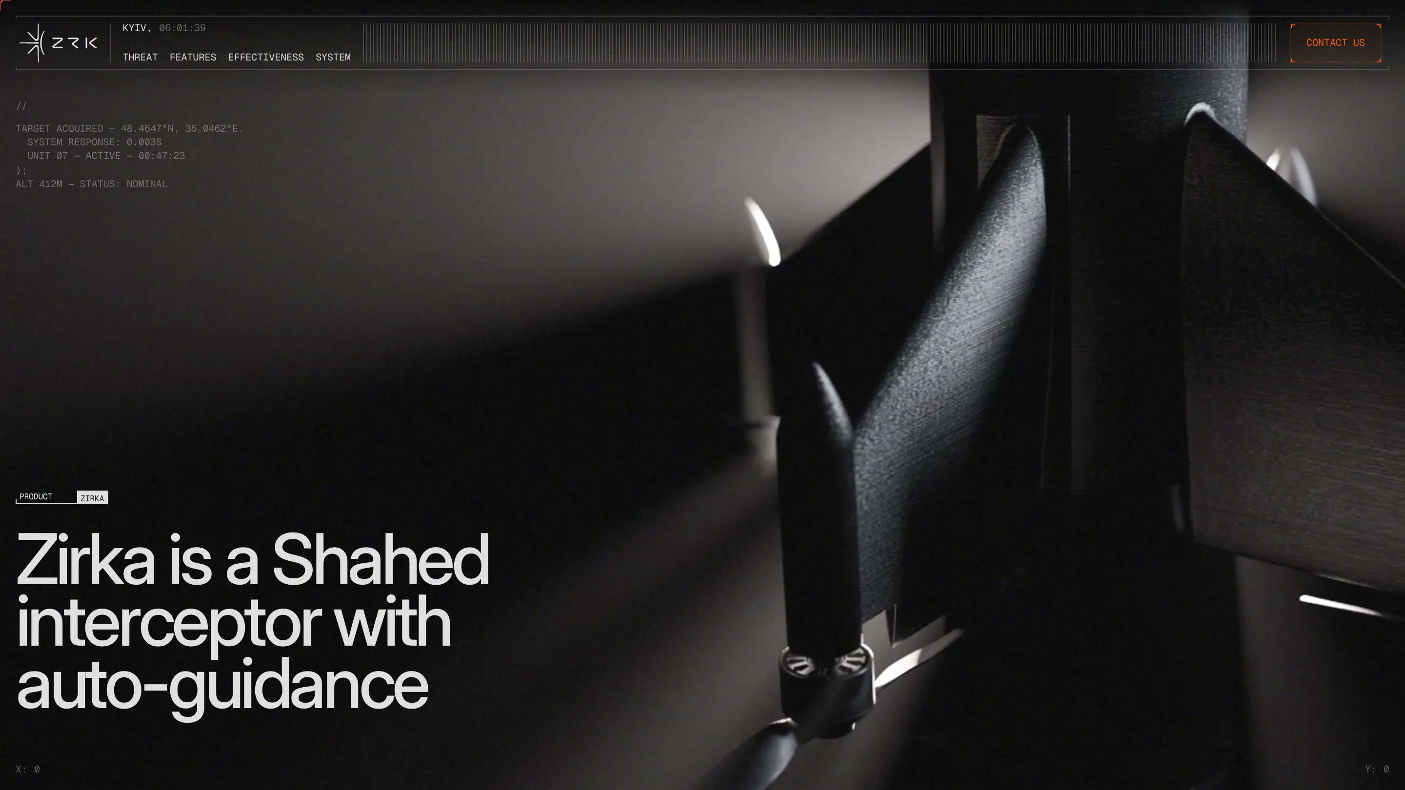
Zirka's website is built as a targeting HUD. Every screen reads like the display an interceptor crew would watch: a live Kyiv clock in the header, cursor coordinates in two corners, status lines set in mono and closed with a code brace. Qream built it for Zirka, a Ukrainian drone that hunts Shahed attack drones, and it took awwwards Site of the Day on 9 November 2026 with a 7.6, its best marks in creativity (7.81) and design (7.73).
The HUD idea could have been a costume. It works because Qream keeps it to two typefaces, one colour and one rule about what each is for.
Two typefaces with two jobs
Inter Display Medium carries the claims. The hero says "Zirka is a Shahed interceptor with auto-guidance" in big, tight, white grotesk over a black and white render of the airframe, lit from one side so most of it sits in shadow.
Geist Mono carries the machine. "TARGET ACQUIRED", a pair of coordinates and "SYSTEM RESPONSE: 0.003S" sit top left in small grey caps, opened with // and closed with };, as if someone pasted a log into the page. The same pattern captions every photograph further down. So the split stays readable all the way through: grotesk is what Zirka says about itself, mono is what the instruments report.
The targeting HUD as navigation
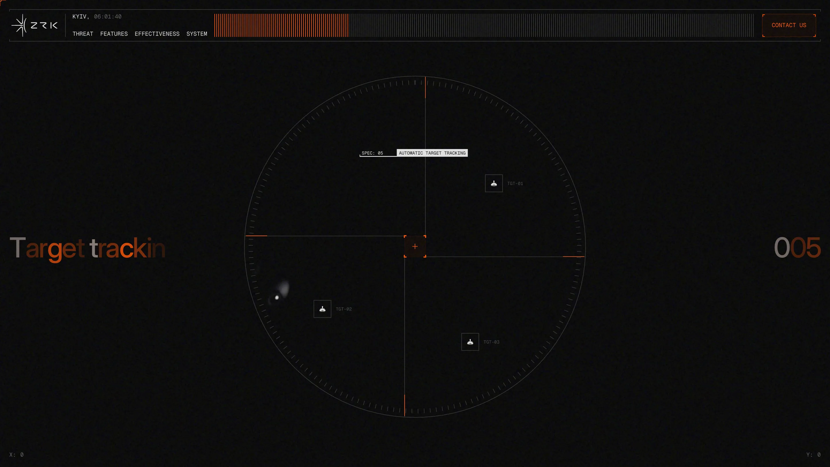
The spec section is the clearest moment. A thin radar reticle fills the screen, three targets marked TGT-01 to TGT-03, an orange crosshair at the centre. Each spec gets its own screen and a counter on the right, 001 to 005, while the name on the left arrives letter by letter in orange before settling to grey. You scroll through the drone's numbers the way an operator steps through contacts.
The header does the same job for the whole page. Its middle is a strip of grey hairlines, and as you scroll they turn orange from the left. It's a progress bar drawn as a signal meter, and it means the HUD never leaves the screen.
One orange, spent on the answer
The palette is near-black (#050505), off-white and a single orange, #FC4F00. Qream spends the orange carefully. In the threat section it tints archive photographs of strikes on Kyiv, so the evidence and the brand share a colour without the photos needing a caption to say why.
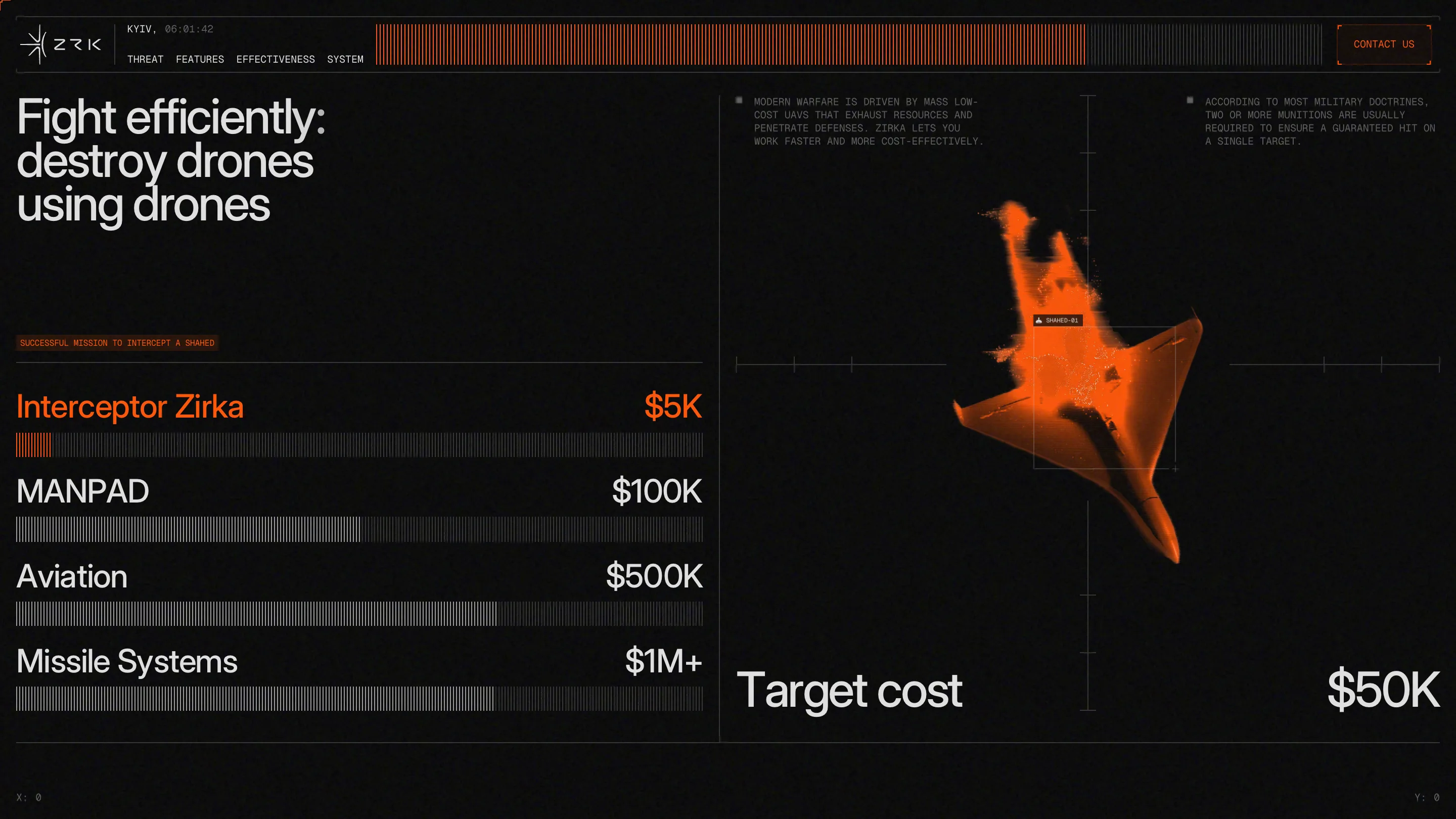
The cost table is where it pays off. "Fight efficiently: destroy drones using drones" heads a list of four ways to stop one Shahed: Zirka at $5K, a MANPAD at $100K, aviation at $500K, missile systems at $1M+. Each row has a bar made of the same hairlines as the header. Only Zirka's row is orange, and its bar is the shortest by far. Opposite, the target itself is rendered in orange with a $50K price under it. You don't need to read the numbers to get the argument. The colour already put Zirka and the threat on the same side of the scale.
A small detail worth copying: the page lists $2.5K per unit elsewhere and $5K per successful mission here, and a mono note explains why, since doctrine usually fires two munitions per target. The copy shows its working.
What the judges marked down
Usability came in lowest at 7.3, and you can feel where. The mono status text is small and grey on black, and the one-spec-per-screen pacing asks for a lot of scrolling before you reach the cost argument, which is the strongest part of the site. Someone scanning for the price has to sit through the radar first.
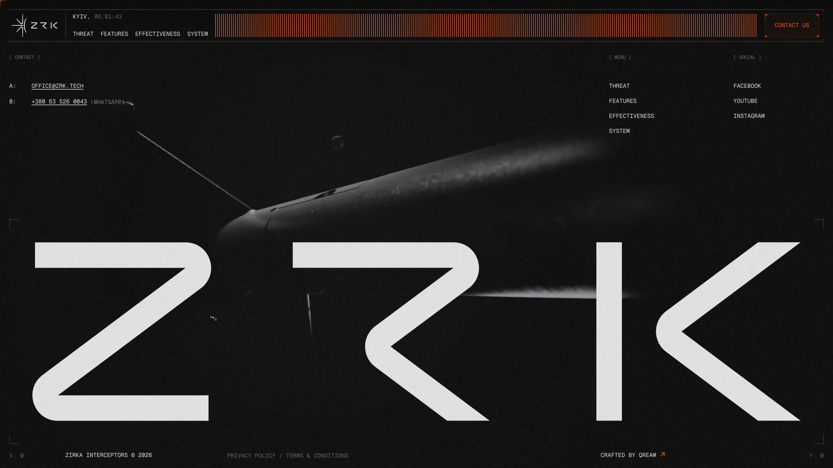
The footer closes on the brand. ZRK runs the full width in a rounded geometric wordmark over a dark render of the drone, with contact, menu and social set in bracketed mono labels, [ contact ], [ menu ], [ social ]. The site was built in Webflow with Blender and After Effects for the renders, and the whole thing holds to the rule set in its first screen. If you're designing for hardware that people judge by its readouts, this is a good model: pick the instrument your buyer trusts and let the interface be that instrument.