Extrafazant's headlines turn serif on the word for motion
Tilburg studio Extrafazant sets its headlines in a heavy grotesk and switches to a light serif on the word that means movement. That switch is the brand.
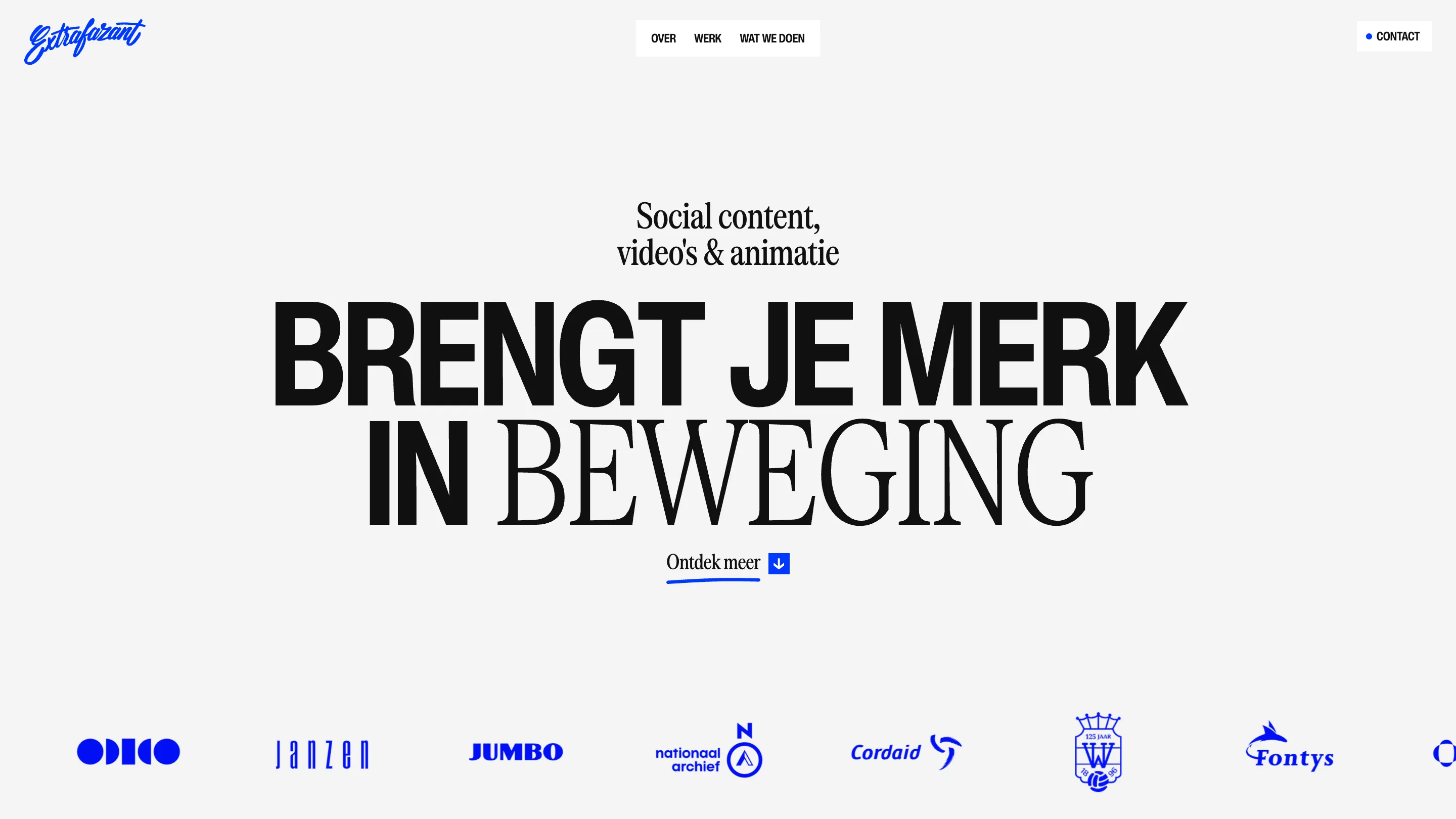
Extrafazant's headline typography does one thing and does it on every page: a heavy condensed grotesk carries the plain words, then a light, wide serif takes over on the word that means movement. BRENGT JE MERK IN, in black slabs. Then BEWEGING, thin and tall. The site took awwwards Site of the Day on 8 November 2026 with a 7.24, and that switch is most of the reason.
Extrafazant is a video and animation studio in Tilburg, in the Netherlands. Designer Dylan Brouwer built the site in Webflow with GSAP, and the judges scored it almost flat across the board: 7.23 for design, 7.23 for usability, 7.28 for creativity, 7.22 for content. Creativity edged ahead, and the type explains why.
Headline typography that changes voice mid-line
The home hero reads "Brengt je merk in beweging", bring your brand into motion. Four words of it are set in the grotesk, tight and loud. The fifth, the one the whole studio sells, drops into a high-contrast serif at the same cap height. Same size, same line, a completely different temperature.
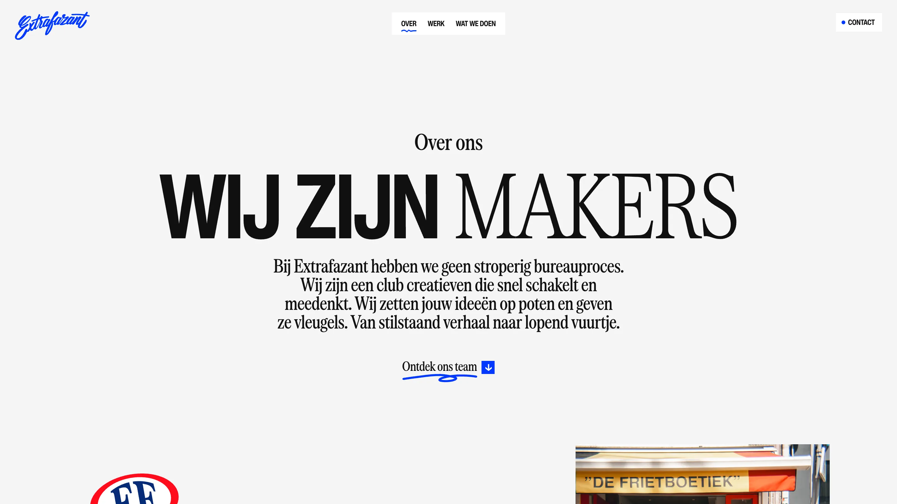
It works because it's a rule. The about page says WIJ ZIJN in the grotesk and MAKERS in the serif. The services page says ALLES in the grotesk and BEWEEGT, everything moves, in the serif. Three pages, three headlines, and the serif always lands on the word a designer would underline. You learn the system by the second page and start reading for the switch.
awwwards lists the loader and hero's variable font interaction among the site's highlights, which is the right instinct for a motion studio: the word about moving is also the word that gets to move. The small line above each headline, "Social content, video's & animatie", is set in the same serif, condensed, so the two faces feel like one family arguing with itself.
One blue, used like a pen
The palette is near-black on a pale grey, #101010 on #f4f4f4, with one electric blue. The blue does the jobs a hand would do. It's the script logo in the top left, it's the scribbled underline under "Ontdek meer", it's the small square arrow next to it, and it's every client logo in the strip under the hero: Jumbo, Odido, Cordaid, Fontys, Willem II, Nationaal Archief. Forcing every client mark into the studio's blue is a confident move. It turns a logo wall into one band of colour and makes the clients look like they already belong to the house style.
The nav is three words in a white box, OVER, WERK, WAT WE DOEN, and the current page gets a wavy blue underline. Small, drawn, consistent with the logo. Nothing else on the page competes with the headline.
Case studies split down the middle
The work pages drop the big headline voice for a split screen. On Odido, the left half is grey with the client name in the grotesk and a short paragraph about the job: Extrafazant worked with agency ACT on the launch of the Odido rebrand, alongside production houses BUCK and Code d'Azur. The right half is solid blue with the animation itself framed in the middle.
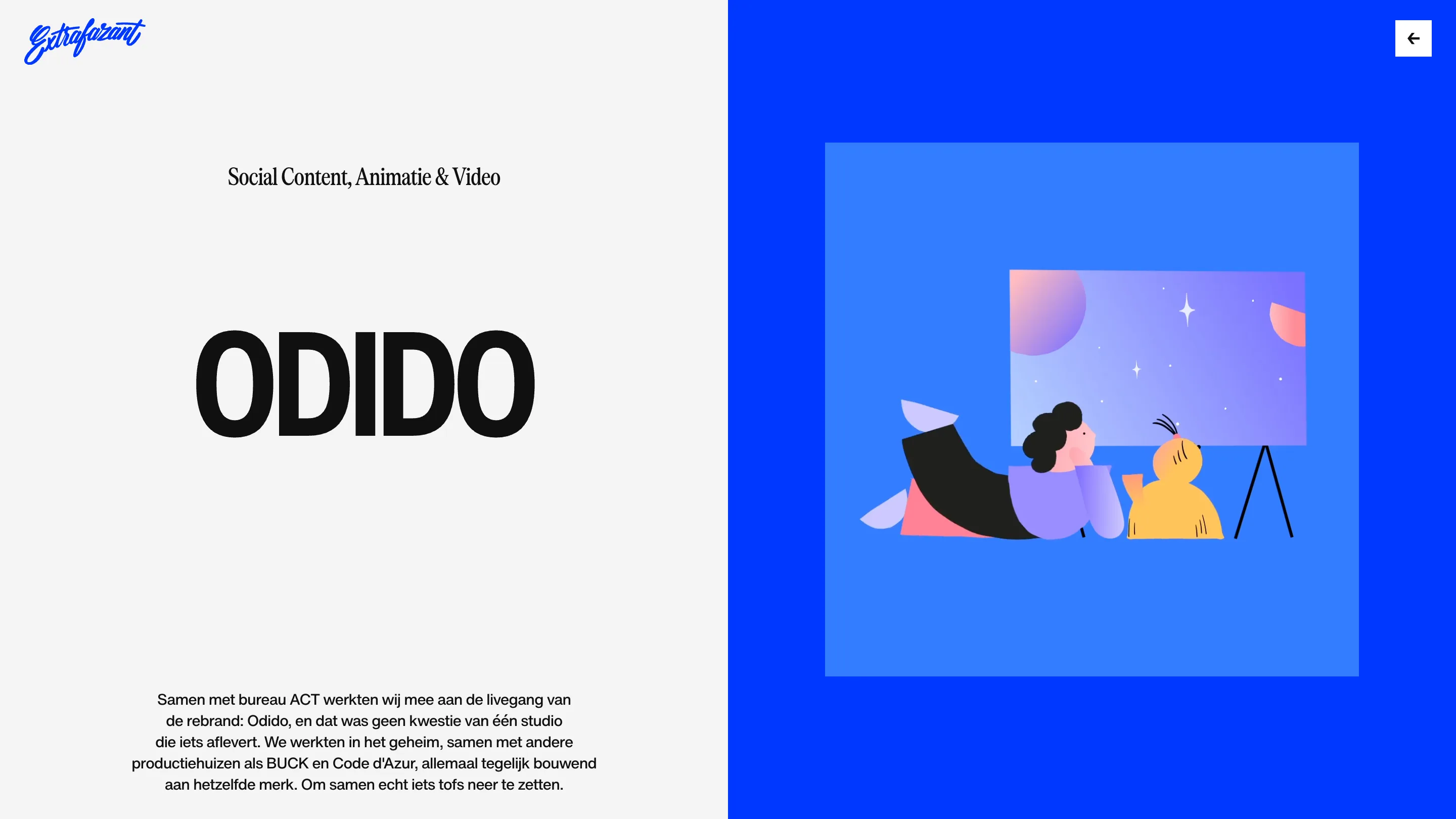
It's a plain layout, and it should be. A studio that makes moving pictures needs a page that holds still around them.
The services page lets the mess in
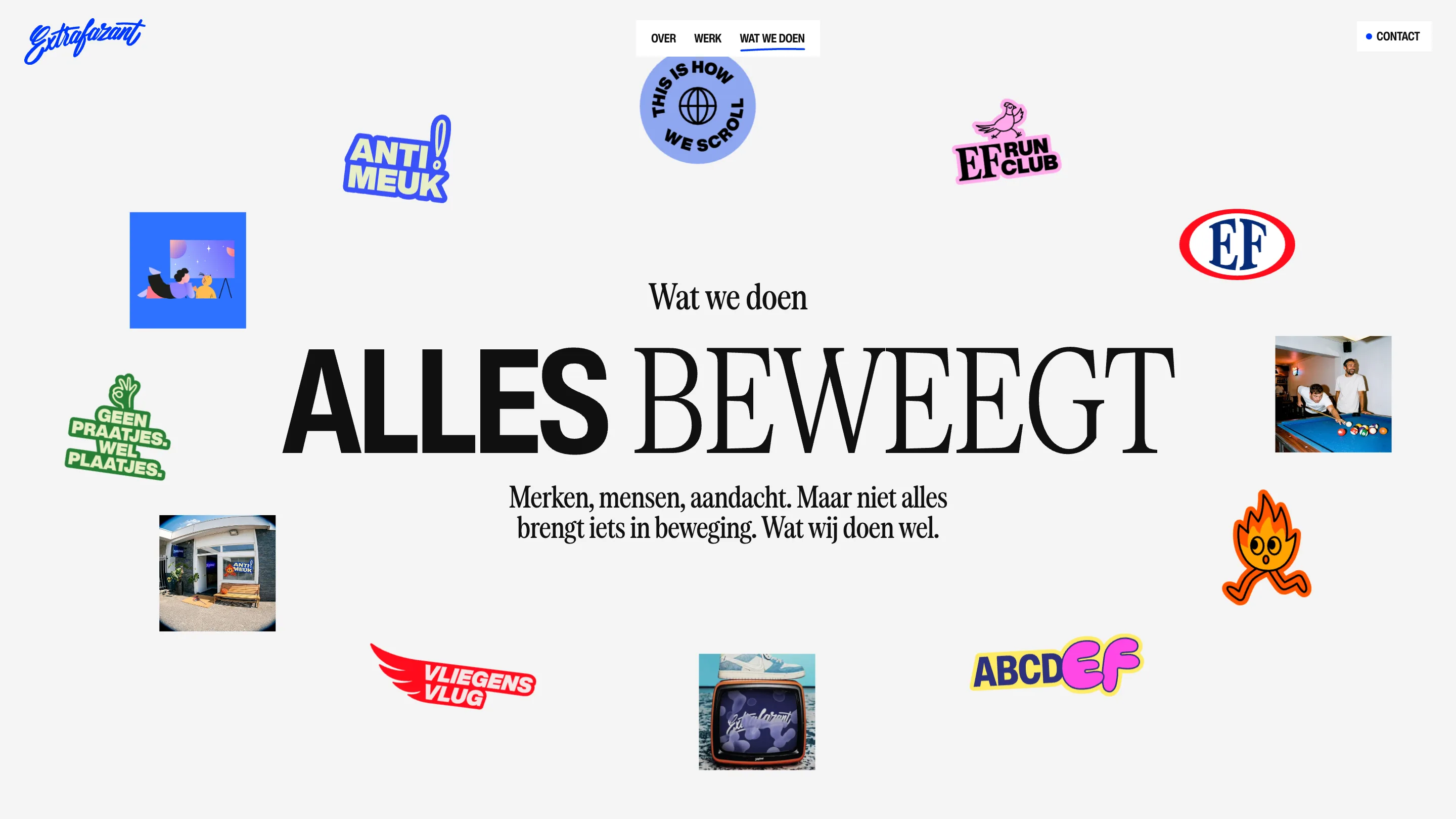
Wat we doen is where the restraint breaks on purpose. ALLES BEWEEGT sits in the centre, and around it floats the studio's own clutter: stickers reading ANTI MEUK and GEEN PRAATJES, WEL PLAATJES, an EF Run Club badge, a cartoon flame running off the page, photos of the team at a pool table and of the studio's front door. awwwards singles out the services hero and its scroll as a highlight, and you can see why. After two pages of black and grey, the stickers read as personality, and the headline type keeps the whole thing from turning into a moodboard.
Why it won
Most of this site is grey, black and white space. What earns the award is one typographic rule applied without exception, a single colour that behaves like a marker, and the nerve to save the noise for one page. For a motion studio, putting the motion inside a single word of the headline is the whole pitch in five words.