Creative Reference Library crops oversized type at the edge
Creative Reference Library sets its own letters too big for the screen, and that crop turns a list of 20 references into a poster.
Creative Reference Library is a list of 20 things two designers keep going back to, and its whole site is built from oversized type cropped at the edge of the screen. The letters of its own name are too big to fit. That one decision gives a small, quiet catalogue the weight of a poster.
The site took awwwards Site of the Day on 10 November 2026 with 7.44, plus a 7.57 Developer Award. It's the work of Bimo Tri and Josh Bendall, built in Webflow with GSAP, and it holds books, albums, interviews and films: Rick Rubin's The Creative Act, Aphex Twin's Selected Ambient Works 85-92, Nujabes' Modal Soul, David Lynch's The Art Life.
A loader that is the logo
The first thing you see is the mark itself. C, R and L sit pushed to the far edges of a warm grey screen, three letters for a whole viewport, and they fill from the bottom up in black as the page loads. The progress bar and the wordmark are the same object.
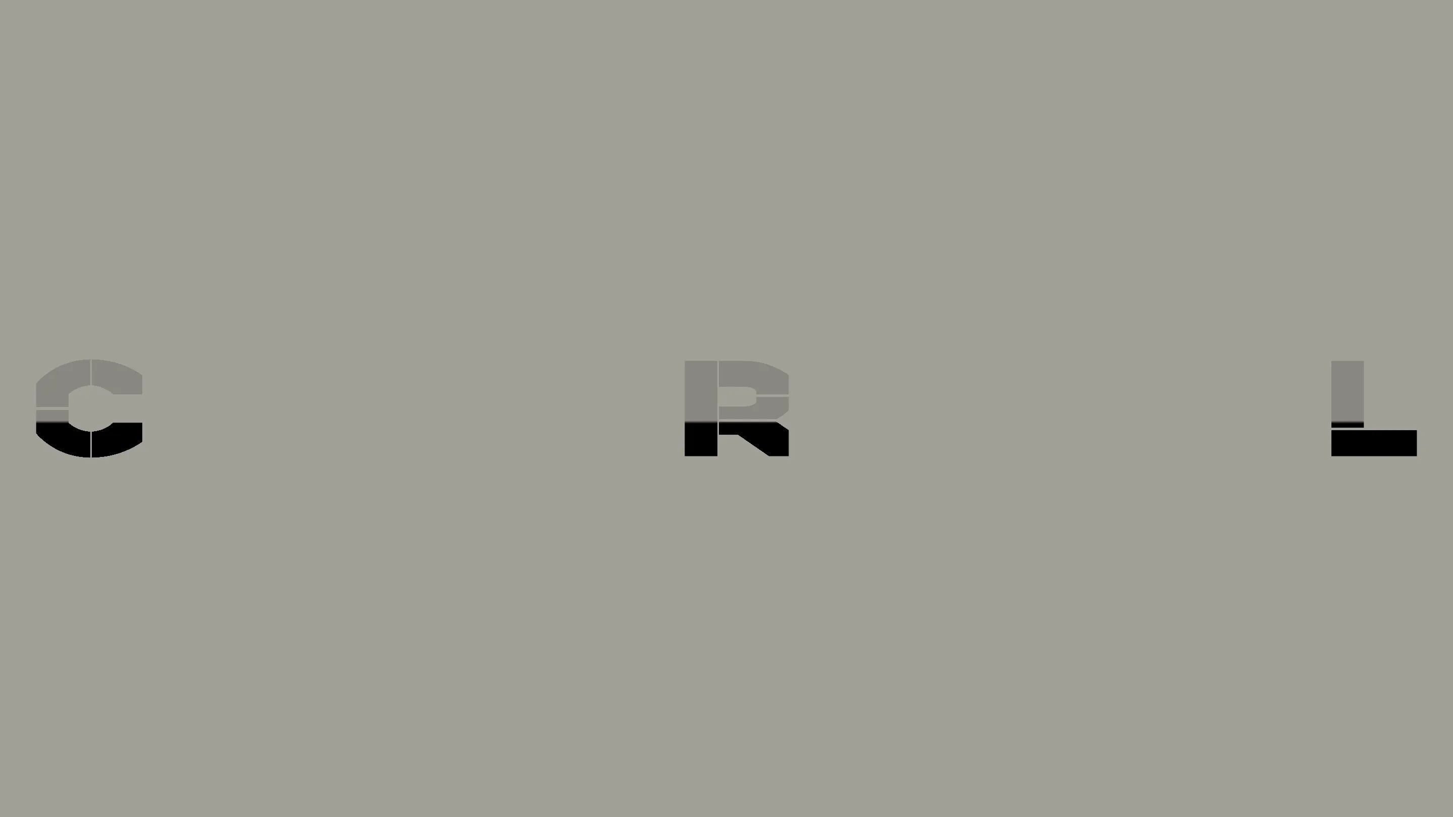
The letters are cut. The C has a vertical slit through it, the R a gap across its bowl, like stencils. That cut carries through every page, which is why the brand reads from a single glyph.
Oversized type as the background
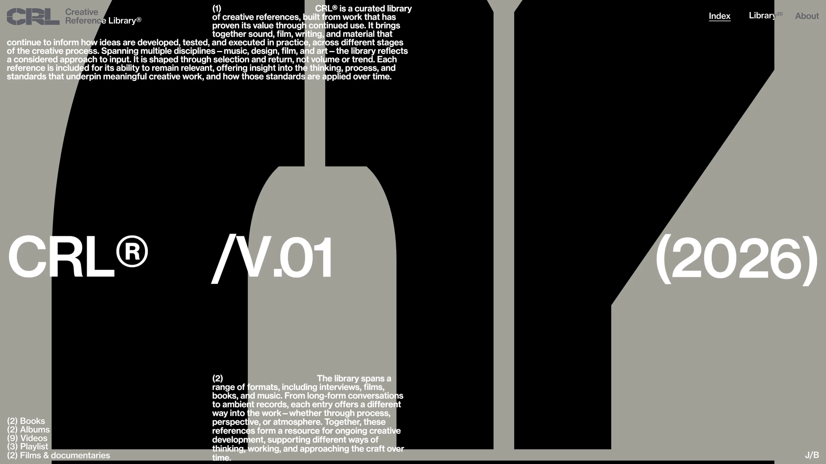
Once the page opens, those letters come back at a scale that can't fit. A black glyph fills the home page and runs off the top and the bottom, so you read it as a shape before you read it as a letter. Over it, in white, sits the masthead: CRL®, /V.01 and (2026), set large and spread across the full width, one at each edge.
The body copy sits on top of all of it, small and dense, in Neue Haas Grotesk. Two paragraphs, numbered (1) and (2) in brackets, wrap around a hard indent so the first line starts halfway across. It's a print habit, and it lets the oversized type do the shouting while the reading text stays at reading size.
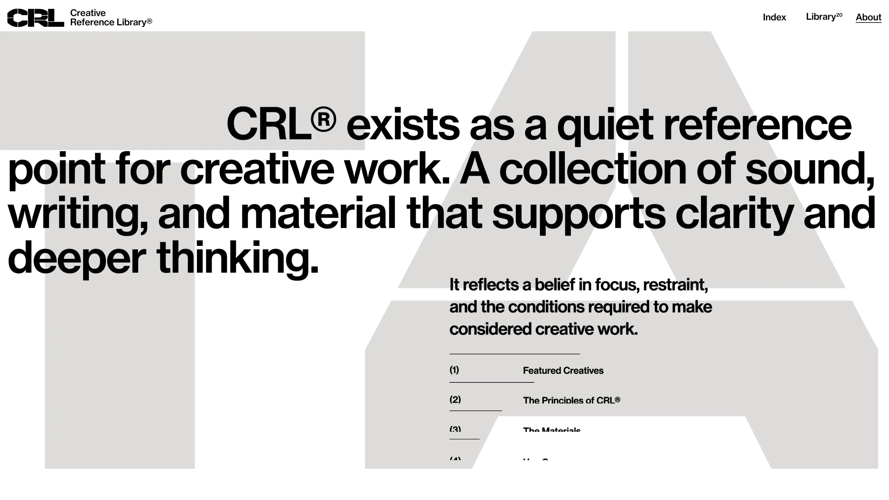
The About page plays the same move in light grey on white. A giant cropped letter sits behind a statement set at headline size, so the type you read and the type you look at overlap on two layers.
Twenty things, laid out as prints
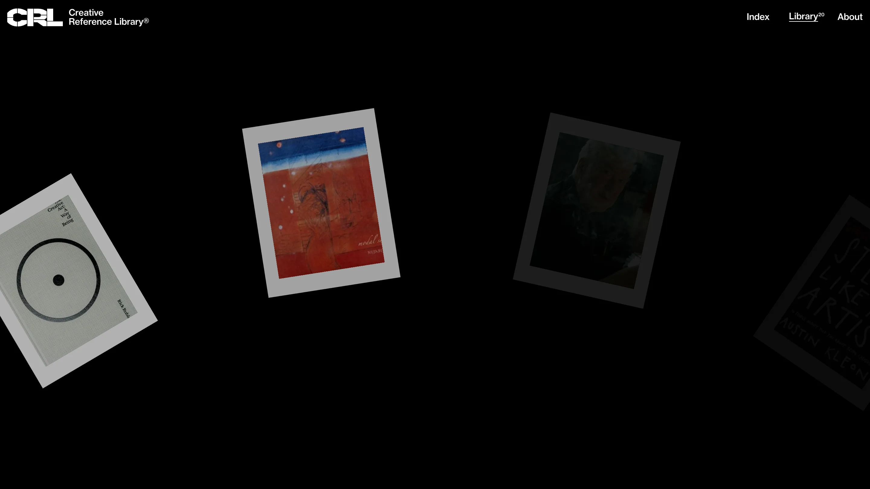
The library is where the site changes register. It goes black, and the references hang on a wheel as tilted prints with white borders, the way you'd pin record sleeves to a wall. The one in front is lit. The others fade back into the dark as they turn away from you.
A toggle switches the wheel to a list, and the list is where the detail lives. Every entry is measured in its own unit: 1hr 10m for Virgil Abloh's Insert Complicated Title Here, 43m for Zane Lowe's visit to Brian Eno's studio, 432p for Rubin's book. The call to action changes with the format too. You watch a talk, listen to an album, view a book.
Why it won
The numbers in brackets do a lot of work here. Library has a superscript 20 in the nav. The home page counts the shelves: (2) books, (2) albums, (9) videos. It's how an archive labels itself, and it suits a site whose About page says it's "shaped through selection and return, not volume or trend."
The restraint is real. One typeface, a grey, a black and a white, and no colour except what the covers bring in. All the drama comes from scale and crop. A designer could take that straight into a portfolio or a small editorial project: pick one letterform worth looking at, make it bigger than the screen, and let everything else stay small.