Realevate keeps one layout and changes only the colour
Awwwards Site of the Day on 27 September. The design idea is one hero frame repeated across four property collections, recoloured every time.
Awards · The Editors · 4 min read ·
Featured: MAKETHECUT®
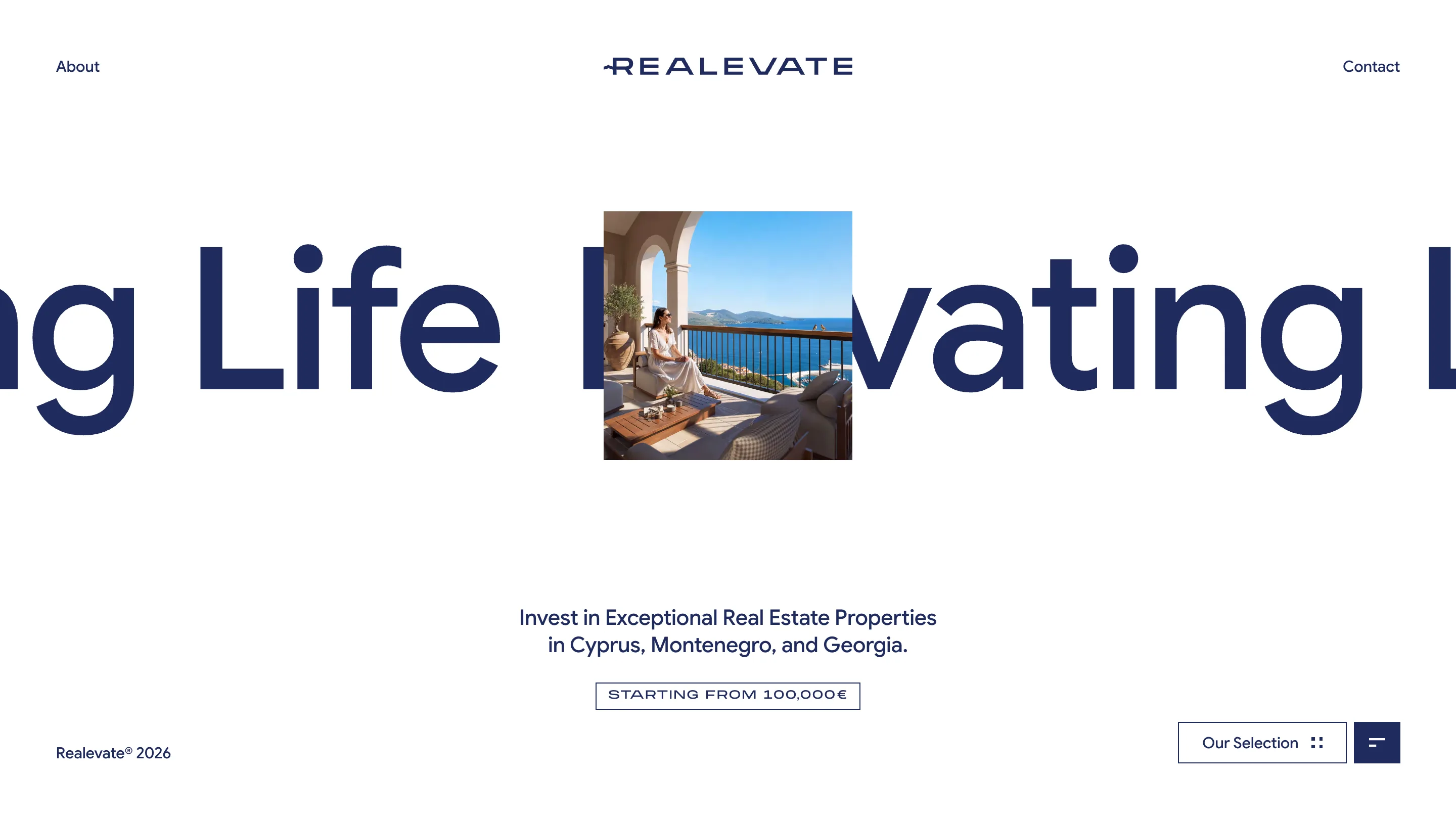
Realevate's site is one screen, built five times. A single word running past both edges of the viewport. A small square photograph punched into the middle of it. Two lines of subtitle underneath, then a bordered chip with a price. That screen is the home page, and it is also every section of the site. The only thing that changes between them is the colour.
It took awwwards Site of the Day on 27 September 2026 with 7.22, and a Developer Award at 7.27. The site sells investment property in Cyprus, Montenegro and Georgia for a marketing agency of the same name, designed by Or Halevi with MAKETHECUT®.
The colour does the sorting
Open the stylesheet and the whole system sits in :root as four pairs of tokens. By The Sea is #222A4C, a navy. Evergreen is #36614D, a forest green. Urban Living is #2D1C2D, a plum so dark it reads brown. Rare Gems is #1C181D, near black. Each one has a muted partner for secondary text, and each page flips the type to white and floods the background with its category colour. The home page is the inverse: navy #1F2B5E set on white.
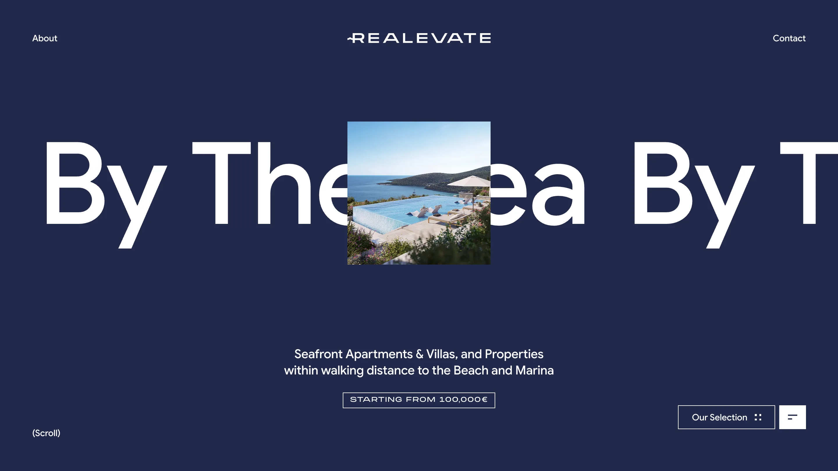
This solves a real problem with property catalogues. Four collections of apartments with a view are hard to tell apart in words, and the photography looks similar across all of them: blue water, warm stone, good weather. A filter chip would make you read. The colour tells you where you are before you have parsed a single line, and it holds for the whole scroll rather than for the length of one label.
The window cut into the word
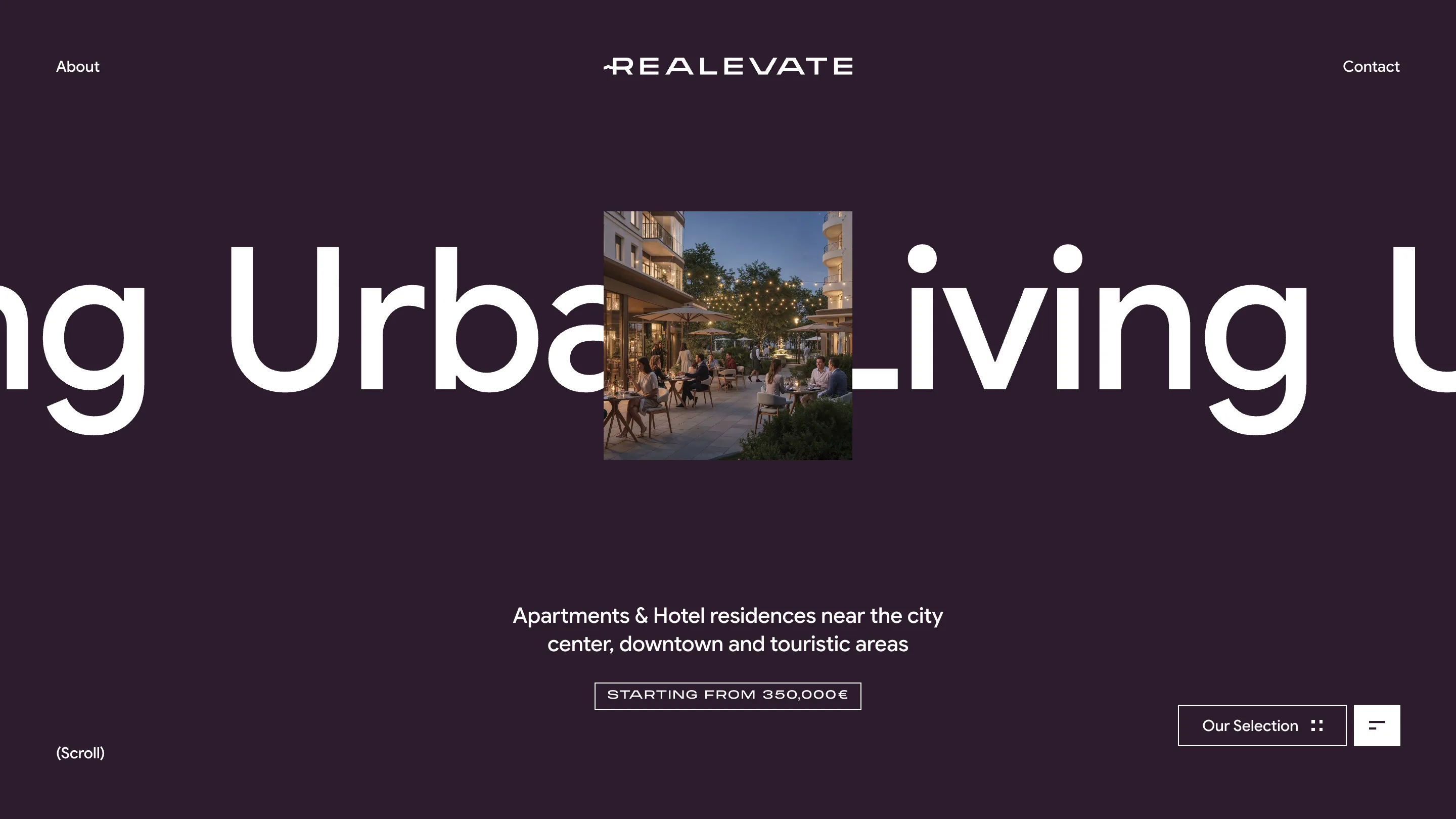
The square image is in the dead centre of the screen, the same size and the same position on every page, and the headline runs behind it as a marquee cropped at both edges. You never see the whole word. On the home page you catch ng Life Ele with vating L picking up on the other side.
That inversion is the site's best move. Type usually sits in front and images behind it. Here the word is the surface and the photograph is the hole in it, which makes a 200-pixel square feel like a viewfinder rather than a thumbnail. It also lets the layout survive a weak photo: the frame is so small that the picture only has to work at postage-stamp size.
Three typefaces, spent carefully
Google Sans carries the marquee and the body. Roslindale Display, a high-contrast serif, is held back for everything below the fold: the section headings, the pull quotes, the nav links, the contact headings. Monument Extended appears exactly once per page, letterspaced across the price chip that reads STARTING FROM 100,000€.
One face per job, and the rarest face reserved for the number that decides whether a visitor keeps reading. On Urban Living that chip says 350,000€ instead, which is the only piece of hierarchy in the hero doing commercial work.
Where the judges marked it down
Design scored 7.41 and content 7.34. Usability came in at 6.88 and accessibility at 6.60, the two lowest numbers on the card, and you can see why. A headline cropped at both edges never states the page title in full. The motion runs on a single easing curve, cubic-bezier(.7, .6, 0, 1), with an 0.8 second overlay, which is consistent but slow when you are clicking through four sections in a row. And the site asks you to rotate your phone rather than reflowing.
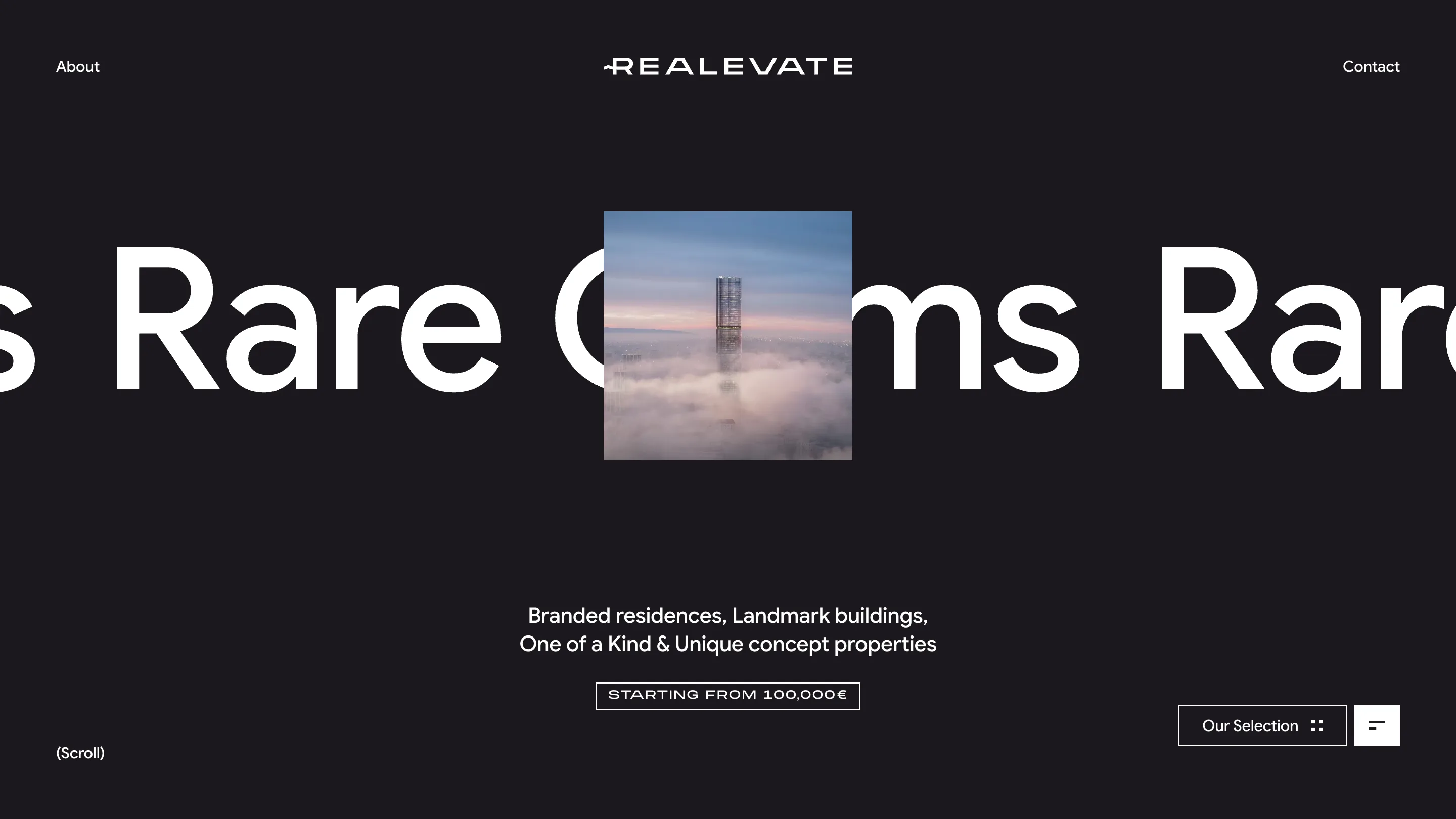
Still, the restraint is what earned it. Most agency sites in this category try to differentiate four collections with four different layouts and end up with four sites glued together. Realevate wrote one frame, defined the difference as four hex values in a token block, and let the palette carry the navigation. That is a design system decision more than a page design decision, and it is why the site reads as one thing.