Merci Michel makes you win the lookbook one point at a time
Merci Michel built the New Balance x Miu Miu launch as a game of Pong on a tennis court. Win a point and a campaign photo comes into focus.
Awards · The Editors · 4 min read ·
Featured: Merci Michel
Merci Michel turned the New Balance x Miu Miu launch into a game of Pong, then made you earn the campaign photos one point at a time. The collection is a tennis kit worn by Coco Gauff, and the site is a playable lookbook: a court, a ball, two paddles, a scoreboard. It took awwwards Site of the Day on 25 September 2026 with a 7.28, plus the Developer Award at 7.38, where the animation sub-score came in at 9.20, the highest number on the card.
It sounds like a gimmick until you see what the game is hiding.
The court lines are the layout grid
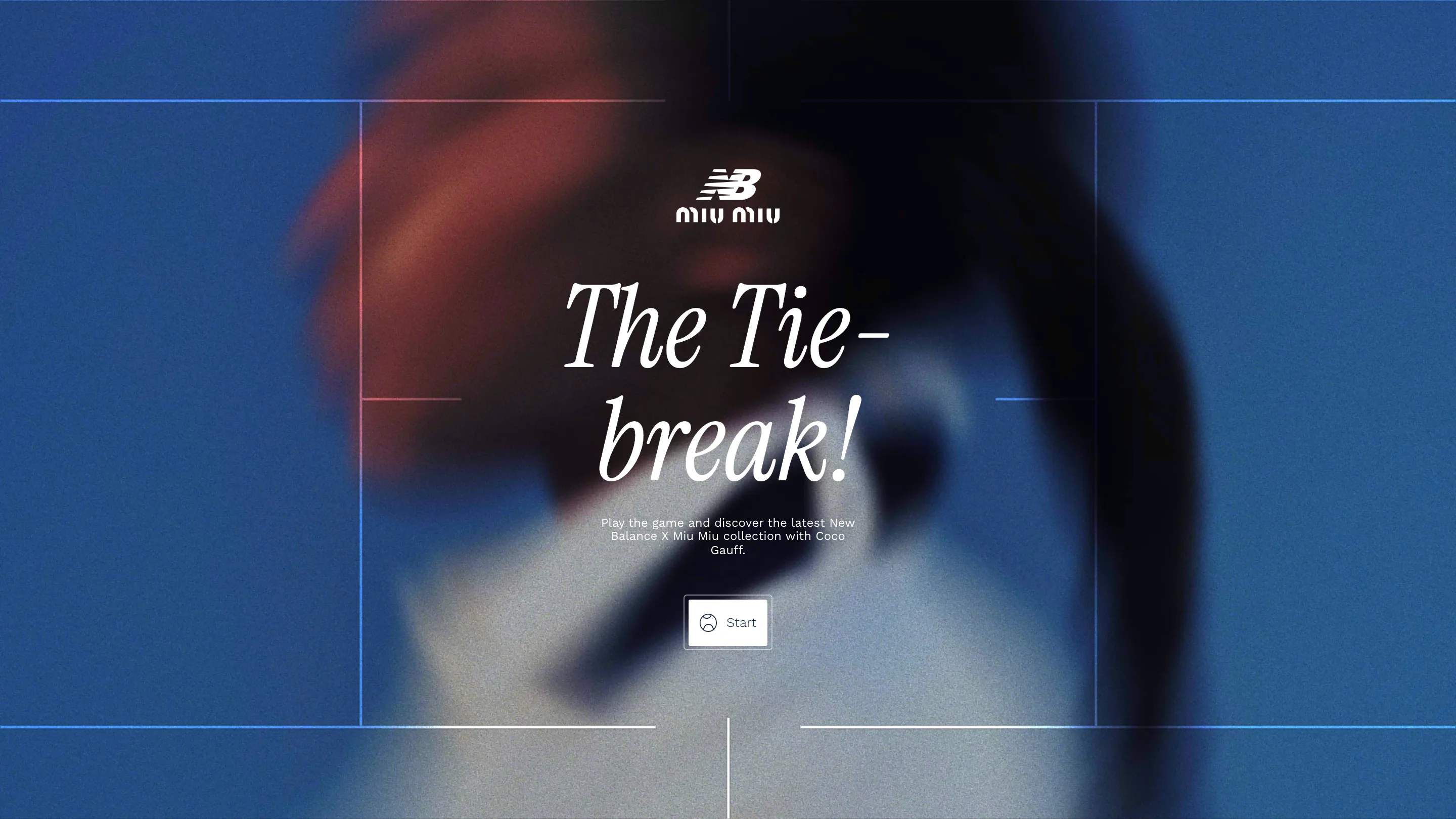
The opening screen is a hard-court blue plane with a tennis court drawn on it in white and pale blue hairlines. Those lines do two jobs. They read as the sport, and they hold the page: the title sits inside the service box, the New Balance and Miu Miu lockup sits above it on the centre line, the Start button lands on the T. Nothing floats. Every element is parked on a line the sport had already drawn, so the composition looks considered without a single decorative rule.
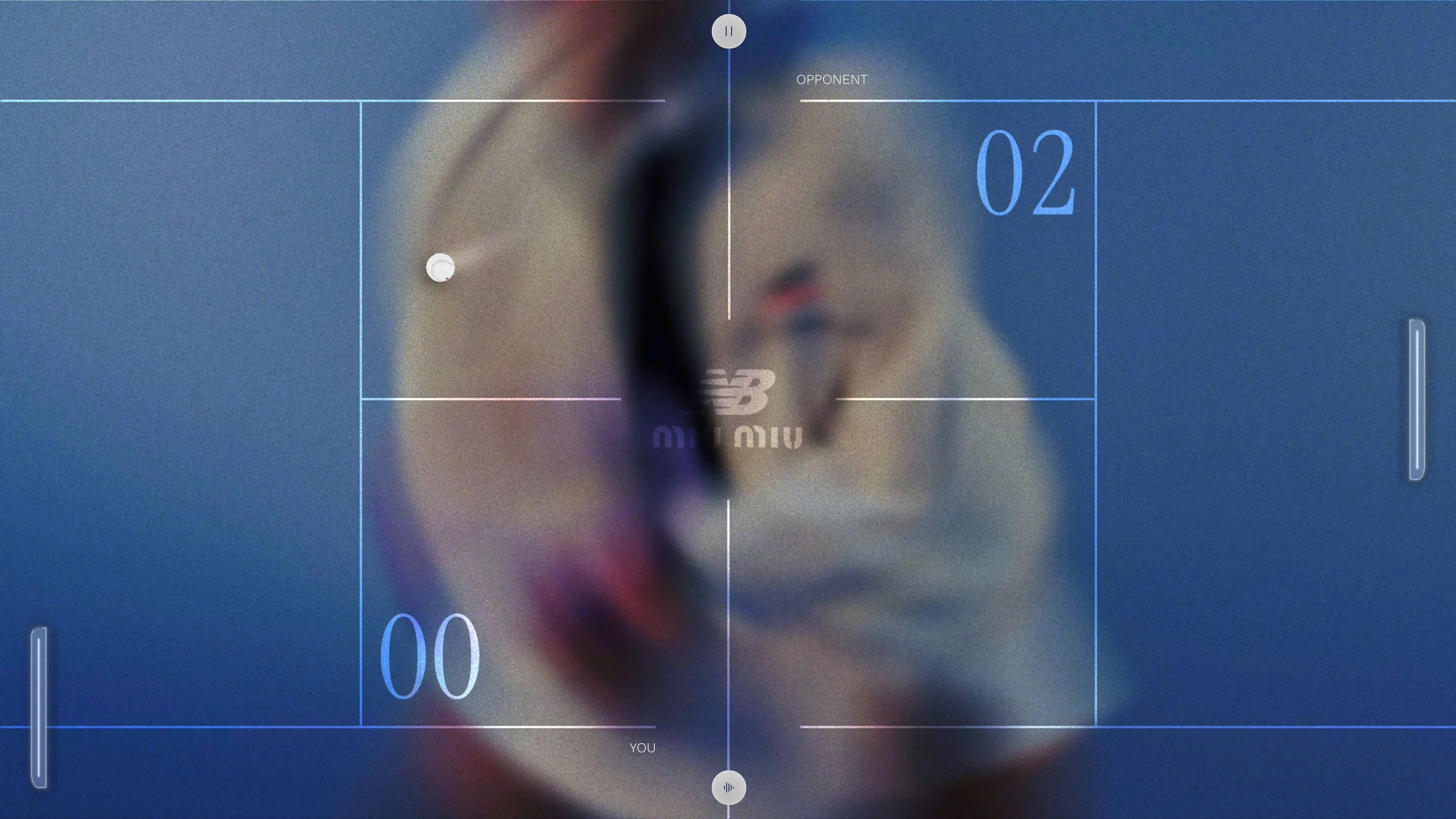
Play starts and the same grid becomes the game board. Paddles slide on the left and right tramlines, the ball runs the length of the court, and the score sits in the back corners at hero size. The interface never leaves the metaphor.
A playable lookbook, locked behind a blur
Behind the court sits a photograph, smeared until it reads as colour. You can just make out a white collar, a braid, a flash of red on a shoe. That blur is the game state.
Every point you win snaps the backdrop into a sharp campaign frame: Gauff in profile with the braid over her shoulder, a knotted headband on a grey backdrop, a white dress caught mid-turn. Click to continue and it dissolves back into blur, and the rally restarts. The blur is a lock and the rally is the key.
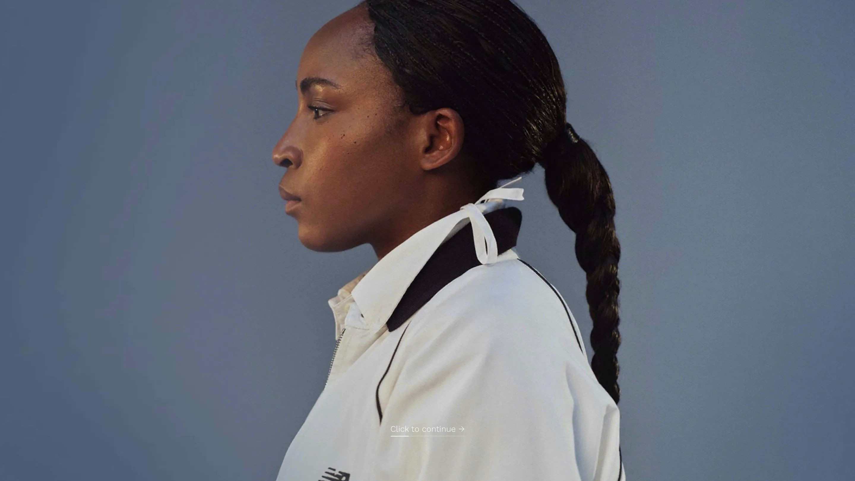
That inversion is the bit of craft worth stealing. The product photography is the reward for playing rather than the wallpaper you scroll past, so each campaign image gets looked at properly, on its own, on a screen with nothing else on it.
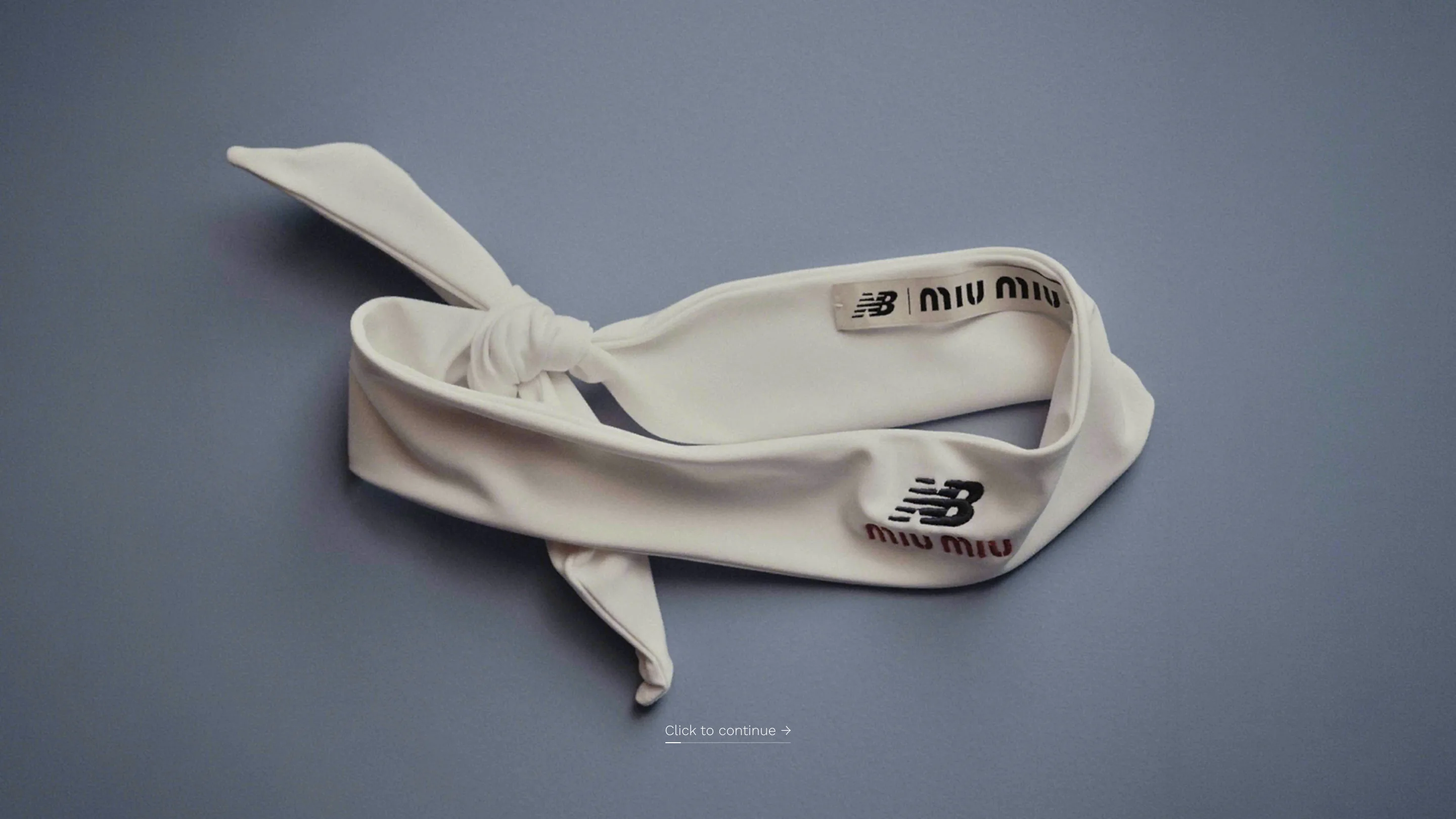
The type carries the collaboration
Two houses share the site and the type settles the argument. Headlines are a high-contrast Didone italic with fine hairlines and ball terminals, which is the Miu Miu register. Labels are the opposite: tracked grotesk caps at around 10px, OPPONENT along the top edge, YOU along the bottom, the kind of thing printed on a scoreboard.
The scoreboard numerals split the difference. They sit in the same Didone at display size, white for the opponent and pale blue for you, parked in the back corners of each half like a stadium clock designed by a fashion house. No third typeface anywhere.
Colour keeps the score
The court is hard-court blue at the start. Take a point, or drop one, and the whole plane shifts to a cold grey with the numerals going warm white against it. A film grain sits over the lot and never lifts, which keeps the flat Three.js planes from looking like a render.
Where the judges marked it down
The score card is honest about the trade. Creativity took 7.53 and design 7.29, while content landed at 6.99. On the developer side, animations and transitions scored 9.20 and accessibility 6.60, with semantics and SEO also at 6.60. A canvas game gives a screen reader almost nothing, and a site that sells a collection with no readable product copy will always lose points on content.
Merci Michel spent the budget on the rally. Judged as a launch, that's the right call. You remember the two minutes you spent chasing a ball, and you remember the dress that appeared when you finally won a point.