Trevor Noah's talent website design is one hero, four props
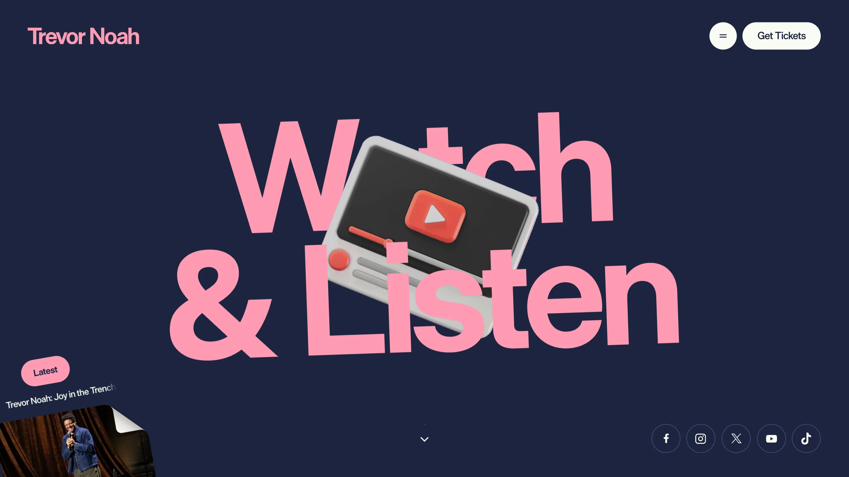
OFF+BRAND built Trevor Noah's site on a single hero: one giant pink word on navy, one cutout object dropped on top. Every section is that swap.
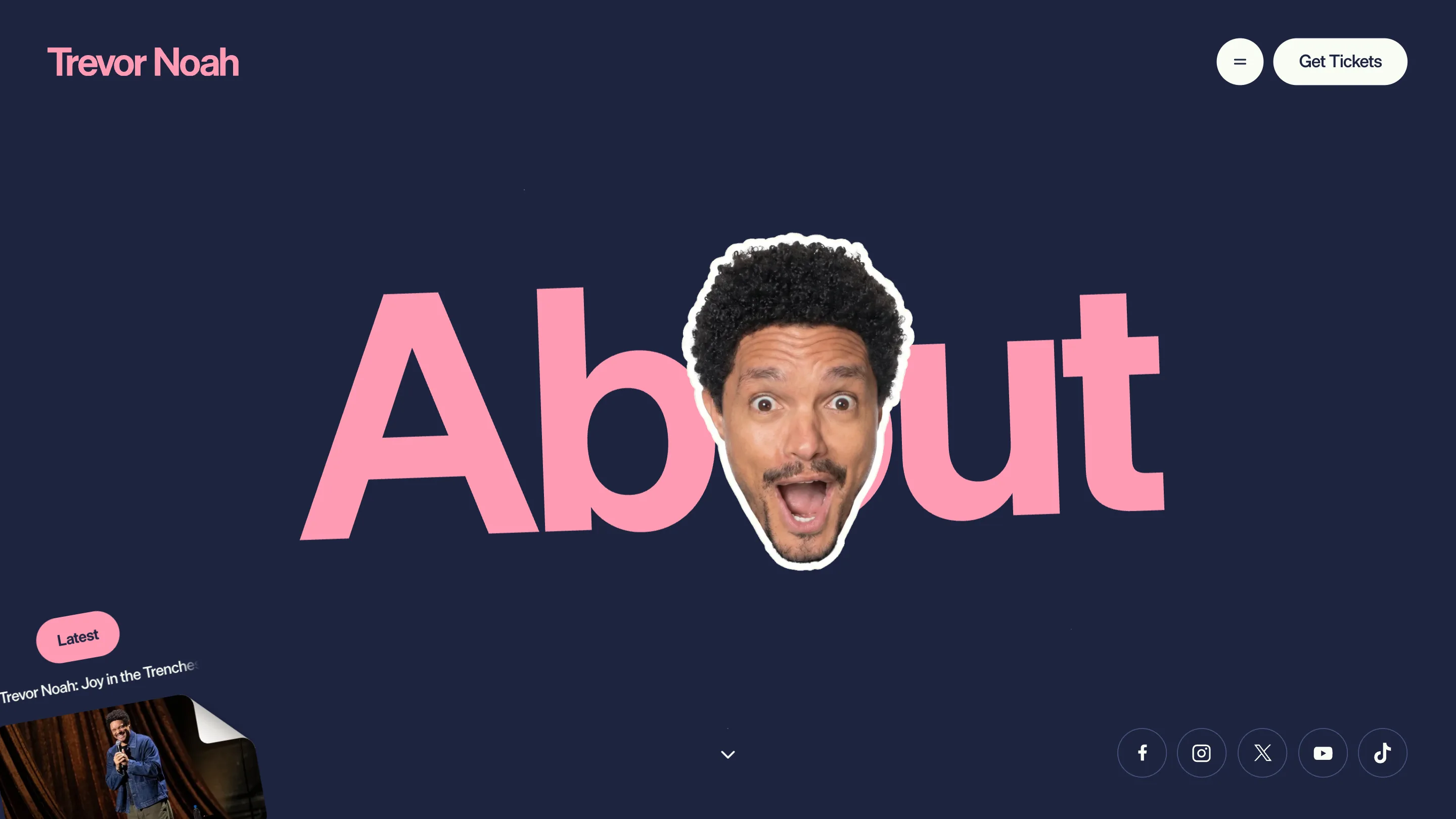
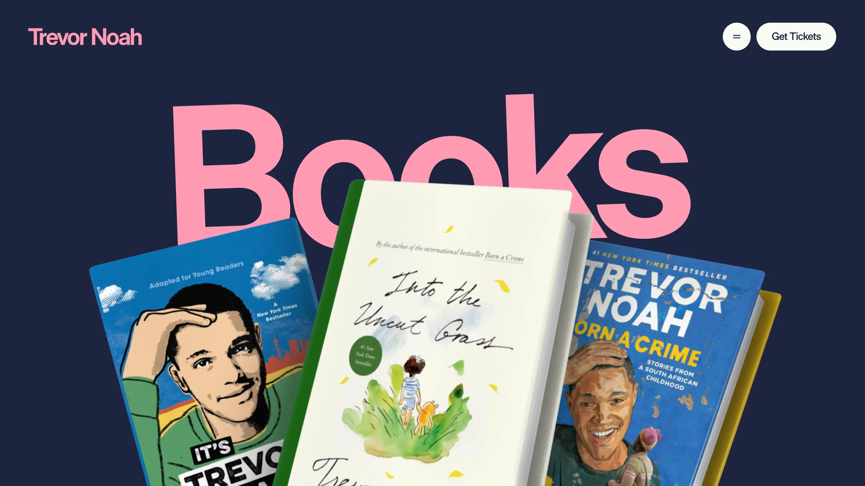
Load any page on trevornoah.com and you get the same picture: one enormous pink word on a navy field, with a single cutout object dropped on top of it. Shows gets a microphone. About gets Trevor's face, mouth open, sitting in the O. Books gets three hardbacks fanned across the K. The talent website design here is one hero template and a box of props, and it works better than most sites that build a bespoke header for every section.
OFF+BRAND made it. Awwwards gave it Site of the Day on 3 September with a 7.45, and a 7.23 developer award.
One word, one object, one z-index
The type is Die Grotesk, shipped as six woff2 cuts covering the B, C and D widths in regular, medium and bold. Two of them are preloaded in the head with fetchpriority high, so the word is already there when the page paints. It sits at the same optical size on every page, baseline just above centre, cropped tight enough that the counters do real work.
The object goes in front. No masking, no knockout, no letterform surgery. Simple stacking, which is why the whole system costs almost nothing to extend.
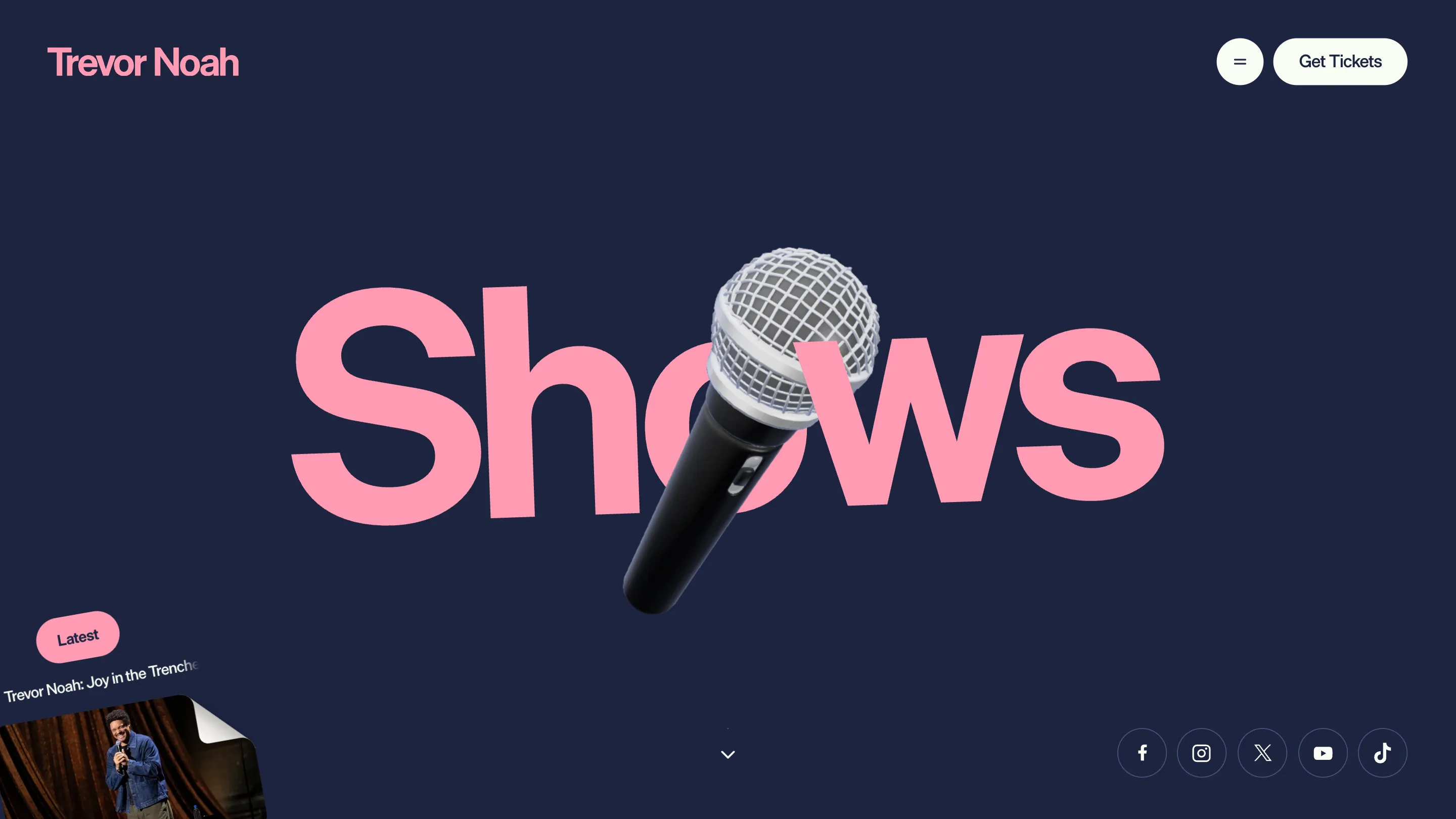
What makes it read as art direction rather than a batch action is placement. The mic grille lands in the O of Shows and stands in for the counter. His face fills the O of About. The books lean into the K at a lower angle than the mic leans into the O. Each object gets its own rotation and its own overlap, so four pages built from the same two layers never line up into a pattern.
A pastel pink that measures at 7.69 to 1
The palette is two colours and a rule. Pink #FF9BB4 on navy #1D2440 for everything display sized, off-white #F9FCF4 for body and the persistent buttons.
Pink on navy sounds like a contrast argument waiting to happen. It measures 7.69:1, which clears AA for body copy and AAA for anything set large. The off-white runs 14.69:1 on the same navy. The one colour that fails, a muted #46517B at 1.98:1, only shows up in decorative rules. So the site gets a loud, warm, slightly silly pink and pays nothing for it. The navy is also the theme-color meta value, so the browser chrome on mobile matches the page.
The nav hides. The ticket button never does
Top right on every page: a hamburger, and a white "Get Tickets" pill. That's the whole persistent nav. Shows, Watch and Listen, Books, About and Store all live behind the icon. One link stays visible at all times and it's the one that sells something.
The /shows page follows through. Dates list as country, format, date, venue and city, each row ending in its own Get Tickets button wired to Seated. There are filters for country, city and event type, a Load More control, and a map headed "Where's Trevor Going?". A designer would notice the filters are doing genuine work here, since the tour runs across Durban, Dubai and a dozen other cities and nobody wants to scroll past Johannesburg to find their own.
The structured data says the same thing in machine language. The JSON-LD lists booking contacts by type, split across Mainstay Entertainment for one lane and two CAA agents for TV, film and live performances, phone numbers included. This is a site that has decided what it is for.
A "Latest" card sits in the bottom left corner of every page, with a peeled page-curl corner, pushing the Netflix special. Persistent, small, and out of the way of the type.
Webflow underneath, a build on top
The pages are Webflow. The site ID is in the markup and the CSS bundle is named ob-trevornoah, where the ob is the studio. The motion and the WebGL come from a separate bundle on trevor-nine.vercel.app, preconnected in the head alongside the Webflow CDN.
That split is the practical decision behind the pretty one. Tour dates and book listings stay editable by whoever manages them, and the interaction layer ships as a real front-end deploy on its own cadence. Plenty of talent sites pick one or the other and suffer for it.
Templates get a bad reputation because most of them exist to save time. This one exists to make a person recognisable in half a second. Four pages, four objects, and you know whose site you're on before you read a word.