Surfer's Journal archive website design has 187 palettes
TEACHER built The Surfer's Journal's 34-year archive so each of the 187 issues paints the whole page in two colours taken off its own printed cover.
Websites · The Editors · 4 min read ·
Featured: The Surfer's Journal Archives (site by TEACHER)
Scroll the new Surfer's Journal archive and the page changes colour 187 times. One palette per issue, taken off the printed cover, written straight into the markup.
TEACHER did the design, art direction, development and motion on it. The archive runs from issue 1.1 in 1992 to 35.4 this autumn, and holds 1,745 articles.
One cover at a time
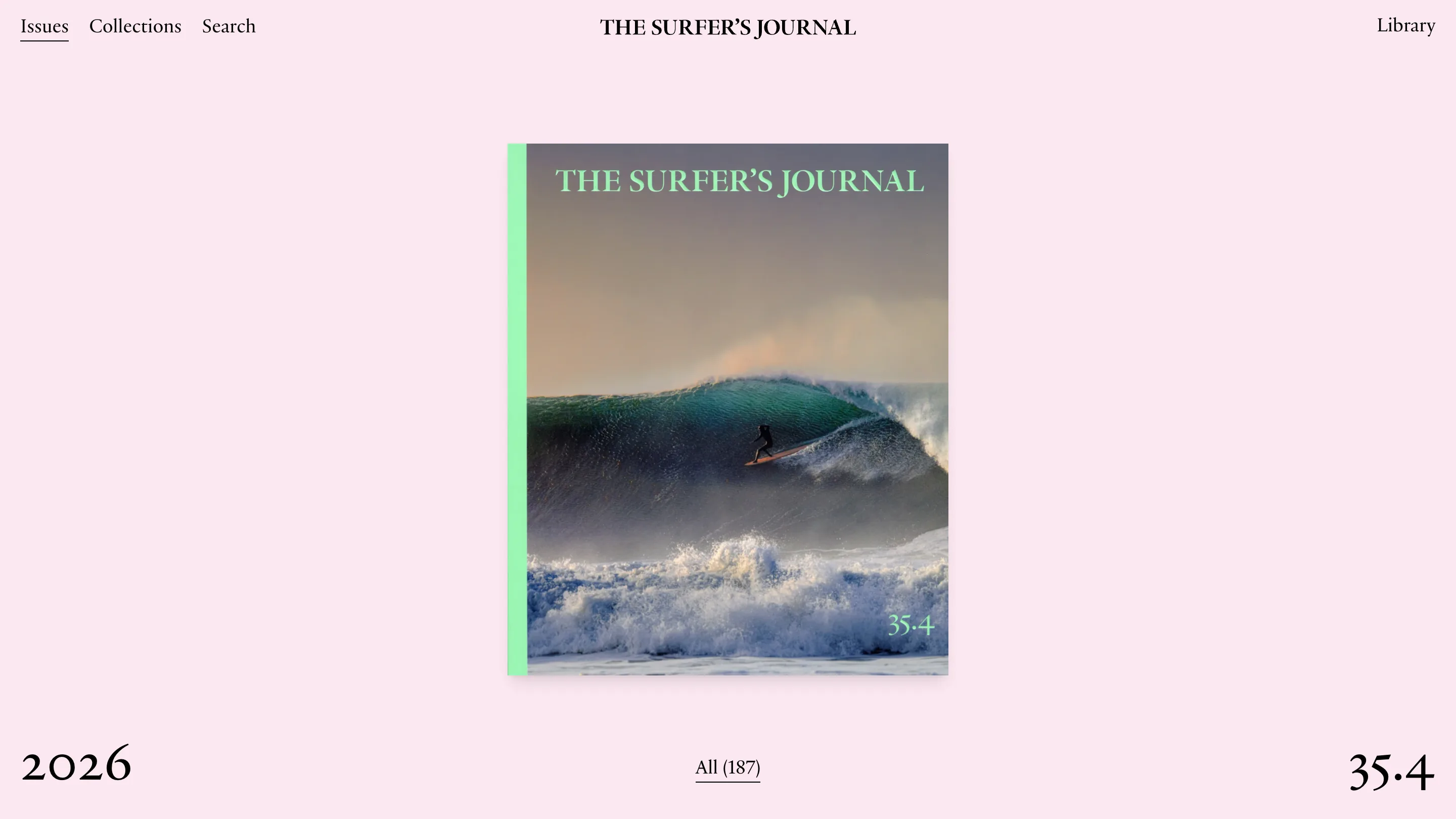
You land on a single cover. Centred, about two thirds of the viewport tall, and the only other things on screen are the year at bottom left, the issue number at bottom right, and a count in the middle reading "All (187)".
That's the navigation. Year on one side, issue number on the other, cover between them. All 187 issues sit in the page as full-screen panels with an incrementing z-index, and Lenis smooths the scroll, so moving back through three decades of the magazine feels like dealing cards off a deck.
It reads slow on purpose. A grid would give you forty covers at a glance and none of them properly.
A palette per issue
Each panel carries two hex values. Issue 35.4 sets --color-primary: #99dec6 and --color-secondary: #fce8f1: the mint green goes on the spine strip down the left edge of the cover, the pale pink fills the whole page behind it. Issue 35.2 is #8bd6e6 on #fff8a3, sky blue on butter yellow.
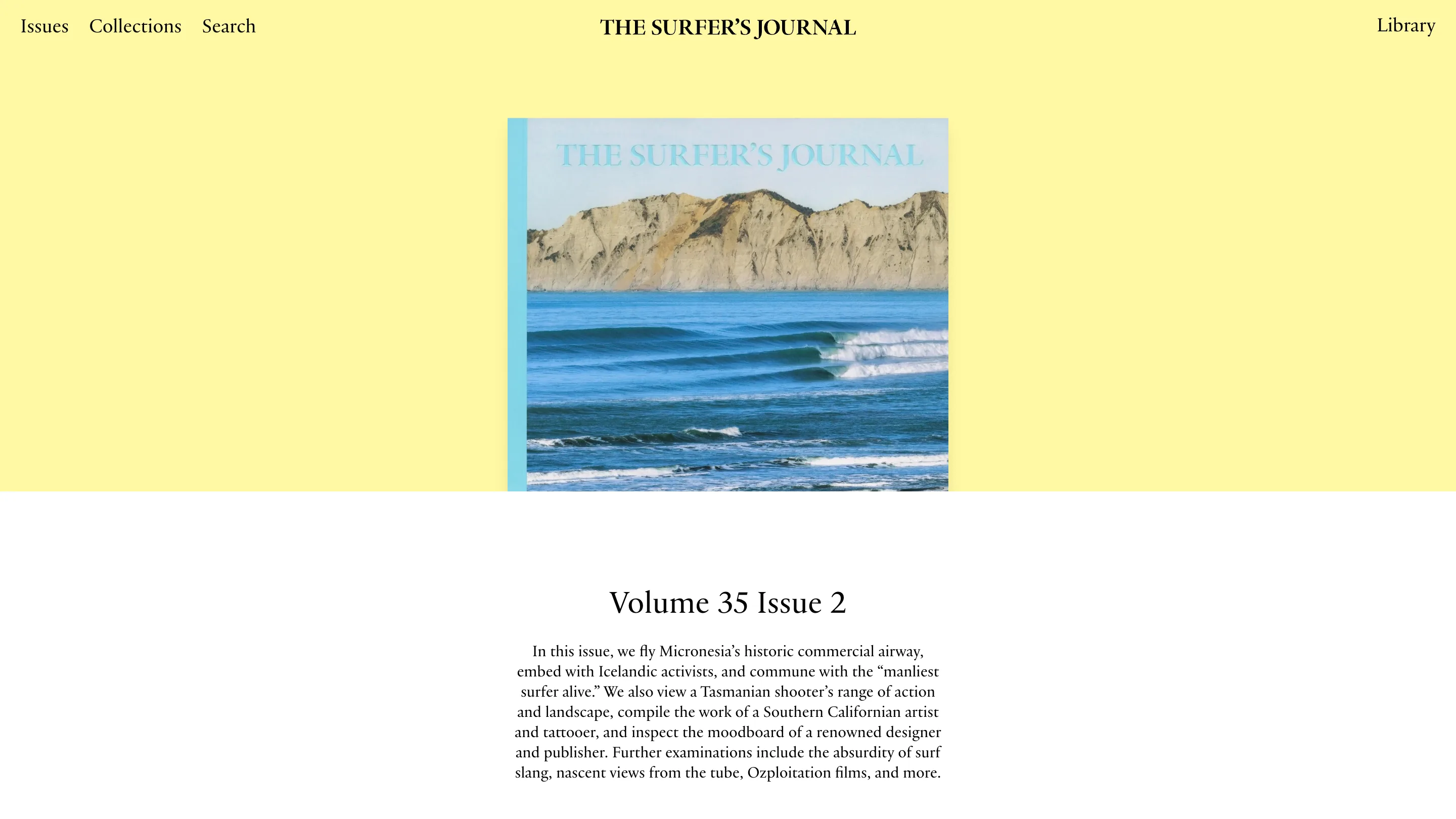
Same template, same type, unrecognisable page. And the spine strip is what makes it more than a tint: the cover reads as a printed object with a colour, sitting on a ground that agrees with it.
The archive website design runs on old-style figures
Look at the "2026" in the corner of the first screenshot. The 2s sit low, the 0 is x-height, the 6 has an ascender. Same with "35.4", where the 3 and the 4 drop below the baseline.
That's font-variant-numeric: oldstyle-nums, and TEACHER has it on every text class in the stylesheet, from body copy down to the small captions. On a site where half the words are numbers, it's the decision that does the most work. Lining figures would have every volume and issue standing up like small capitals, shouting from inside the sentence. Old-style ones lie down and read as text.
The type sits in two families with strict jobs. Practice Display is uppercase every single time it appears, tracking pulled in 2.5px at 48px and pushed out half a pixel at 16px. Practice text carries everything you actually read. Plain, a grotesk, is allowed on exactly three classes: one small paragraph size and two label sizes.
A grid that never crops
The collections page puts four groups on a row and lets each keep its own shape.
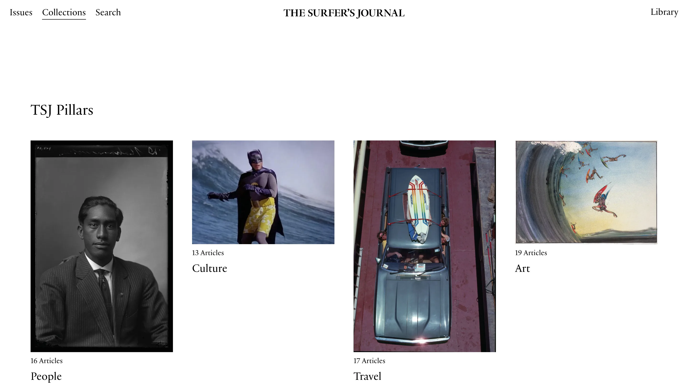
People is a tall portrait plate. Culture is a wide film still. Travel is another tall one, Art a wide painting. Nothing is squared off to a card, so the captions land at four different heights down the row. It looks like a contact sheet, which is what an archive of photography should look like.
The count sits above the name, too: "16 Articles" and then "People". That's the reverse of the usual card order, and it makes the row scan as quantities first.
Search opens with everything
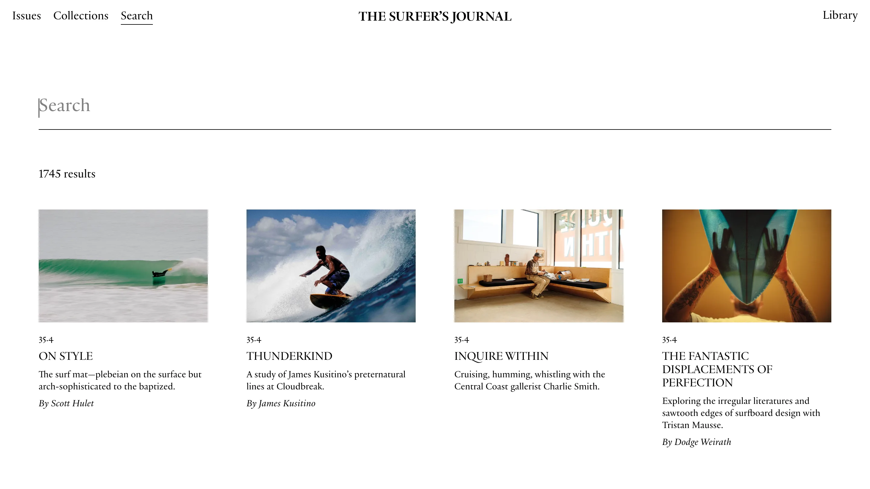
The search page shows all 1,745 results before you type a word. The input is a serif field set at headline size with just a caret in it, the count sits underneath, and the results are already there to browse.
Small decision, and it changes what the page asks of you. An empty search box wants you to arrive knowing what you're after. This one hands you the archive and lets you narrow it.