Atalanta's deep tech website design never uses pure black
Alright Studio built Atalanta on #37352f and #fcfaf3. Pure black and pure white are defined in the stylesheet and never called. Here is why that works.
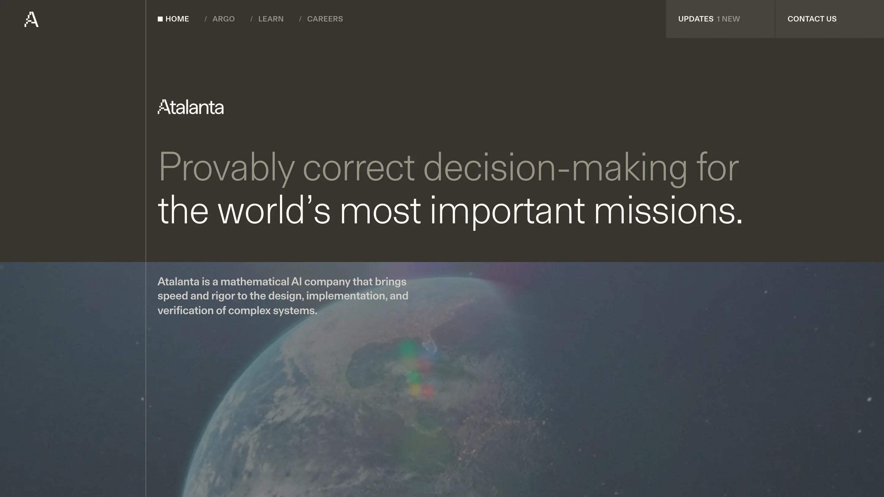
Atalanta's website never uses pure black. The ground is #37352f, a warm dark olive, and the light tone is #fcfaf3, an off-white with yellow in it. Both --color-pureblack: #000000 and --color-purewhite: #ffffff are declared in the stylesheet and then left alone. The greys in between are warm too, #989486 and #d0cec8. There is no neutral anywhere on the page.
That single choice carries the deep tech website design further than anything else on the site. Atalanta sells mathematical verification for energy, space and defence systems, and the reflex for a company like that is a black screen with a cyan graph on it. Alright Studio, the Brooklyn firm credited in the footer of atalanta.tech, built a reading room instead.
Photographs get pushed down to tone
Every hero image sits under a heavy scrim of that same olive. A hand chalking equations on a blackboard, the Earth from orbit, a grey sea under weather: none of them are allowed to behave like a photograph. They read as texture behind the type, closer to a paper stock than to art direction. You notice the writing first and the picture second, which is the correct order for a company whose product is a proof.
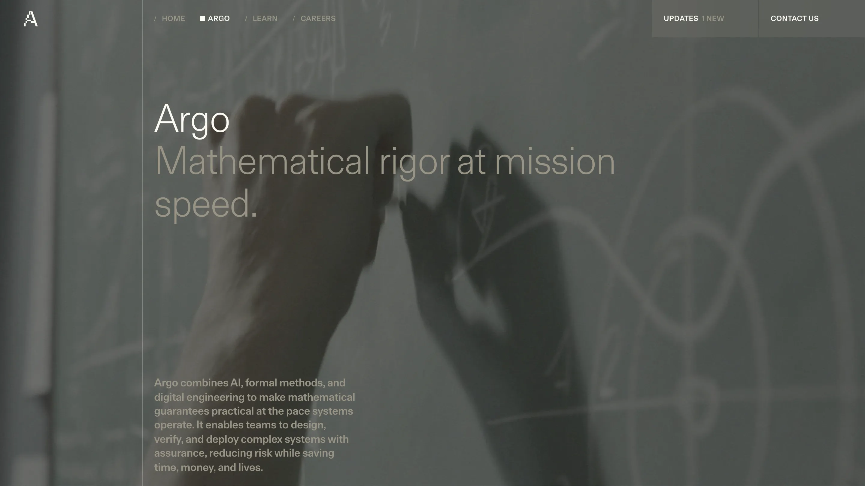
One hairline vertical rule runs the full height of every page, set at 2 * column + gutter on a twelve-column grid with 20px gutters. It is the only grid line you can see, and it never moves between pages. Text starts at it. Images cross it. The page has a spine.
The masthead is one line in two tones
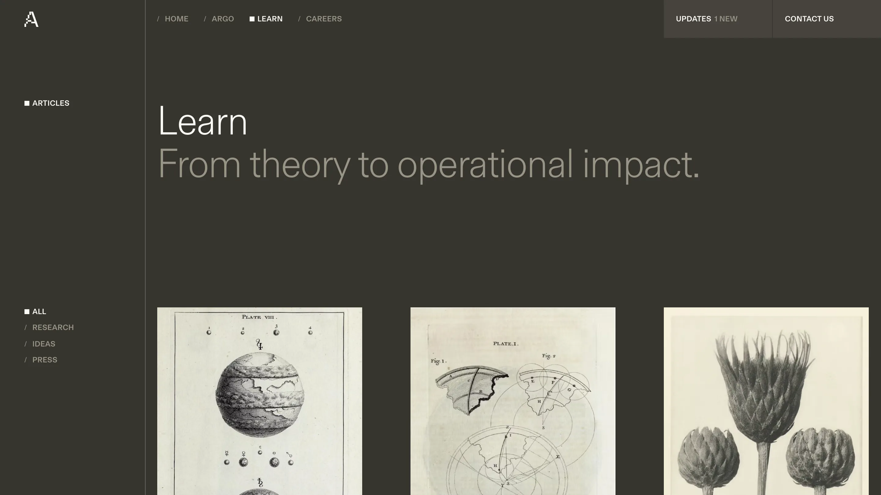
Every page opens with the same object: the page name in #fcfaf3, then a sentence at the same size in #989486. Argo, then "Mathematical rigor at mission speed." Careers, then "We're recruiting a team of modern-day Argonauts." Learn, then "From theory to operational impact." No rule between them, no size change, no label styling. The colour does the whole job of separating a name from a claim.
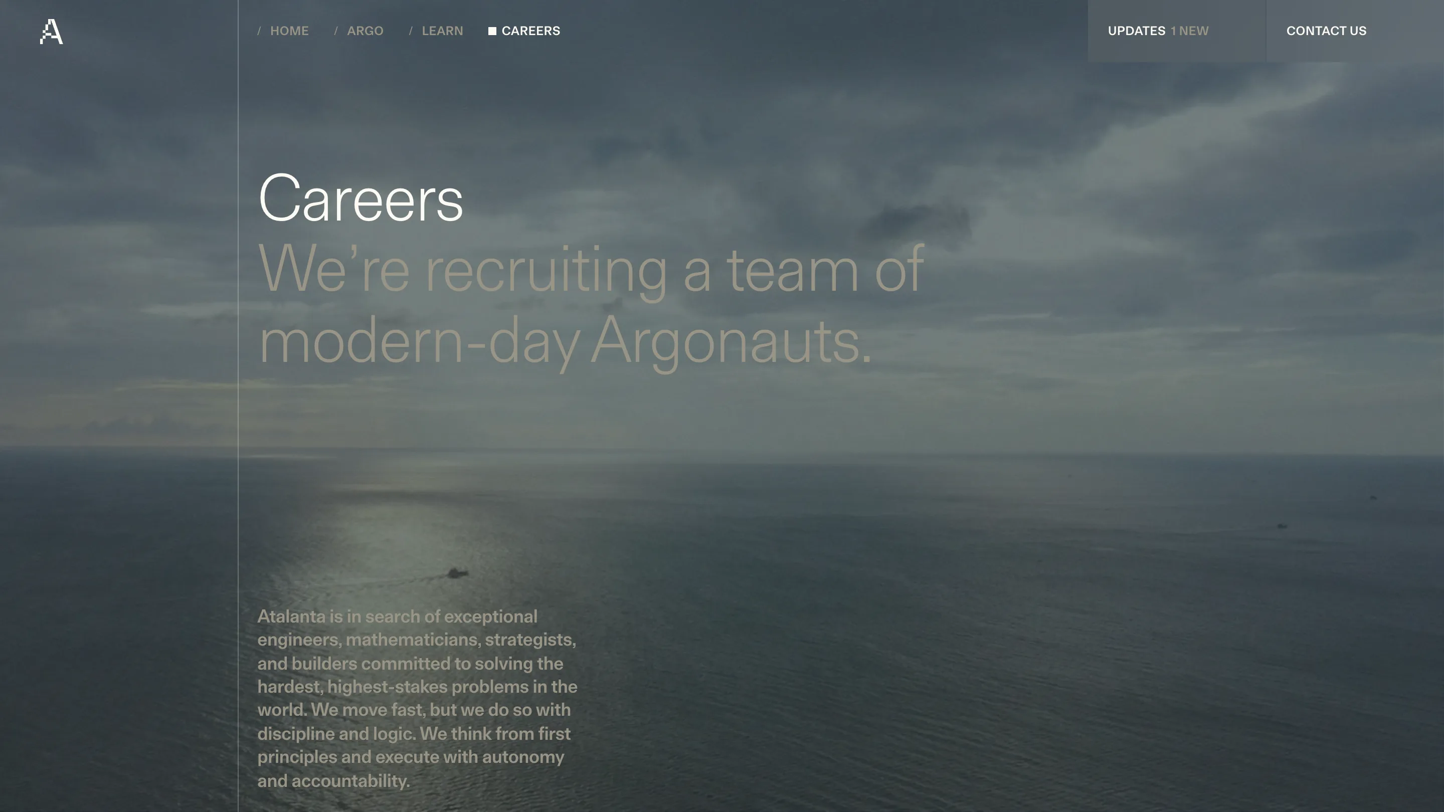
The home page inverts it, and lands better for the inversion. There the muted tone comes first, "Provably correct decision-making for", and the bright line closes: "the world's most important missions." Emphasis moves to the end of the sentence, where a reader's ear already expects it.
Weight runs backwards
FT Aktual sets everything structural. The h1 is 64px at weight 300 with -2% tracking, the h2 50px at 300, the h3 36px at 300. Then the subheads flip to weight 500 at 22px and 18px. Big type is Light, small type is Medium, and the site holds that rule everywhere. A 64px Light headline stays quiet at the size where most sites start shouting, and the 18px Medium nav has enough body to hold the top of the screen without a background.
Body copy is MD Lorien at 18, 16 and 14px. Two families, four weights, one spacing scale of 2, 4, 5, 8, 10, 12, 16, 20, 24, 32, 40, 50, 64, 80, 100.
One square does all the state
Each nav item ships two markers in the DOM. A text slash for the idle state, an 8×8 filled rect for the active one. The state swaps which one shows. Nothing else changes: no underline, no colour shift, no pill. The same filled square marks the active filter on the Learn index and the section label above it.
The logotype is drawn on that square as well. The A is a smooth outline with three small blocks stepping across its counter, each one 2.66 units in a 23-unit box, so the letter looks like it was resolved on a coarse grid and left there. It is the only piece of wit on the site, and it is used twice.
Engravings where the renders would go
The Learn index fills its card grid with 19th-century engraved plates: Jupiter with its bands and moons, a geometry diagram of overlapping circles and shorelines, three thistles. An AI verification company could have put abstract 3D renders in those slots. Old scientific plates make the same claim about rigour with a straighter face, and they sit on #fcfaf3 paper that matches the site's own light tone.
The build is Astro with Sanity behind it, and the CSS uses color-mix to derive every alpha step from the four base tones. Nothing here is expensive. The site is good because someone decided what colour black was going to be and then never wavered.