Royal Sites of Ireland's heritage website lives in its menu
Post Studio put the whole archive of the Royal Sites of Ireland in one menu panel, with a real URL for every list and focus that follows the eye.
The Royal Sites of Ireland website keeps its whole archive inside the menu. Six ancient royal sites, 22 books, podcasts, articles and films, and a long list of partners all open in one cream panel that slides over the home page. Post Studio designed the brand and built the site for a cross-border project between the Irish Government and the Northern Ireland Executive, and that menu is the decision worth studying in this heritage website design.
A heritage website design that opens on a field
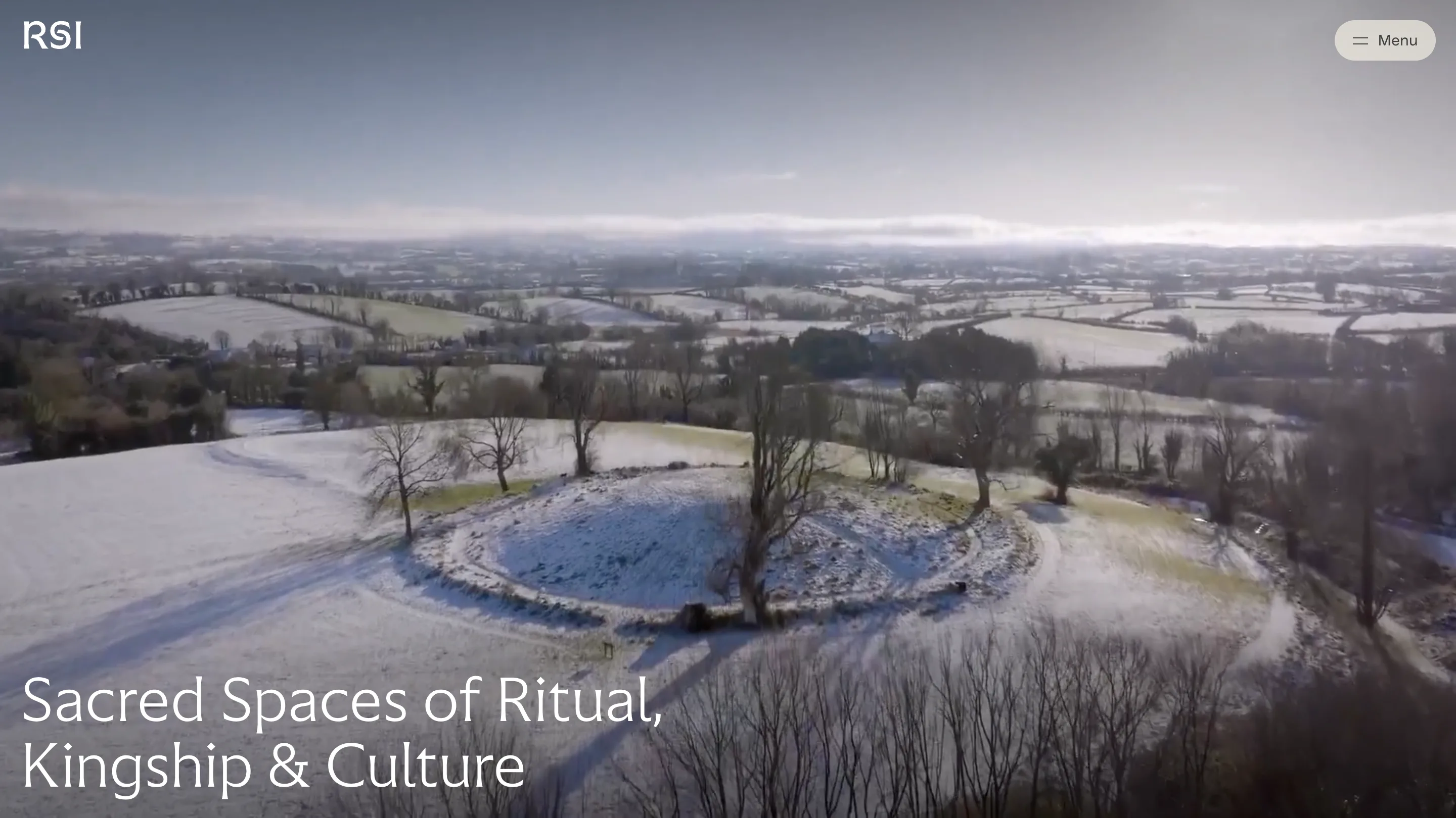
The home page starts with a short splash and then a drone film over a snowy ring fort. One line of type sits at the bottom left: "Sacred Spaces of Ritual, Kingship & Culture". Each word fades in on its own, 150 milliseconds after the one before, so the headline arrives at walking pace.
The splash runs once. The code writes splashShown to session storage and skips the five second intro on every later visit to the home in that tab. A returning visitor gets the film straight away.
The menu is the archive
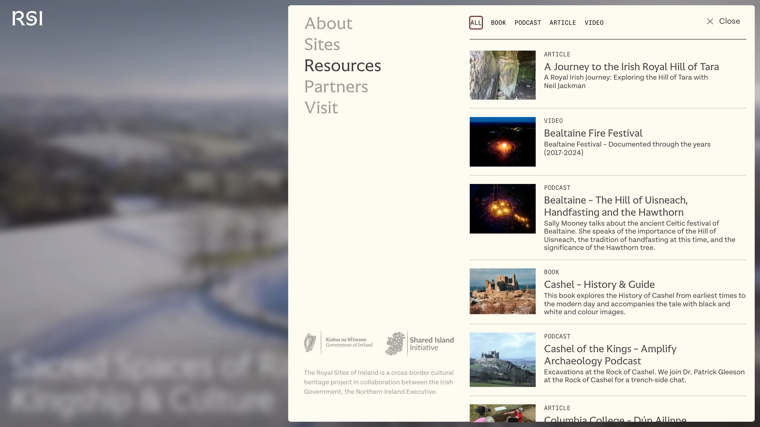
Click Menu and the page blurs behind a cream panel. The left column lists About, Sites, Resources, Partners and Visit in large light type. Two of those, About and Visit, are ordinary pages. The other three open a second column inside the panel itself.
Choose Resources and the right side fills with all 22 items, each with a thumbnail, a tag, a title and a line of description. A row of filters (All, Book, Podcast, Article, Video) sits on top. Choose Sites and the same column lists the six places, each with its county: Tara in Meath, Cashel in Tipperary, Navan Fort in Armagh, Uisneach in Westmeath, Rathcroghan in Roscommon, Dún Ailinne in Kildare. Partners lists the councils, the departments and the creative credits.
The addresses hold up. /resources, /sites and /partners are real addresses. The site calls history.pushState when you open a section, so the URL changes, the back button closes it, and a shared link to royalsites.ie/resources loads the home page with the panel already open on that list. The server sends the same document for all three. You get the feel of an overlay with the behaviour of a page.
Focus follows along. When the panel opens, the first link in the new column takes focus, and links in hidden columns get tabindex="-1" so a keyboard user never tabs into a list they can't see. That's work nobody notices until it's missing.
For a project whose content is mostly six places and a reading list, the trade makes sense. A visitor who wants to read about Bealtaine at Uisneach is two clicks from the podcast, and never leaves the film playing behind.
One family of type, two weights
The type system is three faces with clear jobs. Endure Light sets every heading, a 90px hero and 13px labels alike, with fluid clamp() sizes that grow with the viewport. When a heading needs emphasis, a <strong> switches to Endure Regular instead of a bold, so the stress is one step heavier and the line stays calm.
Tenon Light carries the body copy at 16 to 22px. Auger Mono appears only in the Resources panel, uppercase at 12px, for the filters and the tags. It reads like a catalogue card, which is what that panel is.
Six sites, one template
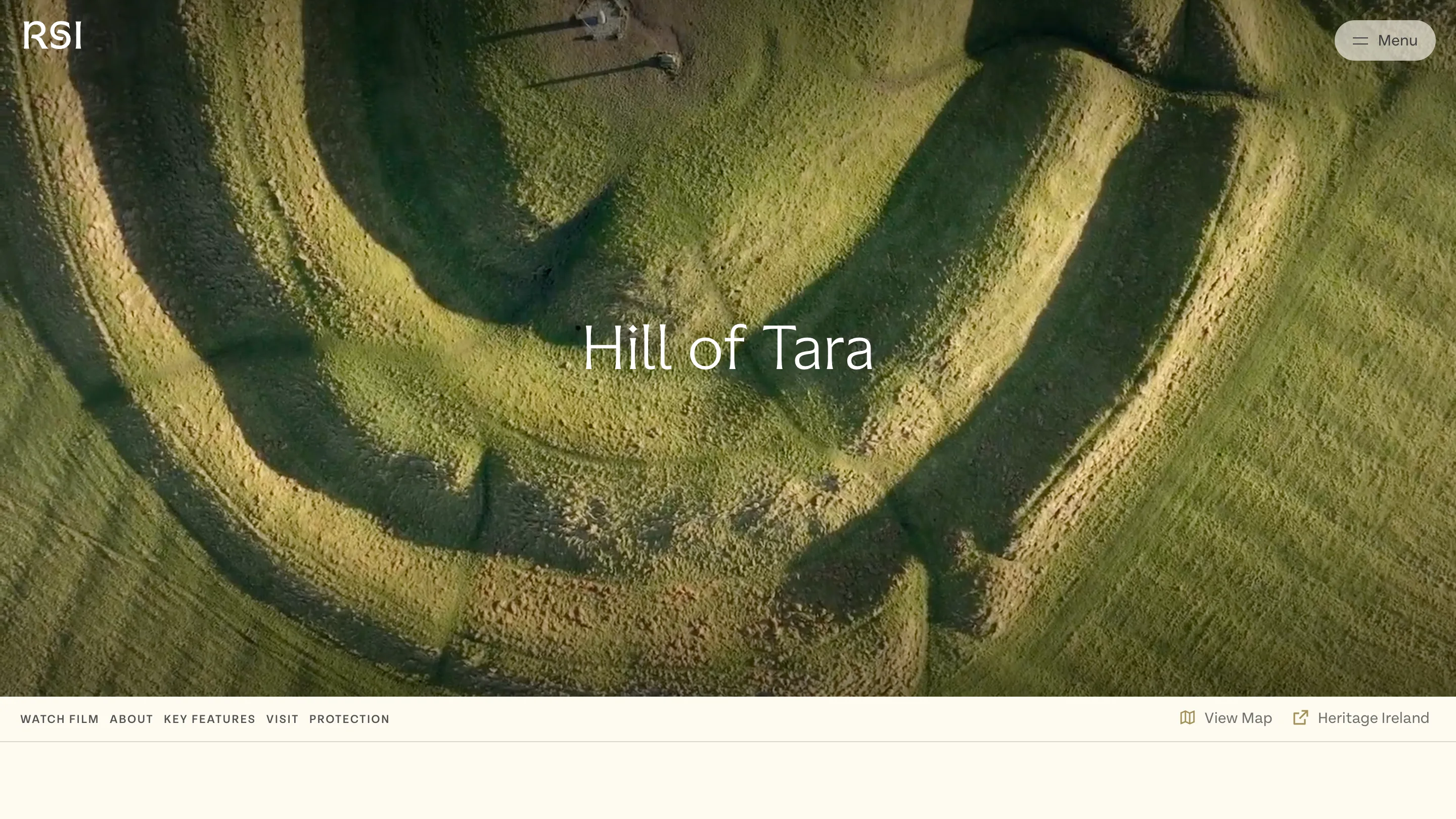
Each site page opens on an aerial film and its name, centred. A cream bar sticks under the hero with anchors to Watch Film, About, Key Features, Visit and Protection, plus a map link and an outbound link to the site's custodian. The Hill of Tara page lists its county, its periods (Neolithic to early medieval), its altitude of 115m and its coordinates before it names a single monument.
The palette stays in the ground it films. Cream #fdfaf1 for panels, a soft charcoal #3e3e3e for text, an oxblood #782a27 that marks the active filter, and a muted gold #a29057. No pure black on the page.
What to take from it
Put the archive where people already reach for it. If your site is a handful of places and a shelf of references, the menu can hold the shelf, as long as each state gets its own URL and focus goes where the eye goes. Post Studio did both, and the result feels like walking a hill with the guidebook already open.