Union's bakery website design hides six ingredients
View Source turned a Paris bakery's sourcing page into a scavenger hunt: six drawn ingredients, each one naming the farm it comes from.
Union Boulangerie's new site makes you go looking for the flour. View Source scattered six hand-drawn ingredients across a one-page bakery website design, and each one you click opens the name of the farm, the mill or the beekeeper behind it. Collect all six and the footer offers you a surprise. It's a small game, and it carries the whole sourcing story.
Union has two shops in Paris, rue Bleue in the 9th and boulevard de Charonne in the 11th, with a third on the Rive Gauche marked as coming soon. The site has four jobs: say what the bakery is, show where it is, take catering and B2B requests, and prove the ingredients are as local as the copy claims. The fourth job is where View Source spent its effort.
Sourcing as a scavenger hunt
The ingredients are blue line drawings: a bag of flour, a block of butter, a jar of honey, an apple, a hazelnut, a carton of milk. They sit in the margins of the About, Method and Contact sections, loose next to the photos, the way a doodle sits on a menu. The markup calls them is-random-placement, which is what they look like.
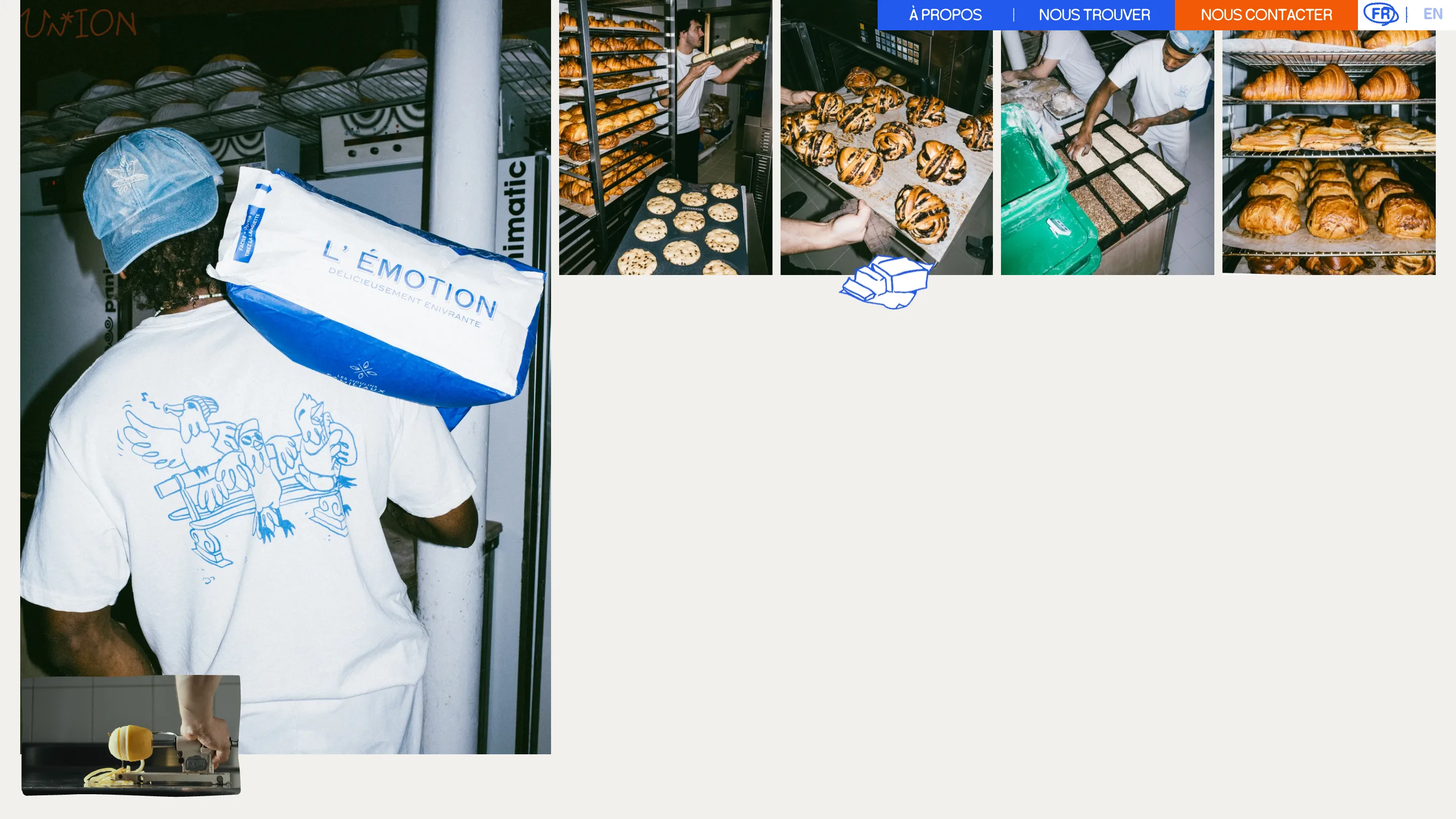
Click the butter and a card opens: AOP butter from Charentes-Poitou, matured cream, light hazelnut notes. The honey comes from Philippe Belmonte at Villeneuve-lès-Avignon, more than 200 organic hives moved with the bloom, chestnut in the Cévennes, lavender on the plateau d'Albion. The flour is from the Moulins de Brasseuil in the Yvelines, organic, milled less than 30 km from Paris. Hazelnuts from Mathieu Martinet in the south-west. Milk from the Maîtres Laitiers du Cotentin.
Every card has a Collect button. Press it and the button turns into an orange Collected label, set at one of six slight tilts so the six never look stamped from one die. The footer keeps the tally on a full blue band: collect all the ingredients on the site and try to win a surprise.
That's the decision worth studying. Union could have printed "local ingredients" and left it there. It names four suppliers and an AOP region instead, and the game makes you read them, because the only way to win is to open every card. The proof is the mechanic.
Three typefaces, three voices
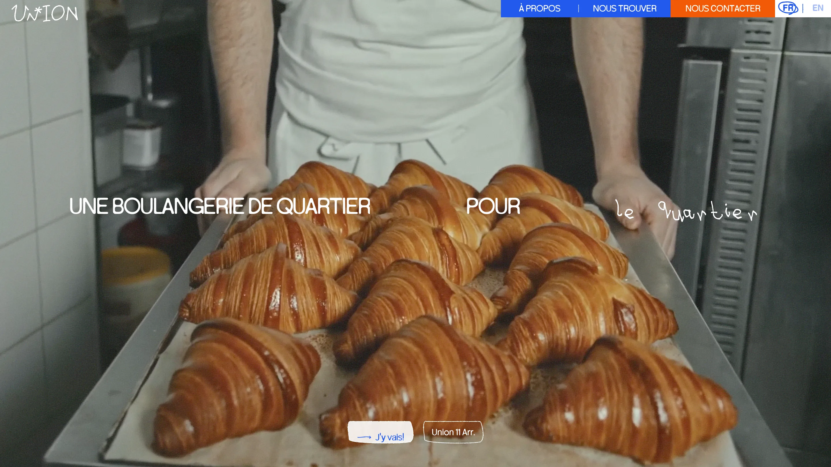
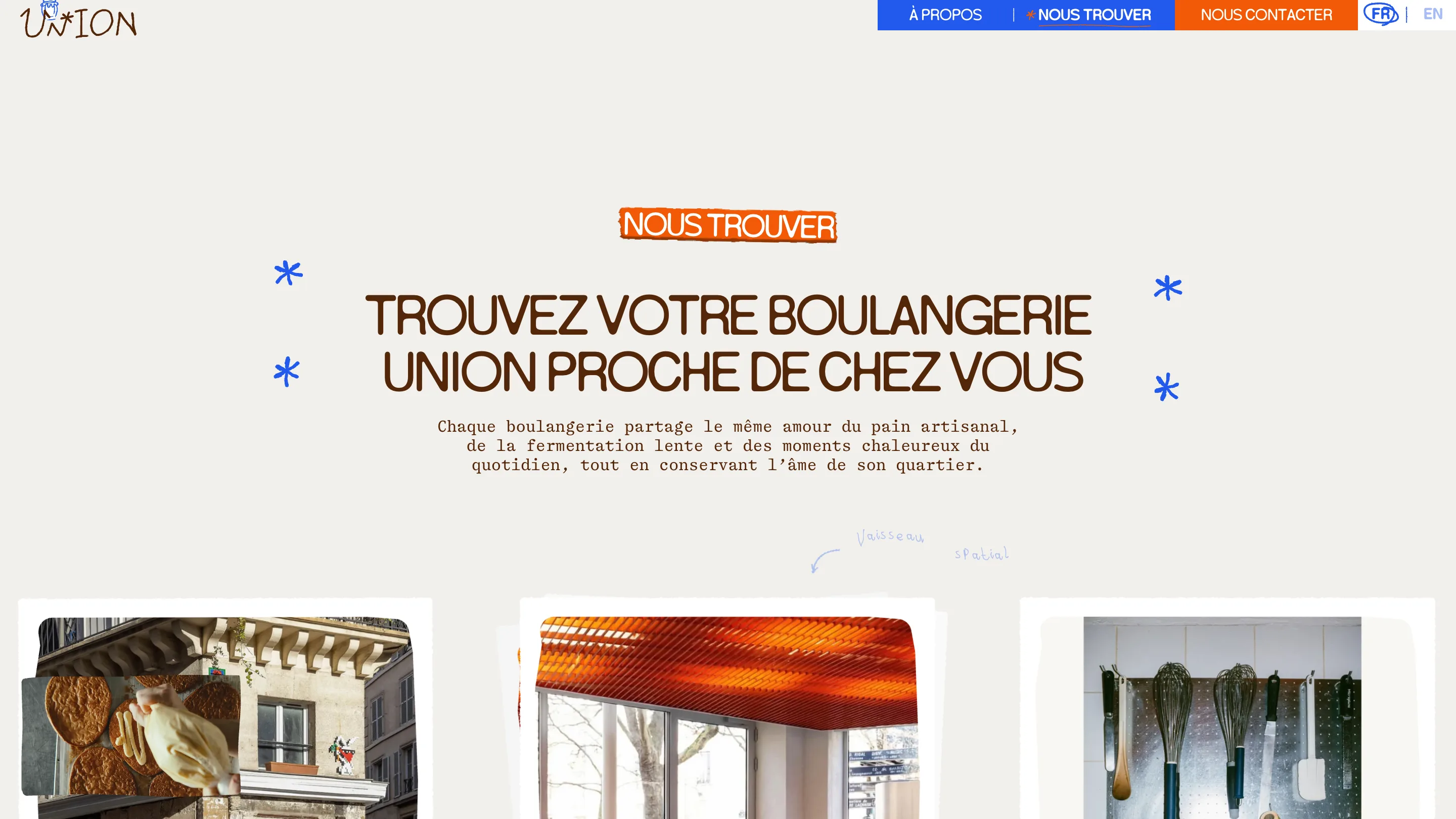
The type system splits the job three ways. Headlines are set in Serial Blur, a tight condensed grotesk shipped as a variable font with a weight axis from 80 to 200, in uppercase with almost no tracking. Body copy is Shinka Mono, a typewriter face that makes the opening hours and the sourcing notes read like a delivery slip. And the handwriting is Kiddo, which draws the logo's wobbly UN*ION, the "le quartier" that trails off the hero headline, and the little arrow pointing at the 11th's nickname, "Vaisseau spatial".
The hero puts all three in one line. "Une boulangerie de quartier pour" runs in Serial Blur caps over a video of a baker carrying a tray of croissants, then "le quartier" arrives in Kiddo, letter by letter, as if someone wrote it on the window. Headlines across the site are split into single characters in the markup so each letter can animate on its own, driven by Motion.
Drawn controls
The hand doesn't stop at type. Buttons are btn-sketch outlines with uneven corners. The message field's underline is a rough brown pencil stroke. The selected request type in the contact form gets a blue scribble under it, closer to a highlighter than a focus ring. Section labels such as NOUS TROUVER sit on torn orange tape.
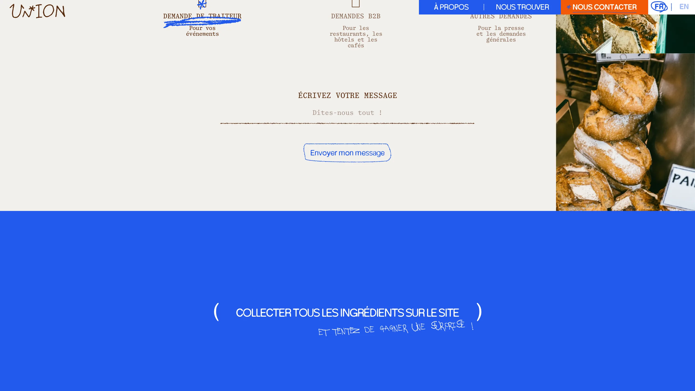
The colour does the opposite. A saturated blue and a hot orange carry the nav, the tape and the drawings, and the rest of the page is a warm off-white with chocolate-brown text. Two flat brand colours keep all that sketching from turning into a scrapbook.
Why the bakery website design works
The site is one long Shopify page, and it could have been a template with croissant photos. View Source gave it one idea that does real work: the ingredients you collect are the claims the bakery wants you to believe. The handwriting, the tilts and the scribbles make the page feel like the shop counter. The game makes you read the supplier list. If you're designing for a small food brand, that's the move to steal: turn the proof into the thing people play with.