Obys runs its studio website on one house typeface
Obys sets its entire studio site in one custom typeface at a single weight. A close look at how the EU studio makes size and space do the work.
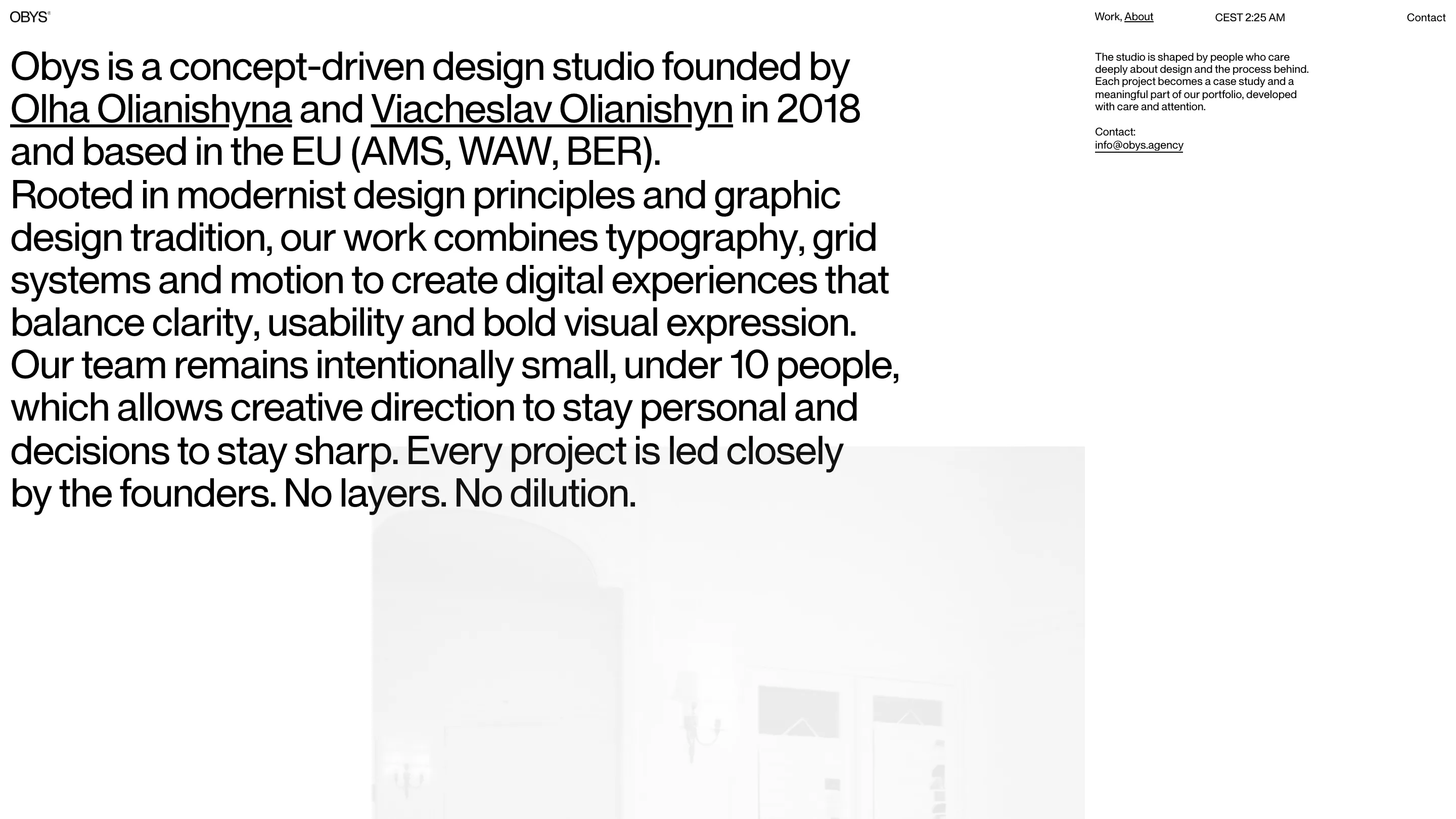
Load the Obys site and your browser pulls down one font file. One weight of one typeface, named Obys after the studio that drew it. Headlines, captions, the navigation, the project titles: all of it sits in the same face at 400, black on white. This is a design studio website that takes its whole voice from a single file, and it works because Obys lets scale and spacing do the job most sites hand to bold.
Obys is a small studio, under ten people, founded in 2018 by Olha Olianishyna and Viacheslav Olianishyn and run out of Amsterdam, Warsaw and Berlin. The About page states the position in the same giant type it uses for everything else: modernist roots, typography and grid systems and motion, decisions led by the two founders. It ends on four words. No layers. No dilution.
A house face doing every job
Check the CSS and there's a single @font-face rule: ObysSans, weight 400. No bold file, no light, no italic. When a site owns one weight and refuses to add a second, the hierarchy has to come from somewhere else. Here it comes from size. The About statement runs at a scale you'd normally save for a hero, while the contact note beside it drops to caption size, and the jump between them reads as clearly as bold-against-regular would anywhere else. The face is a neo-grotesque with enough character in the a, the g and the y to stay itself at 12 pixels and at 120.
The bracket that doubles as a logo
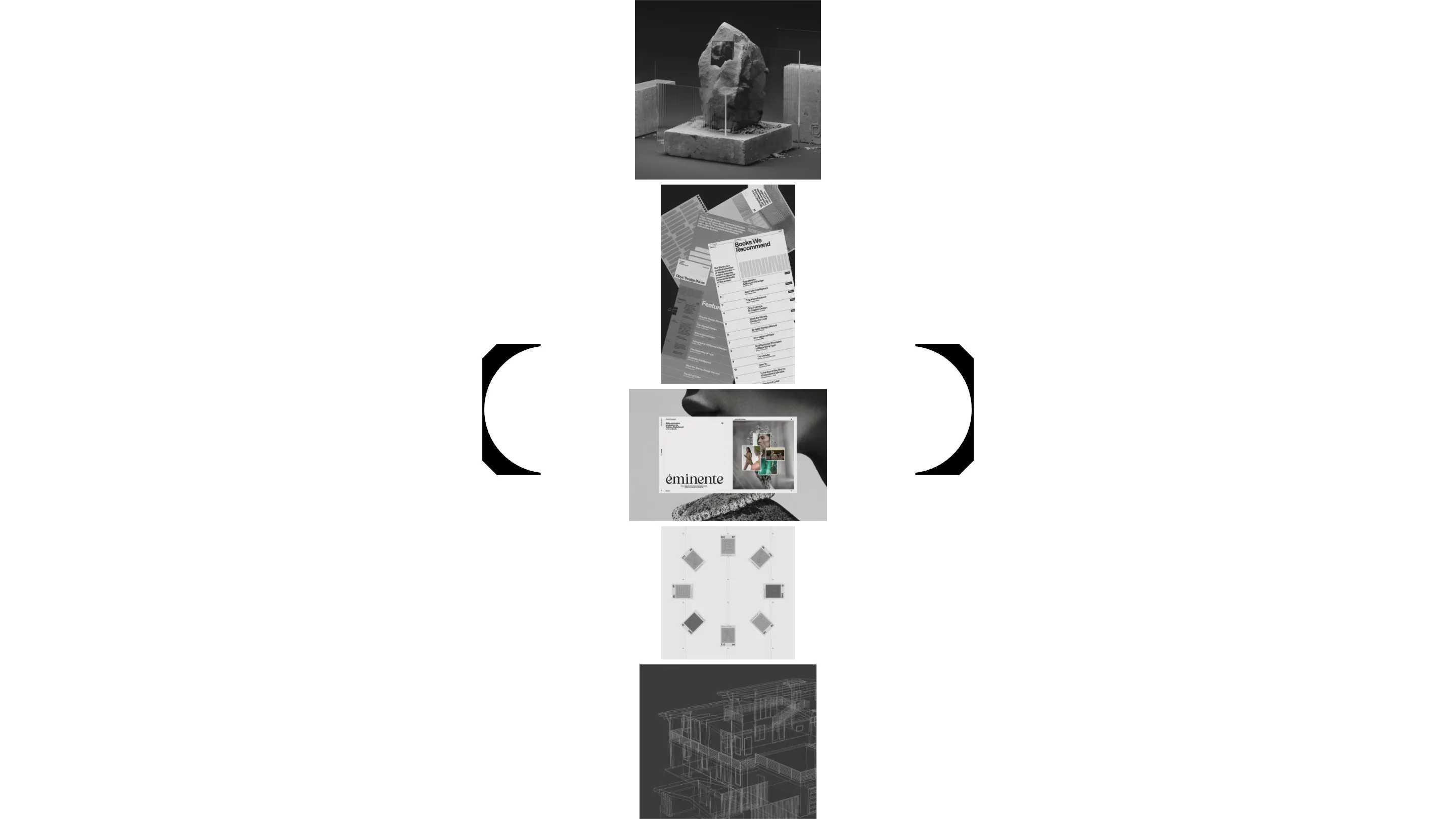
The home page is close to empty. A tall column of project thumbnails runs down the middle, and on either side sits half of a huge bracket, the two halves closing around the stack like parentheses around an O. That mark is the Obys logo, and it's cut straight from the typeface, so the identity and the body copy are the same drawing at two sizes. Scroll, and the thumbnails travel through the frame while the brackets hold still.
Case studies laid out like spreads
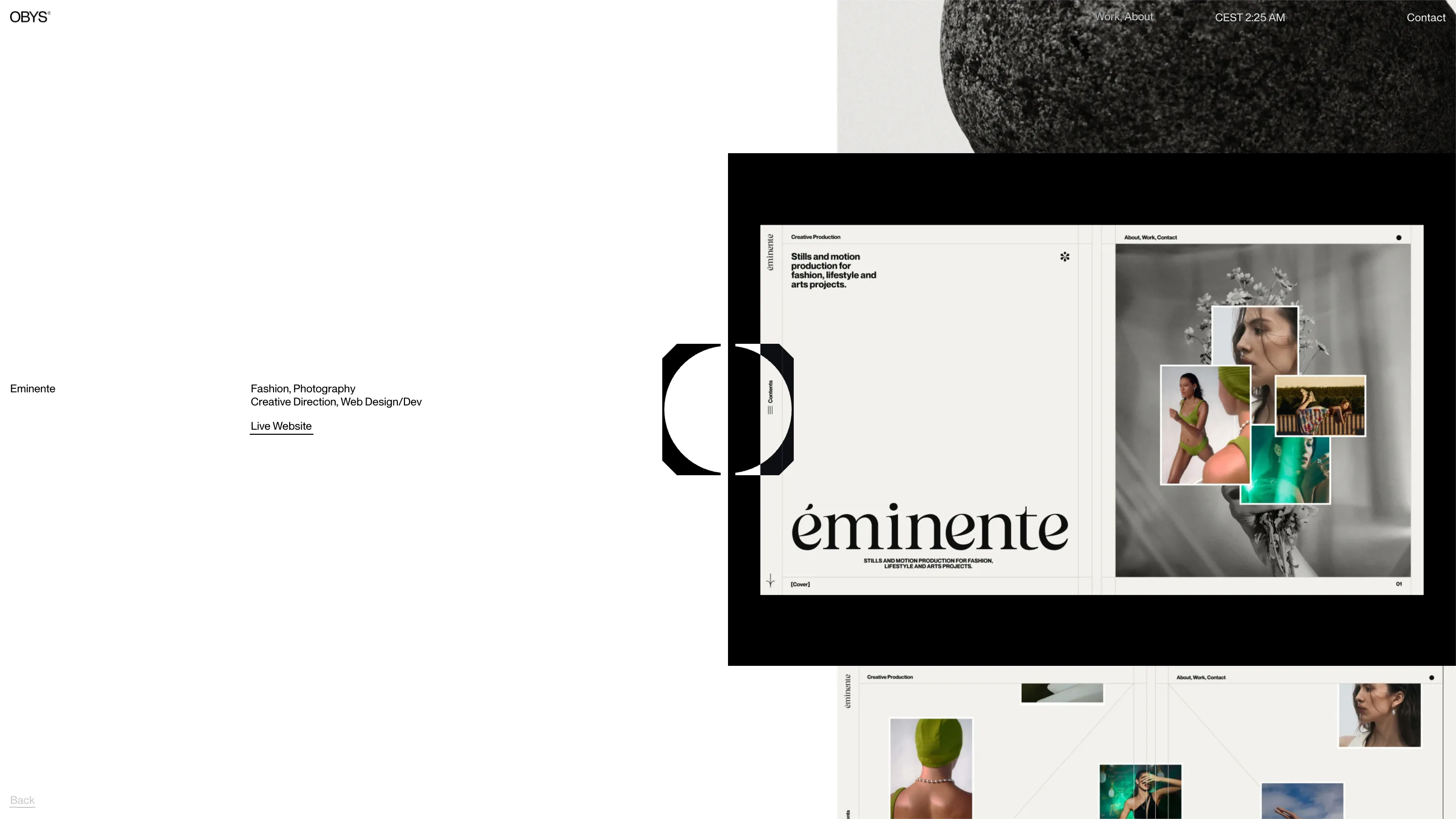
Click into a project and the page turns into something closer to a magazine. Each case study is paginated, with a Cover marker and page numbers like 01 and 03.1 tucked into the corners, and the work sits inside framed device mockups you page through. The Eminente project, a fashion stills-and-motion studio, opens on its own serif logotype and a cluster of green-lit photographs.
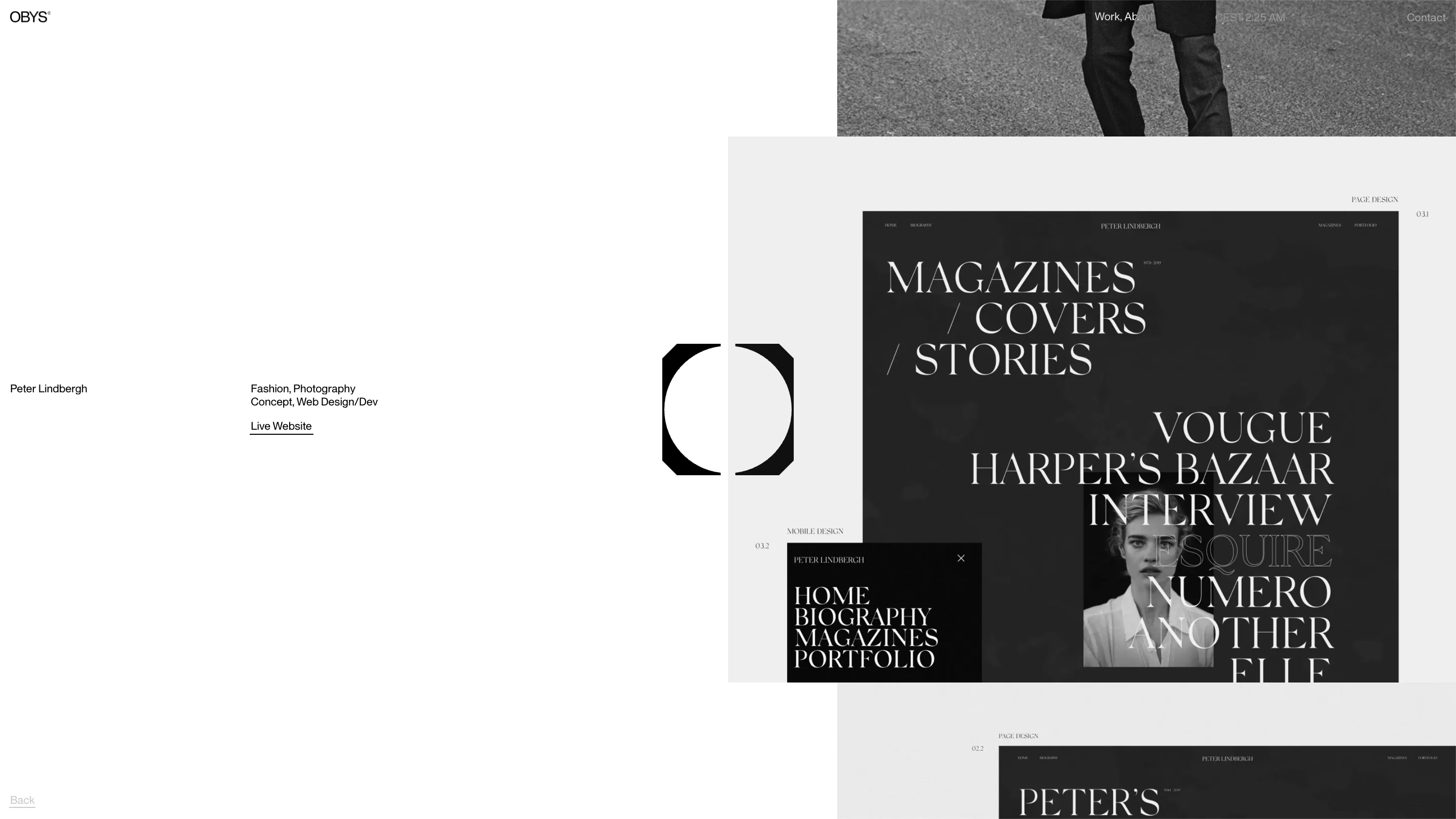
The Peter Lindbergh site gets the same handling, a full-bleed black spread stacking VOGUE, HARPER'S BAZAAR and NUMERO in a high-contrast serif. One thing to notice: inside those mockups the type switches to each client's own face, while everything that belongs to Obys, the labels, the meta, the Back link, stays in the one sans. The studio keeps its voice and the clients keep theirs.
What one typeface buys a studio website
Restraint like this is a bet. Drop every weight but one and you give up the easiest tool for emphasis, so the grid, the sizing and the whitespace all have to be right or the page goes flat. Obys gets away with it because the studio draws type for a living, and the site is the proof of the pitch. One face, one weight, and enough discipline to make that feel like plenty.