'kin turns its portfolio website into a hover-swap gallery
'kin's studio site skips the thumbnail grid. Its work page is one full-bleed photo you steer by hovering a list of project names.
Websites · The Editors · 4 min read ·
Featured: 'kin (by-kin.com)
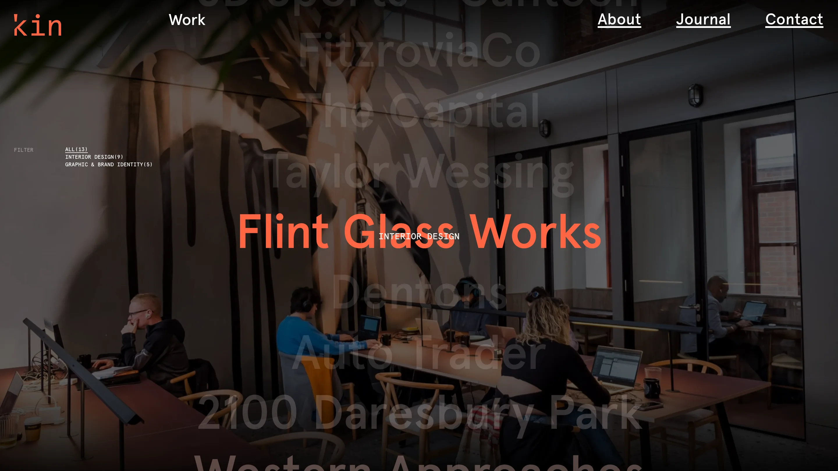
The work page on 'kin is one full-bleed photo and a list of names. Move your cursor down the list and the photo behind it swaps, one project at a time. Hover Flint Glass Works and an office interior fills the screen with the title in orange over it. Drop to Taylor Wessing and the whole background follows your cursor. That hover is the navigation. No thumbnail grid to scan, no cards to click through. The studio portfolio website is a lookbook you steer with your mouse.
'kin is a UK studio doing commercial interiors, branding and graphic design, and its own site reads like a careful piece of both. Thirteen projects live on that one work page. A small FILTER control in the top corner counts them for you: ALL(13), INTERIOR DESIGN(9), GRAPHIC & BRAND IDENTITY(5). Pick one and the list shortens. The number in brackets does real work, telling you how deep each side of the practice goes before you've opened a single case study.
A portfolio website with no grid
What makes this hold up is restraint. The project names sit in a tall column of ghosted grey type, and only the one under your cursor comes forward, in orange, over its image. So the page is never busy. You read it the way you'd read an index, top to bottom, and the picture just confirms what your eye already landed on. A wall of thumbnails and a plain text list usually feel like a choice. 'kin runs both in the same space and lets the cursor decide which one you're looking at.
It's a small idea with a real payoff. A grid of thirteen thumbnails asks you to judge everything at once. A list asks you to read one line, then the next. The images still show up, full size, but on the studio's terms, one at a time.
A monospace does the quiet work
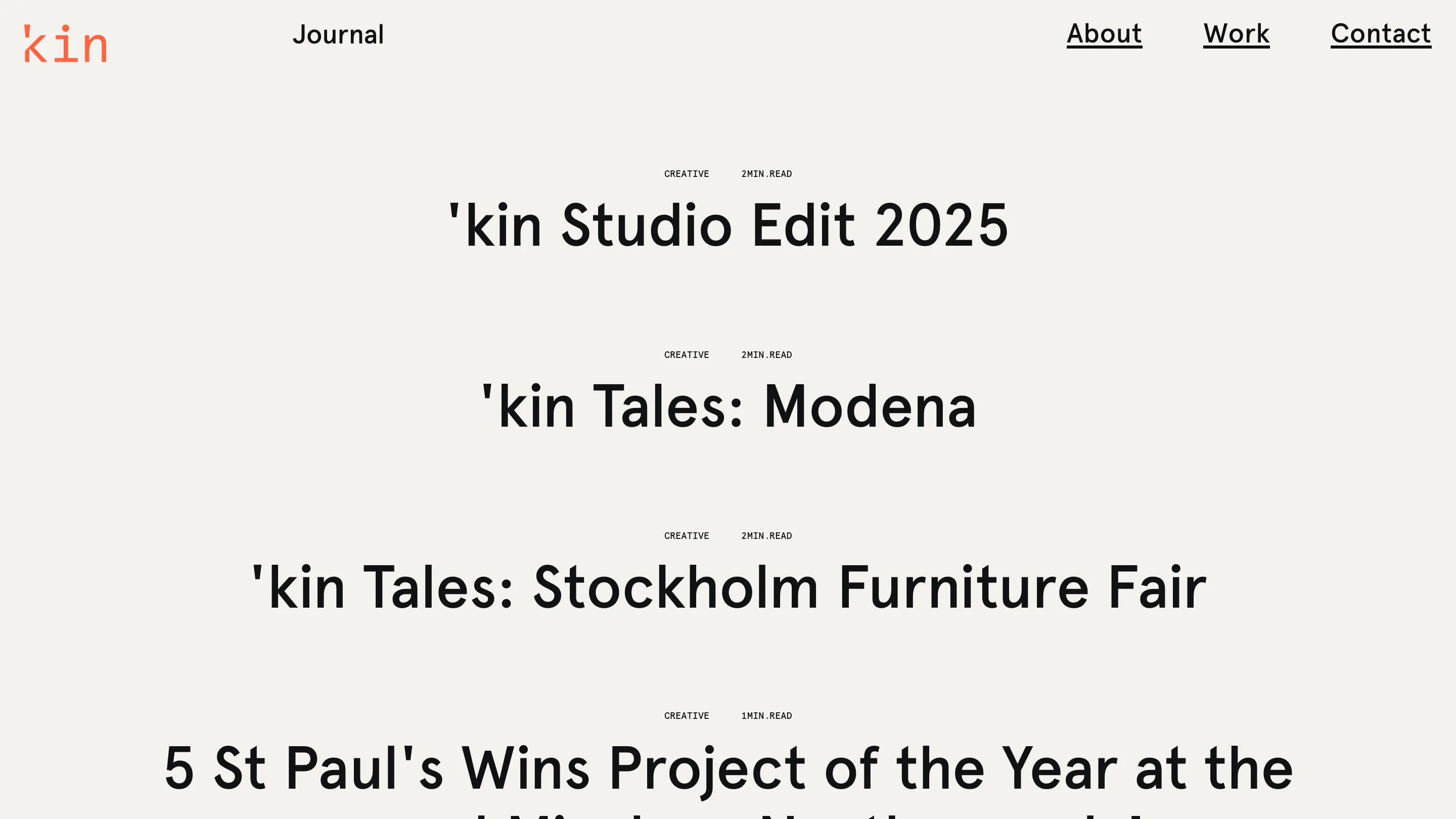
Look at the labels and you'll see two typefaces splitting two jobs. The big stuff, project names, journal headlines, the logo, is set in a clean geometric sans. The small stuff, FILTER, INTERIOR DESIGN, 2MIN.READ, CREATIVE, is set in a monospace. That split is deliberate. The mono reads as system text, like a caption the machine wrote, and it holds the metadata apart from the content without needing a rule, a box or a colour change.
One orange, and nothing else spare
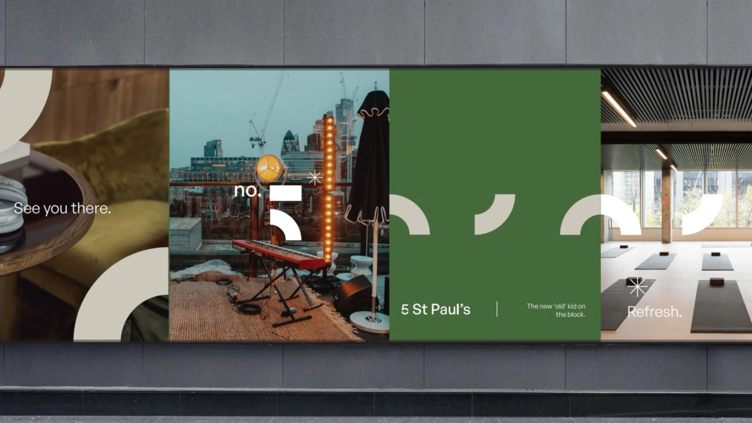
The palette runs close to Dokle's own: near-black ink on warm off-white paper, then a single orange for the logo, the hover state and the word Loading while a page fetches. That's the whole system. One accent, used only where it means something. The work itself carries the colour, the greens and creams of the 5 St Paul's branding, the warm light of the interiors, so the site's own chrome stays out of the way and lets the images do the talking.
The journal drops the pictures
The journal goes the other way and cuts the images entirely. Each post is a big centred headline with two mono tags above it, the category and the read time: 'kin Studio Edit 2025, CREATIVE, 2MIN.READ. Stacked down the page, they turn into a clean typographic list you scan in seconds. It's the same instinct as the work page. Trust the words first, bring the pictures when they earn their place.
Put together, 'kin's site is a good argument for doing less. The type pairing, the one accent, the hover-swap index: none of it is loud, and all of it points the same way, at the work.