Kronborg's museum website design is built on one arch
Spring/Summer gave Kronborg two typefaces, one blue and a hairline arch, then shipped it on the same codebase that runs ten other Danish museums.
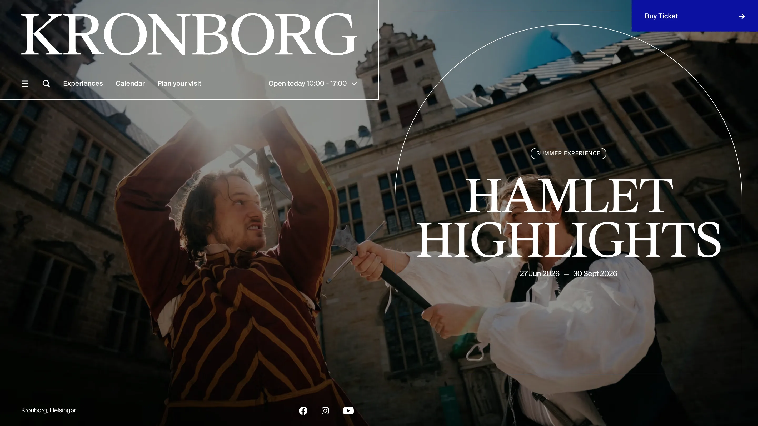
Kronborg's museum website design rests on one shape. A thin white arch, a single pixel wide, sits over the hero image and comes back on nearly every page below it. Nothing else on the site works that hard.
The castle stands in Helsingør, north of Copenhagen, and Shakespeare called it Elsinore. It's a UNESCO site run by the National Museum of Denmark. Spring/Summer in Copenhagen did the strategy, the structure, the design and the front-end.
The arch is most of the museum website design
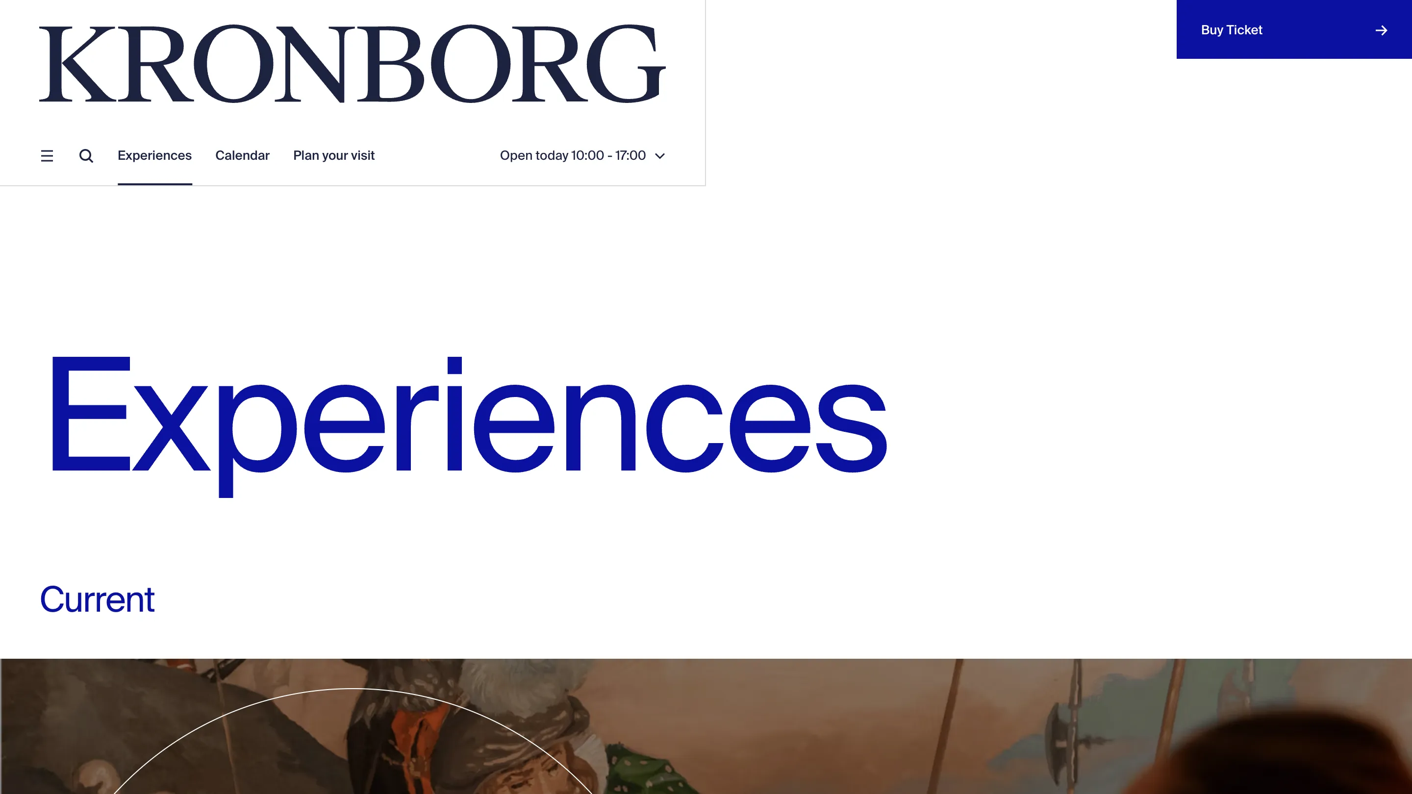
Open the inspector on the home page and the curve turns out to be a positioned div, 660 by 666 pixels at a 1440 viewport, with rounded-t-full and a one-pixel white border. Kronborg's theme also sets --theme-billboard-media-radius-t to 33em, which rounds the top of the image blocks themselves into the same sweep. So the arch shows up twice on the same picture: drawn as a line over it, and cut into its edge.
Kronborg is Renaissance. Its windows, its gates and its casemates are arched. Spring/Summer took that one line, repeated it, and then left the rest of the page alone. No texture, no card shadows, no gold, no ornament. One curve carries the whole building.
Two families, one weight each
The site loads four font files. Three weights of Suisse Int'l and one of Suisse Works. That's the entire type system.
The serif does the drama. "HAMLET HIGHLIGHTS", "WHO IS HAMLET?", the KRONBORG wordmark: Suisse Works at 88px, weight 400, uppercase, tracked in to -2.64px, with a line height of 83.6px. The lines sit closer together than the letters are tall. Set an all-caps serif that tight and it reads like an inscription cut into stone.
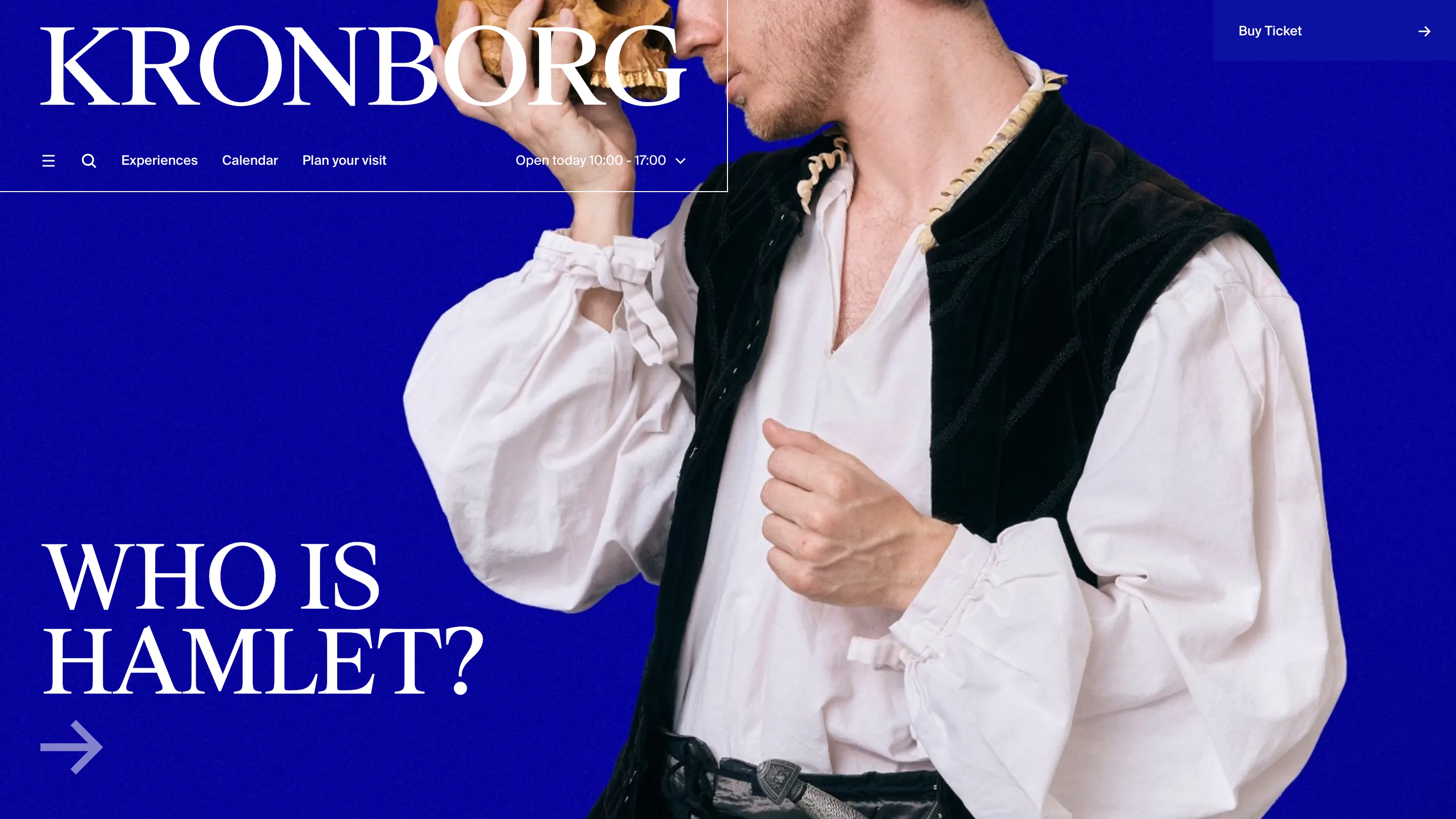
The grotesk does the museum. Section headings are Suisse Int'l at 36px on 37.8px, sentence case, also weight 400. "Experiences". "History of Kronborg". Same weight as the body copy underneath them.
So the hierarchy comes out of family, case and size. Nobody reached for a bold anywhere. On a site that has to hold a 500-year-old castle and a ticket funnel in the same layout, that restraint is why it never tips into brochure.
The header is a corner, not a bar
At 1440 the wordmark and the nav sit inside a box 720 wide and 190 tall, pinned to the top left. Exactly half the viewport. It carries a hairline on its right edge and its bottom edge only, so it reads as a window cut into the page. The ticket button sits alone in the opposite corner, filled solid with the blue.
Between the two corners, nothing. Three nav items, a hamburger, a search icon, and "Open today 10:00 - 17:00" with a chevron. The number a visitor actually came for gets a slot in the nav, and everything else goes behind the menu.
Blue is the text colour
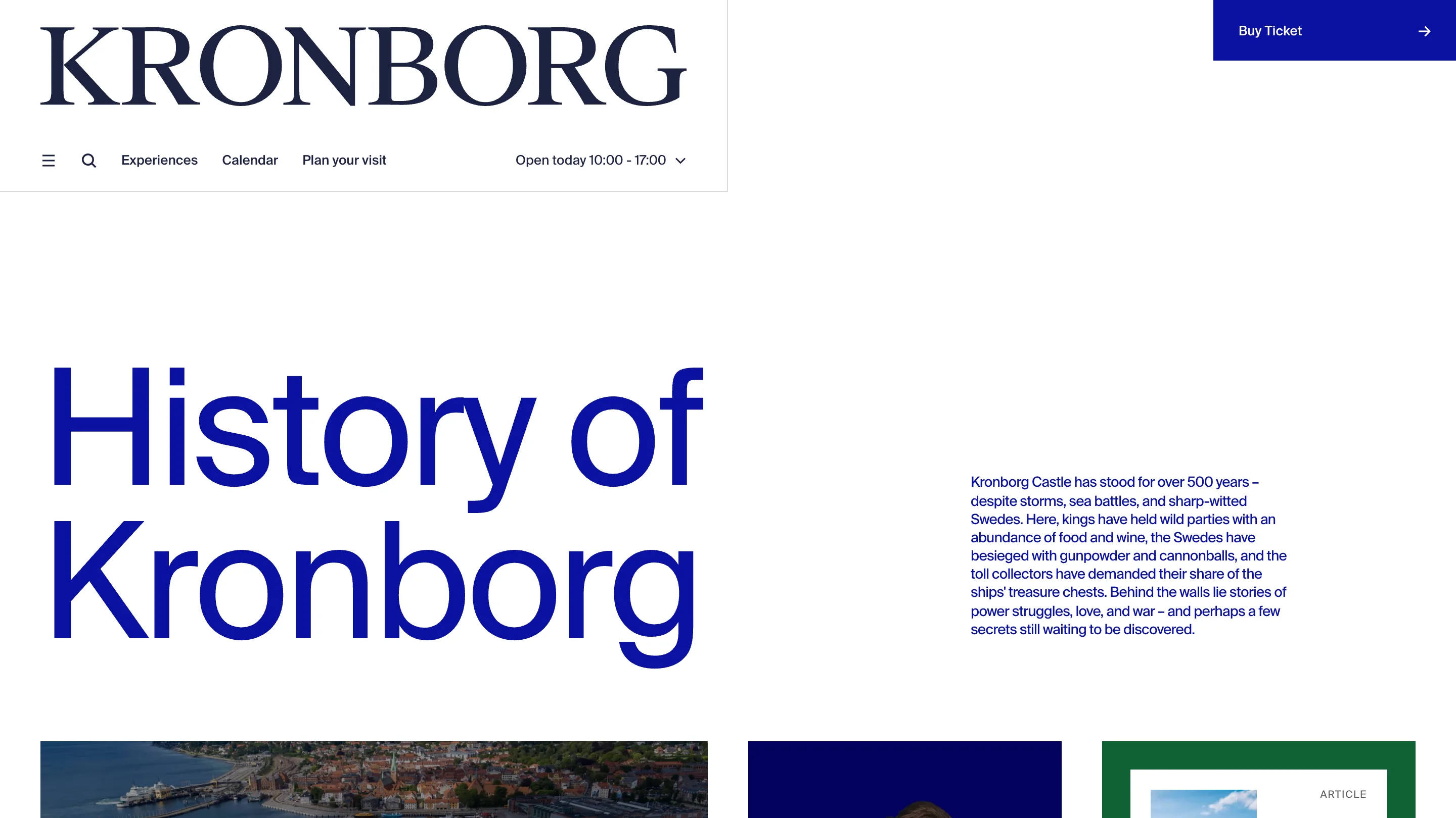
#0b11a0 does more work here than a brand colour usually gets. It's the ticket button. It's the flood behind the Hamlet page. It's the 88px page titles on white. And it's the 16px body copy, where near-black would have been the safe call.
Blue running text on white is a risk. It reads like a link and it costs contrast. It holds because a second colour, a navy at #1c2340, takes the headings that sit on white and keeps the page from washing out into one flat field. The wordmark is a CSS mask rather than an image, so it flips from white over photography to navy on the plain pages without a second file.
Ten more museums run the same code
The body tag says data-theme="kronborg-dk" and data-family="kronborg". The same stylesheet ships eleven themes: Krigsmuseet, Frihedsmuseet, Frilandsmuseet, Trelleborg, Kongernes Jelling, Liselund, Kommandørgården, Brede Værk, Frøslevlejren, Nationalmuseets Skibe and Kronborg. Spring/Summer built on the National Museum's existing platform, and each venue gets its own token set on top of it.
That's the part worth stealing. The arch, the 33em radius, the blue and the type pairing are all theme variables inside a shared component library. Kronborg avoids looking like a template because its theme layer reaches far enough to change the shape of an image block, not only its colour.