
Oath Biome's biotech website design tints the nav per page
Landscape gave the soil microbiology company one frosted pill for a nav, so every hero film paints it. Here's how that and two quiet videos carry the site.
Oath Biome sells microbes for tired soil, and its site by Landscape never lets you forget the ground. The best decision in this biotech website design is almost invisible: the navigation has no colour of its own. It borrows one from whatever film is playing behind it.
It's a small move with a big reach: it makes five environment pages, a science page and a home feel like one place.
A nav with no colour of its own
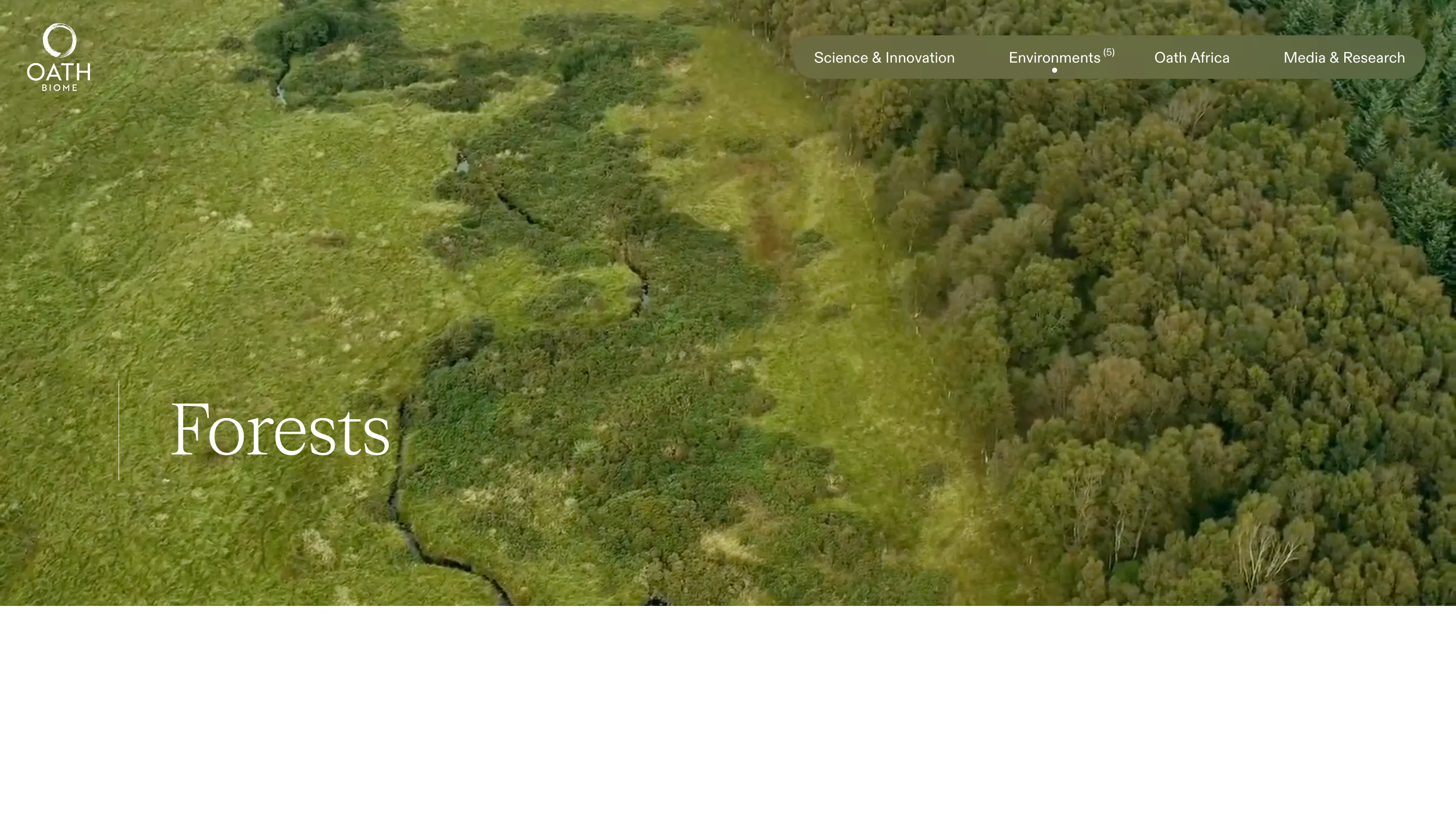
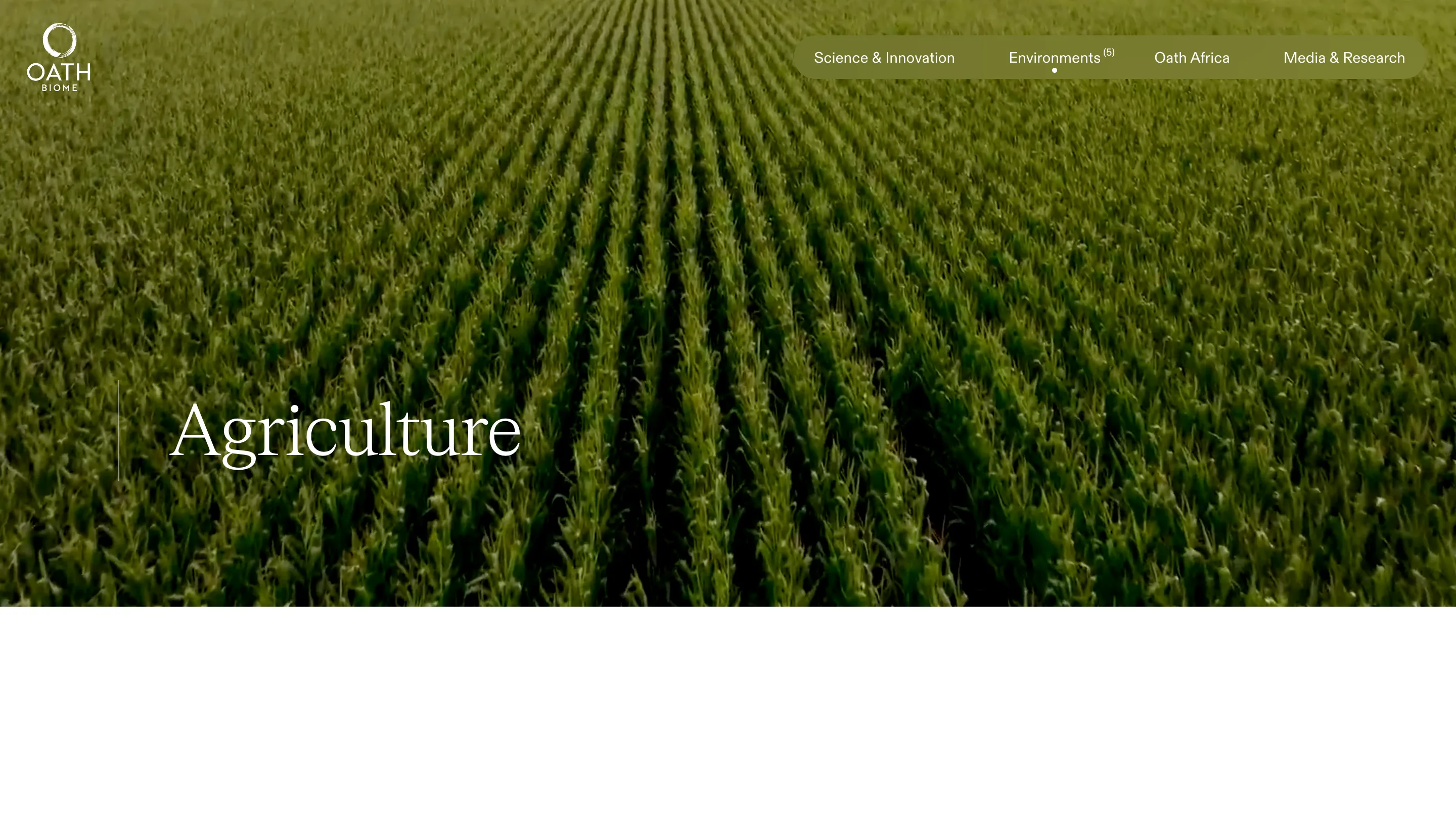
The menu is a single pill on the right of the bar: Science & Innovation, Environments, Oath Africa, Media & Research. Its fill is white at 10% opacity with a 100px backdrop blur and a 100px radius. That's the whole recipe. Over the petri dish on the science page the pill goes a cool lab blue. Over the cornfield on Agriculture it turns olive. Over the moor on Forests it's a darker moss.
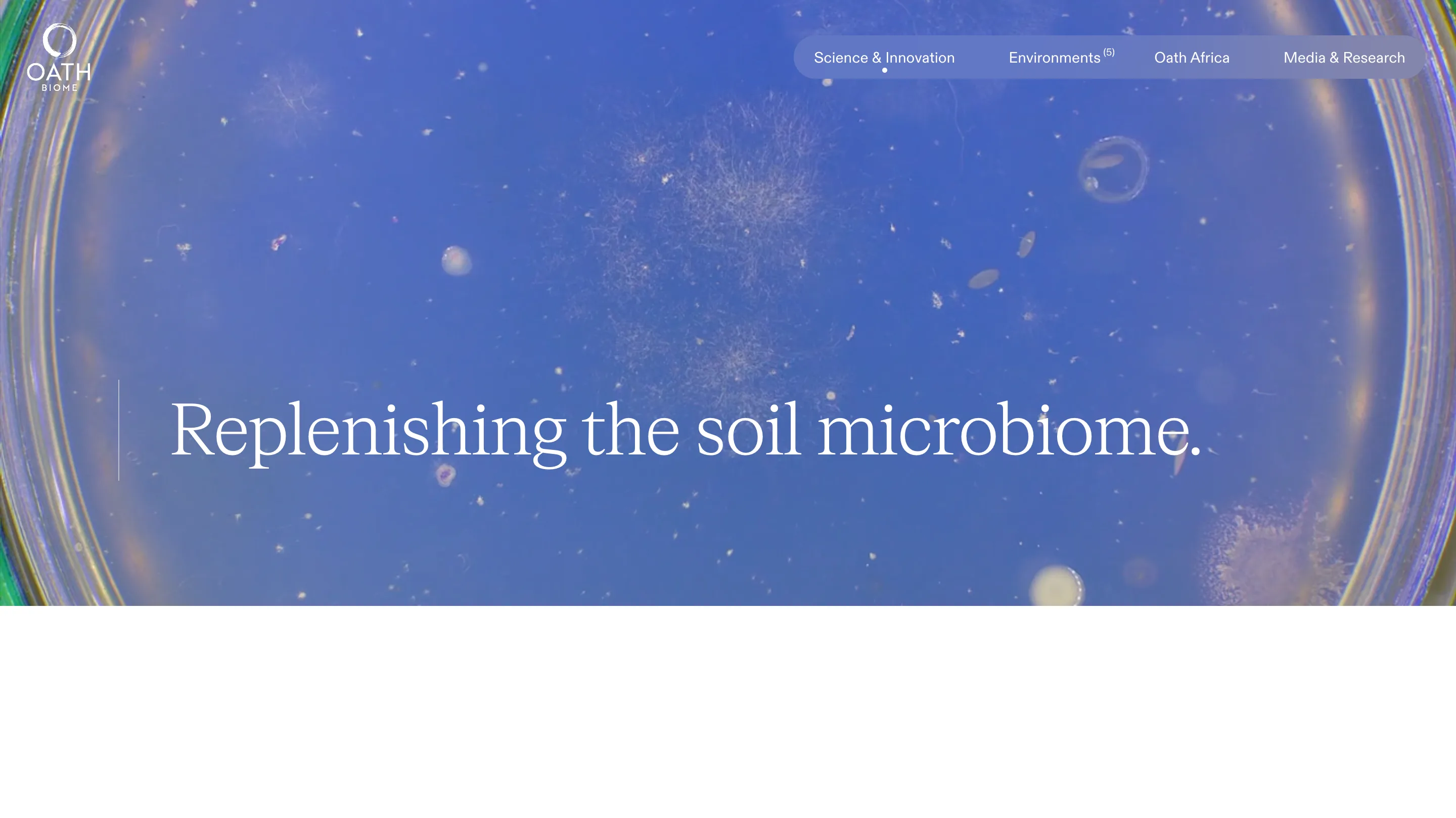
A solid bar would have needed a colour chosen for every page, or one colour that fought half of them. The blur does the art direction for free, and it keeps doing it as the video moves. The logo sits outside the pill in plain white, so the brand stays fixed while the menu breathes with the footage.
Two small marks sit on that pill. A dot under the current section tells you where you are without a heavier active state. And Environments carries a superscript count, (5), so you know the size of the drawer before you open it. Five is a number a reader can hold, and saying it up front makes the dropdown feel short.
Two films that share one row
The home skips a headline hero. It opens on two videos side by side: The Importance of Soil at 2:20 and The Science of Oath Biome at 3:37. The durations sit under each title in the same serif, which is a polite thing to do before asking for five minutes of someone's attention.
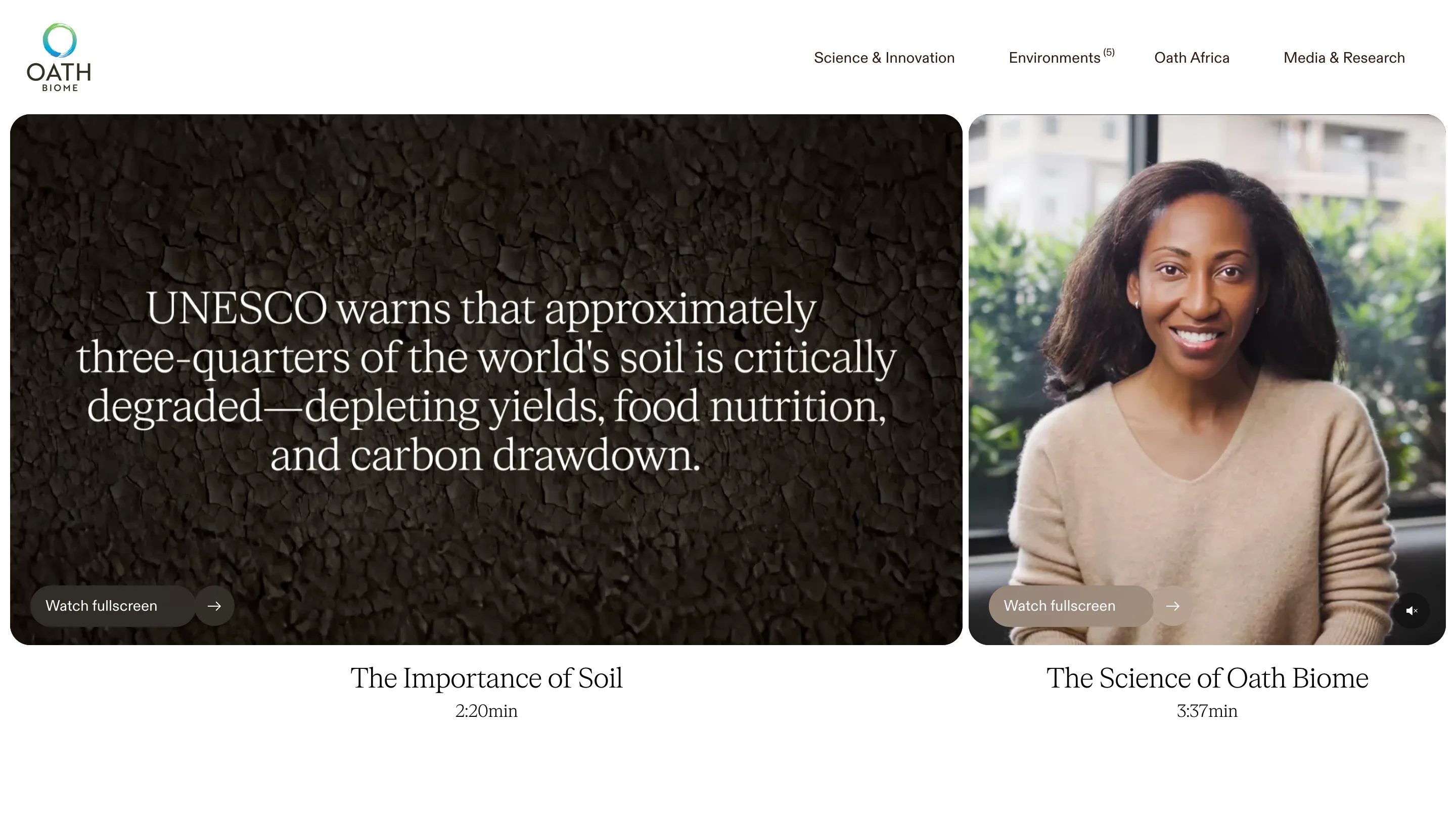
The row is a flex pair split 66.6 to 33.4, with a 6px gap and 20px corners. Hover the smaller panel and the two swap widths over 0.6 seconds on an ease-in-out curve, so the film you're looking at grows into the space. The panel height is tied to the viewport width, about 37% of it, so the pair keeps its proportions from a laptop to a wide monitor. Nothing autoplays with sound. Each film has a Watch fullscreen pill in the same frosted language as the nav.
It's an honest opening for a company whose product is a wettable powder. There's nothing to photograph on a shelf, so the site shows the problem (cracked earth, a UNESCO figure on degraded soil) and a person explaining the fix.
A serif for the claims, a grotesk for the controls
The type split is clean. FK Roman Standard, a serif from Florian Karsten, sets every headline and caption. ABC Diatype from Dinamo runs the menu, the buttons and the body. You can tell which words are the company talking and which are the interface by the shape of the letters alone.
On the environment pages the serif gets one line of space to itself: Agriculture, Forests, Grasslands, each set large in white low on the hero, with a thin vertical rule to its left. The rule is the only ornament on the page. It gives a one-word title something to stand against so it doesn't float on a moving field of corn.
Pacing a mission statement
Under the films, the mission runs as a pinned scroll section a full viewport tall, with the lead line in Diatype at up to 37px and the rest in a lighter 27px. You read it at the speed you scroll, one thought at a time, and the long words about genome sequencing and fungal consortia get room instead of a paragraph block.
The lesson for anyone building a science site is the nav. One translucent pill, three CSS properties, and the footage of every page decides its own accent. Landscape spent its effort on the films and let the interface take its colour from them.