Dragonfly's ASCII website design frames the page in DFLY
Studio Freight drew Dragonfly's site as text characters on black, pinned four serif letters to the corners, and set 122 companies as an index.
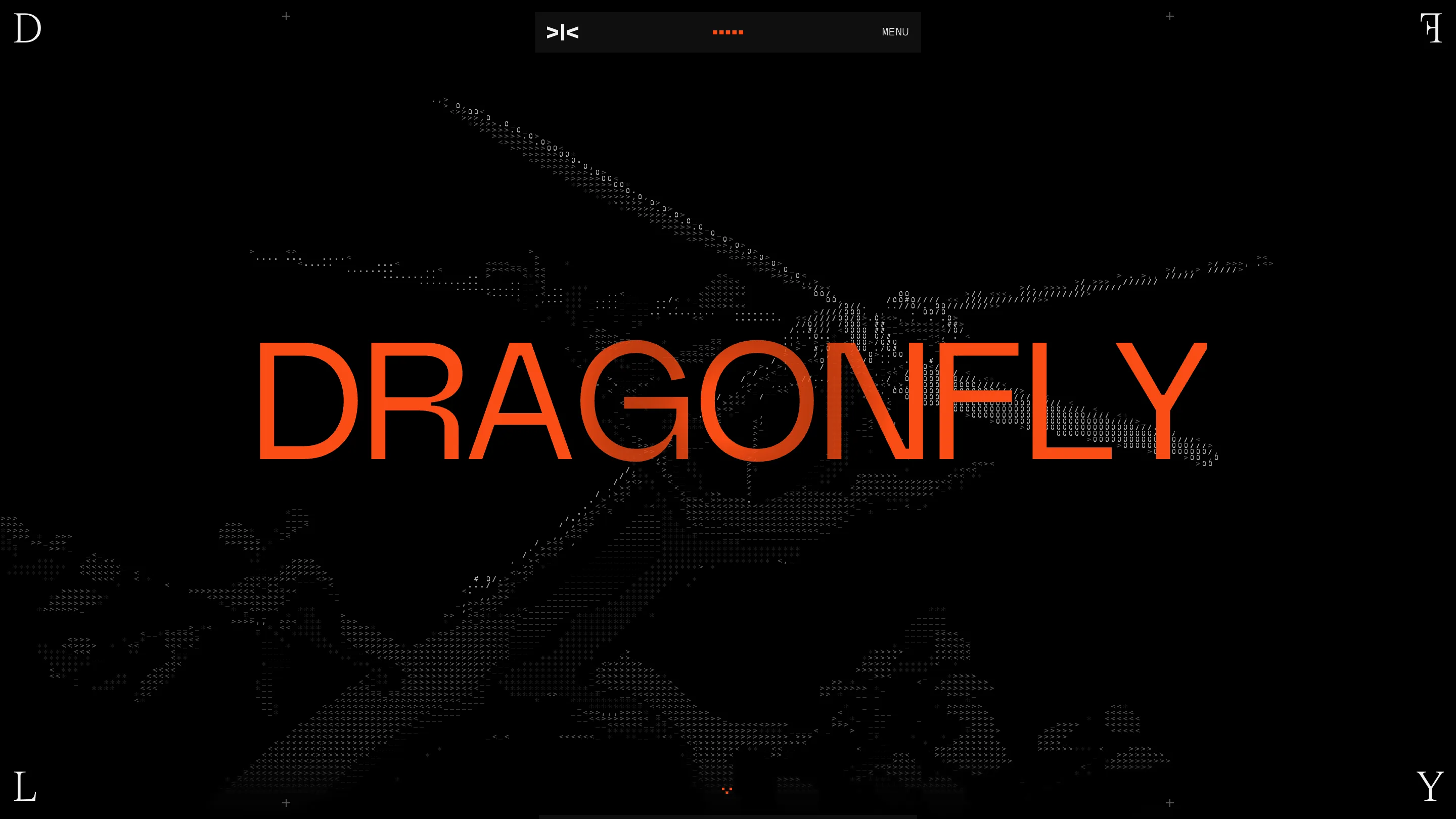
The first thing on Dragonfly's homepage is a dragonfly you can barely see. It's drawn in slashes, zeros and hash marks on near-black, and it only resolves into an insect when you lean back from the screen. Studio Freight rebuilt the crypto fund's site around that one rendering, and Awwwards gave it Site of the Day on 22 July. The ASCII website design runs the whole length of the page, and it carries more of the layout than a motif usually does.
The wordmark is the frame
Look at the four corners of the viewport. Top left, a D. Top right, an F flipped on its vertical axis. Bottom left an L, bottom right a Y. D, F, L, Y: the consonants of DRAGONFLY, broken apart and pinned to the edges in a thin high-contrast serif that appears nowhere else at that size. They don't move when you scroll. Every section you pass sits inside those four letters, so the name gets stated once, structurally, and never has to be repeated in a header.
The nav is a small dark pill floating at top centre: a >|< glyph on the left, five orange marks in the middle, the word MENU on the right. No labels, no logo, same width all the way down. It reads as a piece of hardware sitting on top of the page rather than a bar attached to it.
Sections labelled like a spec sheet
Each block gets a number and a rule. 03 in orange, TEAM in white grotesk under it, SEC-03 in mono out at the left margin, a hairline running the full width. The numbers earn their place here, because this is one long page with a handful of stops and the count tells you where you are. For a fund that sells itself on research, the manual register is the right one.
Portraits that give up half the frame
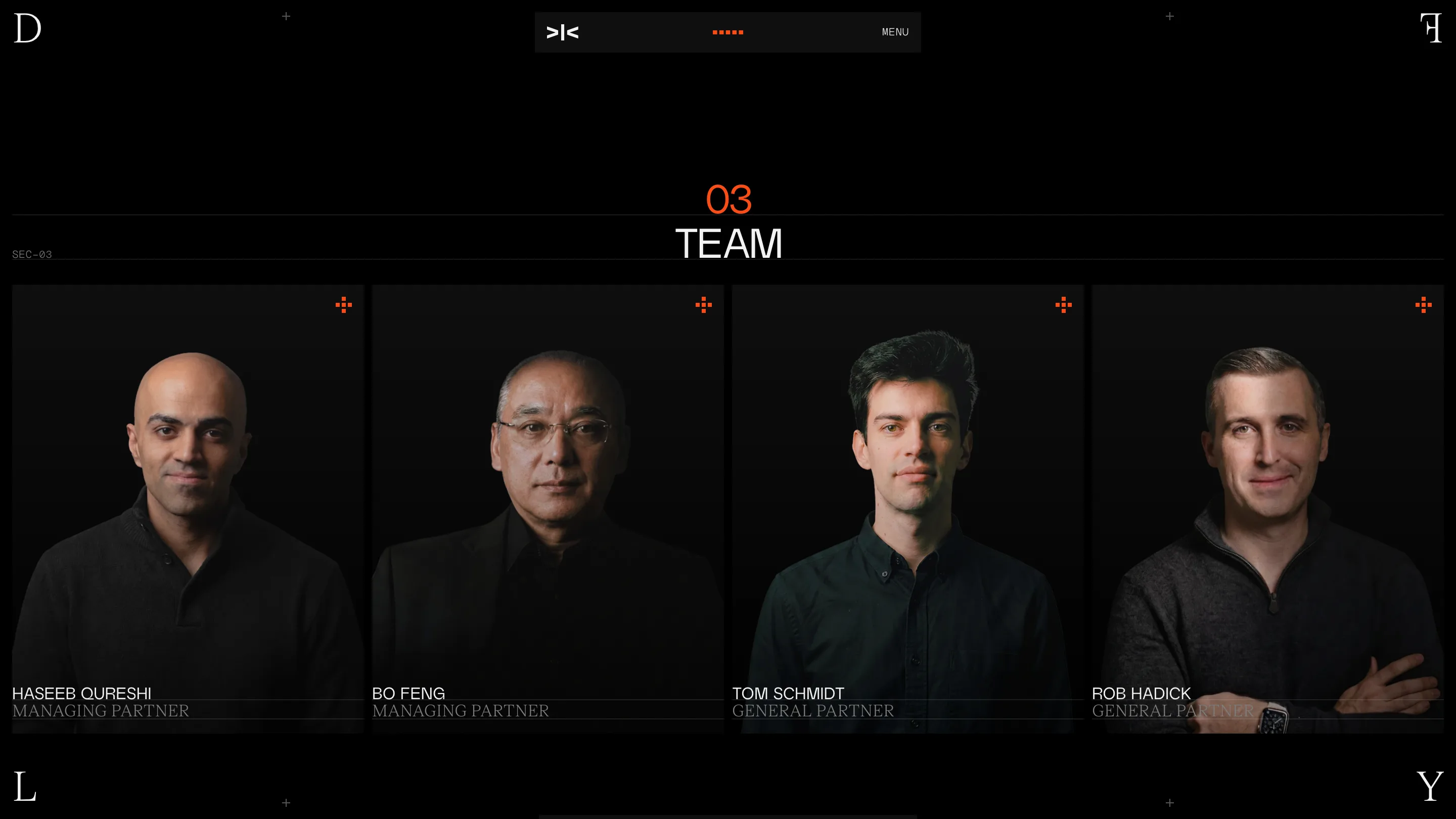
The team grid is four portraits shot low-key on black. Everyone wears black, the key light lands on the face and one shoulder, and the rest of the body dissolves into the page colour. Nothing is cropped into a circle, nothing is masked in CSS. The photography does the masking. Names sit in grotesk caps at the bottom of each cell, roles in a grey serif below, a hairline between the two.
That's a shoot brief rather than a styling decision, and it's the kind of thing that makes a site feel like one object instead of a template with assets dropped in.
The portfolio is an index
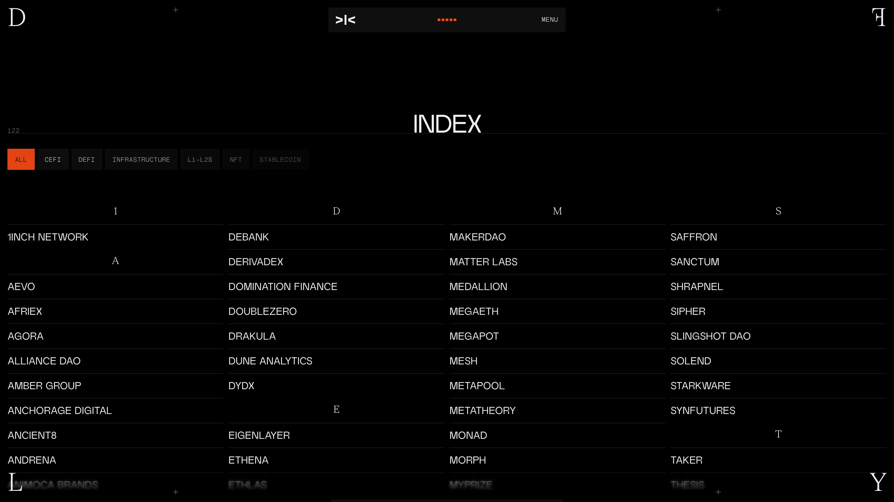
Under a heading that reads INDEX, with a small 122 sitting at the left, the portfolio drops the logo grid most fund sites reach for. Four columns, alphabetical, one company per row, a hairline under each. Serif capitals mark the letter breaks. Filter chips across the top: ALL, CEFI, DEFI, INFRASTRUCTURE, L1-L2S, NFT, STABLECOIN, active one in orange.
122 logos in a grid would be noise, and it would flatten a Series B lead into the same tile as a seed cheque. A list scans. You can find a name in it, which is the actual job. Studio Freight's case study on the earlier version describes letting you keep several company modals open at once and close them all with ESC, and the index keeps that instinct: treat the portfolio as data, then make the data legible.
The footer changes register
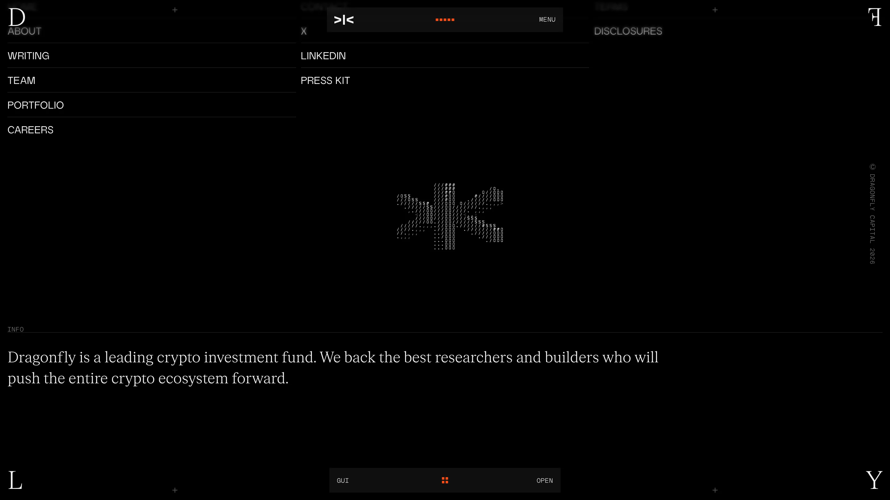
At the bottom the ASCII dragonfly comes back small, and the fund's one-line description is set in the serif at proper reading size: "Dragonfly is a leading crypto investment fund." It's the only stretch of warm type on the page, and after ten screens of mono labels and grotesk caps it lands like someone taking their voice down. A thin bar sits under it, GUI on the left, OPEN on the right.
Three typefaces, one accent colour, one image technique. Everything else is rules and space.