
Carrière Scène's campaign website design is a gig poster
MamboMambo built a careers campaign for Québec's indie venues like a gig poster, then made every sector card carry the count of courses behind it.
Carrière Scène sells careers backstage at Québec's independent music venues, and it looks like the posters taped up outside them. That's the whole bet of this campaign website design: a recruitment site for sound techs, bar managers and administrators that refuses to look like a recruitment site. MamboMambo, the Montréal co-op behind it, built it for Les SMAQ (Scènes de Musique Alternatives du Québec) with funding from the Gouvernement du Québec. Under the poster sits a careful directory, and the two never get in each other's way.
A campaign website design built like a gig poster
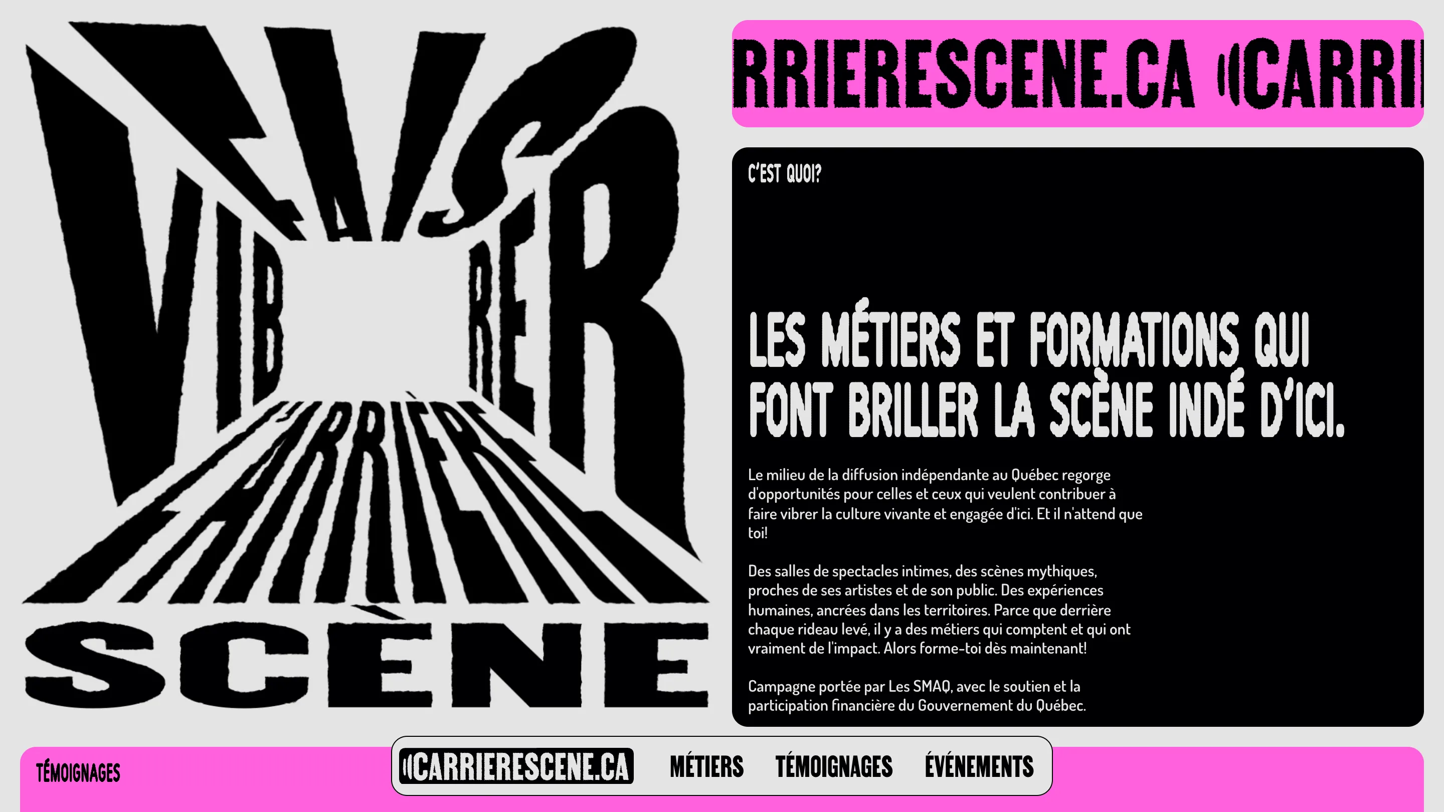
The home opens on a lettering piece that reads "Fais vibrer l'arrière-scène". The words are pulled into a vanishing point, as if you're standing at the back of a room looking at a stage. Every letter has a torn, photocopied edge. Next to it, a black panel with rounded corners holds the pitch in a condensed display face (Early Edition JNL), set in caps with the same rough edge.
Above that panel, the domain runs as a ticker: CARRIERESCENE.CA, again and again, in a pink bar. A campaign lives on posters and Instagram stories, so the address is the thing you need to remember, and the site repeats it at display size.
The body copy goes the other way. It's Dosis, a rounded sans at a modest size, set in short paragraphs. The display type does the shouting so the reading type doesn't have to.
One colour per room
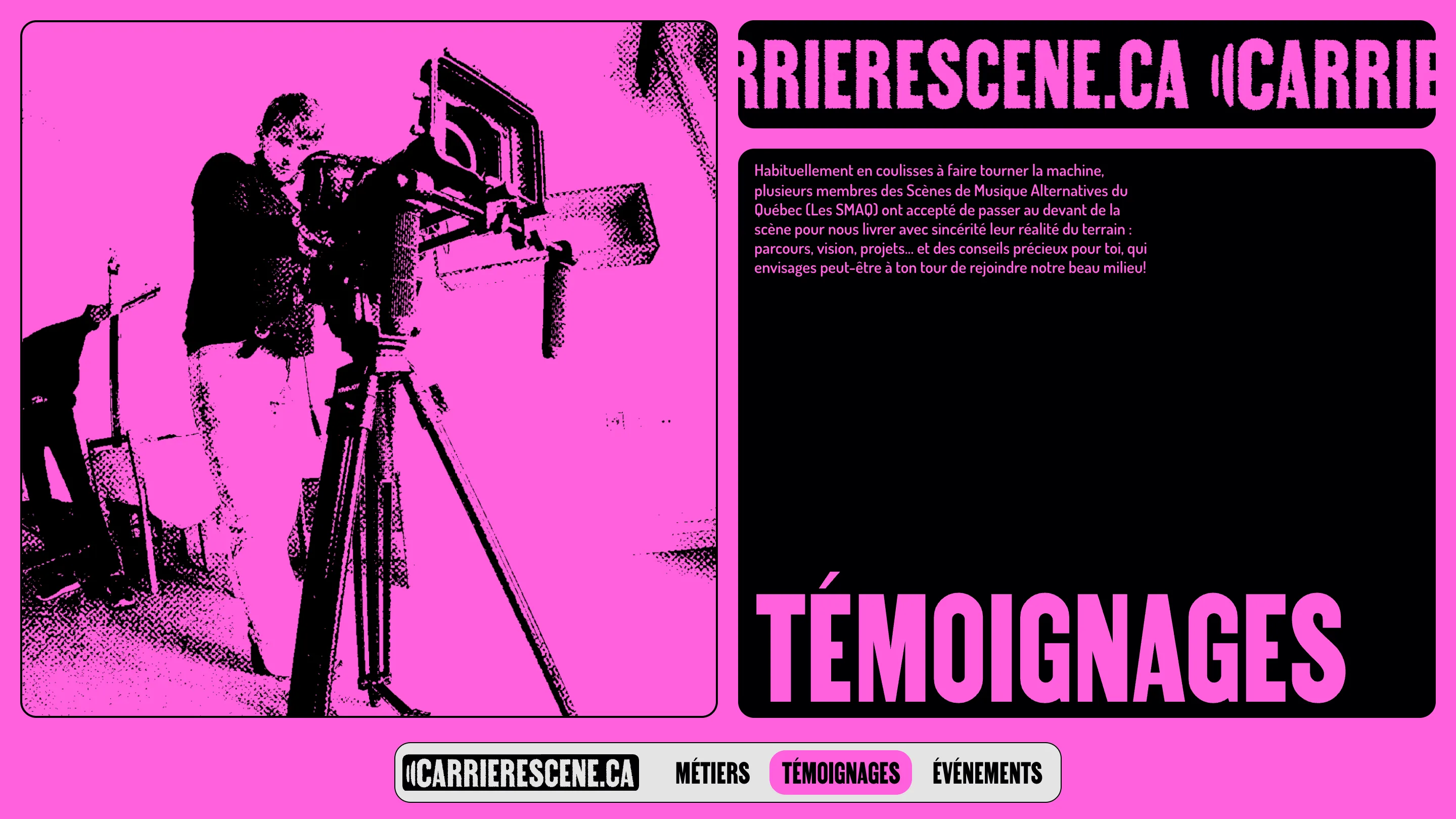
Each section gets its own ground. The home is a pale grey with pink accents. Métiers is a soft blue. Témoignages is the full hot pink. The photographs follow: they're printed as two-tone halftone, black dots on whatever colour the page is wearing, so the knobs of a mixing desk on the Métiers page turns blue and a camera operator on Témoignages turns pink.
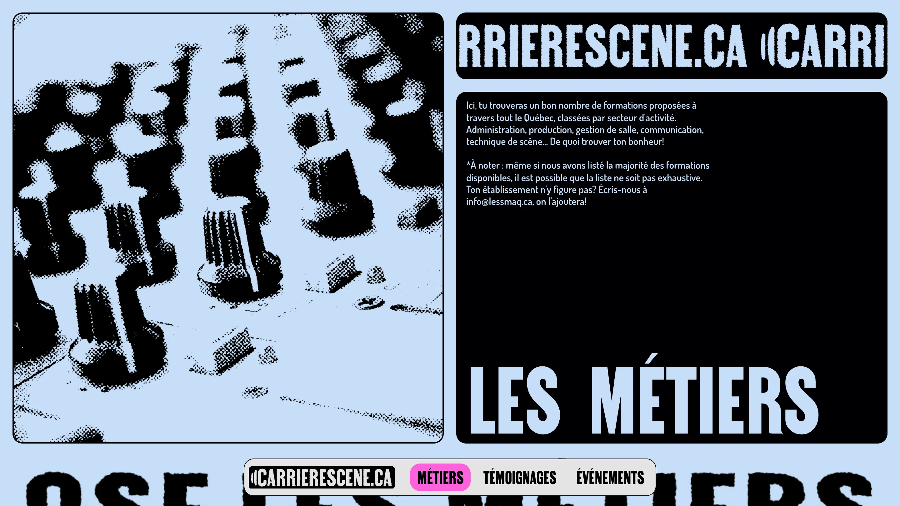
It's a cheap trick in the best sense. Any photo, shot by anyone, comes out looking like part of the same print run. For a campaign that leans on video testimonials from venue staff across the province, that matters: the material arrives uneven and leaves consistent.
The navigation stays put while the colours change. A pill sits pinned to the bottom of the screen with the logo and three links, and the current section lights up in pink.
The numbers on the cards
Here's the detail that makes the site more than a mood. The home lists nine sectors, and each card carries a three-digit number: 012 for stage technique, 034 for venue management, 054 for administration. It reads like a track number on a setlist, and it's a count of courses.
Open Gestion de salle and the 034 comes back as "34 formations au Québec", sorted by region: 3 in Capitale-Nationale, 23 in Montréal, and so on. Each listing names the school, the city and the programme, with a link out. The nine counts on the home add up to 181 listings. The decoration was data all along.
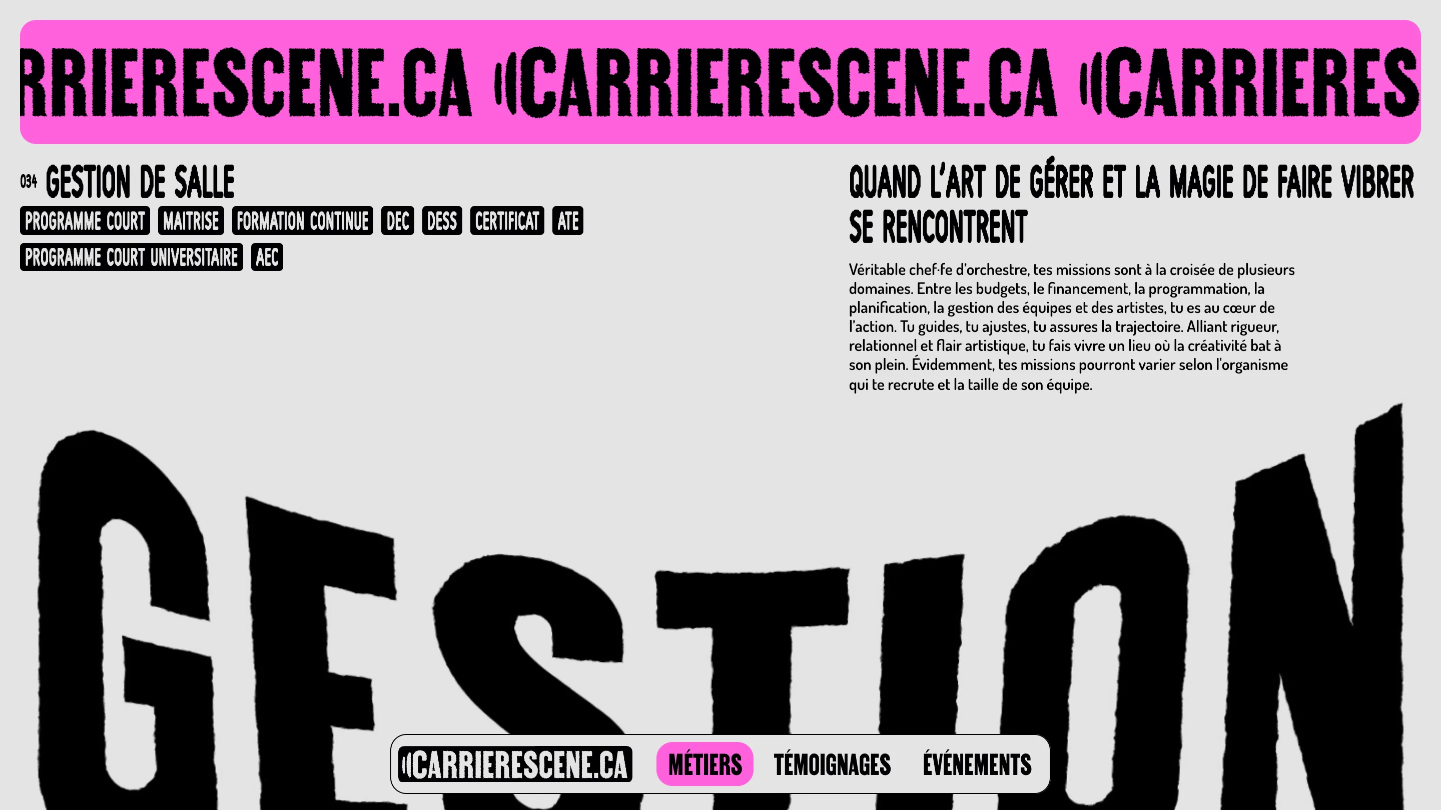
The sector pages keep the poster voice on top. Programme types (AEC, DEC, DESS, certificat) sit in a row of black tags, the job description reads in second person ("tu guides, tu ajustes"), and the sector's name is set huge and bent across the page. Then the page settles into a plain, scannable list of schools. A teenager gets the feeling first and the facts second.
Why it works
The site talks to its reader in tu, the way someone at the merch table would. It borrows the look of the room they already love and puts a real directory under it. The rough type, the per-page colour and the halftone are one system, cheap to extend: a new sector or a new testimonial needs no new design.
If you're designing a campaign site for a sector that's short of people, look at how the numbers are placed. The count of courses is the most persuasive thing on the site, and MamboMambo set it where a band would put a track number.