Made Thought's agency website design: one screen per sector
Made Thought's new site splits its work into eight full-screen sectors, with a wordmark that shrinks into the header and a filter pill always in reach.
Made Thought's new site sorts a branding studio's work by what the client sells. Eight sectors, Beauty, Culture, Innovation, Hospitality, Place, Taste, Fashion and Design, each get a full screen of their own on the home page. That one decision is the whole agency website design, and the rest of the site follows from it.
The London and New York office, now part of AKQA, has a new madethought.com, featured on siteinspire this week with the build credited to Josh Harrison.
A wordmark that starts as the hero
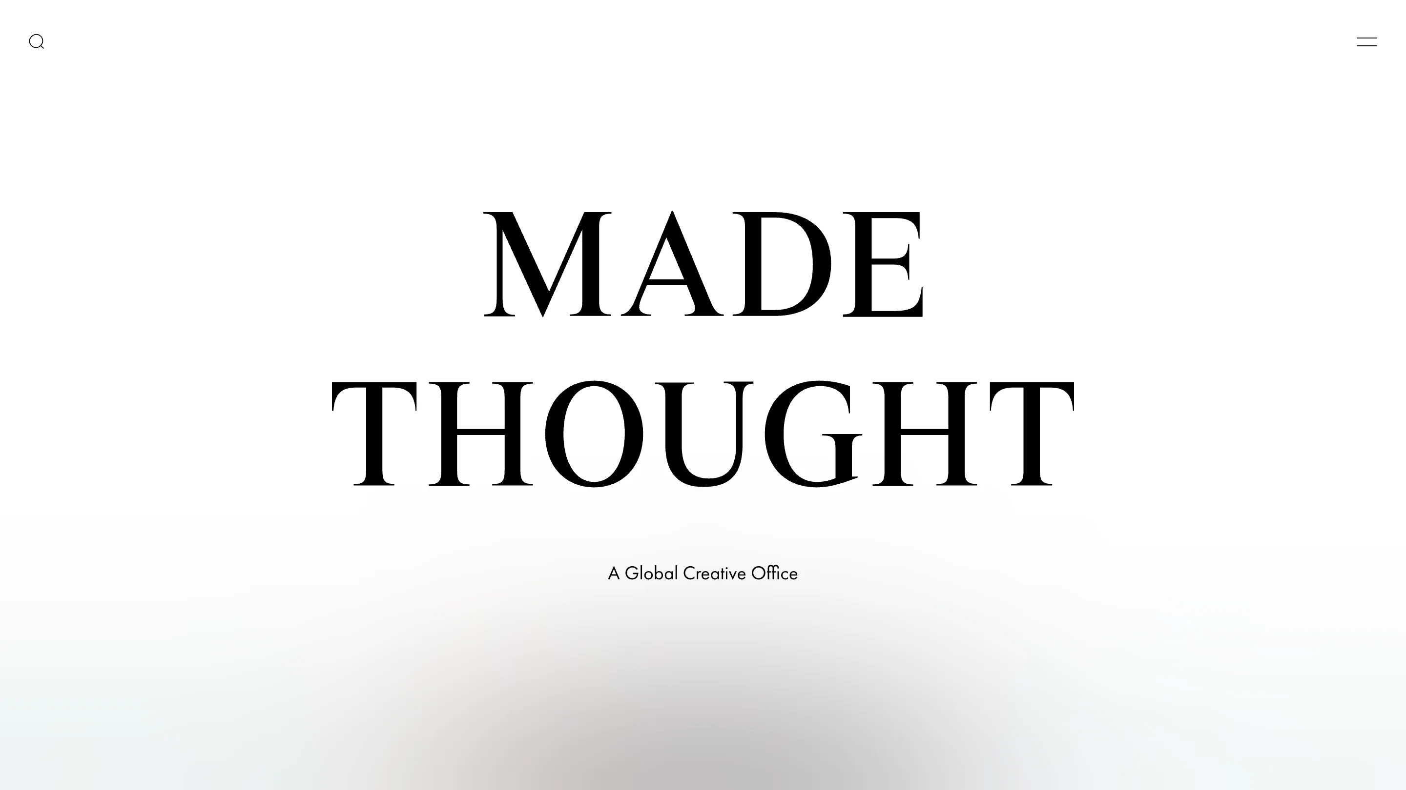
The home page opens on white with two words set huge in a high-contrast serif: MADE THOUGHT, stacked, and "A Global Creative Office" in a small geometric sans underneath. There's no reel and no headline. Scroll, and the wordmark shrinks into the header, centred between a search icon and a two-line menu.
Every page after that wears the same small stacked logo at the top. It's a cheap trick to describe and a hard one to get right, because the hero and the header are the same object at two sizes. The serif carries the brand. The sans does every job that needs reading at 14px: captions, filters, the menu.
Eight sectors, one screen each
Below the wordmark, the page snaps through eight full-bleed panels. Each one plays a video or a still from that sector's work, and the header flips to white the moment it sits over an image. The markup says so plainly: every panel carries its own header colour, so the logo never has to guess.
At the foot of each panel sits a strip of thumbnails. Tap one and the panel swaps to that project and the picked thumbnail dims; "See Project" takes you to the case study. So a fragrance director lands on Beauty and sees Maison Margiela, Charlotte Tilbury and Dolce&Gabbana without scrolling past adidas or a hotel.
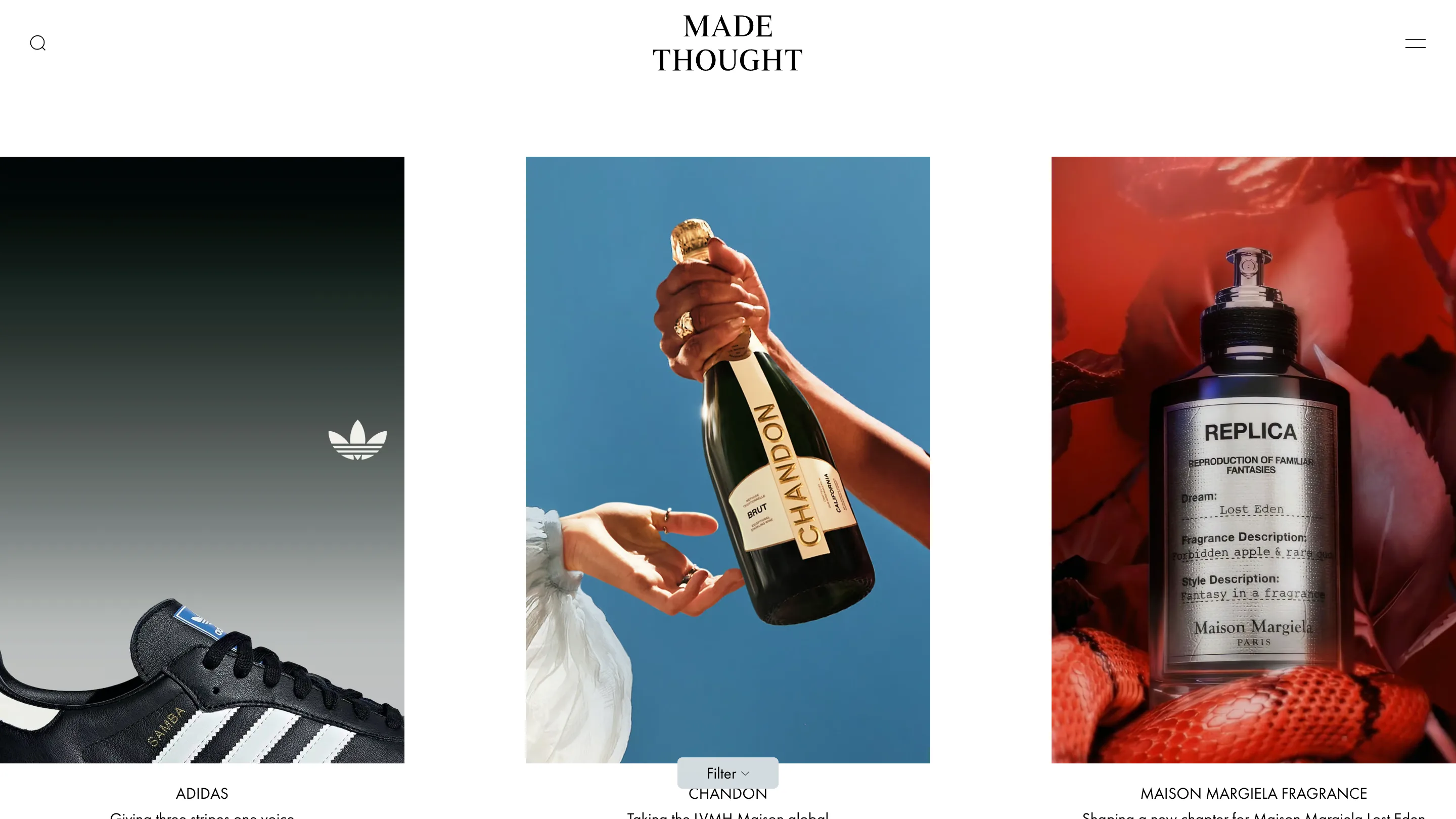
The work index keeps the same logic in a quieter form. Tall portrait images run in three columns, each with a capitalised client name and a one-line brief: "Giving three stripes one voice" for adidas, "Taking the LVMH Maison global" for Chandon. A grey pill reading "Filter" floats at the bottom centre of the screen and opens the sectors again. It stays put while the grid moves, where your thumb already is.
Case studies lead with the picture
A project page gives the first 85% of the screen to film. On Maison Margiela Fragrance's Lost Eden, red petals drift past the camera at full bleed, the logo goes white over them, and only then does the title arrive, in the serif at display size, with a single line in the sans: "Turning forbidden fruit into a sensorial new world for Maison Margiela's REPLICA Fantasies."
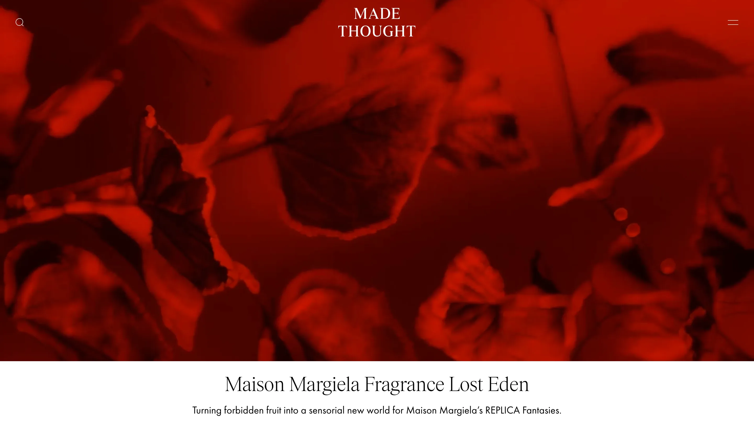
Two type sizes and one line of copy. For a studio that sells to luxury houses, holding the words back is the pitch: the client's world fills the frame, and the studio's voice is a caption.
The serif does the talking on About
The About page swaps roles. The serif comes down from wordmark size to a big reading size and sets three centred lines: "Made Thought is a global creative office based in London and New York, driven by an obsession with intelligent creativity." Under it, a statement starts to build across the width, "We build" on the left and "tomorrow's" in grey italic on the right, waiting for the scroll to fill it in.
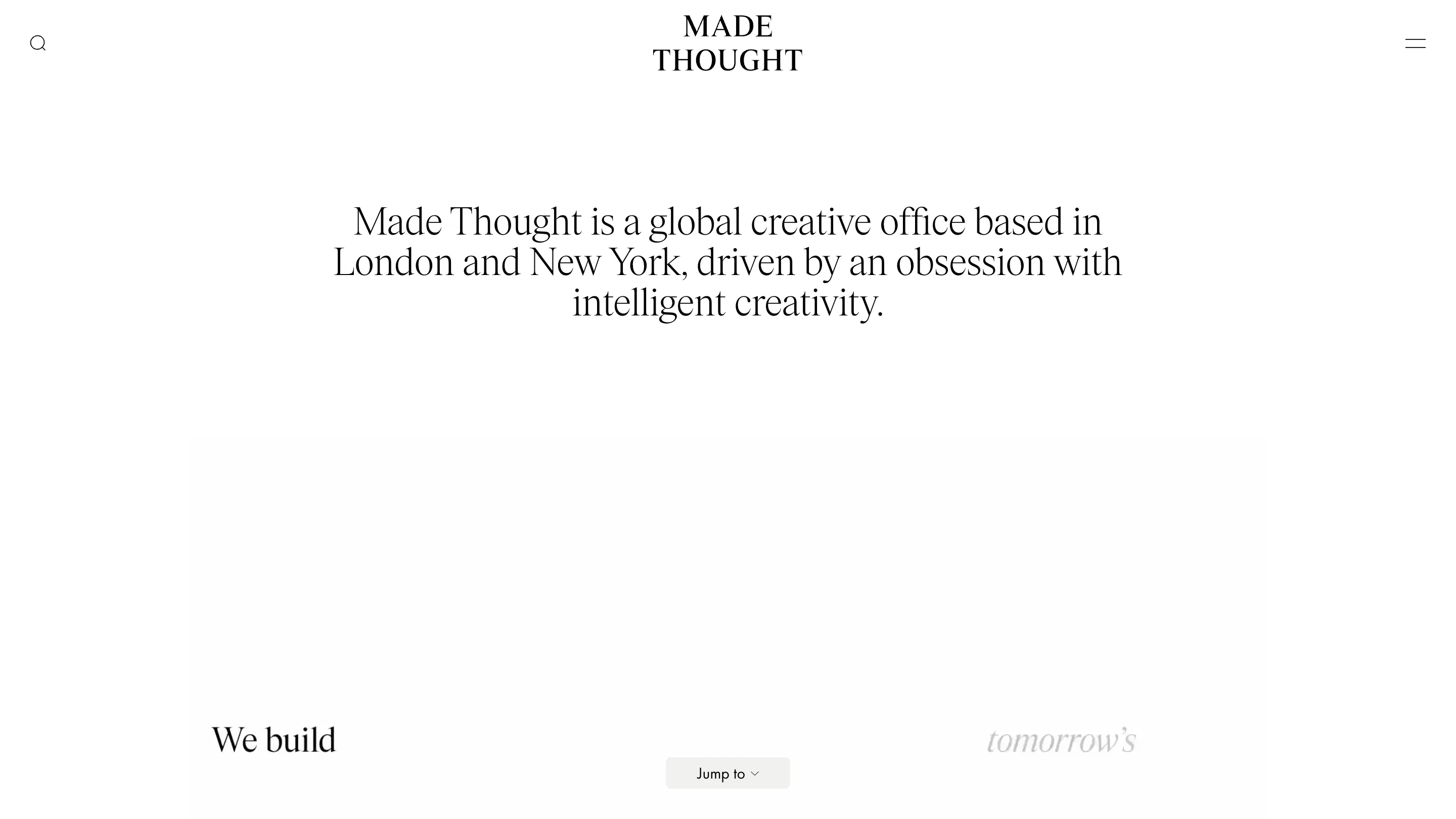
The floating pill comes back here as "Jump to", the same button with a different job. In the footer, two live clocks sit under the addresses, 1 St John's Lane and 72 Spring Street, ticking in London and New York time.
What to take from it
Plenty of studio sites have a sector filter. Giving each sector a full screen, a header that reads its own background and a thumbnail strip that swaps work in place is the part worth copying. A visitor from a perfume house sees perfume first, in under a scroll, and a visitor who wants everything has the Filter pill a thumb away.