
Estudio Niksen lets you set how dense its e-commerce grid gets
A line above every collection reads VIEW: 2 - 4 - 8. Pick a number and the grid reflows from lookbook to contact sheet. The rest of the site is built so that trick holds up.
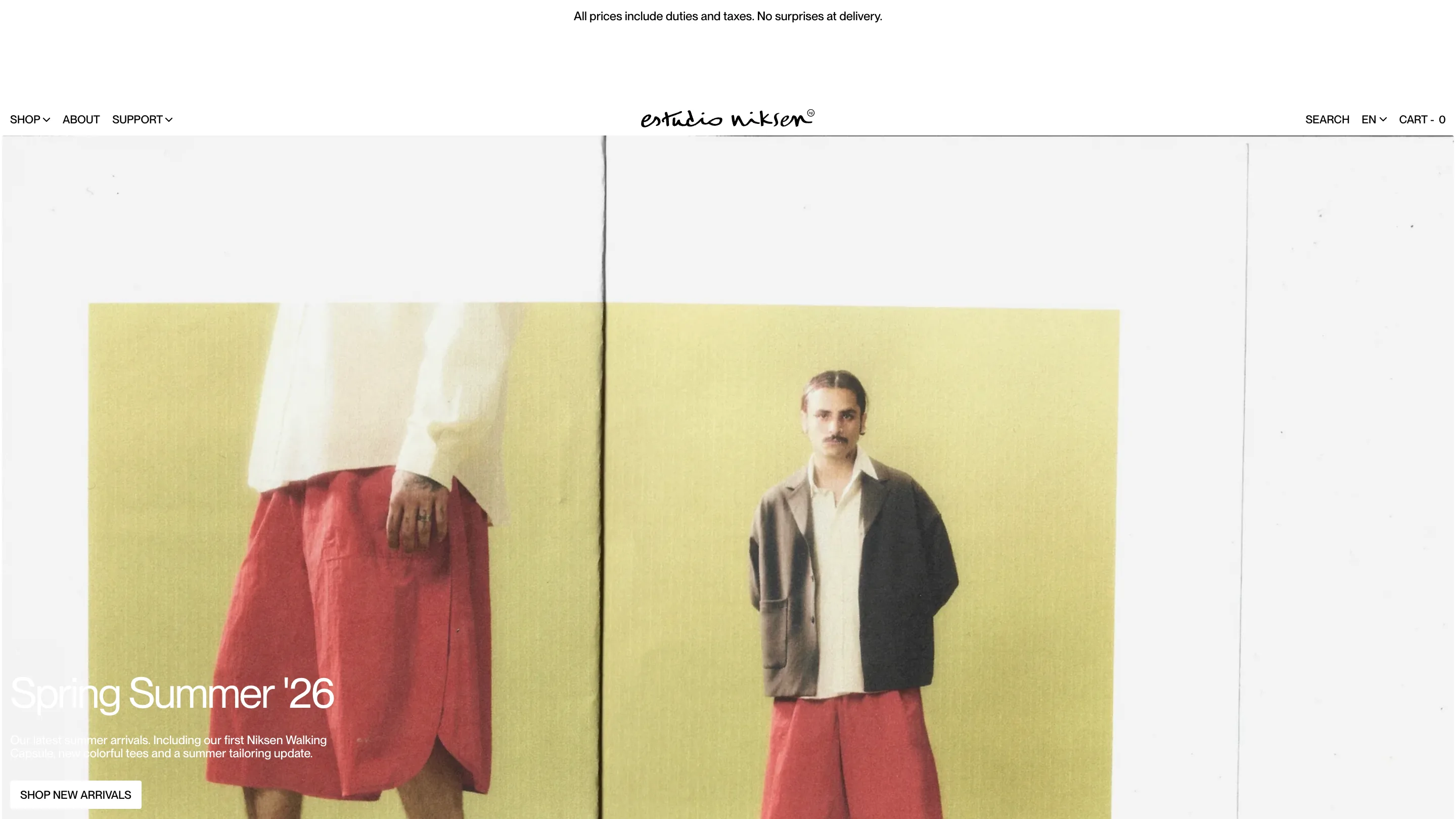
Above every collection on Estudio Niksen there's a small line that reads VIEW: 2 - 4 - 8, with the current number underlined. Click a different one and the e-commerce grid reflows on the spot. Two across gives you a lookbook. Eight gives you a contact sheet. The Montreal label sells clothes for what it calls intentional living, and the site was built by Domaine Public, also in Montreal.
A density switcher isn't rare. What's rare is a shop whose photography and layout are disciplined enough that all three settings look deliberate.
The grid has no gutters
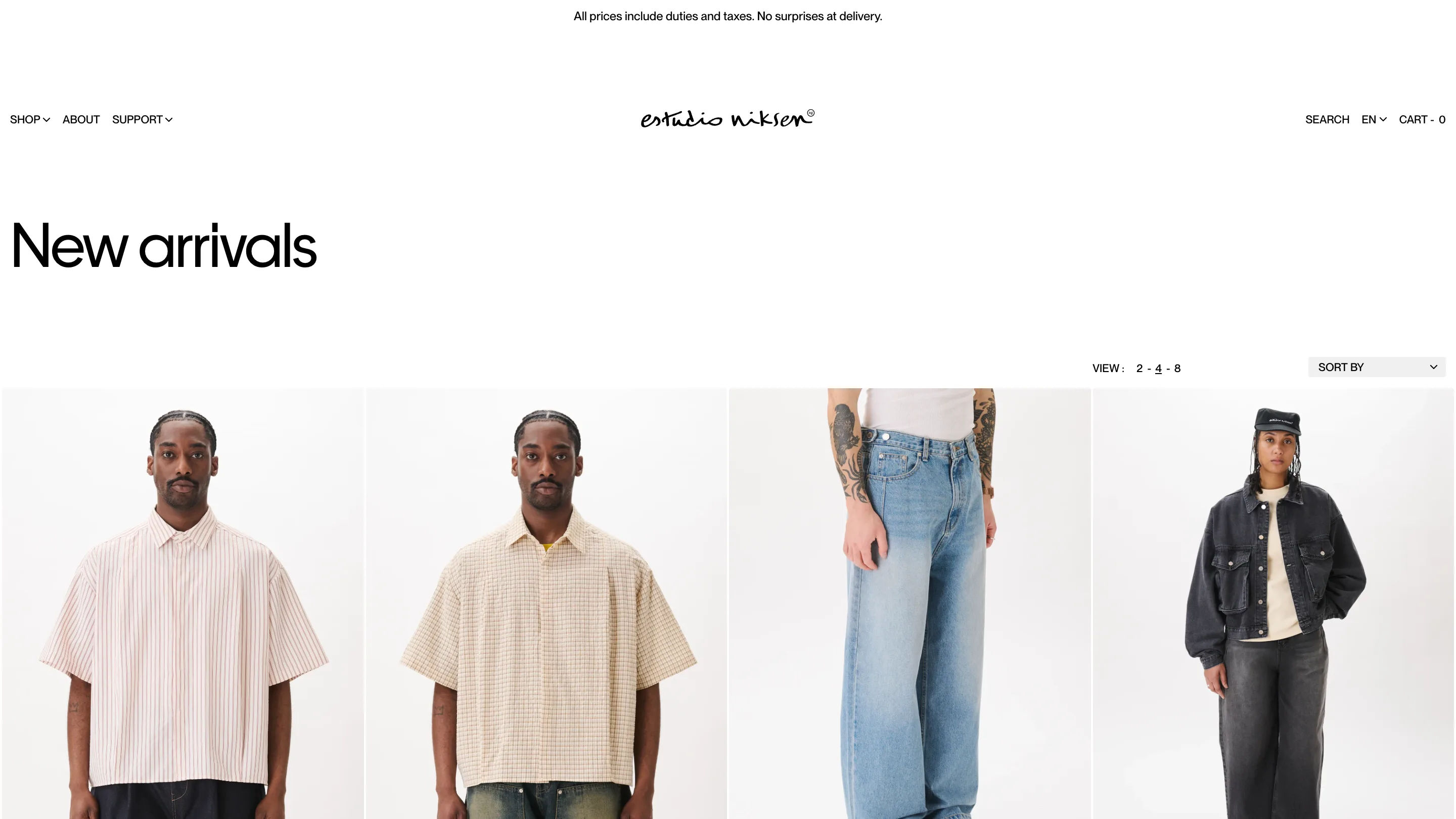
Products sit edge to edge. No gap between cards, no border, no rounded corner, no shadow, no hover lift. Each image runs straight into its neighbour and the row spans the whole viewport, from the left edge of the browser to the right.
That only works because every shot is framed the same way: model front on, cropped at roughly the same height, standing at the same distance against the same pale studio sweep. When four of those touch, the backgrounds fuse into one field and the only thing that changes across the row is the garment. At eight across it reads like a rail in a shop. At two across, the same framing gives you a picture wide enough to see the stitching.
Most e-commerce grid design spends its effort on the card: the border radius, the shadow, the quick-add button that slides up on hover. Here there's no card at all. The photo is the interface.
Almost nothing sits above the products
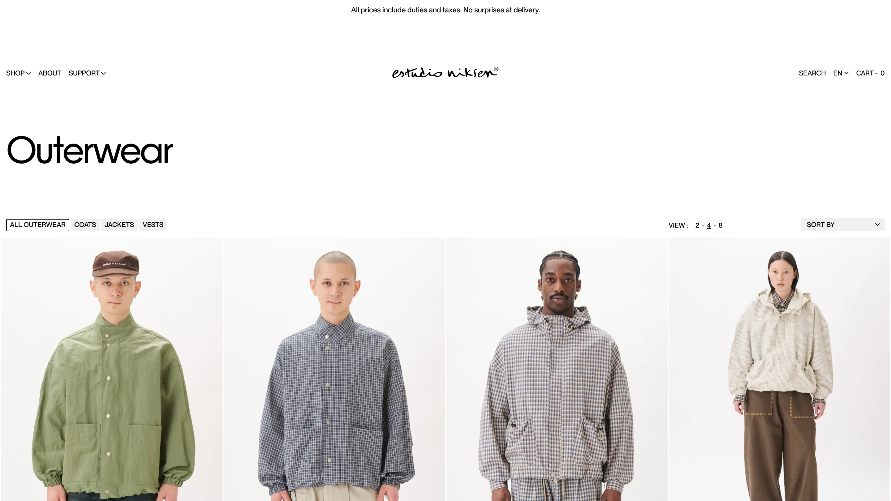
The category title is set enormous, lowercase after the cap, in a plain grotesk, and it's alone. No breadcrumb under it, no product count, no marketing paragraph about the season. Then a band of white about the height of the title itself, then the controls, then the grid.
The controls are one line. Filters on the left as small boxed labels (ALL OUTERWEAR, COATS, JACKETS, VESTS), the active one outlined instead of filled, so the state reads as a frame rather than a colour. VIEW and SORT BY on the right. That's the entire chrome of the page. Whatever the density setting, the header always looks the same, which is why switching from 8 to 2 feels like changing lens rather than changing page.
Small thing worth stealing: the cart is written CART - 0. Words and a number, no bag icon, no red badge.
One piece of handwriting, used twice
The wordmark is a script, drawn by hand, with a small ® tucked on the end. It's the only warm mark in a site otherwise set entirely in a neutral sans. Sitting centred in a white header above a hard-edged grid, it does the whole job of making the place feel like a shop somebody runs rather than a catalogue somebody generated.
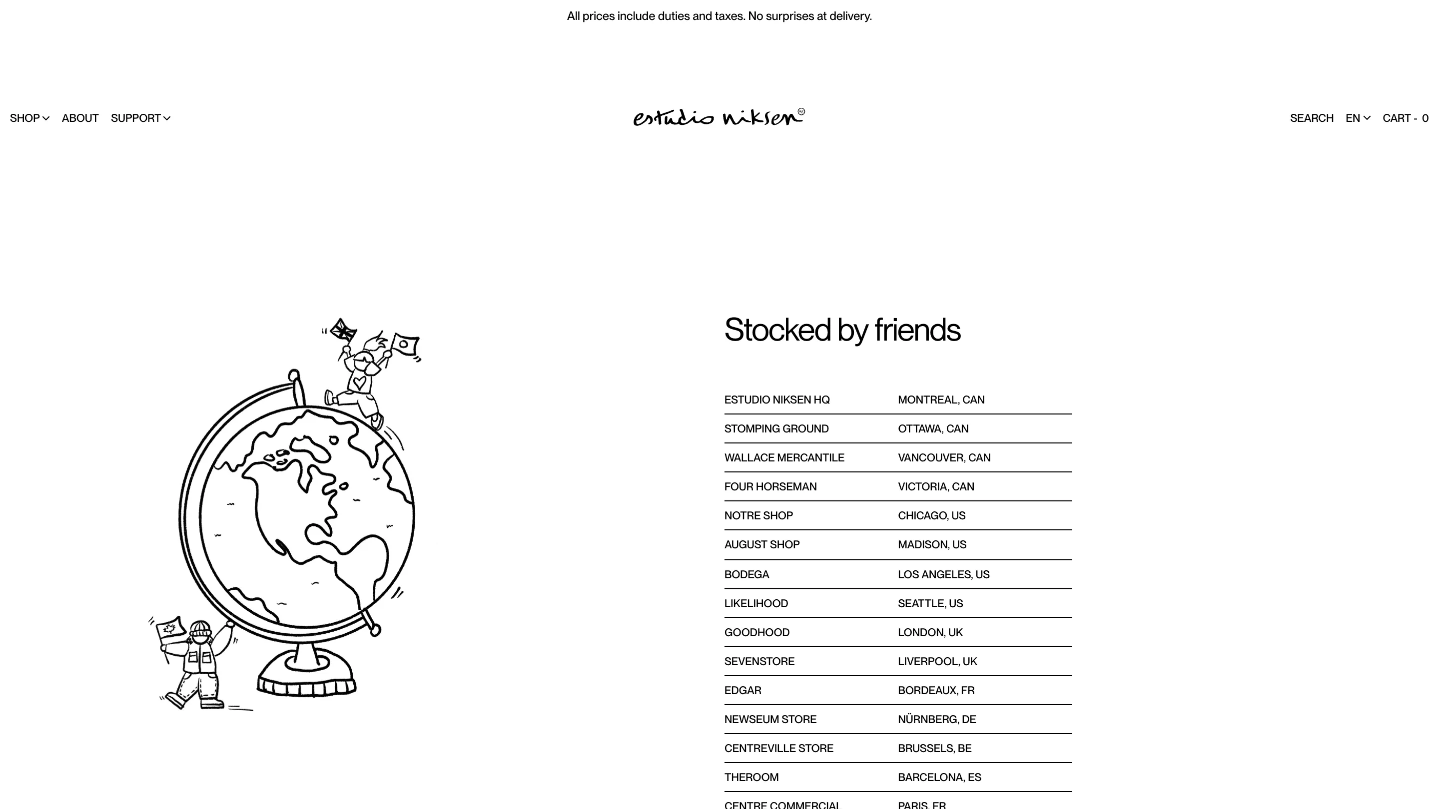
The stockists page picks that hand back up. A ruled two-column list in caps, shop name against city, Bodega in Los Angeles, Goodhood in London, Centre Commercial in Paris. Next to it, a line drawing of a globe with two tiny figures planting flags on it. The page is titled Stocked by friends. Same pen as the logo, used once more, forty pages later.
The banner sells shipping, not a discount
The strip at the very top of every page says: All prices include duties and taxes. No surprises at delivery. For a Canadian brand shipping to Chicago, London and Barcelona, that sentence removes the single biggest reason a full cart gets abandoned. It sits where nearly every other shop puts a promo code.
The site is doing one thing well, over and over. Decide what the customer actually needs to see, give it the whole width, and put everything else on a diet.