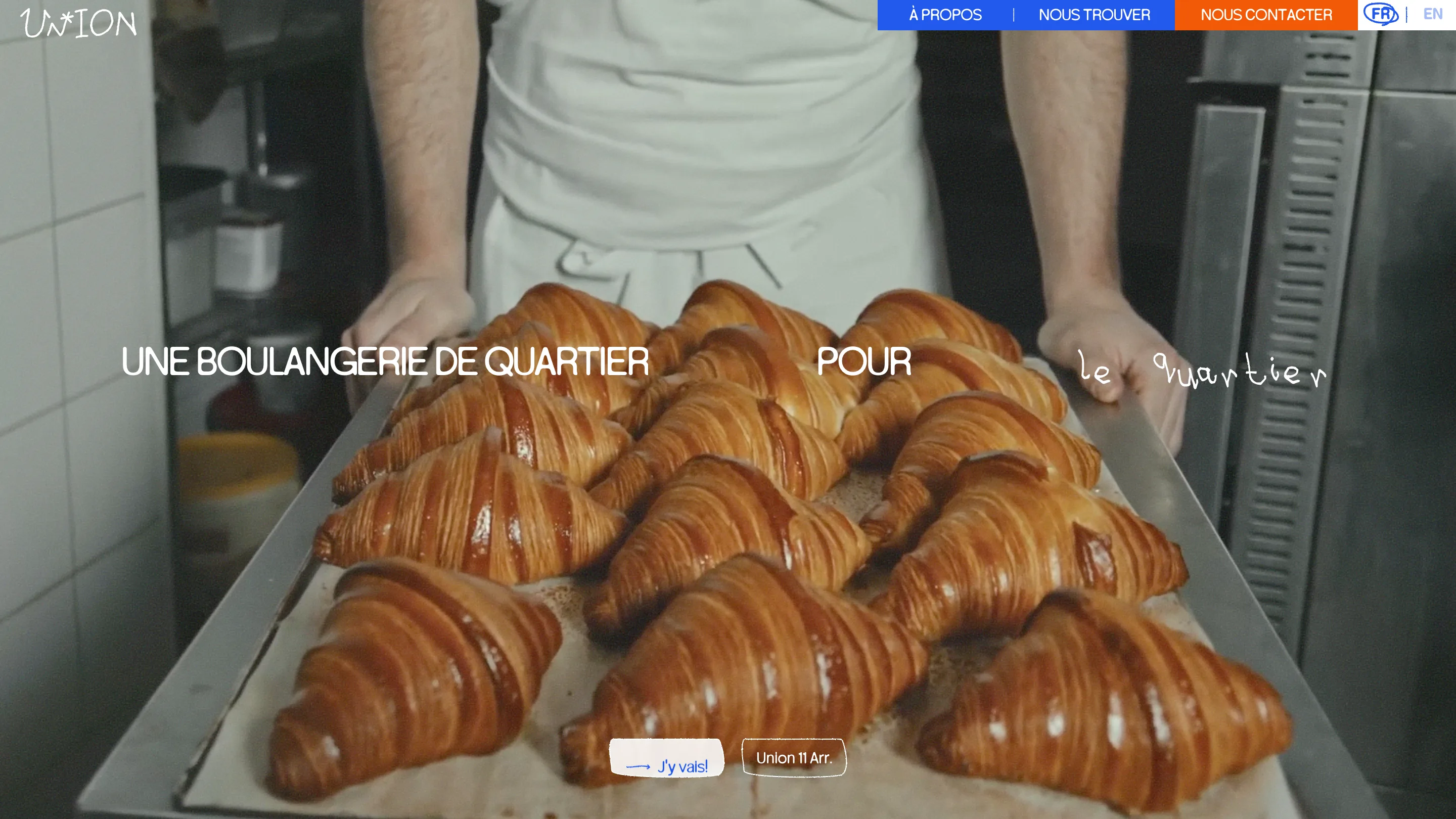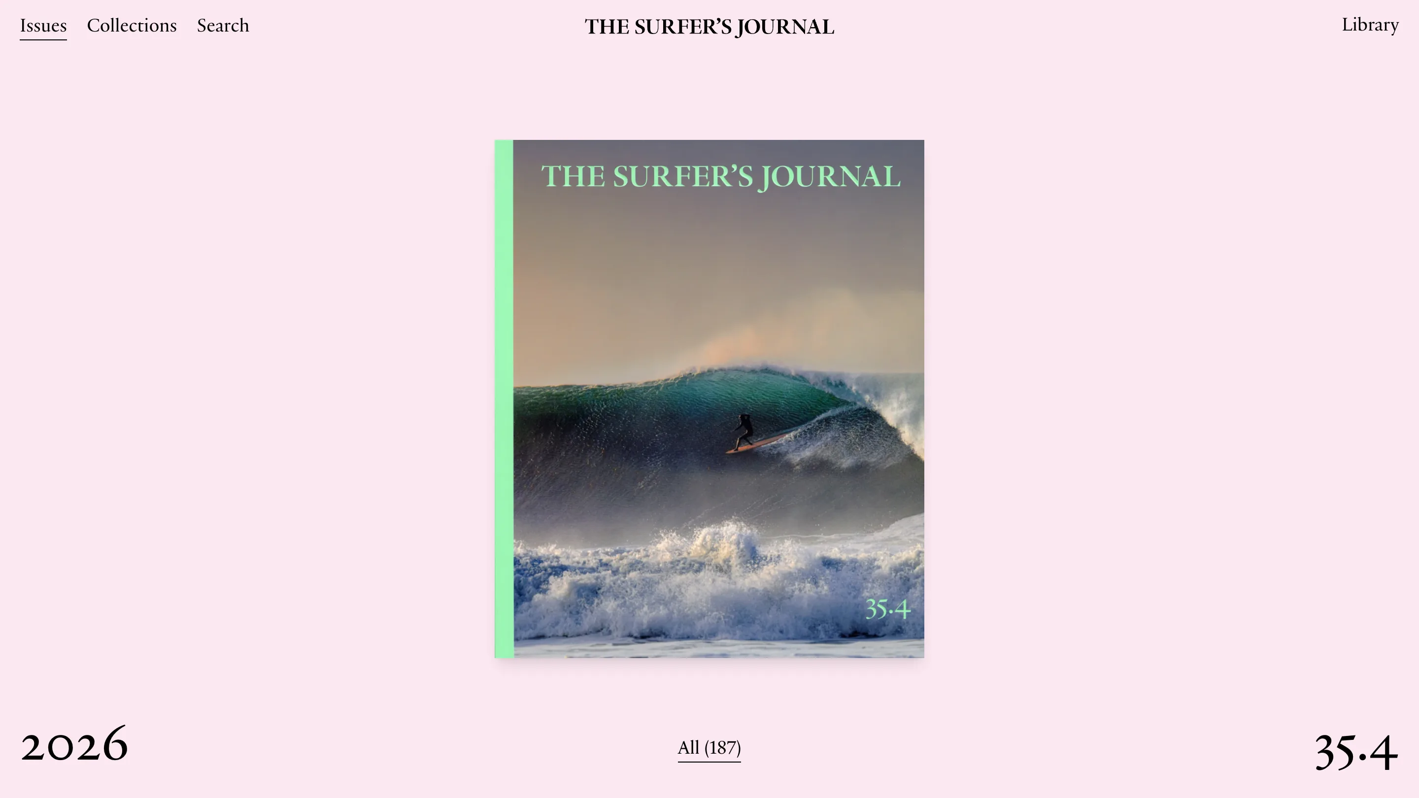
Jeton's fintech website design parks the nav at the bottom
The navigation is a floating pill at thumb height, and every page reuses one hero template with the colour turned up a notch. Bürocratik built it.
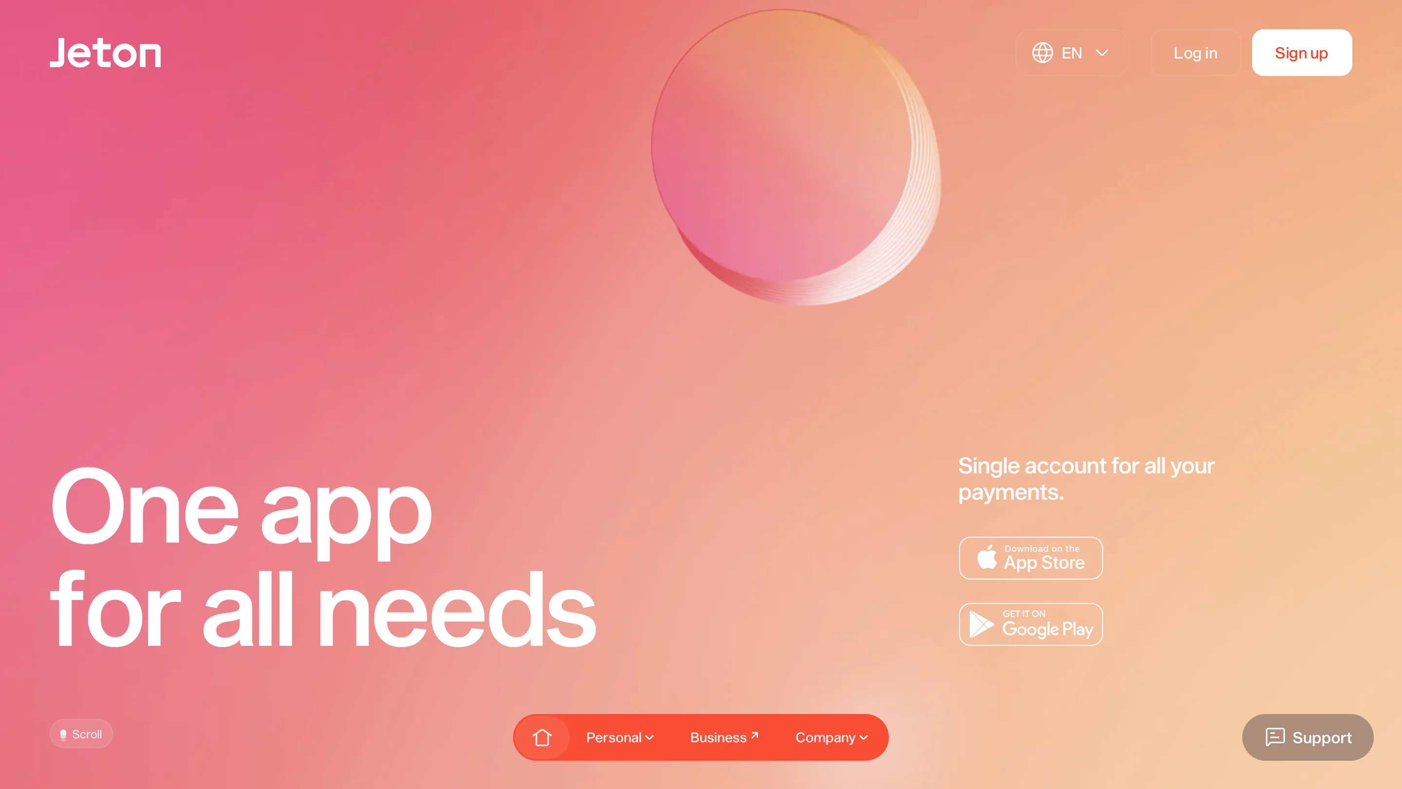
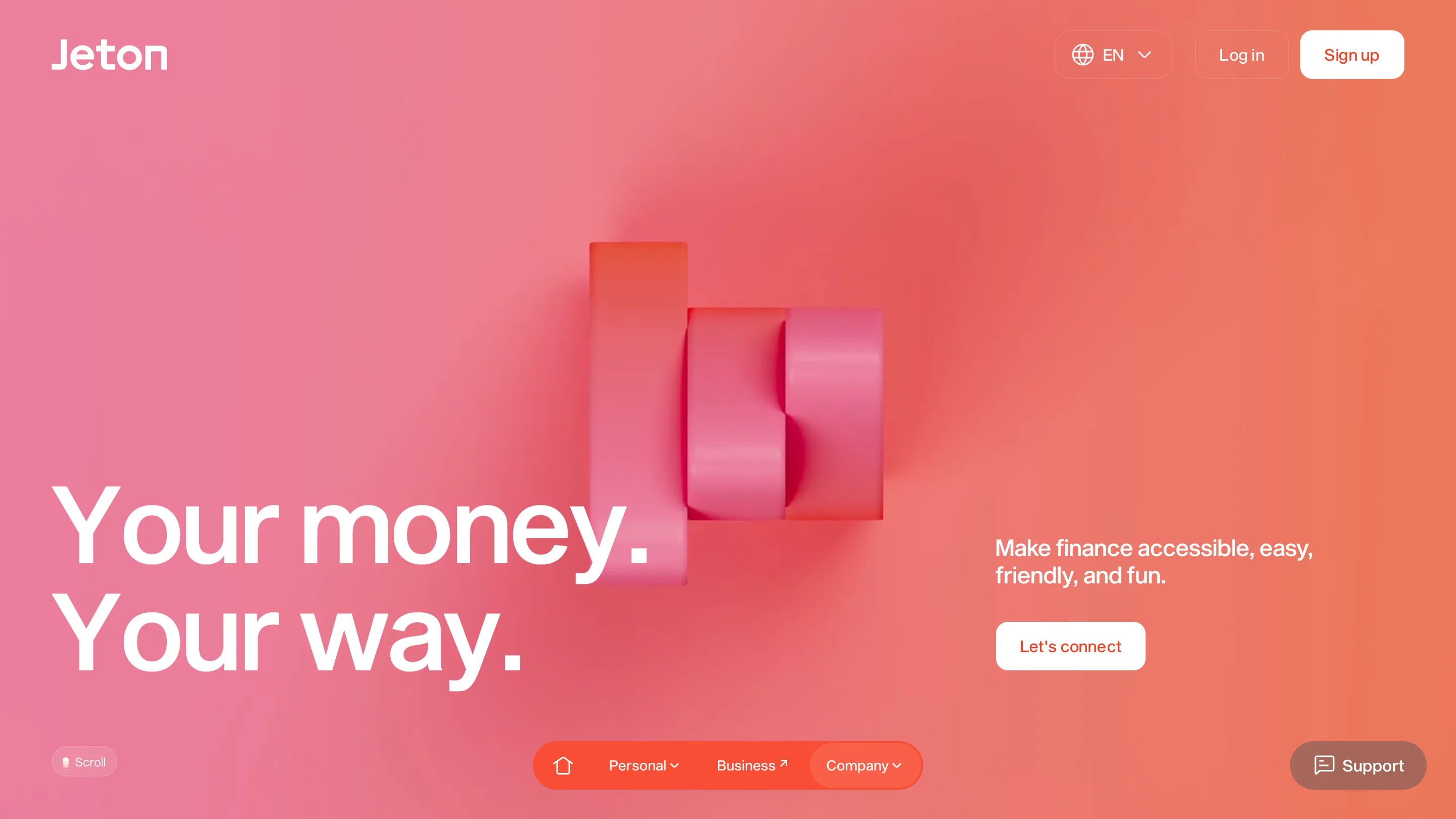
The navigation on Jeton is a floating orange pill at the bottom of the screen, sitting at thumb height. It stays down there on desktop, where nobody has a thumb on the glass. That one decision sets the tone for the whole fintech website design, built by Bürocratik out of Porto and Coimbra for a wallet app with a million or so users.
Most money sites put the menu in a bar across the top and a Sign up button in the corner. Jeton keeps the corner button and moves everything else down. The result is a hero that runs edge to edge with nothing crossing it.
One hero template, repainted per page
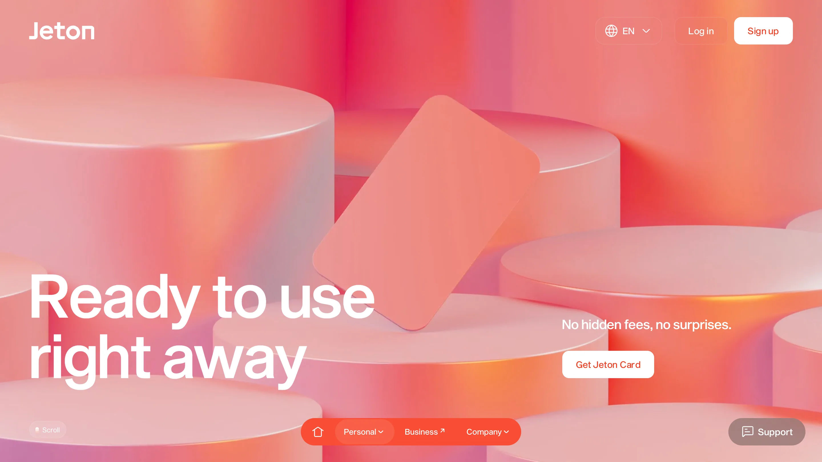
Open four pages and you get the same skeleton every time. Headline set large in white, bottom left, two lines, always two. Subhead and a single button on the right, aligned to the last line of the headline. A 3D object floating in the middle. Gradient behind everything.
What changes is the temperature. The home page is pink sliding into peach. The card page is warmer and busier. The about page pushes into a flat coral. The fees page goes all the way to a solid orange with no gradient left in it. Scroll through the site in one sitting and the colour climbs.
That's a cheap trick in the best sense. One layout, built once, and the pages still feel like different rooms.
The coin is the whole identity
Bürocratik took the word jeton literally. A jeton was a counting token, a disc you pushed around a board to do arithmetic before anyone had a calculator. The studio pulled the disc into the wordmark, where it fills the counter of the O, and then made it the only object in the 3D work.
So the home page has a coin. The card page has cylinders, which are coins seen from the side and scaled up until they read as furniture. The about page has an extruded J and a fat pink disc caught mid-turn. It's one shape, stretched, stacked, and lit differently.
The lighting is what makes it hold together. Every render uses a warm rim light on a matte surface, no reflections, no chrome. That keeps the objects readable against a gradient in the same hue, which is the hard part when your background and your subject are both orange.
Where the system runs out
The fees page is the one that gives it away. Same layout, same headline position, same button. But the 3D render is gone and in its place is a photo of four people smiling at a laptop, cropped into a rectangle on the right.
You can see what happened. Somebody had to ship a fees page, the 3D pipeline is expensive, and a stock photo fills the hole in the template. The flat orange background makes it worse, because the picture now floats on a field with no depth cue anywhere near it.
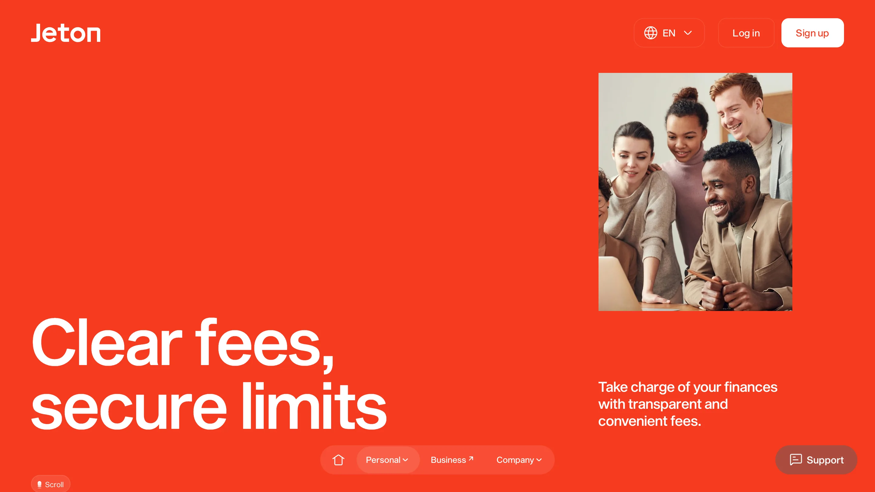
It's a fair thing to notice about any system this tight. A template that carries four pages beautifully will carry the fifth badly the moment the asset budget runs dry, and the tighter the template, the louder the failure. Nobody would blink at that photo on a normal marketing site. Here it lands like a wrong note.
What's worth stealing
The bottom nav, if your product is a phone app and the site is selling it. The muscle memory matches.
The colour ramp across pages, which costs nothing and does the work a second layout would have done.
And the discipline of one shape. Jeton could have commissioned a dozen 3D scenes. It commissioned a disc and then found out how many things a disc can be.