House of Honey hangs an interior design studio website on one pink script
Every page of the House of Honey site opens with the same word set three ways: a small cap line, a serif title, and an enormous hot-pink script running off both edges. It works because they never break the pattern.
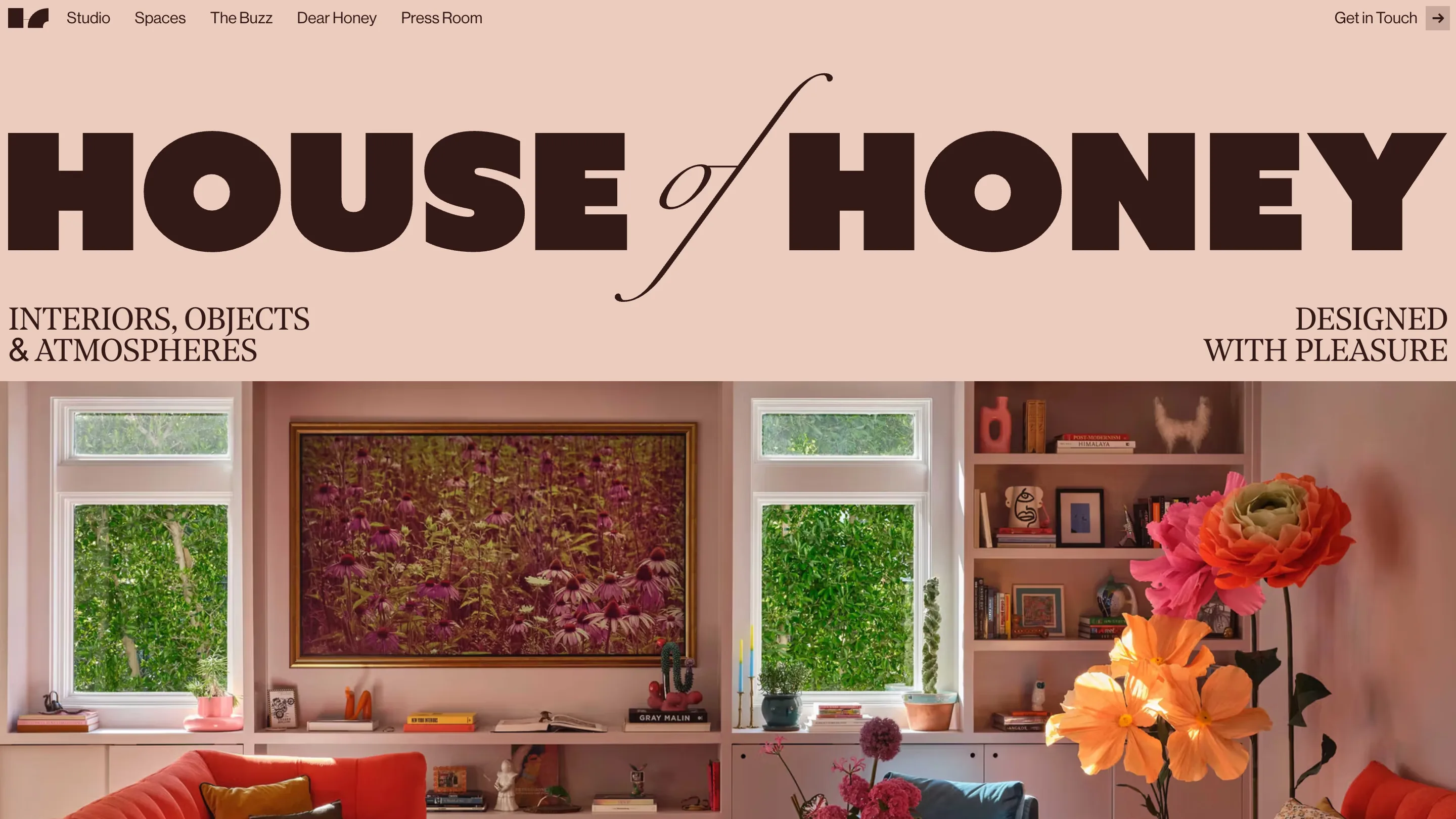
Every page on the House of Honey site opens the same way. A small line of letter-spaced caps. Under it, a serif title in capitals. Behind both, the same word again in hot-pink script, blown up until it runs off both edges of the screen. Spaces. Studio. Dear Honey. Same three layers, different word, sitting over a full-bleed photograph of somebody's living room.
That repetition carries this interior design studio website. It's the work of designer Eva Landaluce and developer Edoardo Lunardi for House of Honey, the Los Angeles and Montecito collective founded by Tamara Kaye-Honey. Awwwards gave it Site of the Day on 15 July.
The masthead says it three times
On /spaces the kicker reads PROJECTS, the title reads SPACES WITH STORY, and the script says Cucina in pink over a Malibu kitchen. The three lines don't repeat information so much as set three different reading speeds. The caps line tells you where you are. The serif title gives the page its editorial claim. The script is pure texture, cropped so hard you read maybe four letters of it.
Cropping it is the decision worth stealing. A script at that size, fully visible, would look like a wedding invitation. Cut by the frame on both sides, it stops being a word and turns into a mark laid across the photo.
One pink, and only at display size
The palette is dusty rose and a very dark brown. Warm, quiet, matched to the interiors in the photography. Then there's the pink, which belongs to a different decade and a much louder brand.
It survives because it's rationed. The pink appears at two scales and nowhere else: the giant script, and the small pill around the active nav item. Body copy is brown. Buttons are brown. Nothing in the middle of the type scale is ever pink. So the eye reads it as an accent rather than a second brand colour, and the interiors underneath stay the point.
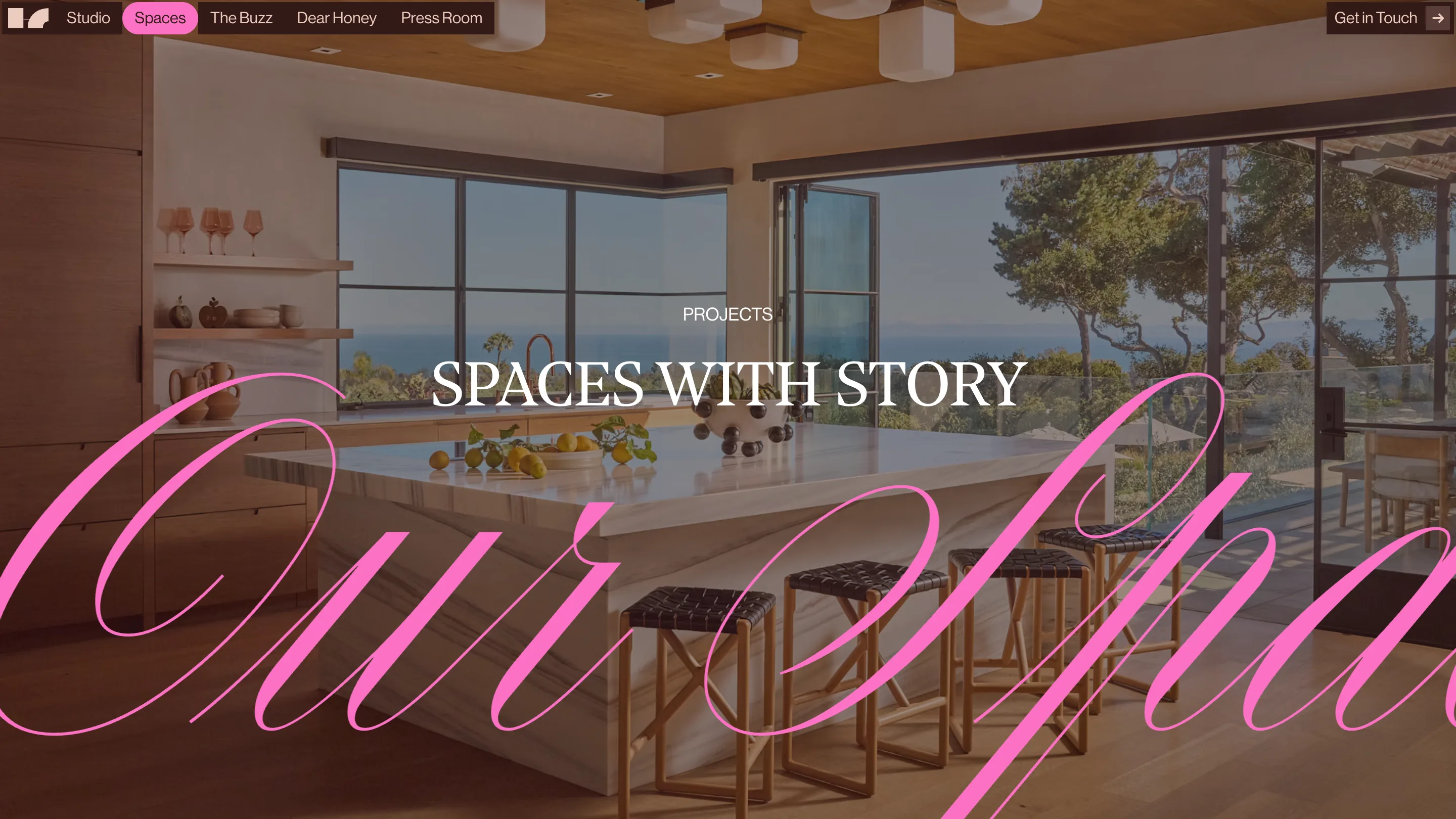
The home page skips the photo behind the wordmark and sets HOUSE of HONEY in brown against flat rose, with the swash of the italic of doing the work the pink script does elsewhere. Same move, tuned down for the front door.
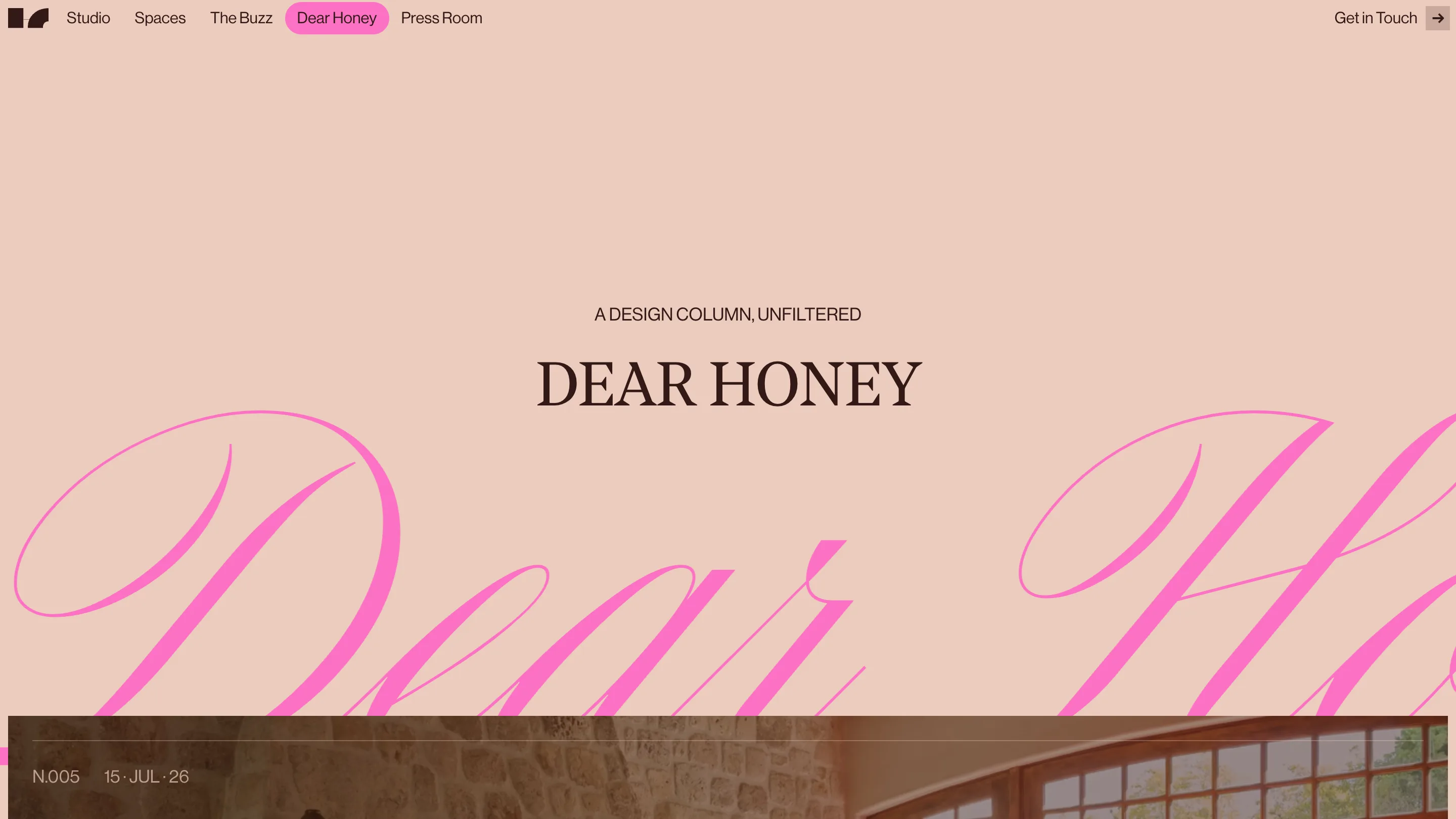
Dear Honey has issue numbers
The column is labelled A DESIGN COLUMN, UNFILTERED, and the entries are numbered. N.005, dated 15 · JUL · 26, the day the site won. Most studios put their writing under Journal and let the dates rot. Numbering an entry commits you to a next one, and the dot-separated date reads like a masthead rather than a CMS field.
The entry list runs as full-bleed image bands with the number and date sitting on the photo in thin uppercase. No cards. No excerpt. You get a picture, a number, a date, and you click.
The chrome floats
Navigation is a single dark brown bar pinned to the top with rounded bottom corners, so it reads as an object resting on the page instead of a header attached to it. The active item gets the pink pill. Get in Touch sits at the far right with an arrow in its own square.
Under the pretty part, the rebuild had a job: the old site was slow. This one runs on Next.js and Sanity, and the photography, which is the studio's real product, loads without making you wait for it.
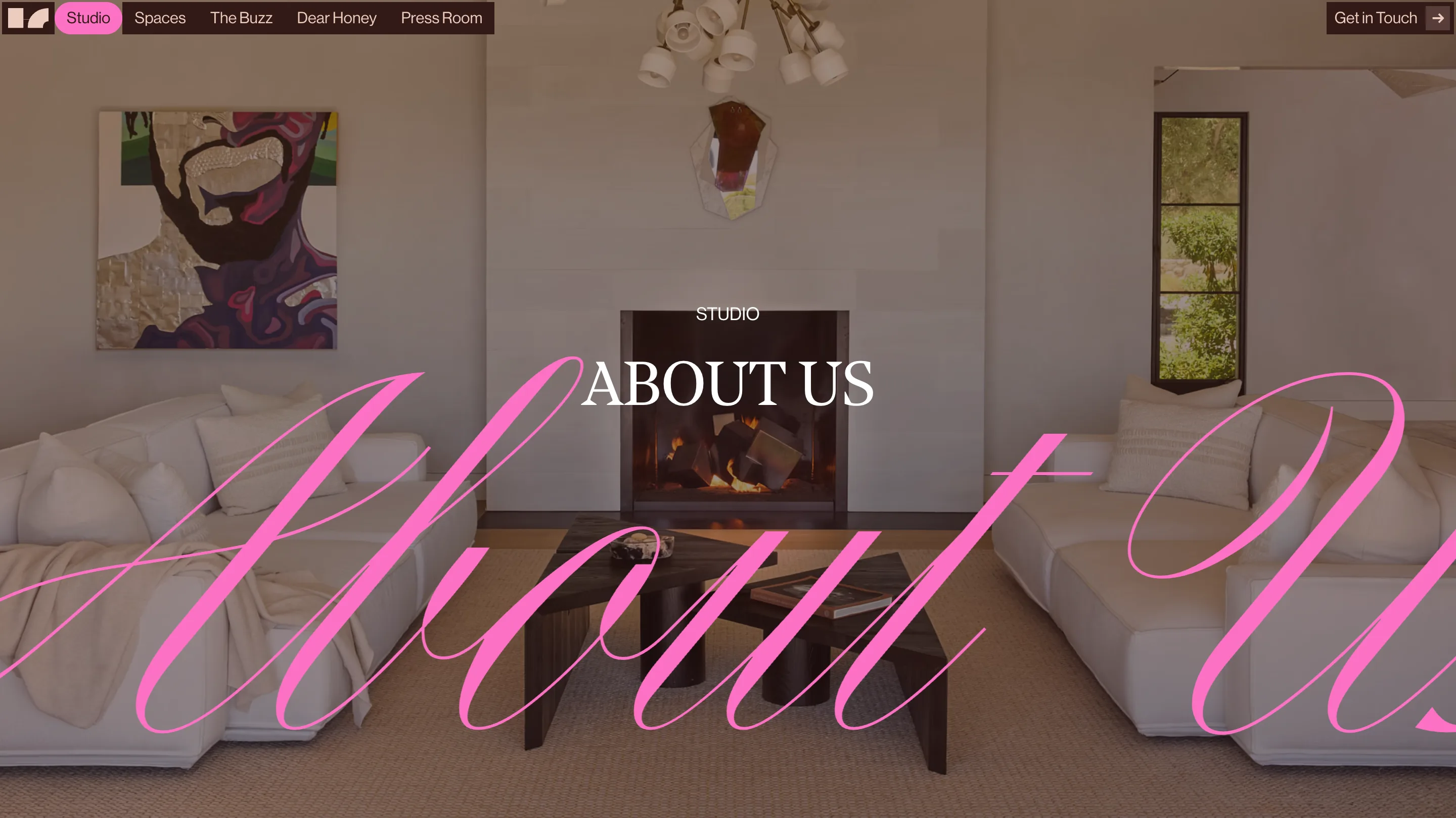
What holds it together is discipline. One masthead structure, one accent colour, one place each of them is allowed to appear. Five pages later you can still predict the top of the screen, and the rooms are what you remember.