Warren and Mahoney's logo-as-mask hero gives every page a different face
The Australasian architecture practice runs the same monogram across the top of every section and changes only what fills it. One shape, four moods, no carousel.
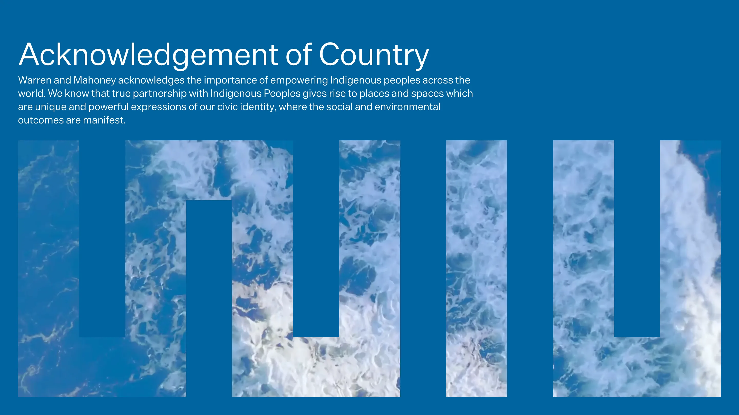
Warren and Mahoney give every landing page the same hero, and it never reads the same twice. Their five-bar monogram runs full width across the top of each section of wam.studio, cropped at both edges so it stops looking like a logo and starts looking like a colonnade. The only thing that changes page to page is what sits inside the bars. Logo as a mask, at building scale.
The practice was founded in 1958 and now runs seven offices across New Zealand and Australia. A firm that size usually ends up with a homepage carousel of fifteen hero shots, which is what the site politely refuses to do.
The mask carries the photography
On the home page the field is flat cobalt and the bars are cut out of it, so the counters become windows onto aerial footage of surf. You get the water in five vertical slices, moving, with the negative space of the letterform holding it in place. It's the one moment on the site where an image is allowed to be big, and the monogram is what makes it feel deliberate rather than decorative.
Compare that to the usual full-bleed video hero with a headline floated over the middle. Here the shape does the framing, the text sits above it in the top left, and nothing overlaps. Type and image never fight for the same pixels.
Flat color does the same job on the inside pages
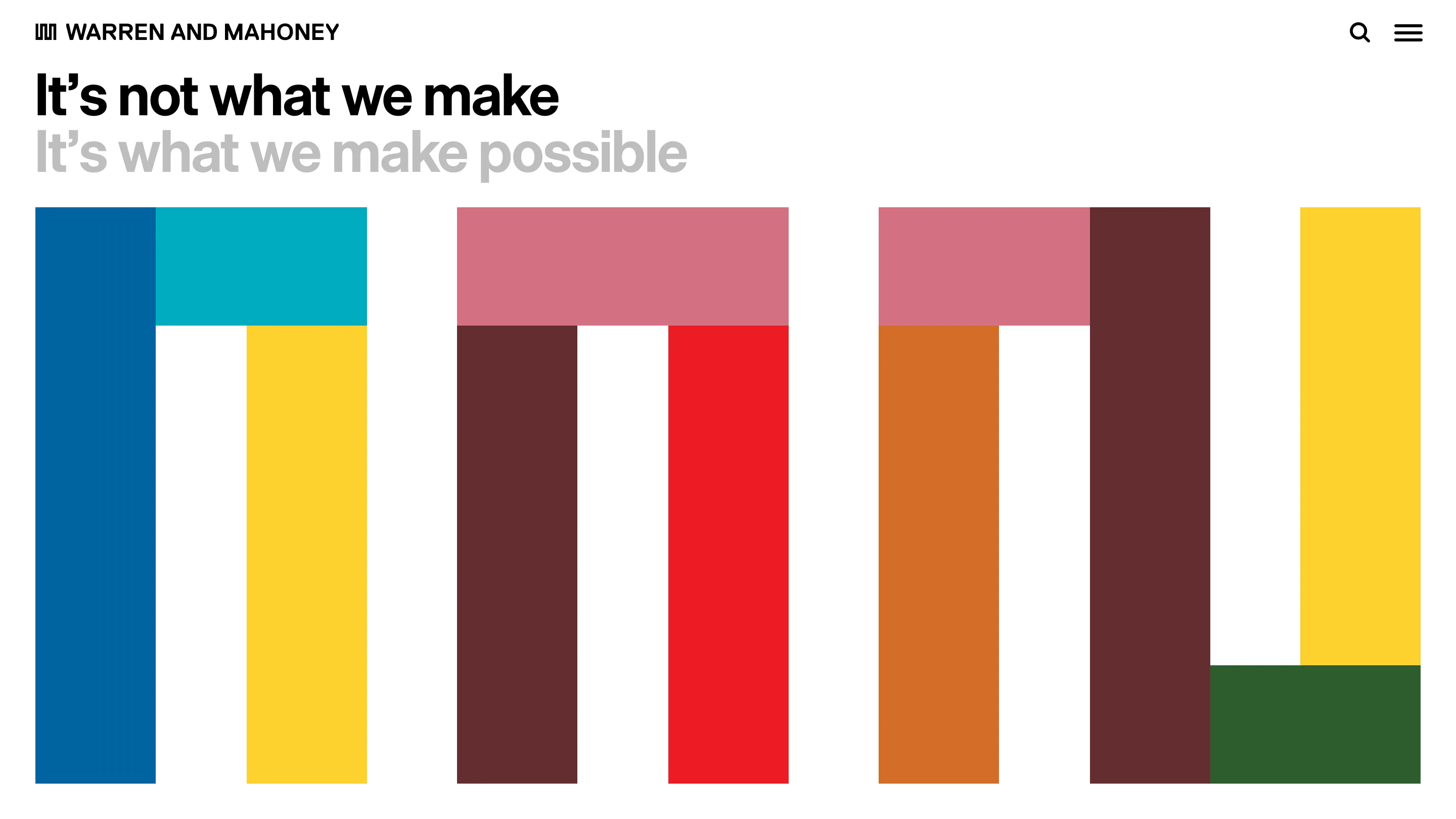
The work index drops the photography and fills each bar with a different flat color: two blues, a yellow, a deep maroon, a red, dusty pink, burnt orange, a bottle green. The bars sit at different heights, so the composition reads as a bar chart before it resolves back into the monogram. Nothing is centred. Nothing is rounded. The counters are hard rectangles.
And the practice page throws away the color mix entirely and goes to one orange field with grey bars.
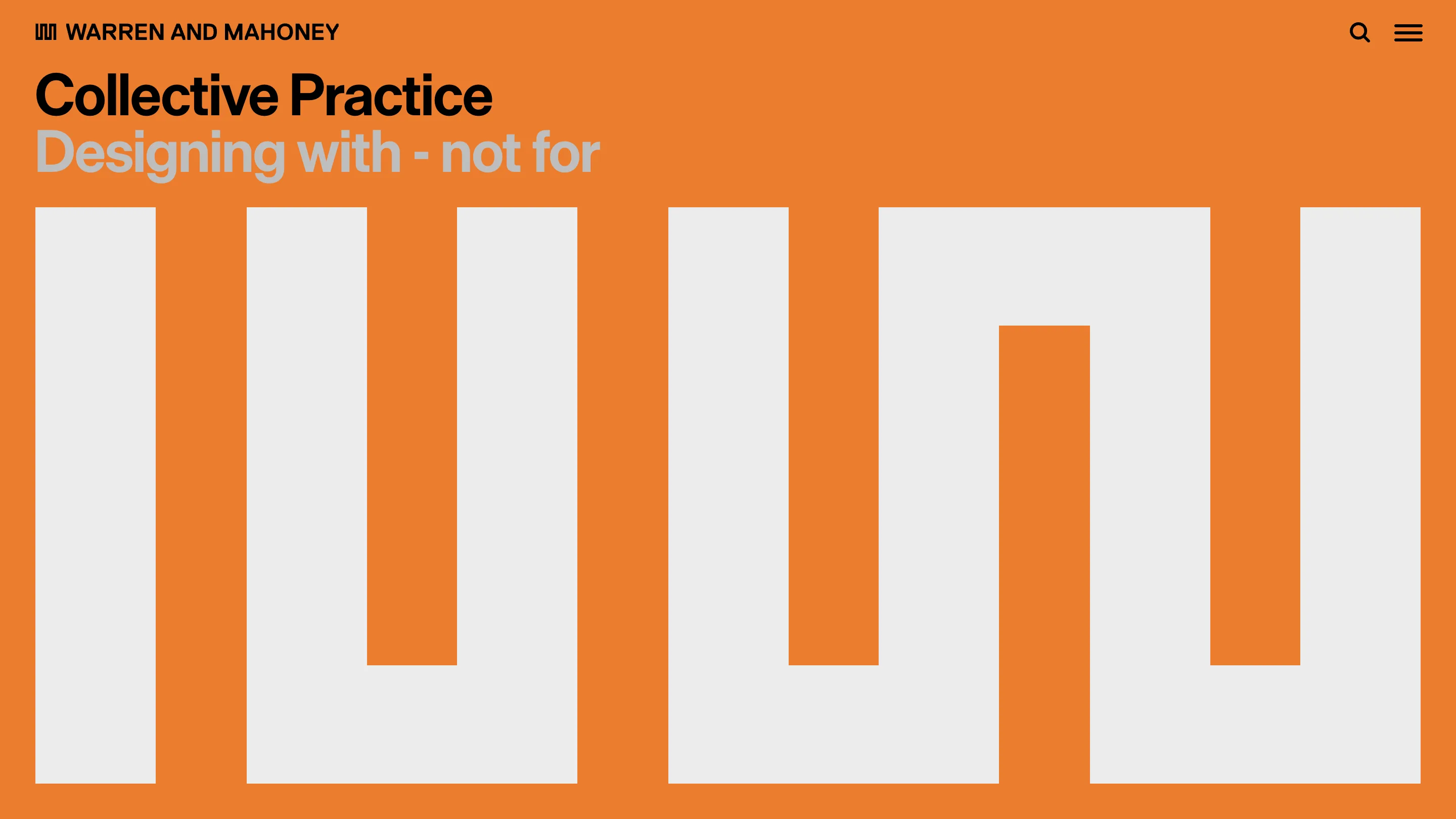
Same shape, same crop, same headline position, one color swap. After two clicks you stop reading the nav and start navigating by hue. That's the payoff of holding the layout fixed: the variable becomes information.
The headline lockup is two lines and two greys
Every hero carries the same two-line structure. A black line names the section, a grey line underneath says something about it. "Collective Practice / Designing with - not for". "Collective Experience / People make the place". "It's not what we make / It's what we make possible".
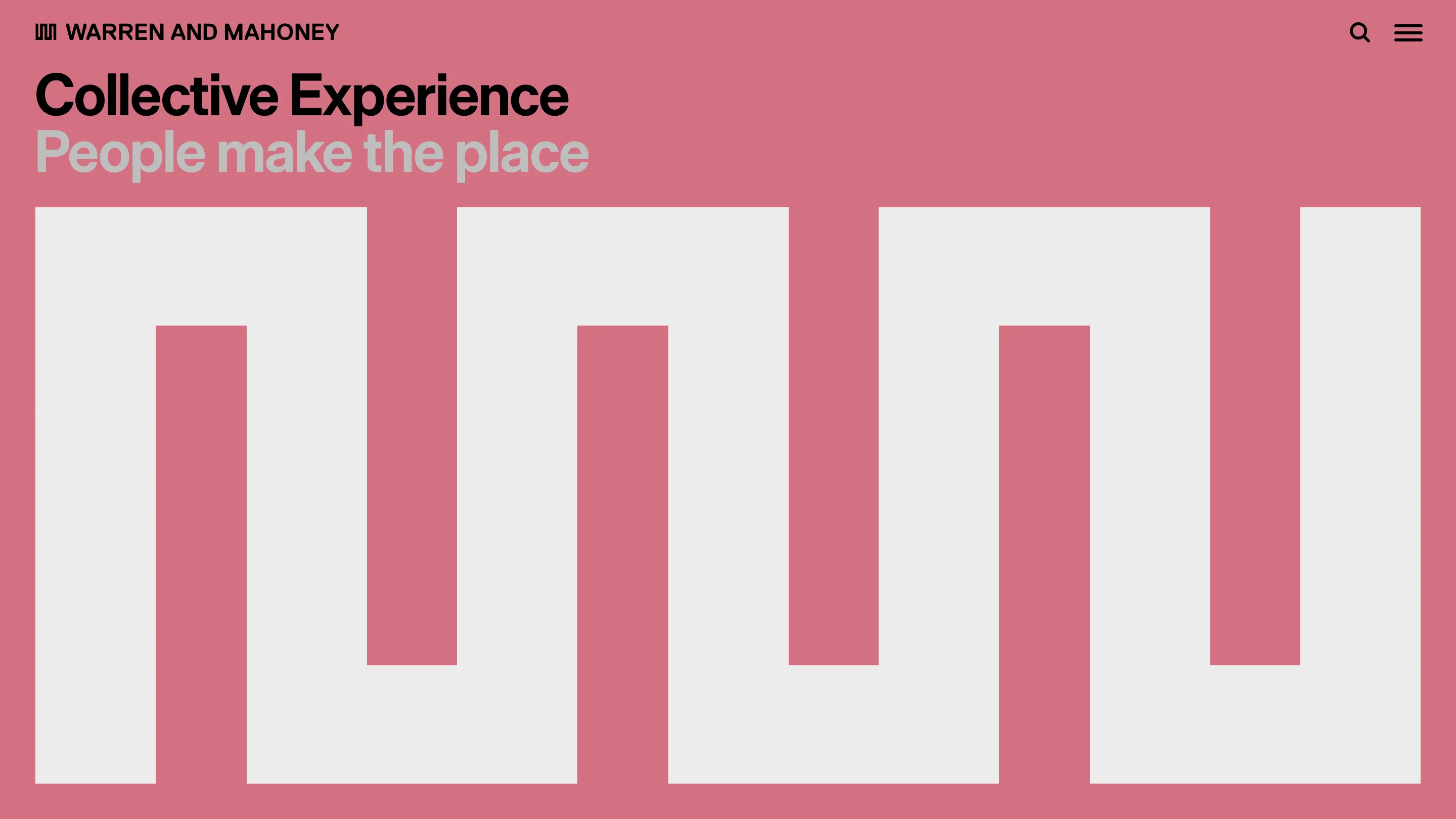
The grey is doing real work. Both lines are set at the same size in the same tight grotesk, so the only ranking signal is contrast. The first line is the label you scan, the second is the sentence you read if you want it. Two lines, one type size, a clear order. Most sites would have shrunk the second line and lost the rhythm.
What to steal
The move is cheap to copy and hard to copy well. Take a mark with strong vertical structure, blow it up past the point of legibility, crop it at the viewport edges, and treat the fill as the page variable. It only holds together if the rest of the page is disciplined: fixed headline position, one type size, no drop shadows, no gradient over the image.
Credit to Warren and Mahoney, found in the Httpster gallery.