Nudot puts bilingual typography in every page header
The Taichung studio pins one English word to each edge of the screen and hangs the Traditional Chinese in the gap. Same move on every page.
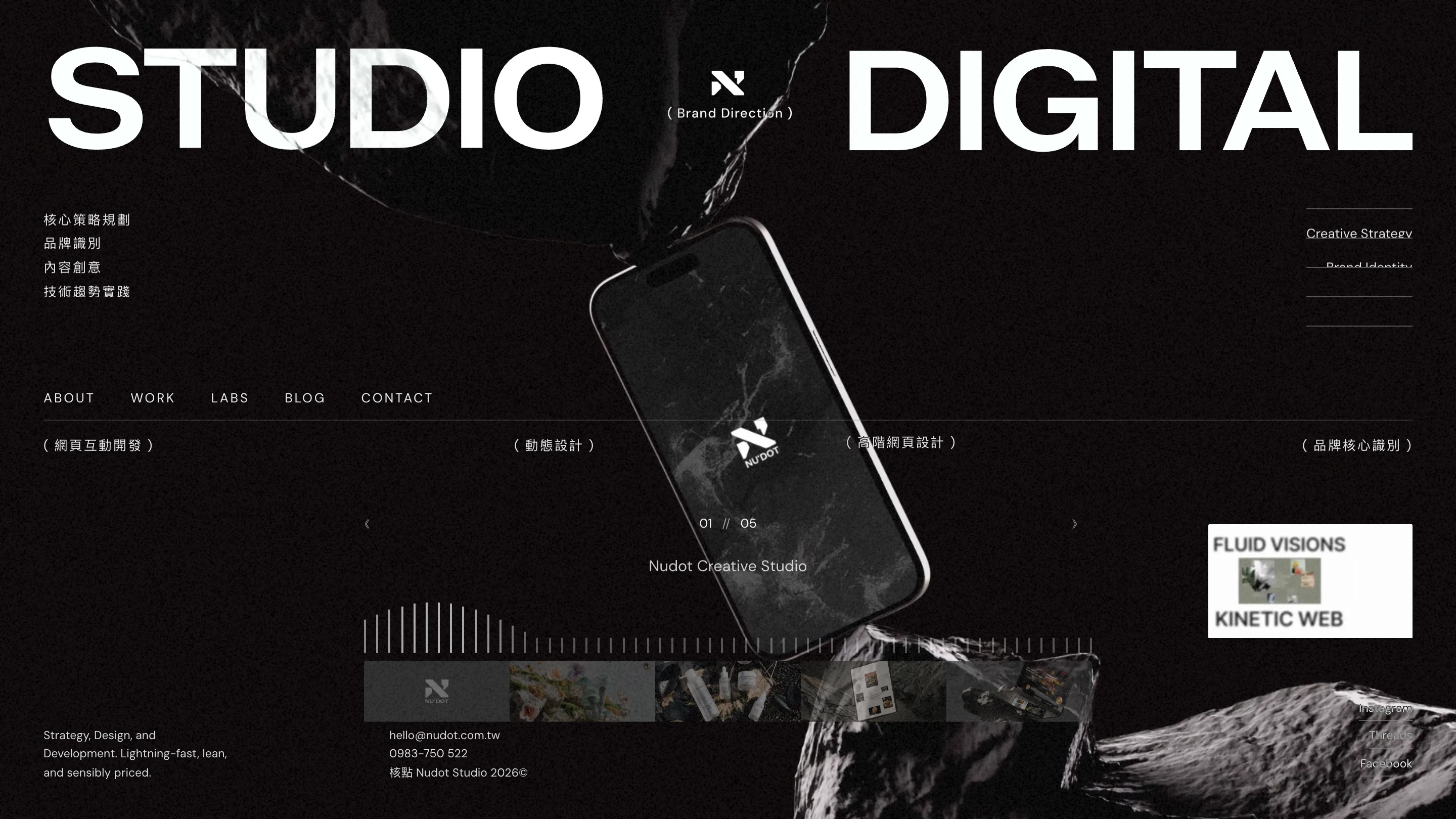
The header on Nudot pins one English word to the left edge of the screen and one to the right, set enormous, with the Traditional Chinese sitting small in the gap between them. STUDIO on the left. DIGITAL on the right. A hairline rule underneath, and a row of bracketed Chinese labels spaced along it. That is the whole idea, and the Taichung studio runs it on every page of the site.
Bilingual typography works when each script gets its own job
Setting Latin and Chinese in the same headline is awkward because the two scripts move differently. Chinese characters are square and uniform, no ascenders, no descenders, even colour across a line. Latin caps in a grotesque have wildly different widths and lean on a strong baseline. Stack them at the same size and the Chinese looks heavy and the Latin looks loose.
Nudot never puts them at the same size. English takes the scale, one or two words at display size, letter-spaced tight. Chinese takes the detail: 網頁互動開發, 動態設計, 高階網頁設計, all set small, wide-tracked, wrapped in full-width brackets ( ). The brackets are the tell. They give each Chinese phrase its own container so it reads as a caption rather than a competing headline.
The Chinese column on the left of the home page does the same thing in another register. 核心策略規劃, 品牌識別, 內容創意, 技術趨勢實踐, four lines, generous tracking, stacked against the English service list on the far right. Two languages, two edges, and a phone mockup tumbling through the middle.
The masthead is a template
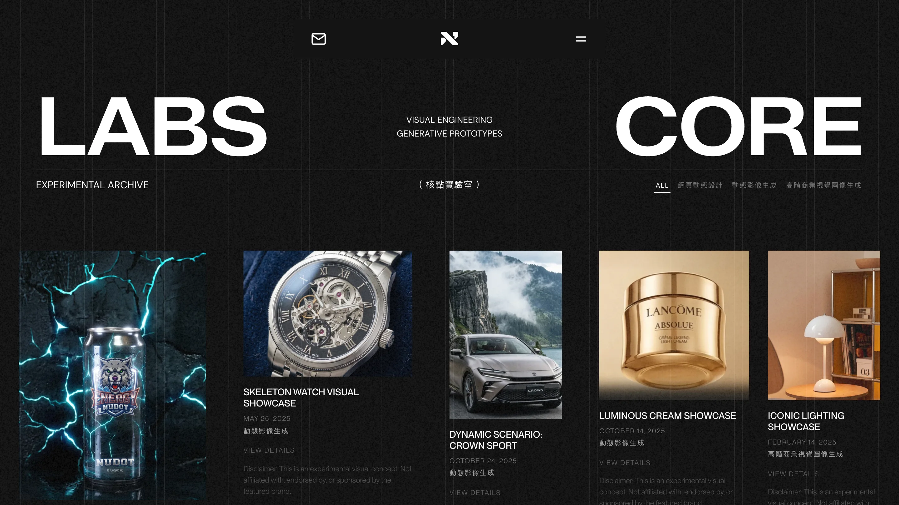
Home gives you STUDIO and DIGITAL. Work gives you WORK and DESIGN. Labs gives you LABS and CORE. Same slot, same rule, same bracketed Chinese caption dropped in the centre, same three-column strip underneath.
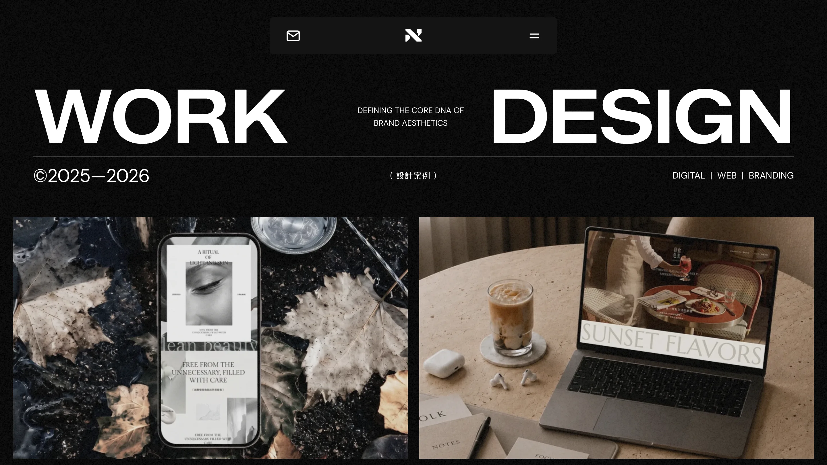
On the work page that strip reads ©2025–2026 at the left, (設計案例) centred, DIGITAL | WEB | BRANDING at the right. On the labs page it reads EXPERIMENTAL ARCHIVE, (核點實驗室), then the filter chips. The furniture stays put and the words change. After two pages you can predict the third, which is what makes the site read as one system instead of five compositions that happen to share a colour.
A second voice for the pages that need one
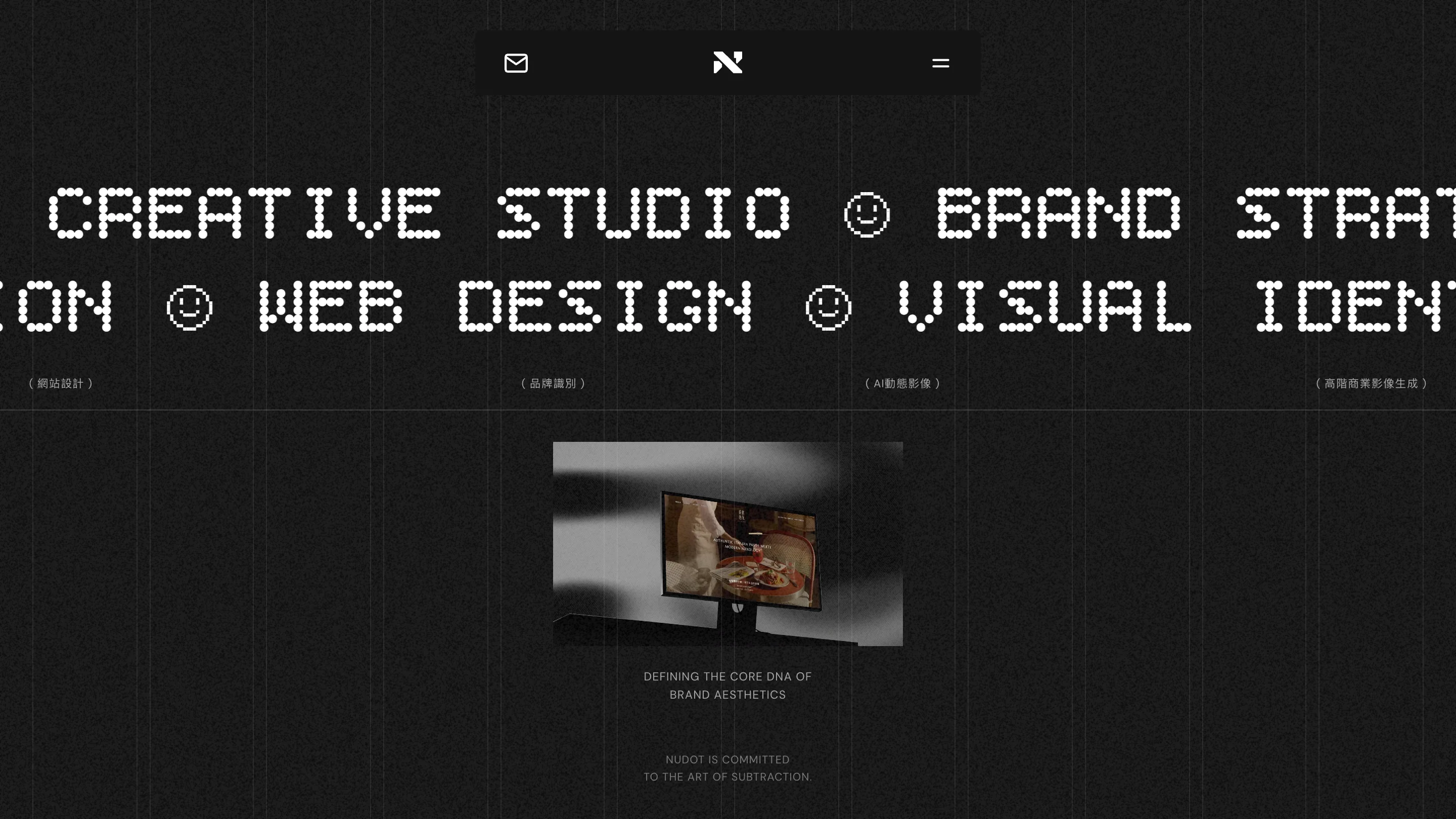
The about page breaks the rule on purpose. The header swaps the grotesque for a dot-matrix face and turns it into a marquee: CREATIVE STUDIO ☺ BRAND STRATEGY ☺ WEB DESIGN ☺ VISUAL IDENTITY, with smiley glyphs as separators, running wider than the viewport so the letterforms get cropped at both edges. Underneath, one small screen mockup floating in the dark and a line in grey caps: NUDOT IS COMMITTED TO THE ART OF SUBTRACTION.
The dot-matrix face comes back on the 404, where the numbers are built from pixel blocks, a Chrome dinosaur runs along the bottom rule, and the score in the corner reads HI 00404 00024. Somebody spent an afternoon on a page they hope nobody sees.
Everything sits on one screen
The home page doesn't scroll to make its case. Wordmark, Chinese service column, English service list, a text-only nav row (ABOUT WORK LABS BLOG CONTACT, no boxes, no underlines), a project carousel counting 01 // 05, a strip of thumbnails, and a footer band with hello@nudot.com.tw and a phone number, 0983-750 522. All of it in one viewport, on near-black, with a grain texture and a marble-and-smoke render pushed behind the type at low contrast.
The phone number is worth noting. Studios in Taiwan tend to publish one, and seeing it there instead of a contact form makes the whole page feel like a business rather than a portfolio.
The move you can borrow
Take two words that name the page. Push them to opposite edges at the largest size the viewport allows. Put the small type, the language switch, the date range, the category, in the channel between them. Draw one hairline underneath and hang a three-part strip off it. Then repeat it, unchanged, on every page.
Nudot Creative Studio is based in Taichung. Found in Minimal Gallery.