Estudio Niksen keeps a hand in its minimal e-commerce web design
The Montreal label's shop is almost entirely white space with no cards, borders or shadows. The personality lives in a signature wordmark and a set of loose line drawings.
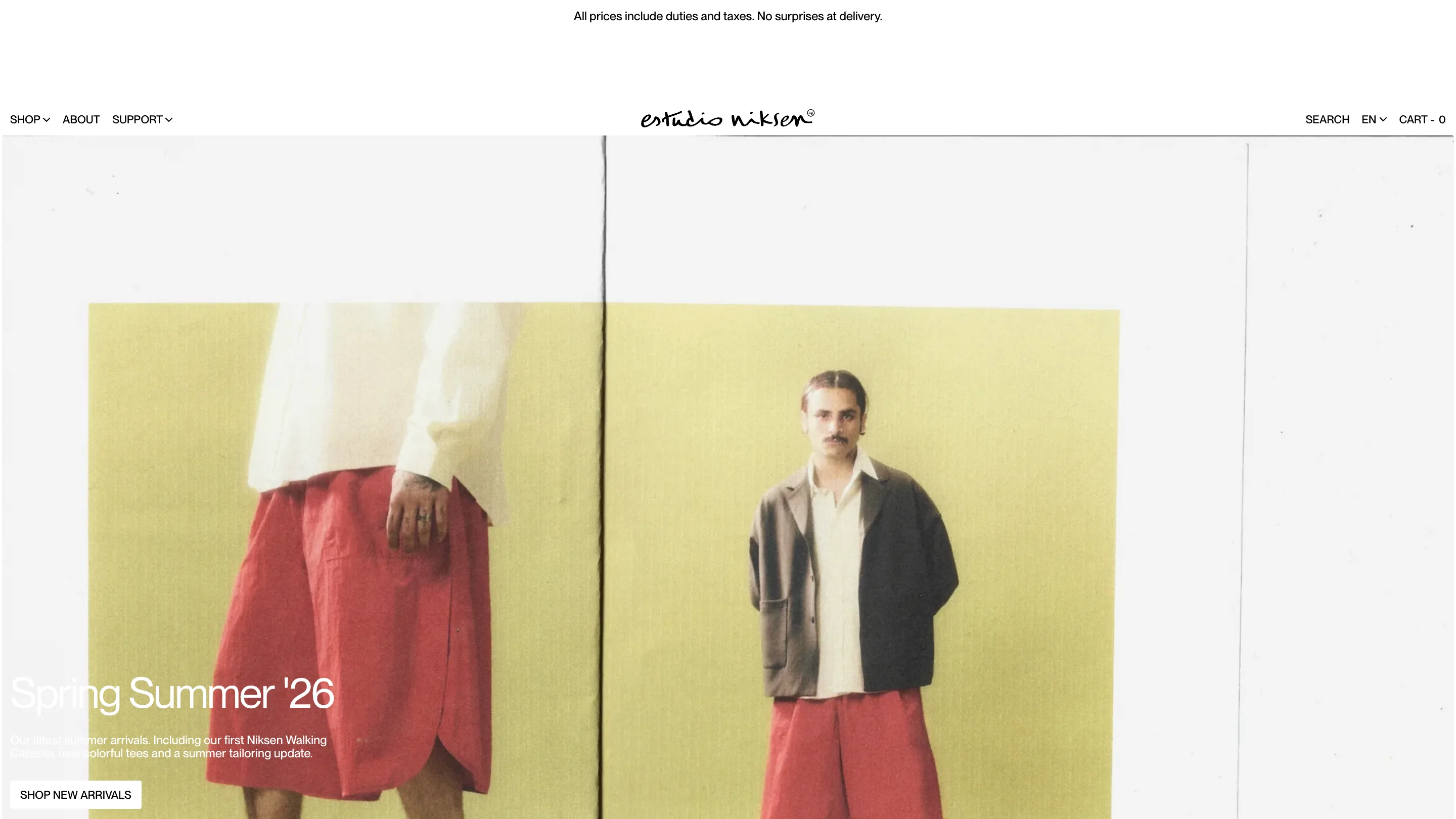
Estudio Niksen's shop is nearly all white, and it still feels like a person made it. That's the hard part of minimal e-commerce web design. Strip the cards, the shadows, the rounded corners and the badges, and most shops go cold. This one doesn't, because Domaine Public put the warmth in two places and left the rest of the page alone.
The label is Montreal-based, founded in 2021, with a store on Desnoyers and a satellite in Seoul. Niksen is Dutch for doing nothing on purpose. The site takes that seriously.
The header carries one expressive mark, and only one
The wordmark is a fast ink signature with a small circled R sitting on its shoulder. It's centred, and it's the only handwritten thing in the whole chrome. Around it, everything is set in the same geometric grotesque, uppercase, small, tracked open: SHOP, ABOUT, SUPPORT on the left, SEARCH, EN, CART on the right. Six words across the top of the page and nothing else.
Above the header runs a thin line of black text on white: "All prices include duties and taxes. No surprises at delivery." That's the single biggest objection a Canadian brand shipping abroad has to answer, and it's answered in eleven words before you've scrolled once. Most shops bury that in a shipping policy three clicks down.
Type does the labelling work
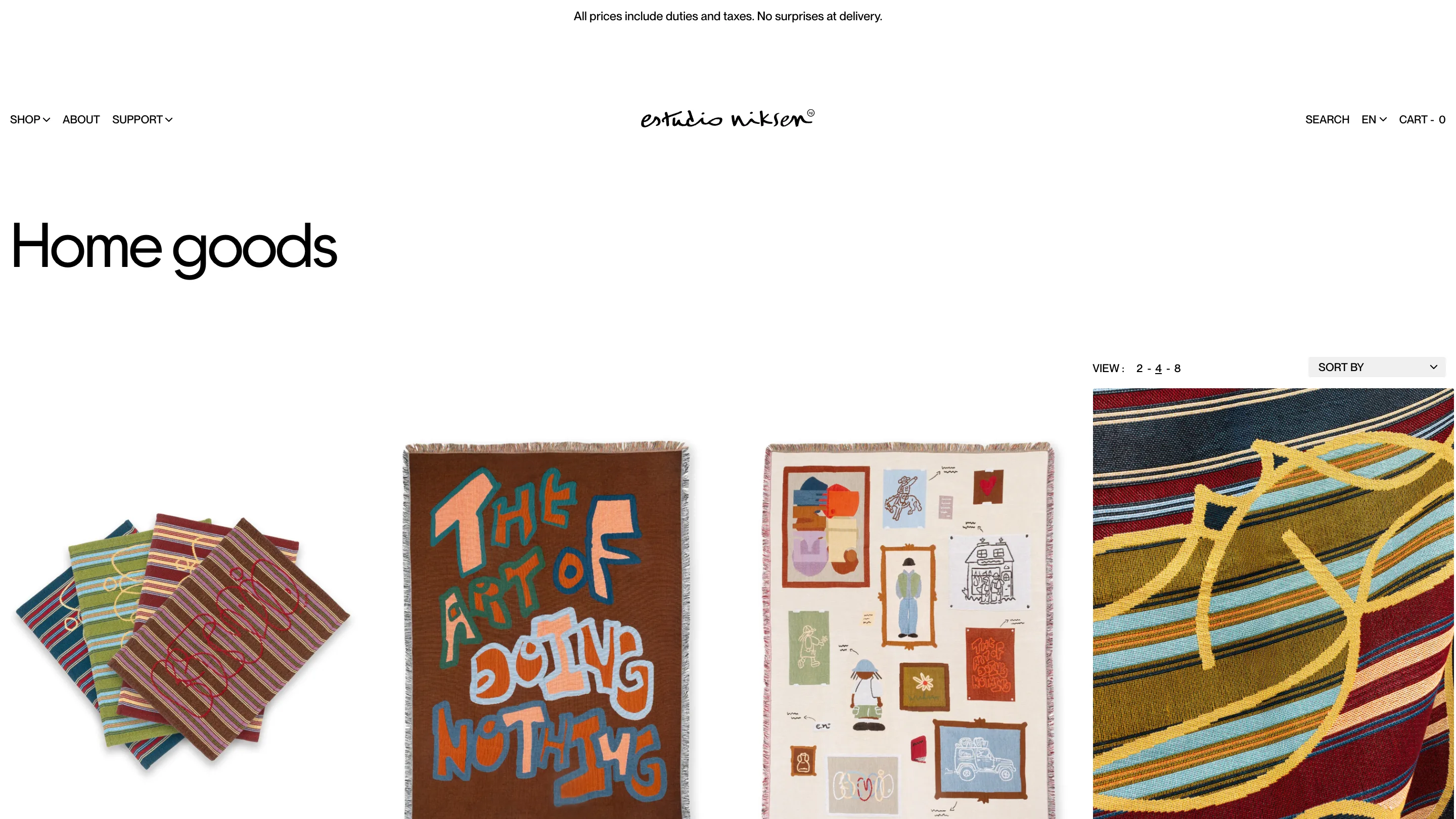
Collection titles are set enormous and flush left with a full screen of air under them. "New arrivals." "Home goods." No eyebrow, no breadcrumb, no icon, no count of products. The size alone tells you where you are, and the empty band beneath it separates the label from the goods better than any rule or box would.
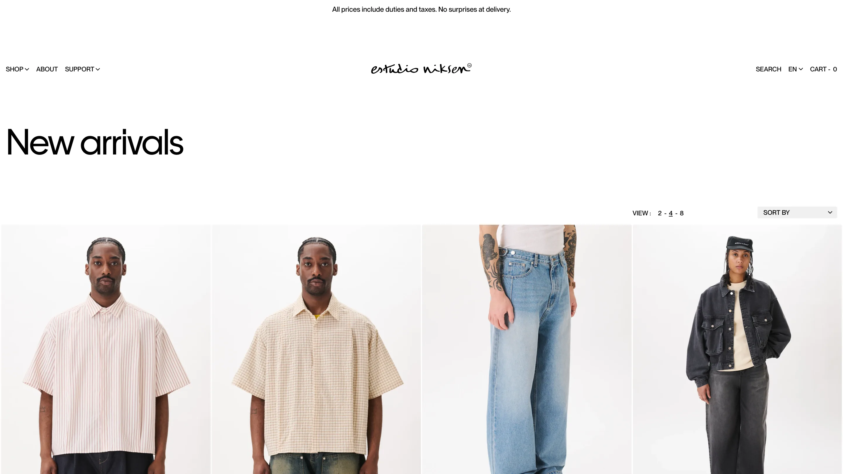
The grid underneath is the part worth stealing. Product shots run edge to edge, corner to corner, with white gutters between them and no container at all. The photography is all shot on the same off-white seamless, so the tile background and the page background are the same value. The clothes appear to be floating on the page rather than sitting inside a card.
A density switch instead of a filter wall
Over on the right, above the grid: "VIEW: 2 - 4 - 8", with the active number underlined. Two per row when you want to look at a garment. Eight when you're scanning for the one you already have in mind. It's a two-character control that replaces the usual pile of filter chips, and it respects that browsing and hunting are two different moods.
Sort sits next to it in a plain select. That's the whole toolbar.
The drawings do the talking
The home goods page is where the restraint pays off. Blankets covered in wobbly hand-lettered type, one of them woven with the words THE ART OF DOING NOTHING, land on a page so quiet that the colour hits twice as hard.
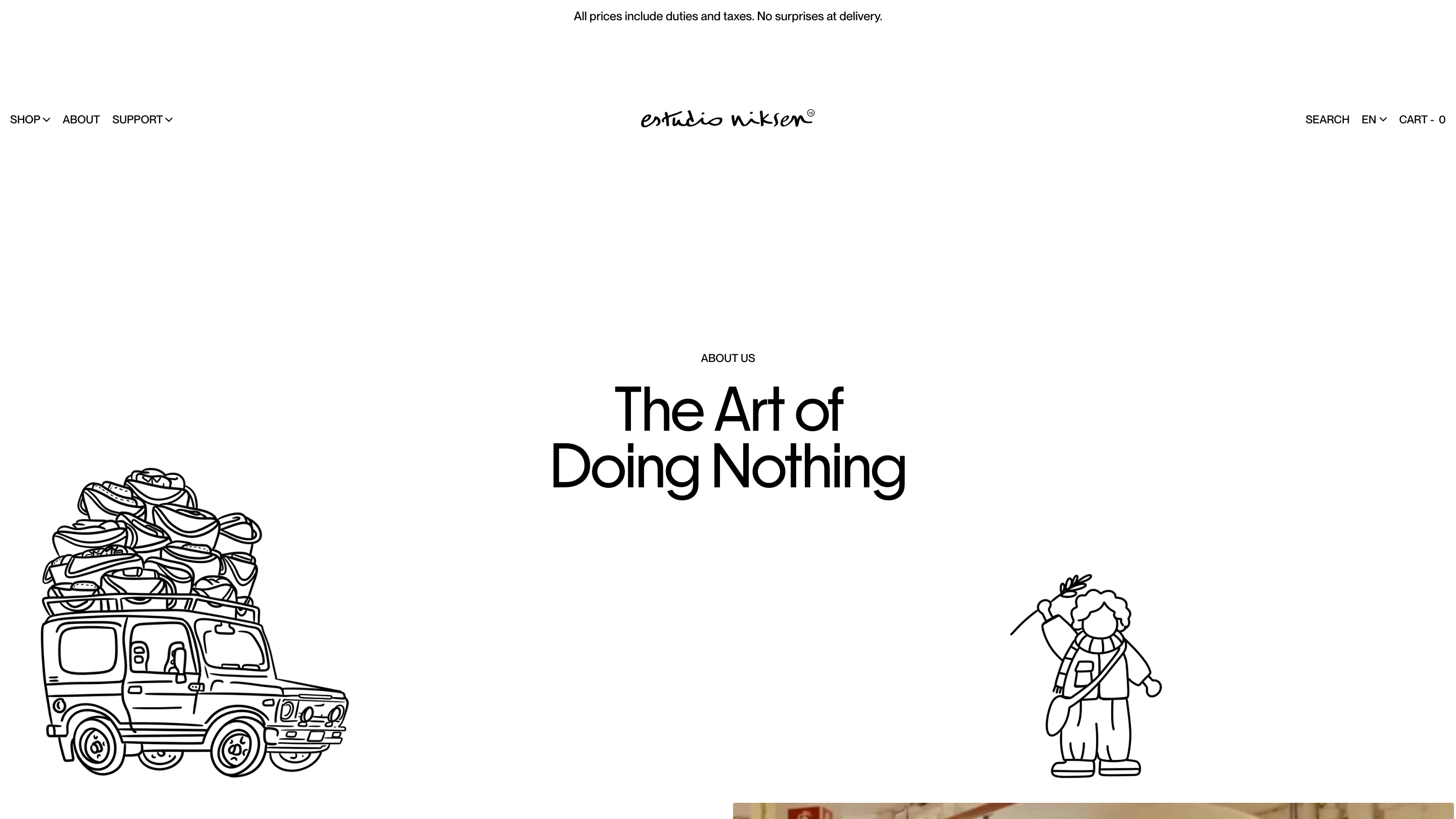
The about page pushes it further. The title runs centred and huge, and instead of a hero image there are two loose black-line drawings parked out in the margins: a Suzuki-shaped van with a rack piled high with bags, and a small figure holding up a branch. They're not decorating a box. They're standing in white space with acres of room around them, which is why they read as drawings and not as clip art.
Where it slips
One thing to flag. The homepage sets its hero copy in white over a scanned photograph whose top half is pale paper and whose lower half is a soft yellow wall. "Spring Summer '26" survives it. The two lines of standfirst under it don't, and the SHOP NEW ARRIVALS button is doing the work of holding the corner together. A scrim, or black type, would cost nothing here.
That aside, the lesson holds. Minimal e-commerce web design gets cold when a team removes the ornament and puts nothing in its place. Estudio Niksen removed the ornament and kept a signature and a pen.
Found via siteinspire. Site by Domaine Public for Estudio Niksen.