Bou's agency website design runs on one-sentence heroes
Bou's agency website design gives every page one centred sentence and its own gradient ground, then goes quiet when a case study begins.
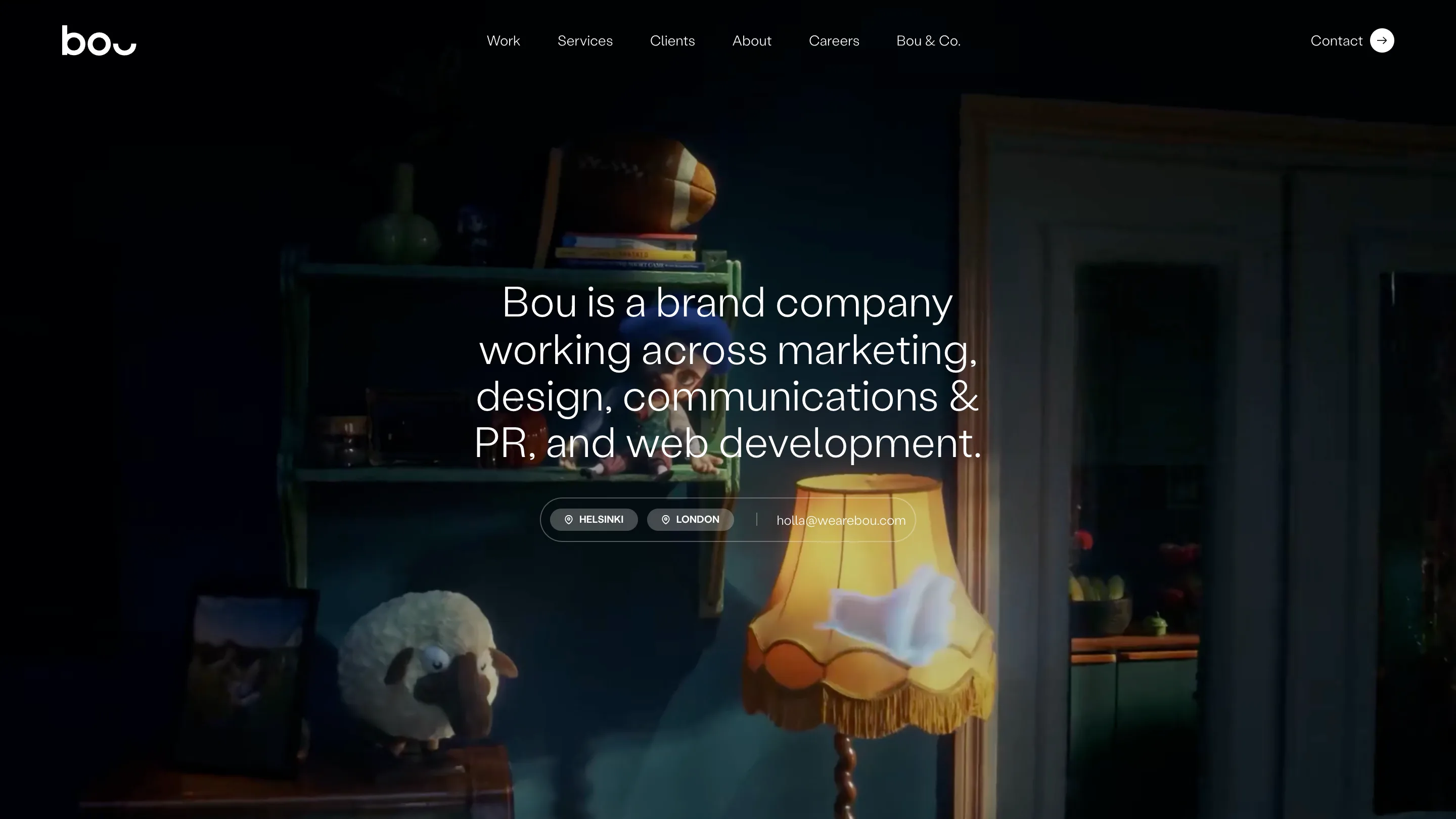
Bou's agency website design puts one sentence at the centre of every page and lets the background change around it. The Helsinki and London brand company opens its home on a single line, "Bou is a brand company working across marketing, design, communications & PR, and web development," set in a light grotesk over a looping stop-motion film. That line does the work a hero, a tagline and a services grid usually split three ways.
We found Bou on minimal.gallery, and it earns the spot with few moving parts: one typeface, one centred column, one pill-shaped control, and a ground that shifts with every page.
A one-sentence hero carries the whole home
The home headline runs to four lines and sits dead centre, with the six nav links centred above it and the logo pushed hard left. Under it, a single rounded capsule holds two location tags, Helsinki and London, and the email address. That capsule is the only interface element in the hero. No button, no arrow, no scroll prompt.
The film behind it is dark and warm: a puppet on a shelf, a lamp with a fringed shade, a sheep that looks lost. The puppet is the one from Bou's Hay Day campaign, the first card on the Work page, so the background is a case study playing on mute. White type sits on it without a scrim because the scene is lit low and the type is large enough to hold.
Statement headlines on soft gradient grounds
The inner pages swap the film for gradient grounds, and each page gets its own temperature. About sits on a pale pink and lilac haze. Work goes deeper, into a saturated violet that fades to white right before the project grid starts.
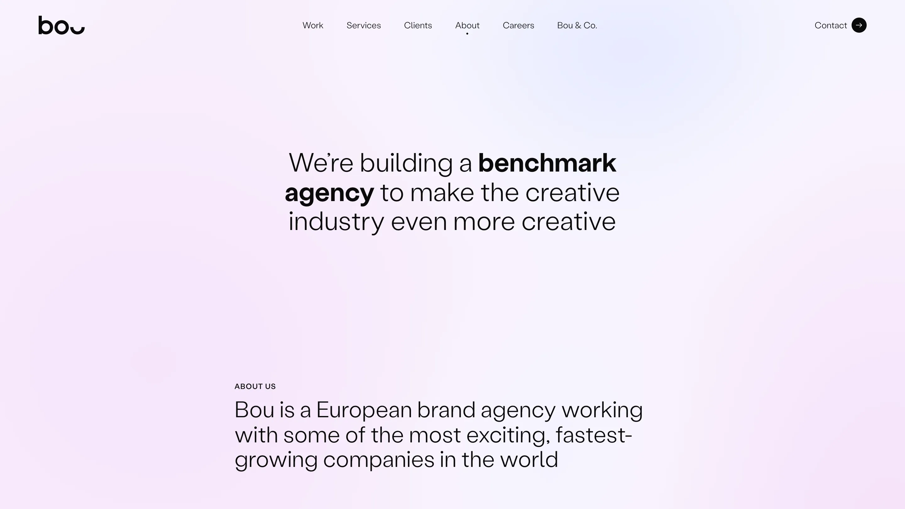
The About headline shows how much the type system can do with weight alone: "We're building a benchmark agency to make the creative industry even more creative." Two words go bold, the rest stays light, and the eye lands on the claim before it reads the sentence. The typeface is Stabil Grotesk, loaded as a single variable file, so the jump from light to bold costs nothing extra.
Below the fold the column narrows and drops to the left, with a small all-caps label, "About us," over a second statement at a smaller size. It's the same move twice, at two scales.
Copy with a sense of humour
The Work page headline is "Work work work work work work." Six words, one of them repeated, set larger than anything on the About page. It's a joke, and it buys the paragraph underneath a lot of goodwill. That paragraph then gets specific: an all-time NPS of 68, last updated 10/2026, with the term itself underlined and explained in a tooltip.
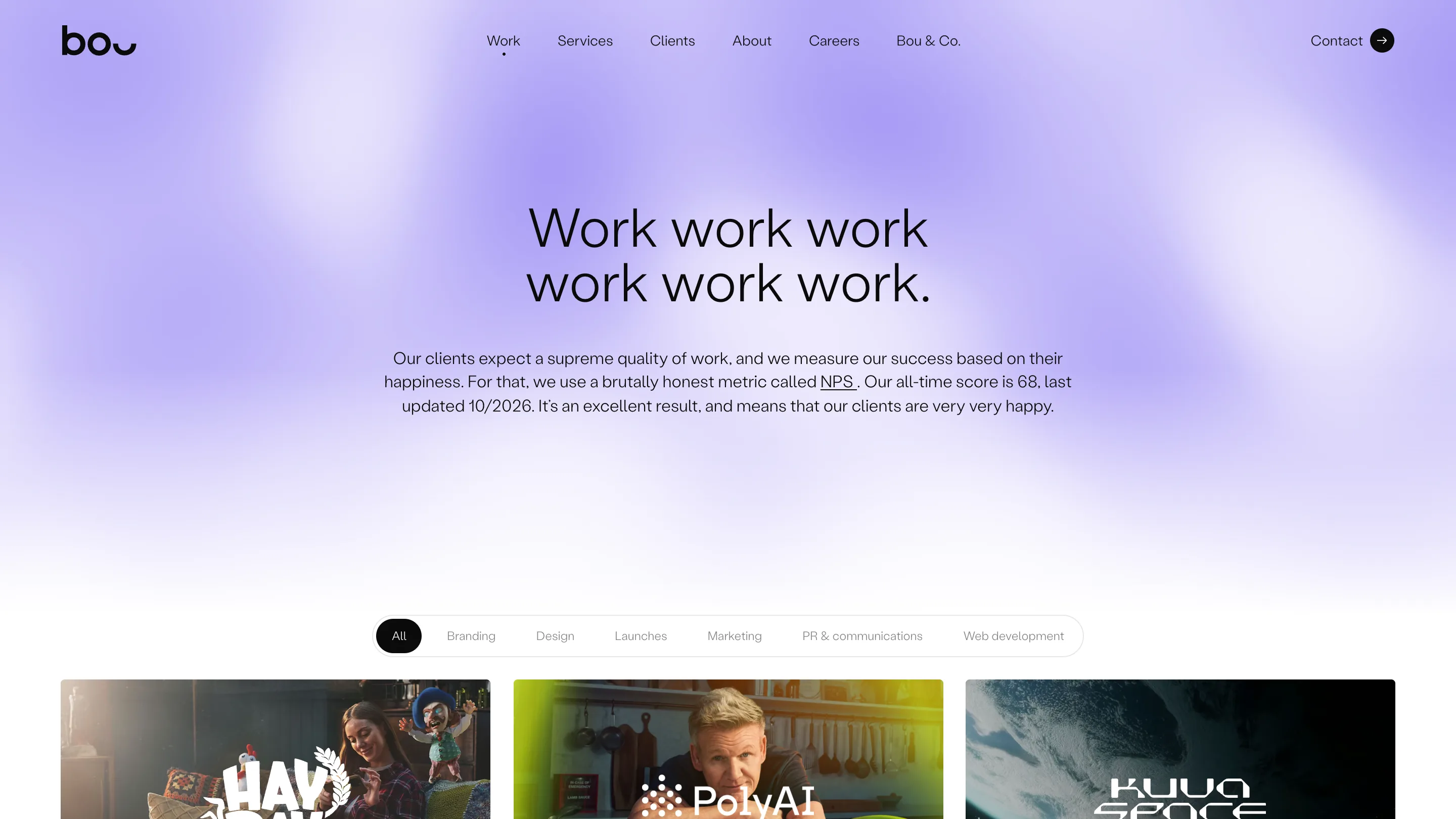
The filter bar repeats the capsule from the home hero: one rounded track, seven options, the active one filled black. Branding, Design, Launches, Marketing, PR & communications, Web development. The cards under it run three across with each client's own logo printed straight onto the key visual, so Hay Day, PolyAI and Kuva Space read as their own brands first and Bou's work second.
The case study turns white and goes to two columns
Open a case and the gradient is gone. The Polestar page is plain white, with the client name set twice across the top: once in Bou's light grotesk on the left, once as Polestar's own wordmark on the right. A thin rule closes the header.
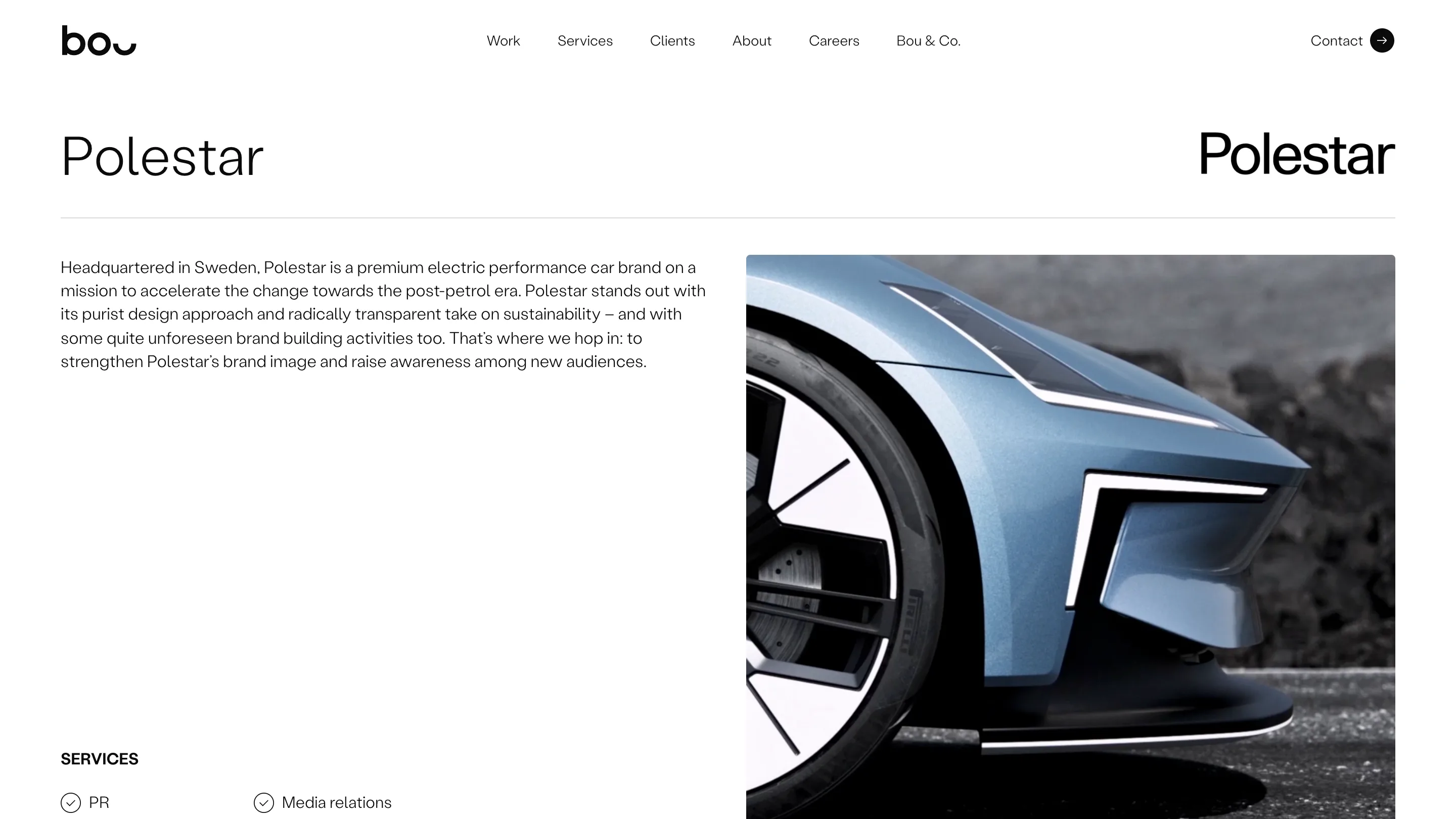
Below it, a short text column sits next to a tall crop of the car's front wheel and light bar. The services list at the bottom uses circled check icons, two columns of them, which keeps a long list of PR tasks scannable. The headline from the home page set up the claim; the case page is where the evidence lives, so it drops the atmosphere and gets quiet.
What to take from Bou's agency website design
Pick one sentence per page and give it the whole centre of the screen. Let the background carry the mood and change it per section, so a visitor knows where they are before reading the nav. And reuse one control shape everywhere: Bou's capsule holds the contact line on the home and the filters on Work, and that repetition is most of what makes the site feel designed by one hand.