Driftime's impact report web design is built to be read
Driftime's 2025 impact report runs as six web chapters, each with its own gradient, justified serif in four columns, and an audio track you can play.
Inspiration · The Editors · 4 min read ·
Featured: Driftime®
Driftime put its 2025 impact report on the web as six chapters you scroll through, each one carrying its own colour. The impact report web design treats an annual document the way a magazine treats an issue: a cover, named sections, body copy justified across four columns, and an audio briefing you can play instead of reading. Driftime is a London studio that works with environmental and social organisations, and the report is about a hard year for both sides of that table.
Six chapters, six gradients
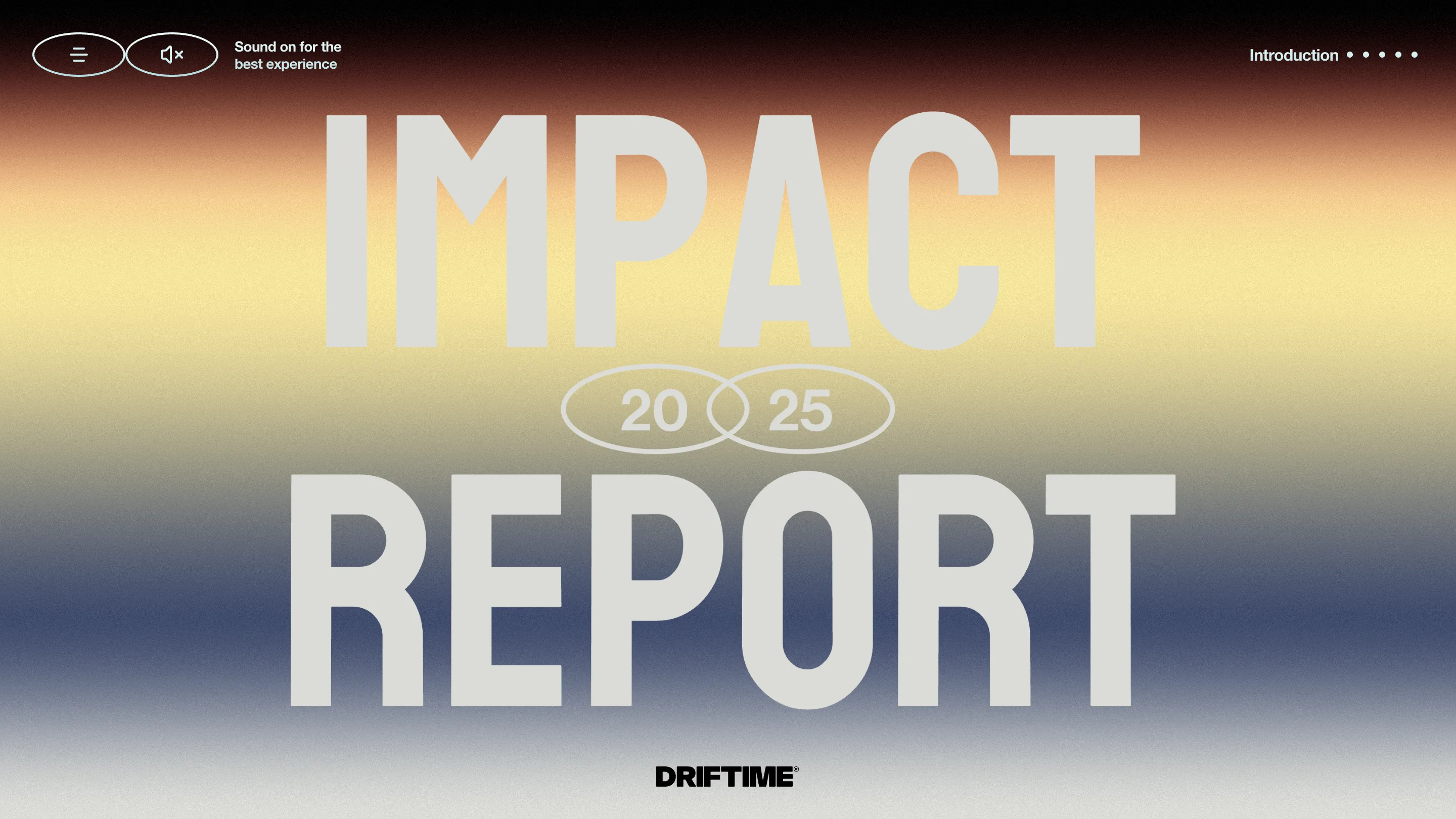
The cover sets the rule. IMPACT over REPORT in a wide grotesk, tight to the edges, with 20 and 25 in two overlapping ovals wedged between the two words. Behind it, a gradient that runs rust at the top through yellow into navy, with enough film grain over the whole thing that it reads as printed rather than rendered. The studio wordmark sits alone at the bottom.
Every chapter opener repeats that shape and changes the weather. Landscape is navy dissolving into fog. Moves is aubergine going white. Horizon is gold falling into slate.
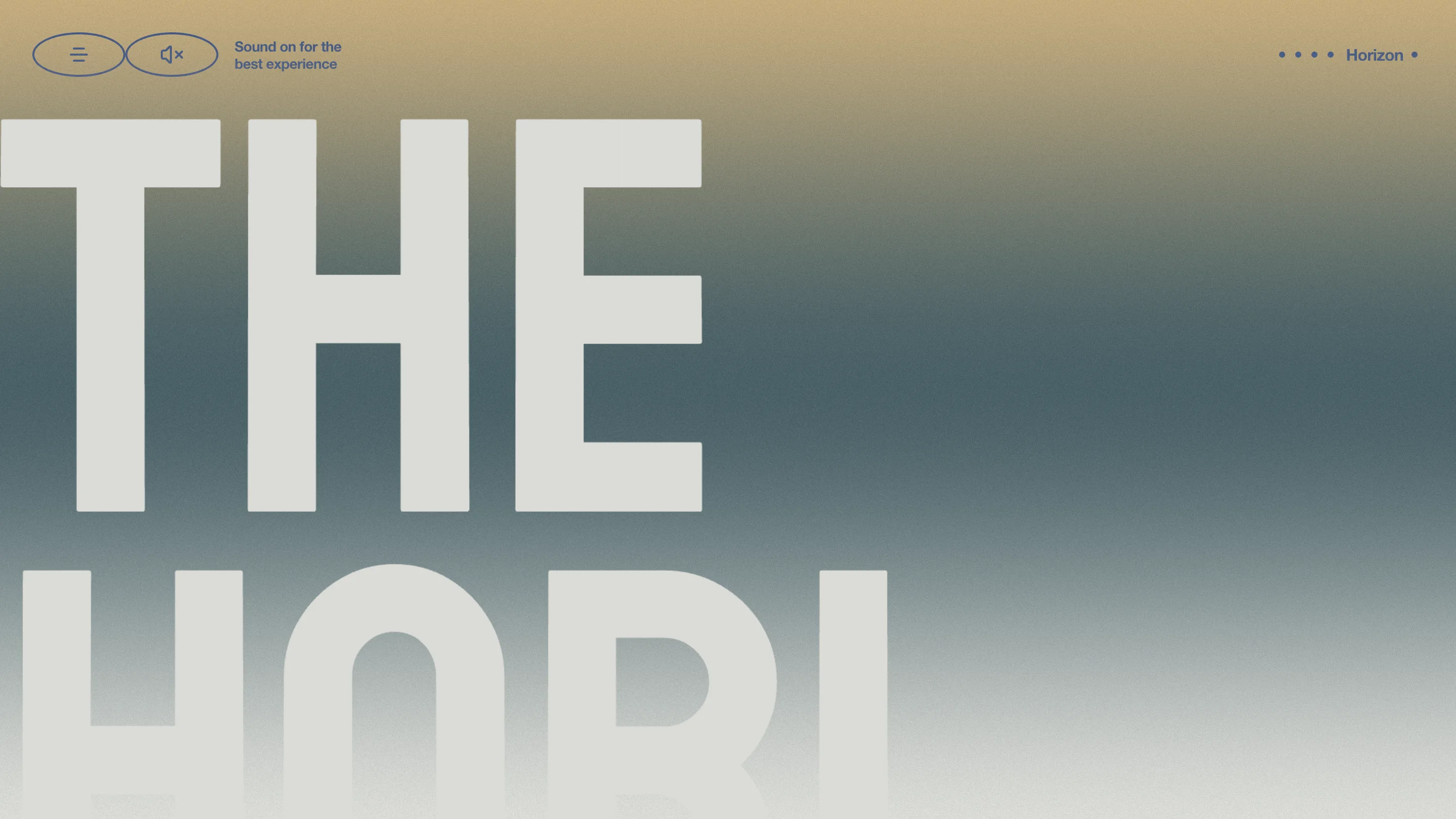
The top right corner tracks where you are with five dots and the chapter name. That is the whole navigation. No progress bar, no sidebar, no chapter index sitting permanently on screen. You know which section you are in because the colour changed.
Four columns, justified, on black
Scroll past the opener and the page goes black and the type gets small. The body is set in a serif, justified, across four columns that read left to right like a broadsheet spread rather than down one endless scroll column.
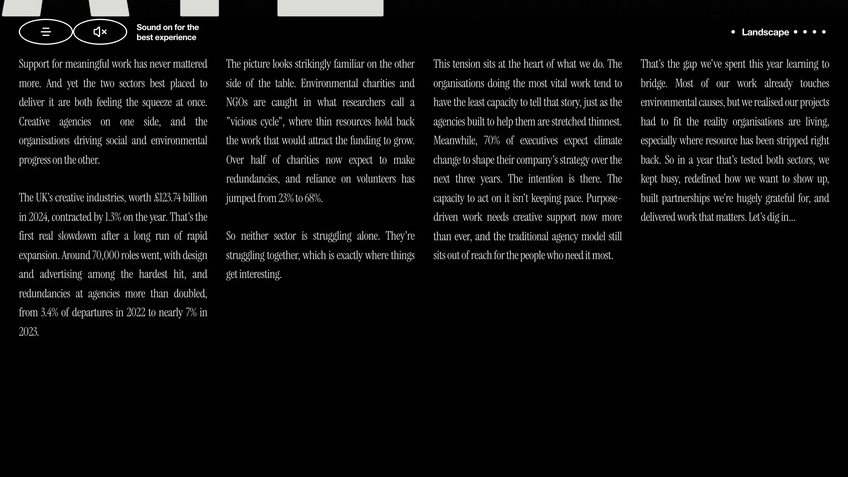
It works because the copy is dense with numbers and the columns keep the measure short. The UK creative industries, worth £123.74 billion in 2024, contracted 1.3% on the year. Around 70,000 roles went. Agency redundancies climbed from 3.4% of departures in 2022 to nearly 7% in 2023. On the charity side, reliance on volunteers jumped from 23% to 68%, and over half now expect to make redundancies. Then the turn: 70% of executives expect climate change to shape strategy inside three years.
Four columns of justified serif is a risky setting on a screen. Rivers open up, hyphenation gets ugly, and long lines strand the reader. Driftime gets away with it by keeping each column narrow and each paragraph to four or five lines, so a column is a unit of thought and you never have to hunt for where the next one starts.
Listen or read
Curiosities, the closing chapter, drops the full-bleed gradient and puts a pale sheet of paper on a starfield. A Listen and Read toggle sits at the top of the sheet. Pick Listen and you get the audio briefing. Pick Read and the serif stays.
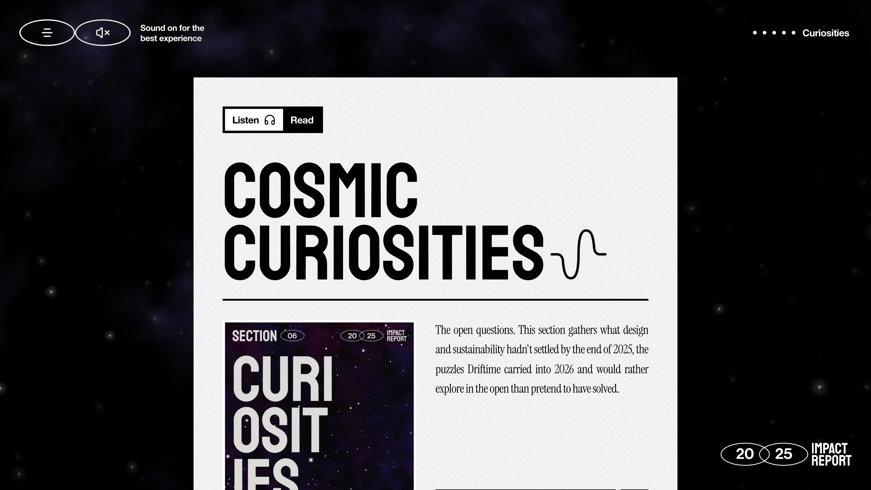
The sheet carries a section card in the left column, black and purple, stamped SECTION 06 and 20/25 in the same oval badges from the cover. That badge is doing a lot of work across the report. It shows up on the cover, in the corner of the page, on the section cards, and it is the one graphic element that makes six differently coloured chapters feel like one document.
Why the format holds
Most of the craft here is restraint about interaction. There is no scroll hijack, no cursor trick, no card that flips. What changes between chapters is colour and one line of copy in the corner. Everything else stays put, which is what lets you read 4,000 words of it.
Driftime credits its own team for the design and is straight about using AI as a tool inside the process rather than pretending it did not touch the work. Found via Minimal Gallery.