Snøhetta's low-carbon web design dithers every photo
Snøhetta's site lets readers switch to 16-colour dithered GIFs up to 80% lighter. The constraint became the look. Here's how Værsågod built it.
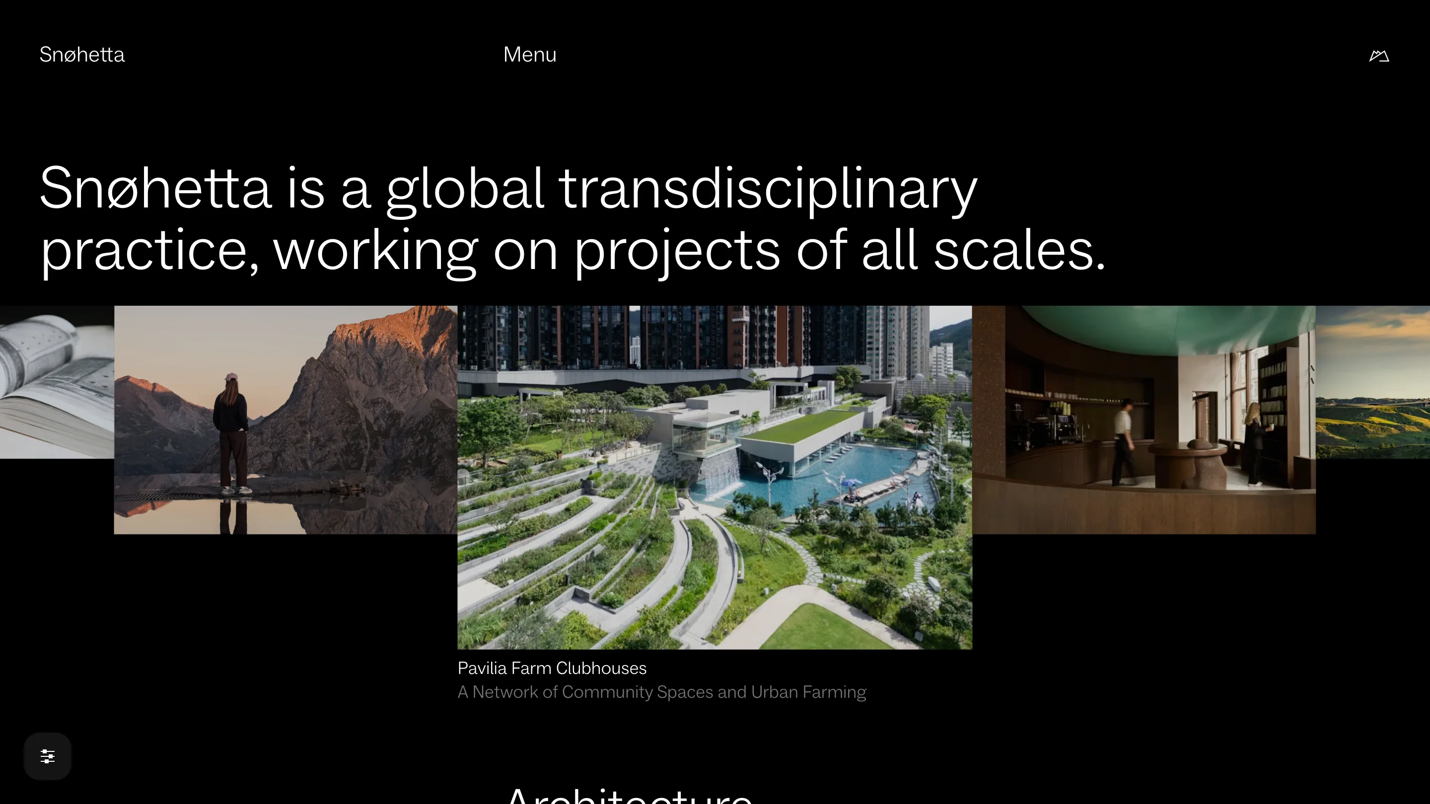
Snøhetta's website ships a 300-pixel GIF of a woman standing by a mountain lake. It weighs 7.9 KB. The sharp JPEG of the same view weighs 40.5 KB. That swap, repeated on every picture, is the core of the best low-carbon web design we've seen on an architecture practice's site, and the reason it looks the way it does.
Snøhetta built the site in winter 2023 with the Oslo studio Værsågod, as part of a new identity that ran from 2022 to 2024. We found it on Httpster, filed under a tag the gallery has used three times: Low carbon.
A low-carbon web design you can switch on
Bottom left of every page sits a small round button with three sliders on it. Open it and you get three switches: Dark mode, Simplified and Low-res. Each one cuts the data the page asks for.
Simplified drops most of the animation and the interactivity, and loads even less JavaScript than the default. Low-res replaces the photographs with dithered GIFs. The home page reads the choice from markup: every picture carries two sources, a data-highres-srcset pointing at a JPEG on the CDN and a data-lowres-srcset pointing at a GIF. The visitor picks which one travels.
That's the part worth copying: the reader holds the dial.
Dithering as a look
The Low-res images go through a fixed recipe, which Værsågod published: 16 colours, Floyd-Steinberg dithering, saved as GIF, then upscaled two to four times. The result is 60 to 80 percent lighter, by their count, and our Lech Mountain Mirror test lands at the top of that range.
The constraint became the style. At 16 colours a sunset over the Alps turns into bands of rust and slate with a fine noise across them, closer to an early Mac screen than to a stock architecture photo. Værsågod calls it a nod to early computing. On a site full of concrete, timber and fjords, the grain reads as material, and it makes a practice known for big buildings look handmade.
Greys instead of weights
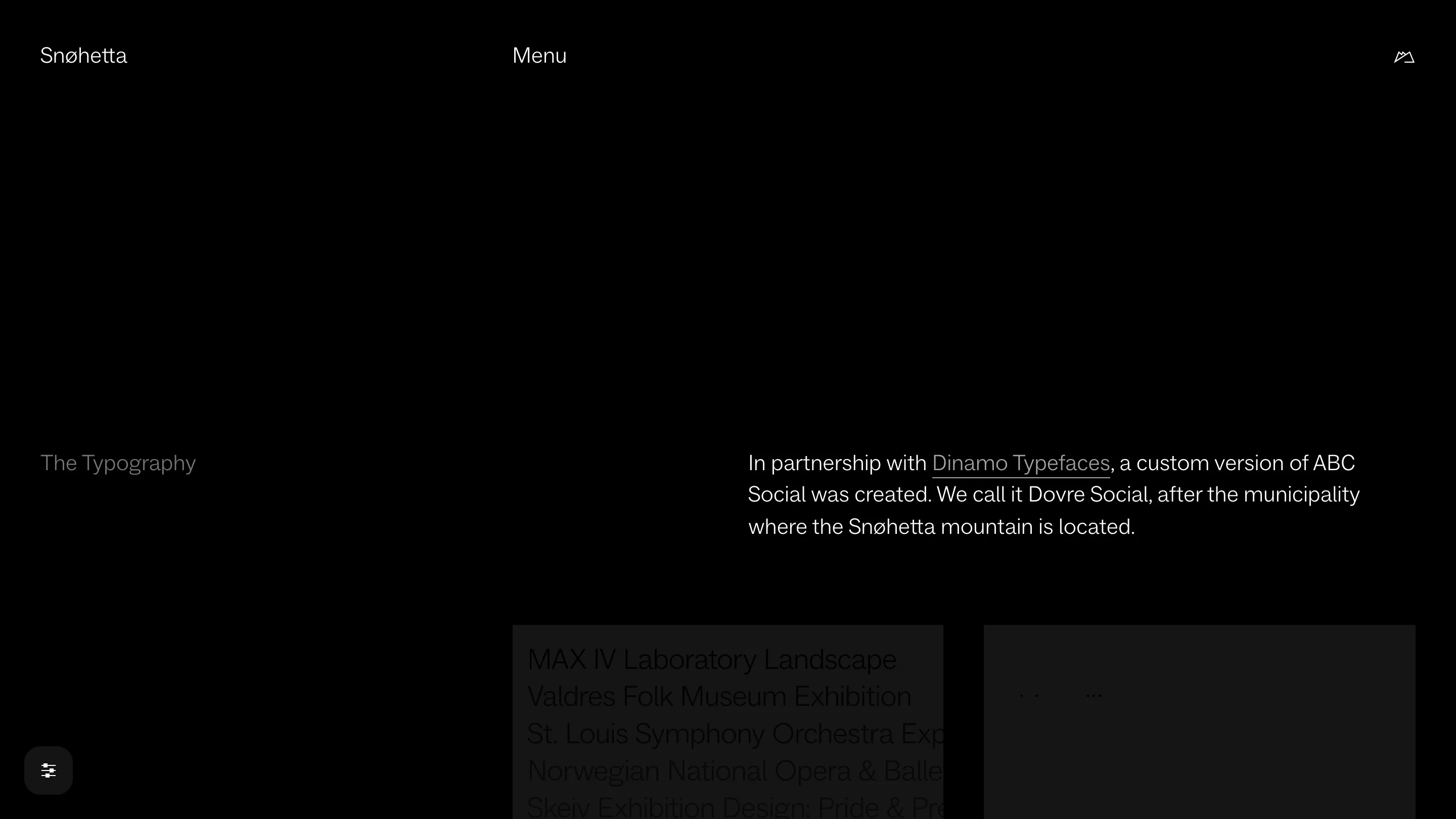
The type is Dovre Social, a custom cut of ABC Social made with Dinamo Typefaces and named after the municipality where the Snøhetta mountain stands. The site loads it in two files, Light and Light Italic.
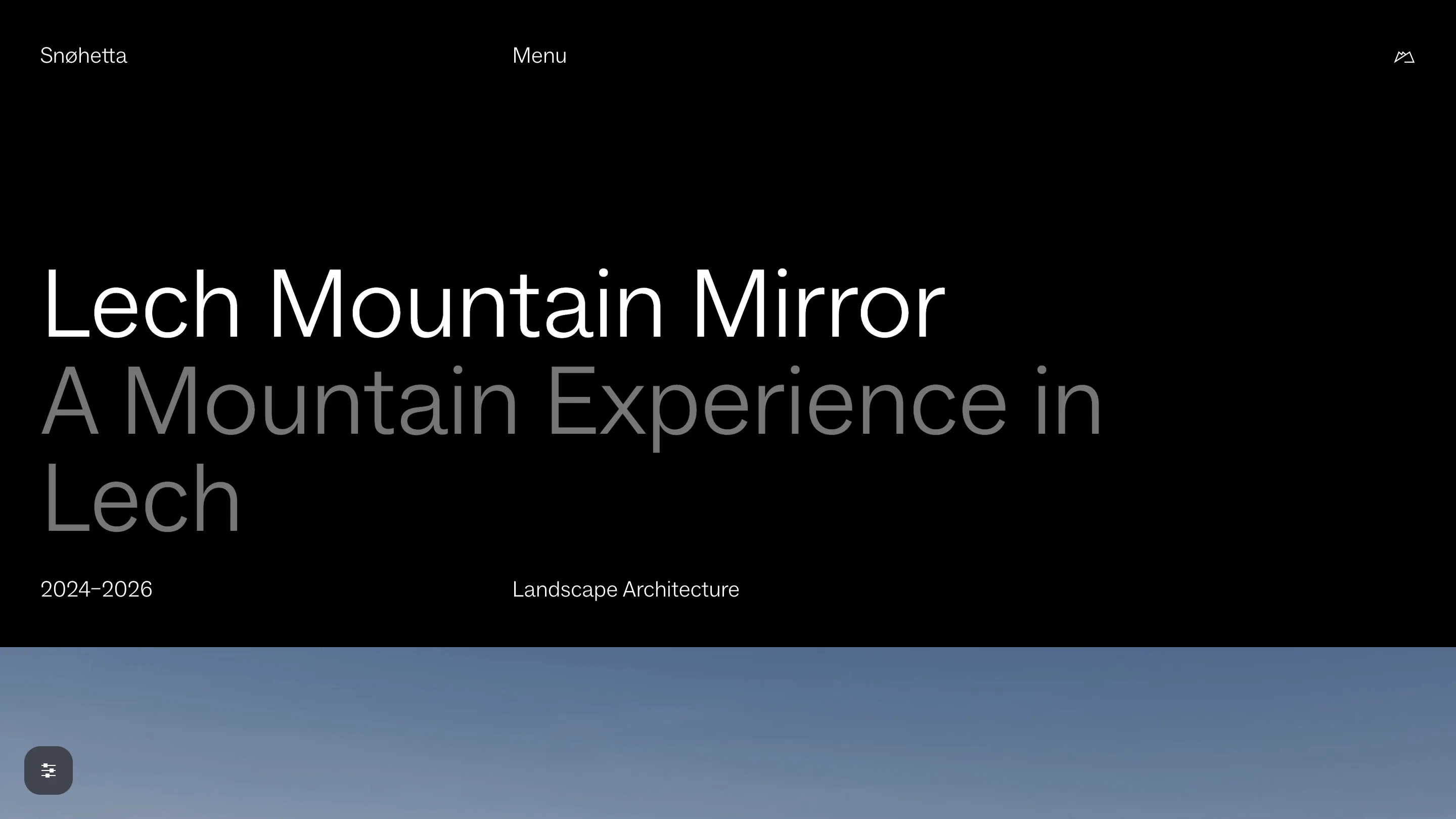
So hierarchy can't come from bold. It comes from grey. A project page sets the name in white and the subtitle underneath in a mid grey at the same size: "Lech Mountain Mirror", then "A Mountain Experience in Lech". The identity describes the palette as black and white and everything in between, with greys tuned separately for light and dark grounds. One weight, a few greys, no extra font files to download. The typography saves bytes too.
An archive that stays quiet
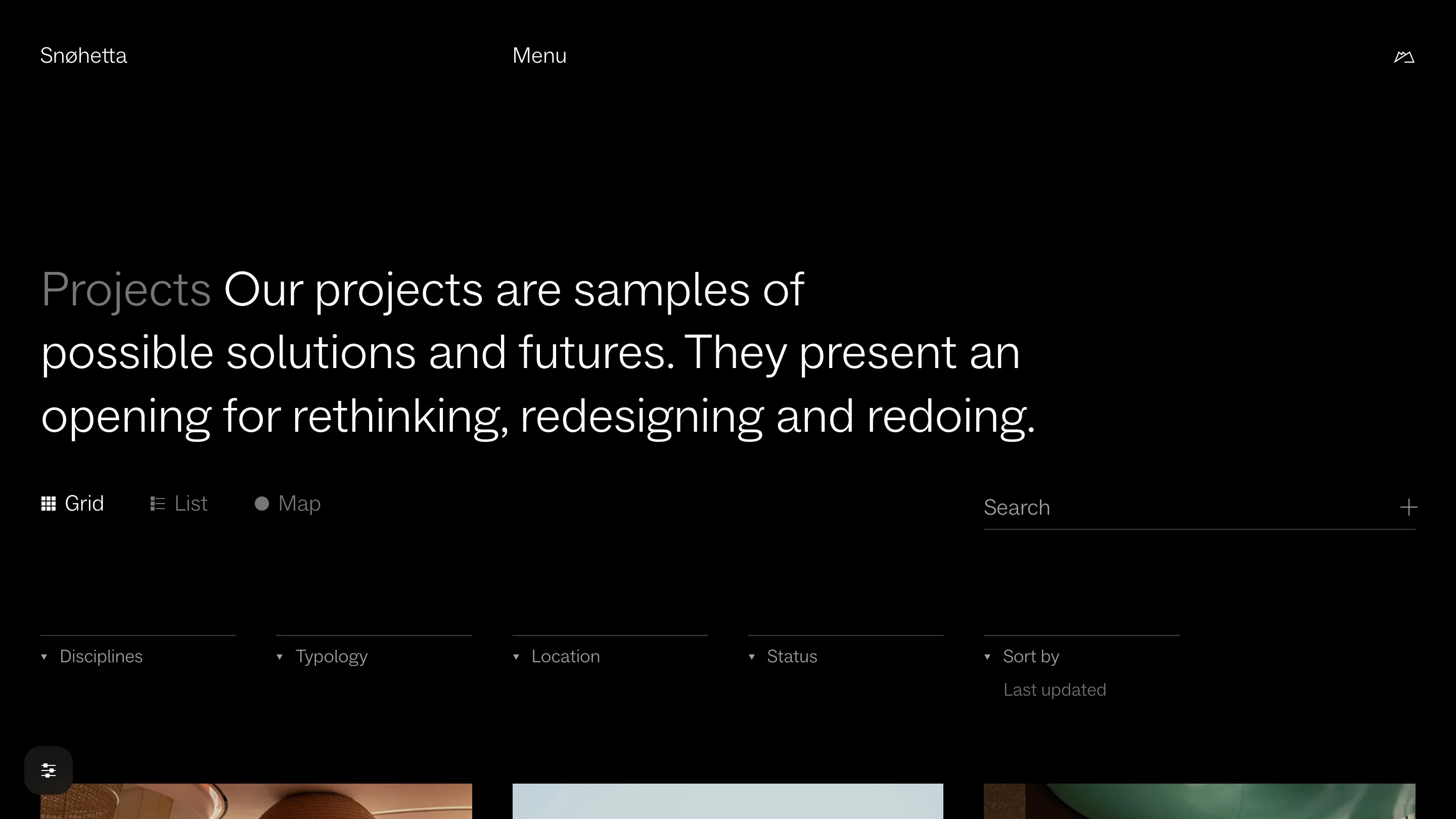
The projects index opens with one sentence in large type, then a switch between Grid, List and Map, and four filters: Disciplines, Typology, Location, Status. Every control is a word in the same light weight, set on hairlines. The only icons are small glyphs beside the view names, and there isn't a coloured button on the page.
Behind it, Værsågod moved the content off a proprietary CMS onto Craft, cached pages as static files, split the JavaScript into pieces that load on demand, and put the assets behind a CDN on hosting that runs on renewable power. None of that shows. It's why the page arrives fast.
What to take from it
Give the reader the switch. A Low-res toggle costs one extra image per picture on the server and saves most of the weight for anyone who flips it.
Let the constraint draw. Sixteen colours and a dither pattern gave Snøhetta a visual signature that's hard to mistake, and it came out of a file-size budget.
Build hierarchy with tone. One weight and a handful of greys did the work three weights usually do. The site won Visuelt's Green Award in 2024 and a Communicator Award of Excellence in 2025. It earned both on the same decisions.