Jacky Winter Gallery's website design hangs work on black
Three photographs on black at three different heights, and no headline. How the Jacky Winter Gallery site turns a hang into a web page.
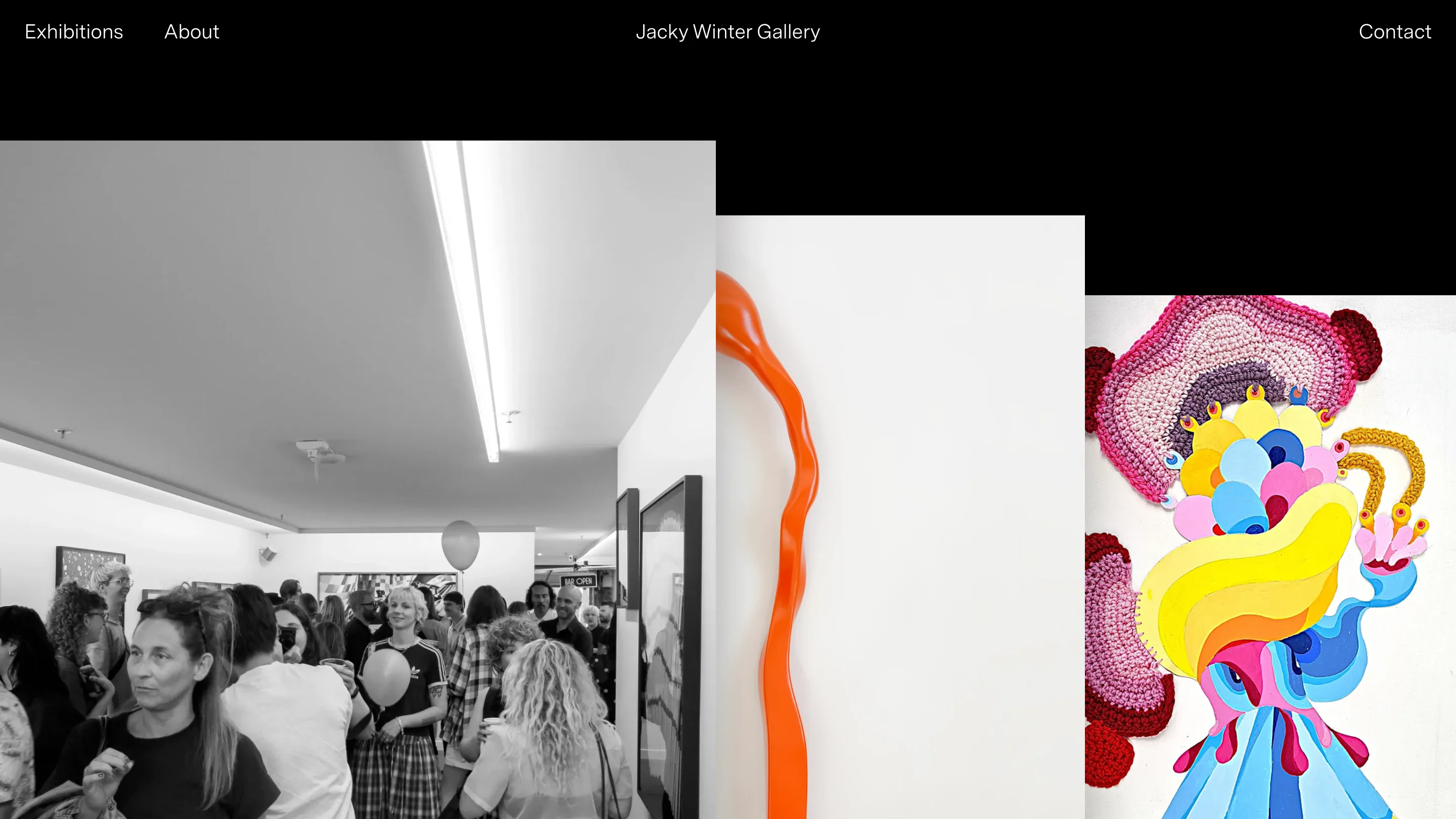
The Jacky Winter Gallery site opens on black, with three photographs sitting at three different heights and nothing else. No headline, no intro paragraph, no scroll cue. As gallery website design goes it's close to nothing, and it works because the page behaves like a wall instead of a feed.
The gallery is at 52 Budd St, Collingwood, in Melbourne. The Jacky Winter Group started it in 2008 as a room for design-led art, and it's been in the Budd St shopfront since 2017. Shena Jamieson curates. The site is the listing for all of it.
The hang, translated to a page
Look at the home screen. Three images, each running off its own edge, each starting at a different vertical offset. The first sits just under the nav bar. The second drops about a third of a viewport lower. The third lower again. Nothing lines up.
That misalignment is the point. Works on a gallery wall get hung to the room, at whatever height the eye wants them, and the site copies that rhythm. Black behind them does the job a matte board does. It removes the frame, so the crocheted pink piece, the orange squiggle and the grainy opening-night photo each keep their own edge.
Two typefaces, two jobs
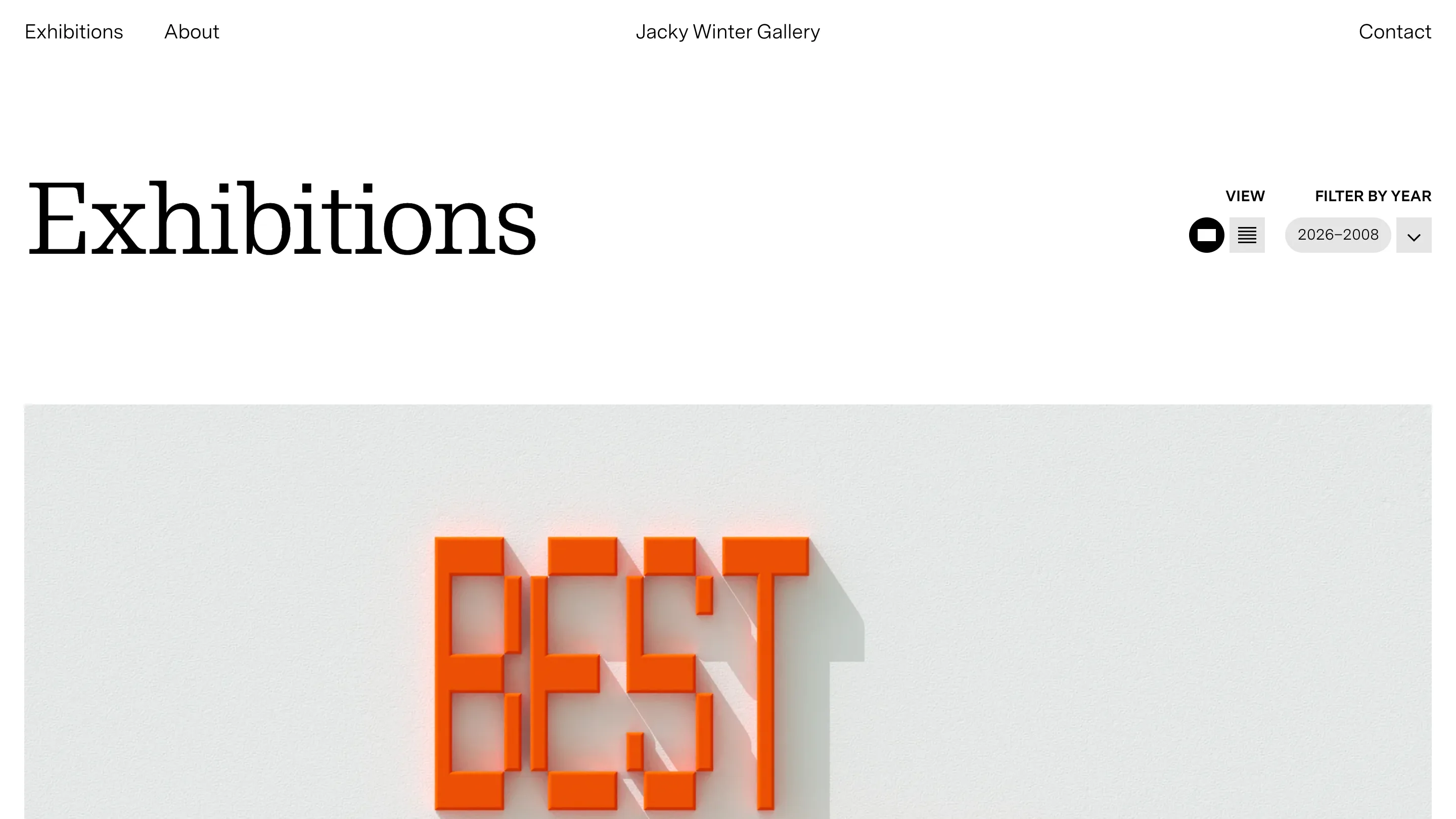
The nav is a neutral grotesk at around 15px, four items, split three ways across the top: Exhibitions and About on the left, the wordmark centred, Contact on the right. It reads as furniture and gets out of the way.
Then the headings arrive in a high-contrast serif at roughly ten times that size. "Exhibitions" runs a third of the page width, hairline serifs, heavy stem contrast, the kind of face you'd expect on a Melbourne exhibition poster rather than a CMS template.
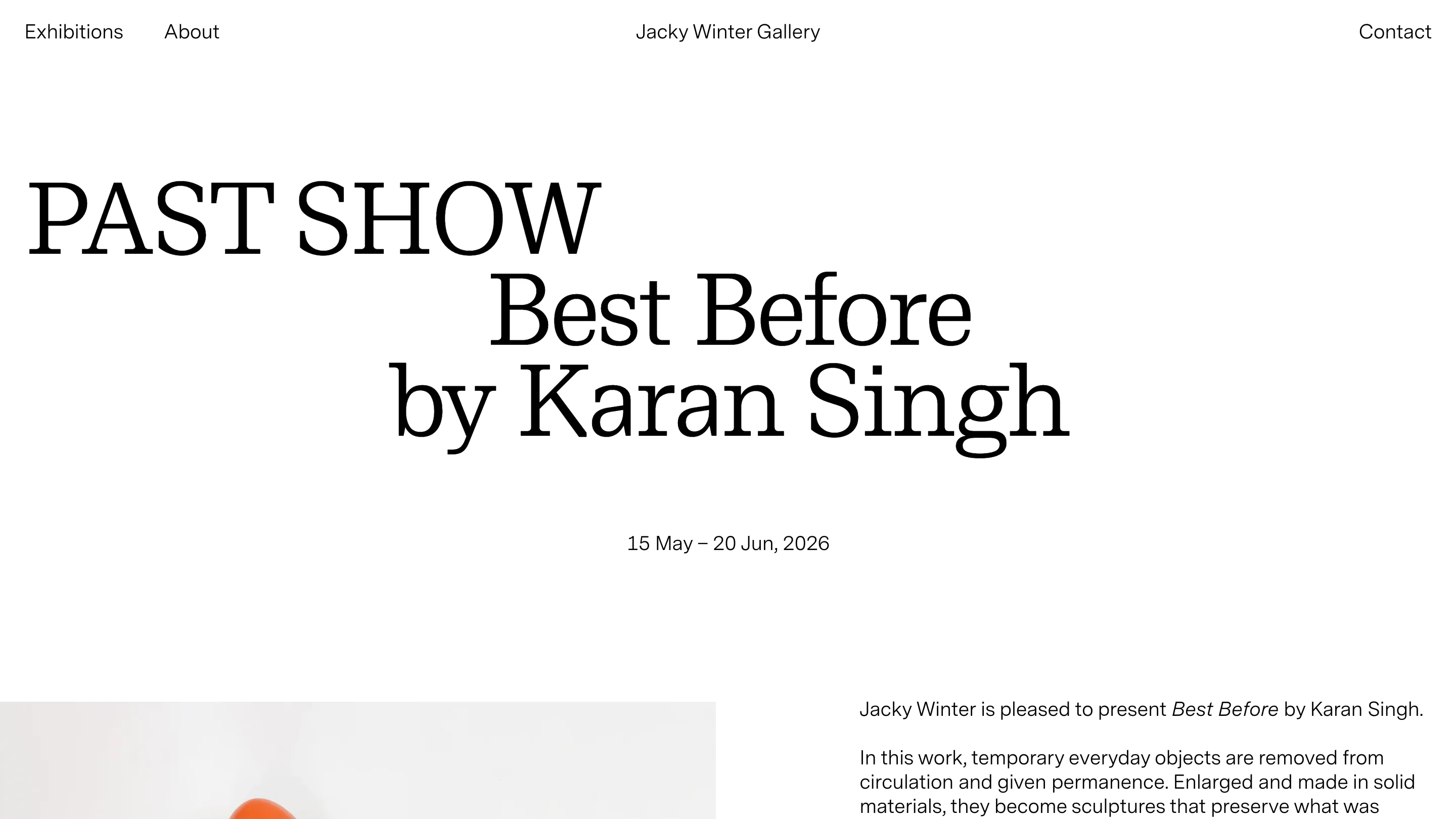
The show pages push it further. On Karan Singh's Best Before, the title block steps down and to the right in three stages. PAST SHOW in caps, flush left. Best Before indented under it. by Karan Singh indented again. Dates sit centred below, back in the grotesk. It's a staircase, and it tells you status, title, artist, in that order, by position alone.
Eighteen years, filtered by one dropdown
Top right of the Exhibitions page there's a two-state view toggle, grid or list, and a dropdown that reads 2026 to 2008. That range is the gallery's whole life. Both controls are small grey pills, quiet enough that the serif still owns the page.
Keeping every year since 2008 turns the listing into a record of what Melbourne illustration was looking at, one month at a time. Toyworld 2. Rosetta. Recovery Mode. She'll Be Right? Motif. Nine shows land on the first screen before you touch the filter.
One photo, one column, one address
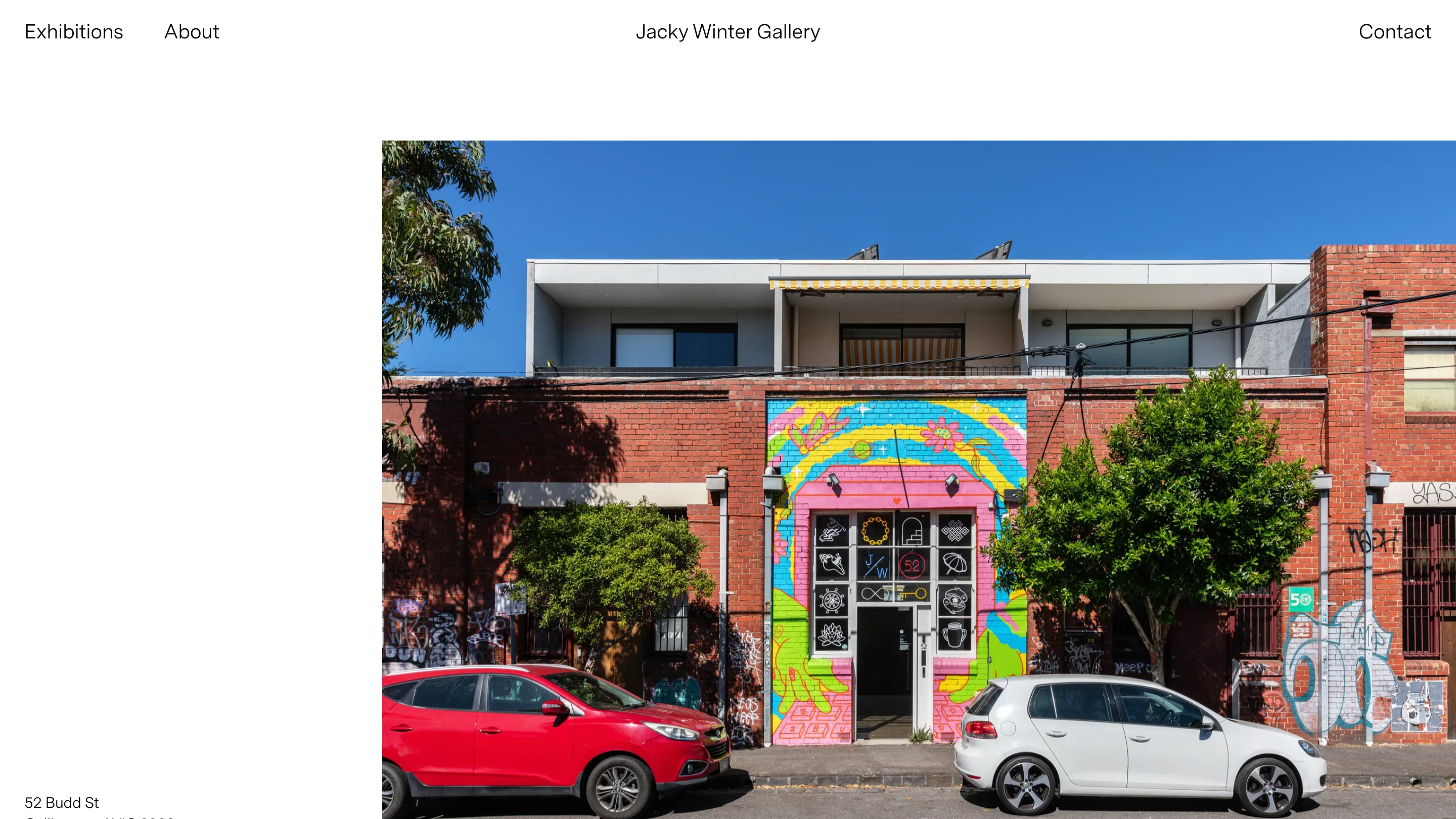
The About page holds one wide photograph of the shopfront: rainbow mural over pink render, red brick either side, a red car and a white car parked out front. Text runs down the left in the same small grotesk as the nav and ends on the street address at the bottom of the frame. Hours, history, the three earlier Collingwood addresses, the architects who did the fit-out.
What's worth taking: one serif with enough contrast to carry a page on its own, one grotesk for everything else, and position doing the work you'd usually ask of weight and colour. Black behind other people's images is still the cheapest way to make them look expensive.
Found via Httpster. The gallery is open Wednesday to Friday 11 to 6 and Saturday 12 to 5.