House of Honey runs oversized script type over every page
The interiors studio sets one giant pink script word per page, cropped by the screen edge. Edoardo Lunardi designed it. Here's how it holds up.
House of Honey sets one script word per page at a size that doesn't fit the screen.
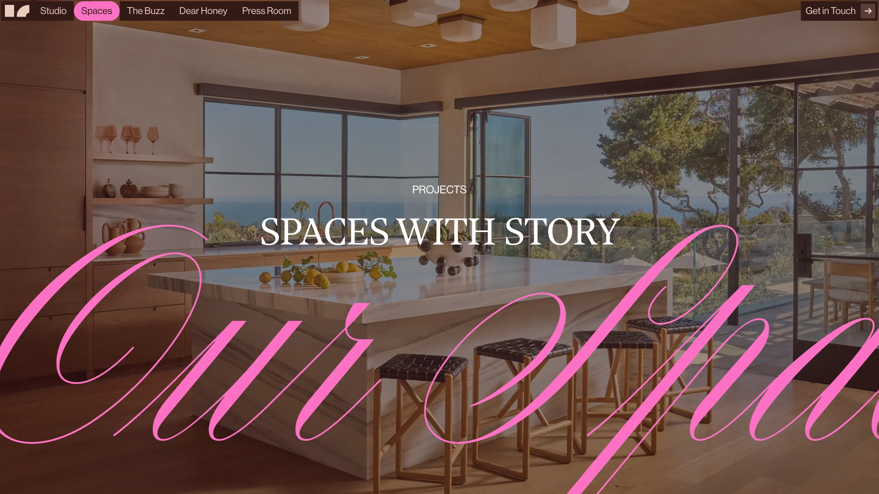
On the Spaces page the word is "our spaces", drawn in a high-contrast engraver's script, filled hot pink, laid across a photograph of a hillside kitchen. It runs off both edges. You read the middle and your eye finishes the rest. The site belongs to House of Honey, an interiors studio in South Pasadena, and it was designed by Edoardo Lunardi. It picked up Site of the Day and a Developer Award on Awwwards on 14 July.
Oversized script typography, one word per page
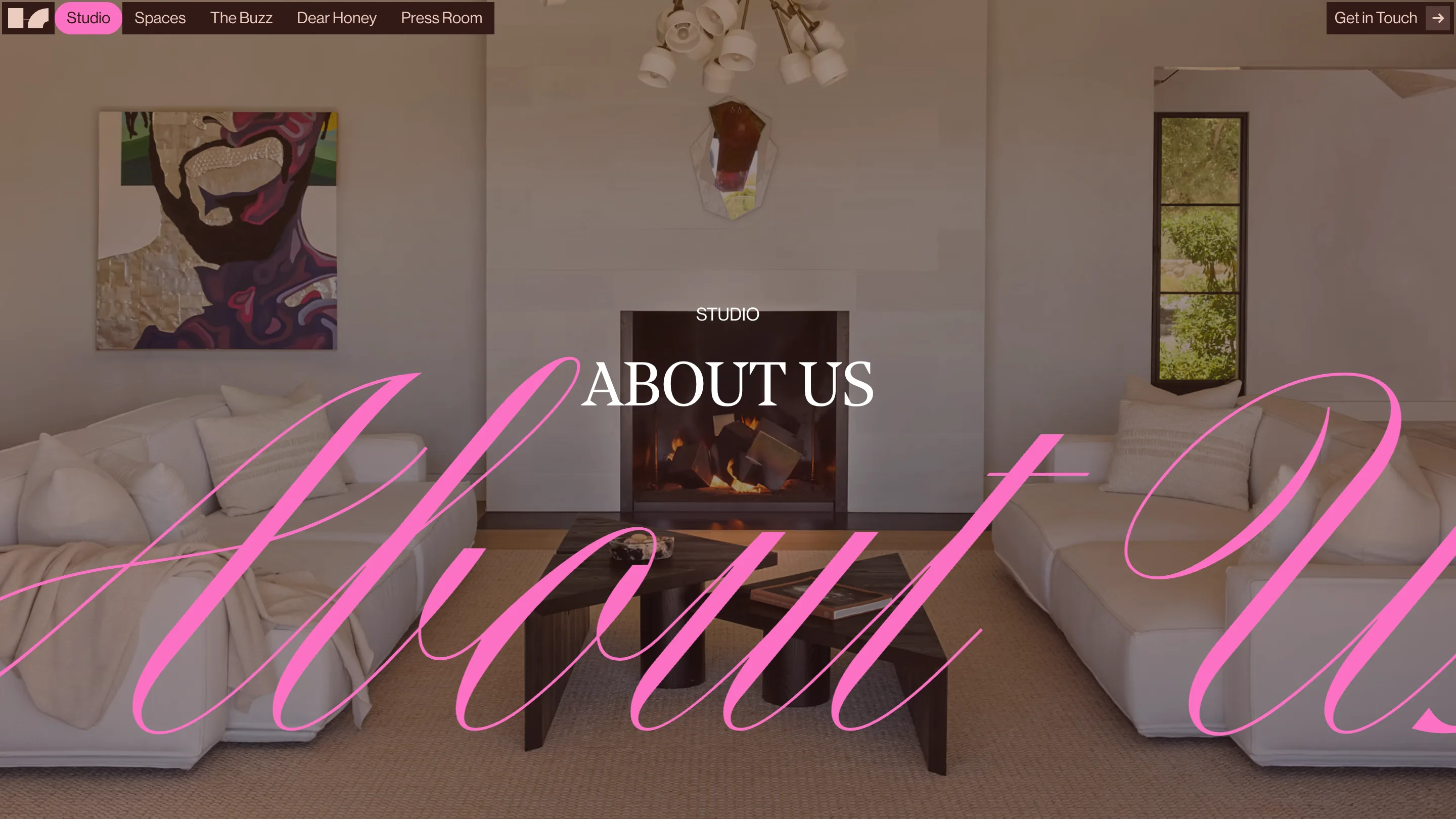
Every interior page is built from three layers, in the same order. A full-bleed photograph at the back. The script word in the middle, scaled past the viewport so only its belly is visible. A centred title in caps on top. Studio, Spaces, a single project: same recipe, different word.
The crop is the decision. A script set to fit would read as a signature stuck on a page. Set to overflow, it reads as a texture, and the loops of the l and the h turn into pattern over the photograph. Because the letterform is high contrast, the thin strokes almost vanish against the image and the thick ones carry the colour. That's what keeps it from becoming a wall of pink.
The serif on top does the reading
The script never has to be legible, because a second typeface handles that job. Titles sit in a Didone-style serif, caps, wide letterspacing, white, dead centre: SPACES WITH STORY, ABOUT US, GOOD TASTE, BAD BEHAVIOR. Above each one a small eyebrow in the same face names the section.
So the page has a loud layer and a quiet layer, and they never fight, because they're doing different work. The script sets the mood. The serif tells you where you are.
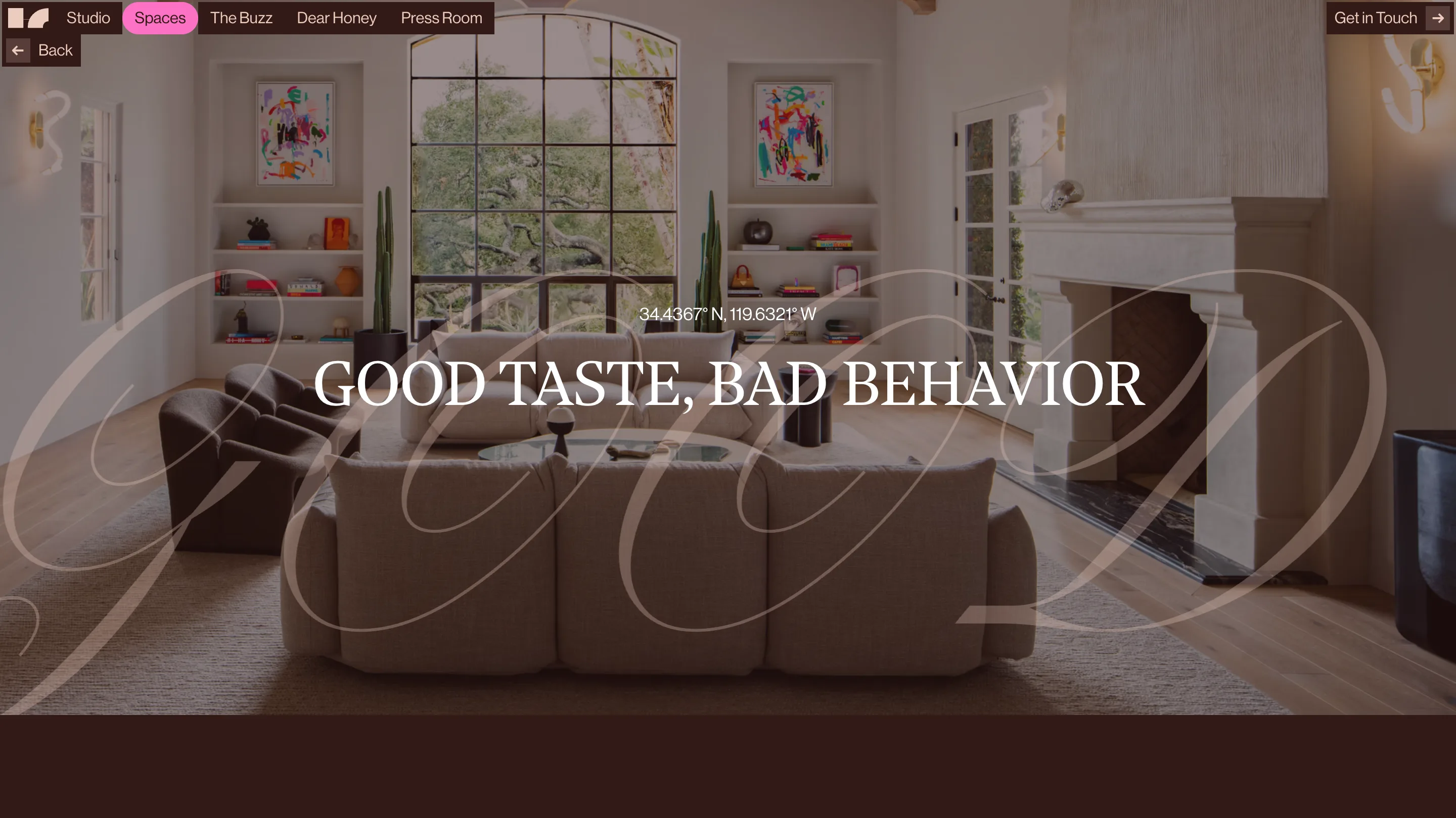
Project pages add one small thing that pays off: latitude and longitude in place of a location name. Under the title of a Santa Barbara house you get 34.4367° N, 119.6321° W. Six characters of confidence, and it fits an interiors studio that names its projects Good Taste, Bad Behavior and French Country Fantasy.
One colour, used at full strength
The pink is the brand. It shows up in the script, in the active nav pill, in the dusty tint behind the home page wordmark, and nowhere else. Everything around it is dark brown, white, and whatever colour the photography brings.
That restraint is what lets the pink run at that scale. On the project pages the script drops to a translucent white instead, because the room is already warm and a pink layer would have muddied it. Same device, tuned to the photograph underneath.
The home page breaks its own rule
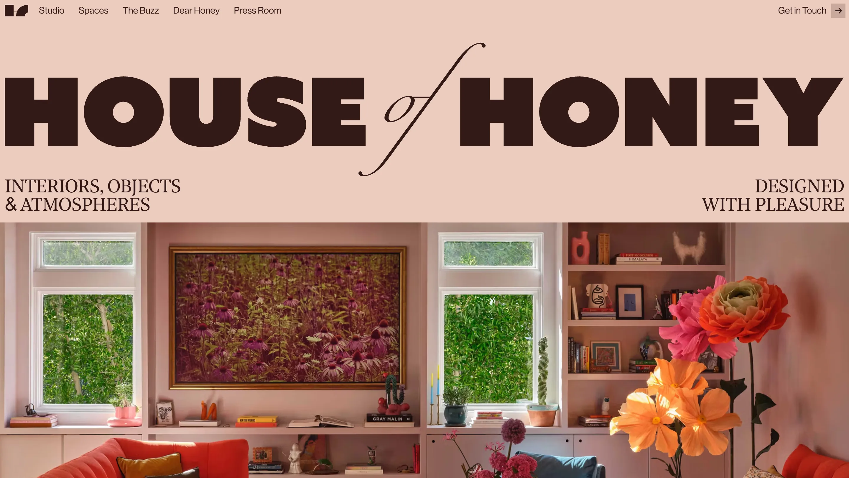
The home page drops the photograph and gives the type the whole field. HOUSE of HONEY runs edge to edge in a heavy grotesque, and the of is a script italic whose descender swings down and loops under the whole lockup, tying the two words together. Two straplines flank it: INTERIORS, OBJECTS & ATMOSPHERES on the left, DESIGNED WITH PLEASURE on the right. Below the fold, a four-column grid of rooms starts immediately.
One screen, and you have the studio's name, its register, and its work. The interior pages then spend the rest of the site repeating the same two typefaces in a different arrangement.
What holds it together
The trick is that the script is decoration with a job. It carries the brand colour, it fills the dead space in a photograph, and it changes word by word so no two pages feel identical, all without adding a line anyone has to read. Most sites reach for a gradient or a grain overlay to do that. This one reached for a letterform.
Worth studying if you're designing for a studio whose work is already photogenic. The photography sells the rooms. The type has to sell the taste.