Cecilie Bahnsen builds editorial fashion e-commerce
The Copenhagen label's shop reads like a lookbook: full-bleed photography, a quiet serif wordmark, and a grid that pairs detail crops with full looks.
Inspiration · The Editors · 4 min read ·
Featured: Cecilie Bahnsen
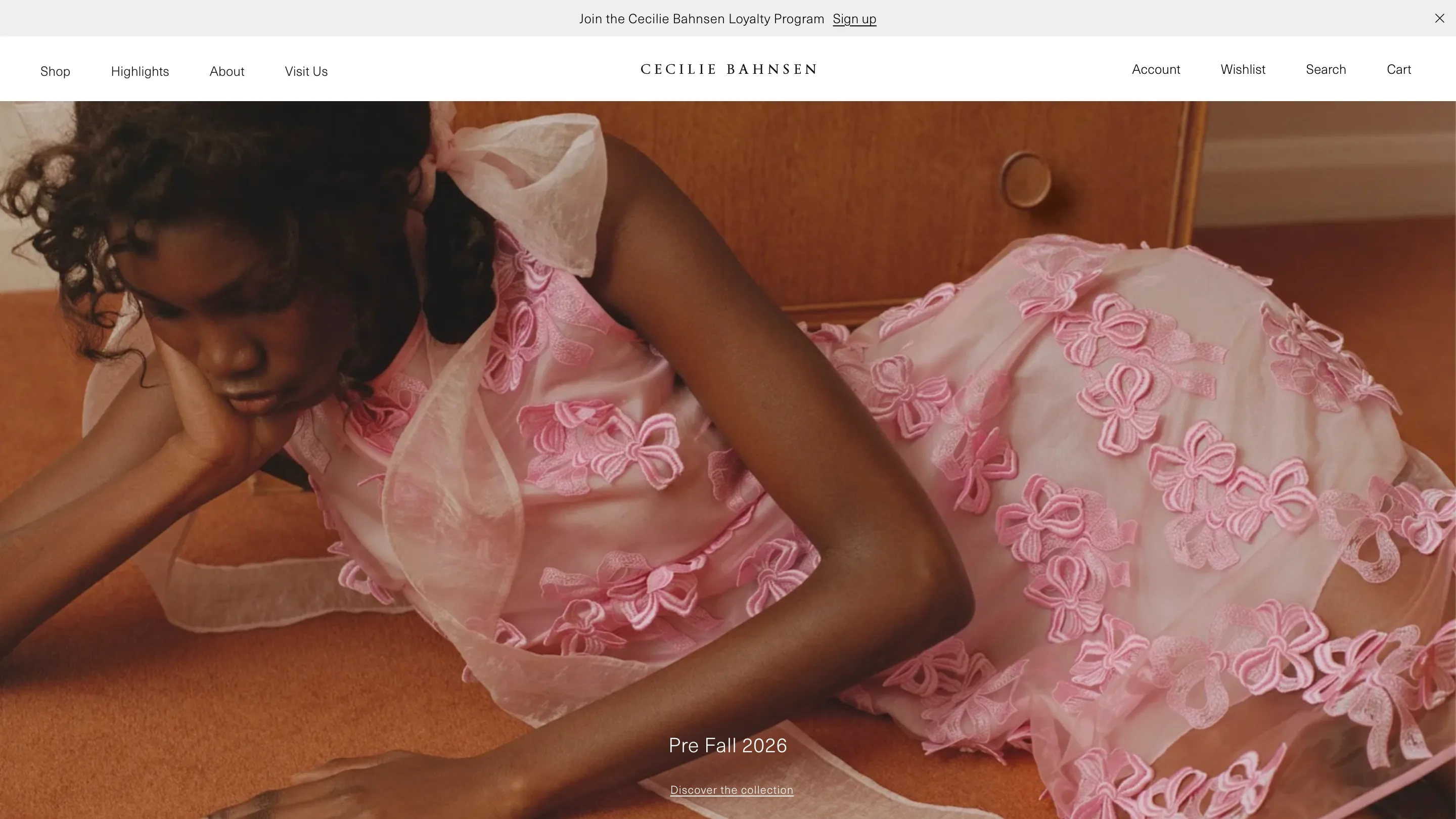
Open Cecilie Bahnsen and a model lies across an orange carpet in a pink dress covered in embroidered bows. No headline competes with her. The wordmark sits small and centered, the nav is four quiet words, and the photograph runs edge to edge. This is editorial fashion e-commerce done with the restraint of a magazine cover, and it's one of the calmest luxury shops online right now.
Cecilie Bahnsen is a Copenhagen fashion house. Its clothes borrow from French couture and Scandinavian plainness, hand-designed fabrics turned into dresses you're meant to keep for years. The site, found through Minimal Gallery, treats that patience as a design brief. Nothing hurries you.
The typography stays out of the way
The wordmark is set in letterspaced serif capitals, "CECILIE BAHNSEN", thin and evenly tracked. It reads like a stamped label. Everywhere else the type is a small neutral sans: Shop, Highlights, About, Visit Us across the top, "Pre Fall 2026" and "Discover the collection" over the hero in a size most sites would call a caption.
That size choice is the whole strategy. When the photography does the shouting, the text can whisper. Section titles like "Dresses" or "Spring Summer 2026" sit at roughly 28 pixels, left-aligned, with an ocean of white space above the grid. You read them as chapter headings, not banners.
The lookbook logic behind this editorial fashion e-commerce
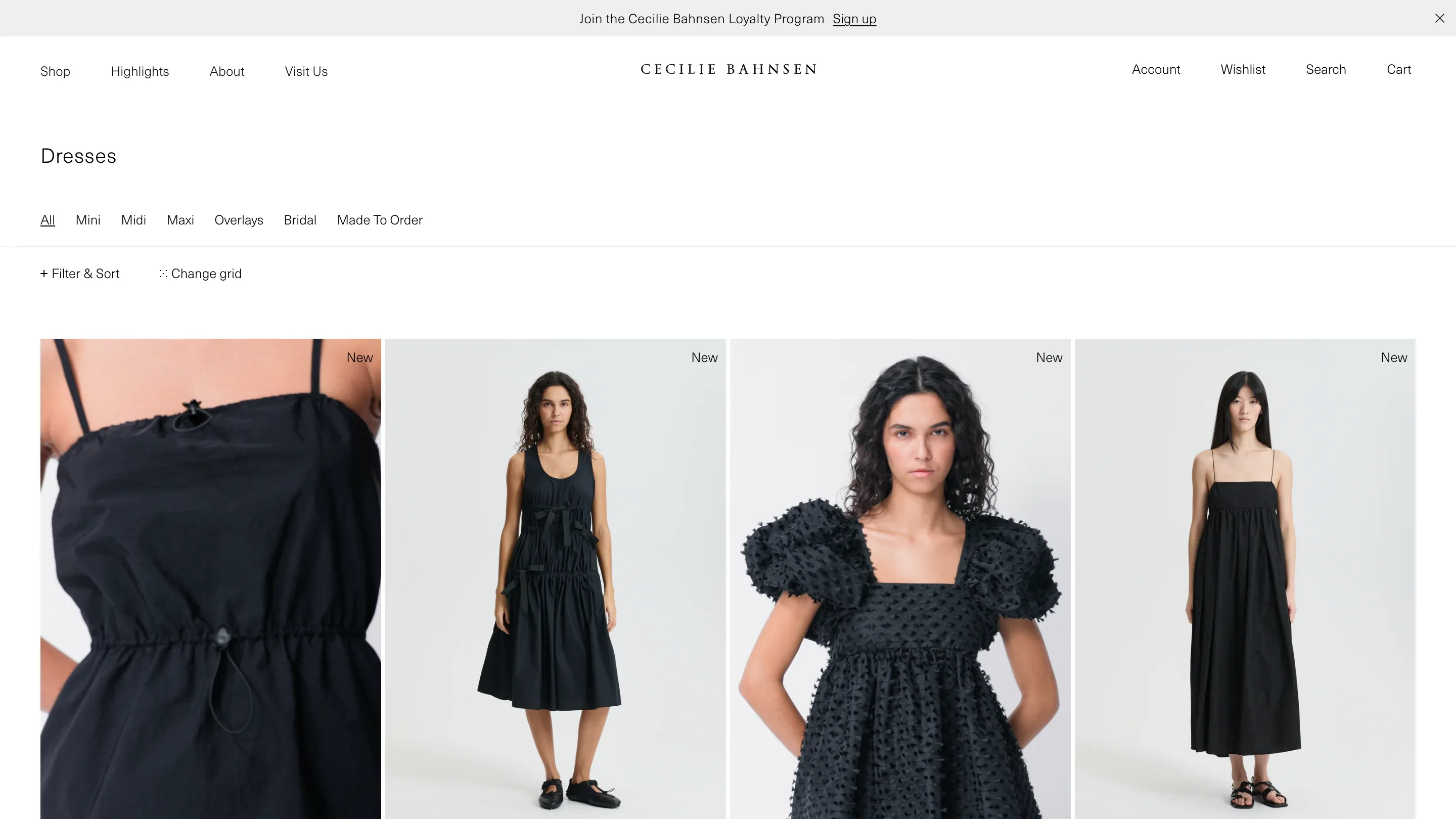
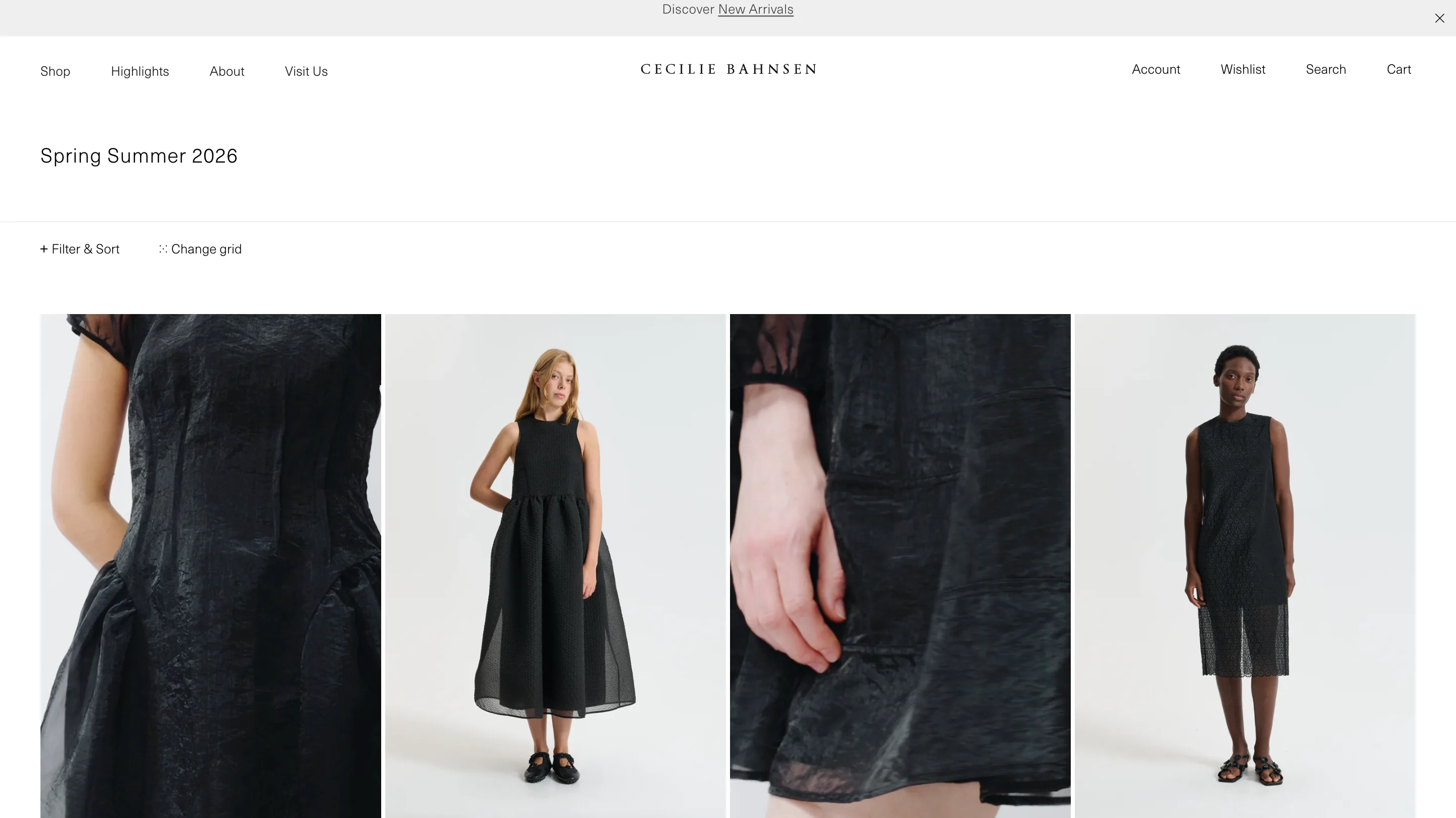
Standard product grids lock every item into an identical frame. Bahnsen breaks that. The listing pairs a full-body studio shot with an extreme close-up of the fabric beside it, so a dress on a model sits next to a macro crop of its drawstring waist or its bows. One cell shows you the silhouette, the next shows you the hand of the cloth.
That alternation turns a catalogue into a spread. Your eye moves the way it would through a printed lookbook, wide shot then detail, and the black Spring Summer 2026 dresses gain weight from the crops set between them. A "Change grid" control resizes the whole thing, and a thin row of sub-filters (Mini, Midi, Maxi, Overlays, Bridal) keeps the chrome to a single line.
Restraint scales to the editorial pages
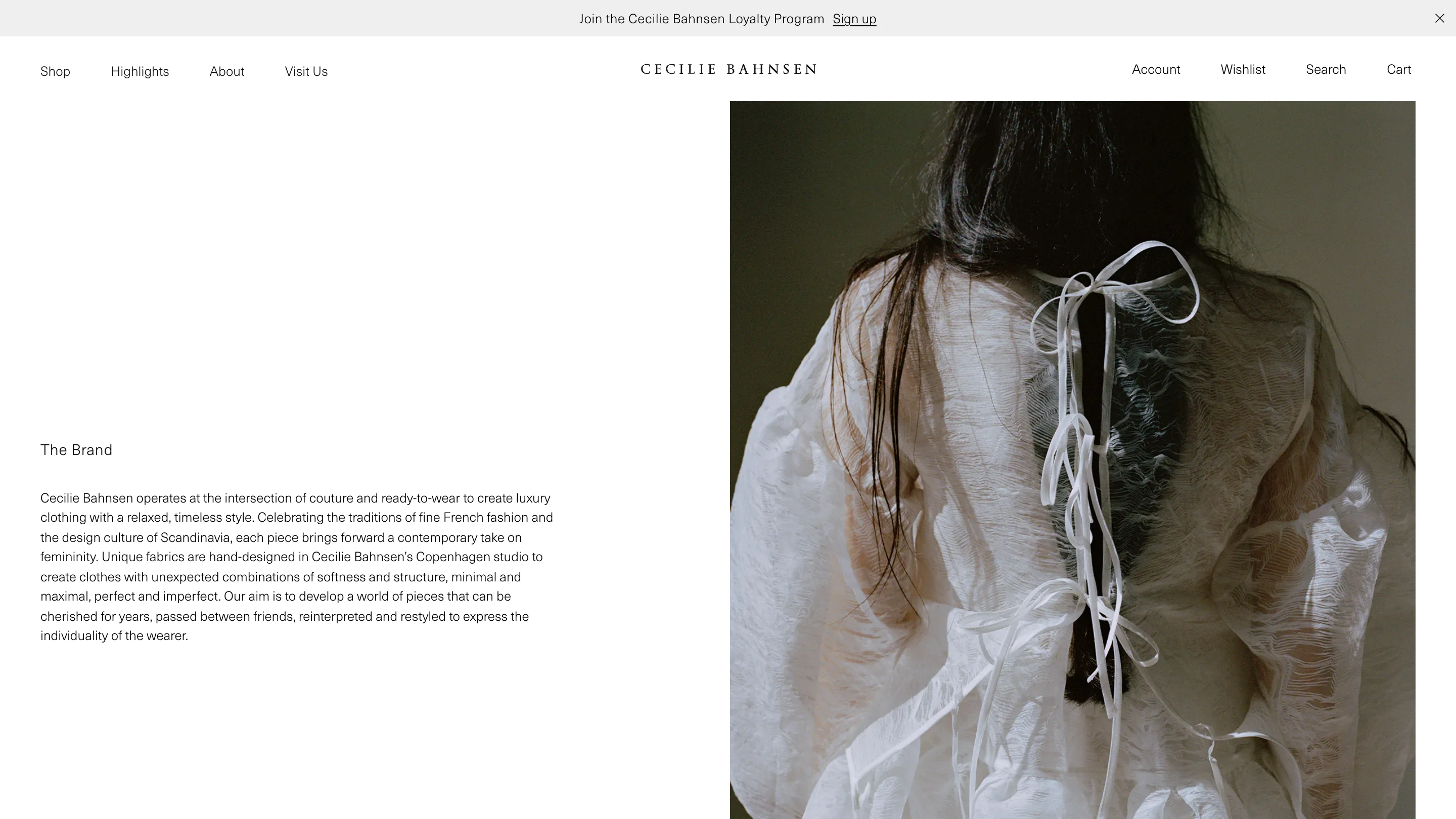
The About page, titled "The Brand", splits the screen down the middle: a column of copy on the left, a single full-height photograph on the right of a sheer white top laced with ribbons. The text sets couture against ready-to-wear, softness against structure, and the layout answers with the same balance, words on one side, image on the other, nothing in between.
It's a quiet lesson for anyone building a shop. Luxury online rarely comes from more effects. It comes from trusting one strong photograph, setting the type small enough to stay out of its way, and giving the whole page room to breathe. Cecilie Bahnsen sells dresses meant to last, and the site is built to match.