Stereoscope's packaging-led web design reads like the label
Stereoscope Coffee builds its shop out of its own coffee bag: the label, the pill fields, the kraft paper. The packaging is the interface.
Stereoscope Coffee's website is its coffee bag, opened up and laid flat. The Los Angeles roaster runs a clear case of packaging-led web design: the label system that OlssønBarbieri drew for the bags is the same system the shop pages are built from. Read one and you can read the other.
The Oslo studio made the identity, the narrative and the packaging, and the packaging has the shelf to prove it: Gold at the European Design Awards in 2023, a Gold Cube from the ADC, first place at the Dieline Awards, a D&AD shortlist in 2024. The site, found on siteinspire, carries that work straight onto the screen, label by label.
The hero is a bag and a player bar
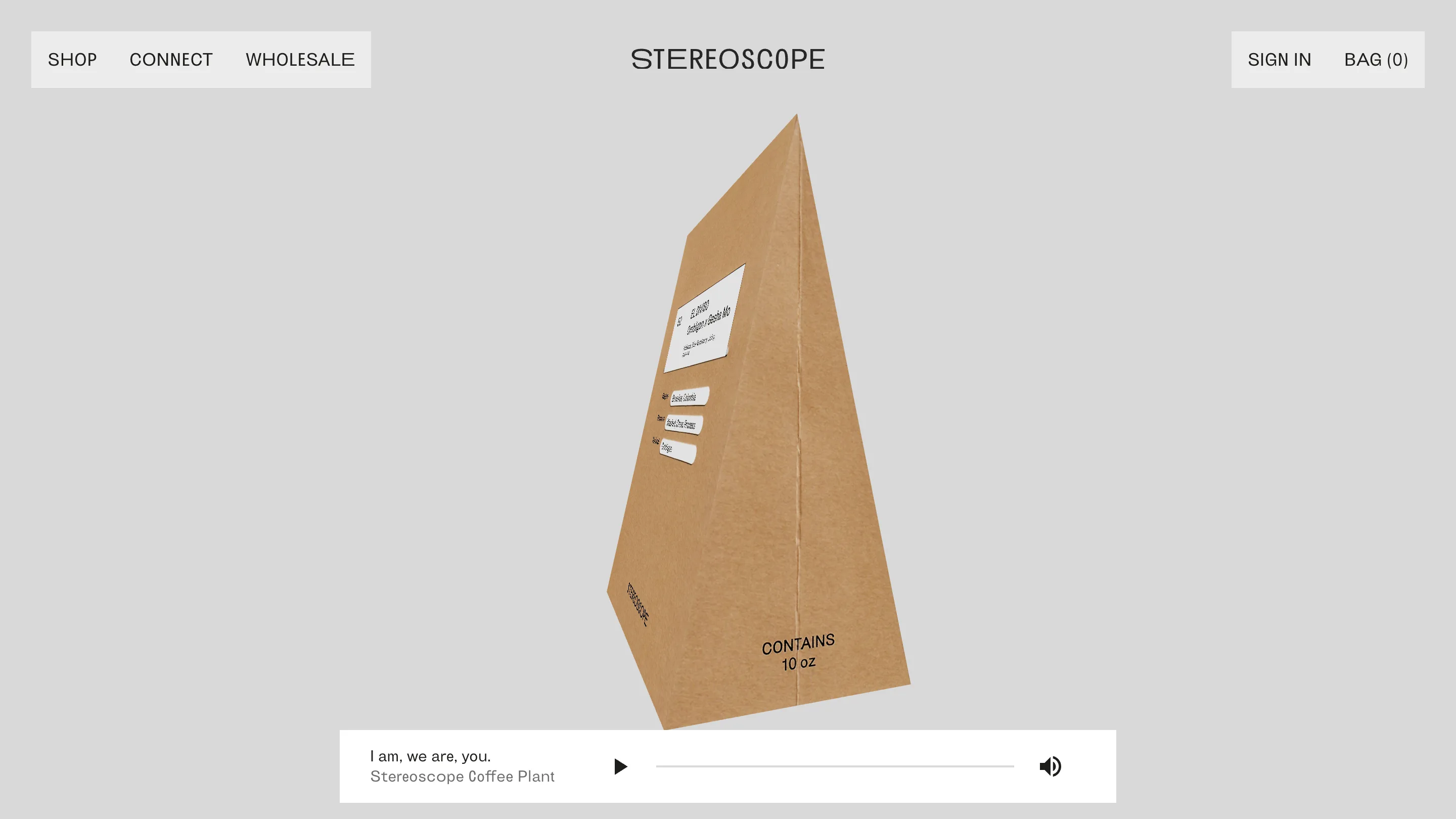
The home page opens on flat grey and one object. A kraft-paper bag turns slowly in the middle of the screen, a short loop that shows the label, the side seam and the line "Contains 10 oz" at the base. There's no headline over it. The wordmark sits at the top in Brunswick Grotesque, the menu and the bag count sit in two pale boxes at the corners, and that's the whole frame.
Under the bag there's a white bar built like a music player: a title, "I am, we are, you.", a credit line reading "Stereoscope Coffee Plant", a play button, a scrub line and a volume icon. It stays pinned to the bottom of the window as you scroll. For a brand called Stereoscope, a player is the right piece of chrome to keep on screen. It reads as a record sleeve with a track queued, and it's the only element on the page that follows you.
Packaging-led web design on the product page
The product page is where the idea pays off. Open the Kenya Gichathaini and the left half shows the bag itself, flat, with its white label: a lot number, 51, the country in capitals, the farm underneath, then four tasting notes. Below the label sit three rounded pills, Region, Process and Varietal, each filled in like a form.
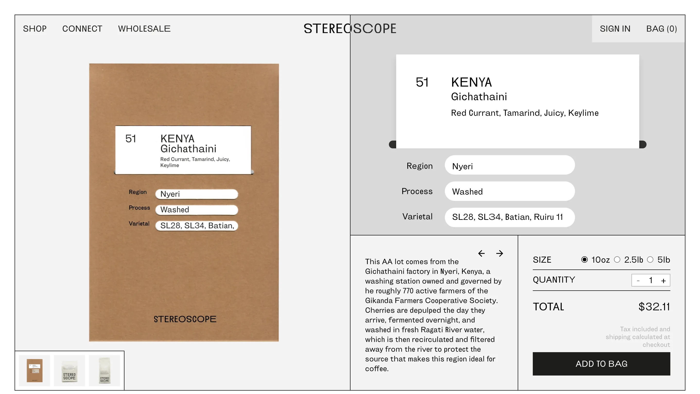
The right half rebuilds that label at screen size. Same number, same order, same tasting notes, and the pills become real interface: Nyeri, Washed, SL28, SL34, Batian, Ruiru 11. A thin dark rail under the label card echoes the bag's fold. Then the page drops into a plain grid of ruled cells for the story, the size picker and the add-to-bag button, all in the same grotesque at one weight.
That's the move worth stealing. The data a coffee buyer wants (origin, process, varietal) already had a home on the physical product, so the screen keeps the home. Someone who's held the bag knows where to look, and someone who hasn't learns the system before the bag arrives.
Grey, kraft and one typeface
The palette is three things: a cool grey ground, the brown of the kraft paper and black type. Photography brings the rest, and it's all hands and paper. The shop page opens on two hands tearing the perforated strip off a grey box printed with "In pursuit of depth and simplicity".
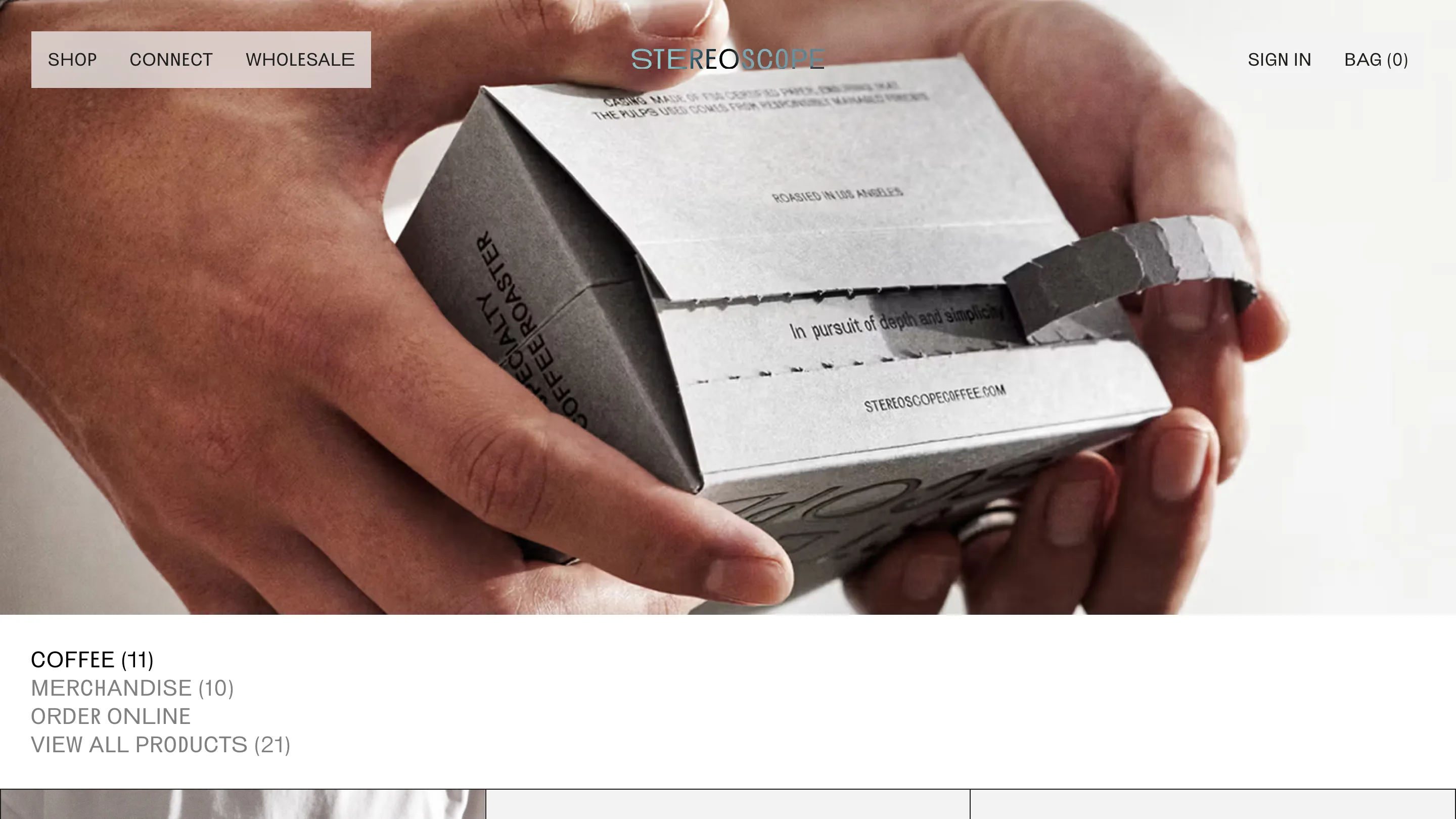
Under it, the categories are a short list in capitals with counts in brackets, Coffee (11), Merchandise (10), View all products (21). The active one is black, the rest are grey, and that list is the whole filter. The same restraint runs through the type: one face, uppercase for navigation and product names, sentence case for the long copy, and almost no change in size between them.
The about page keeps its distance
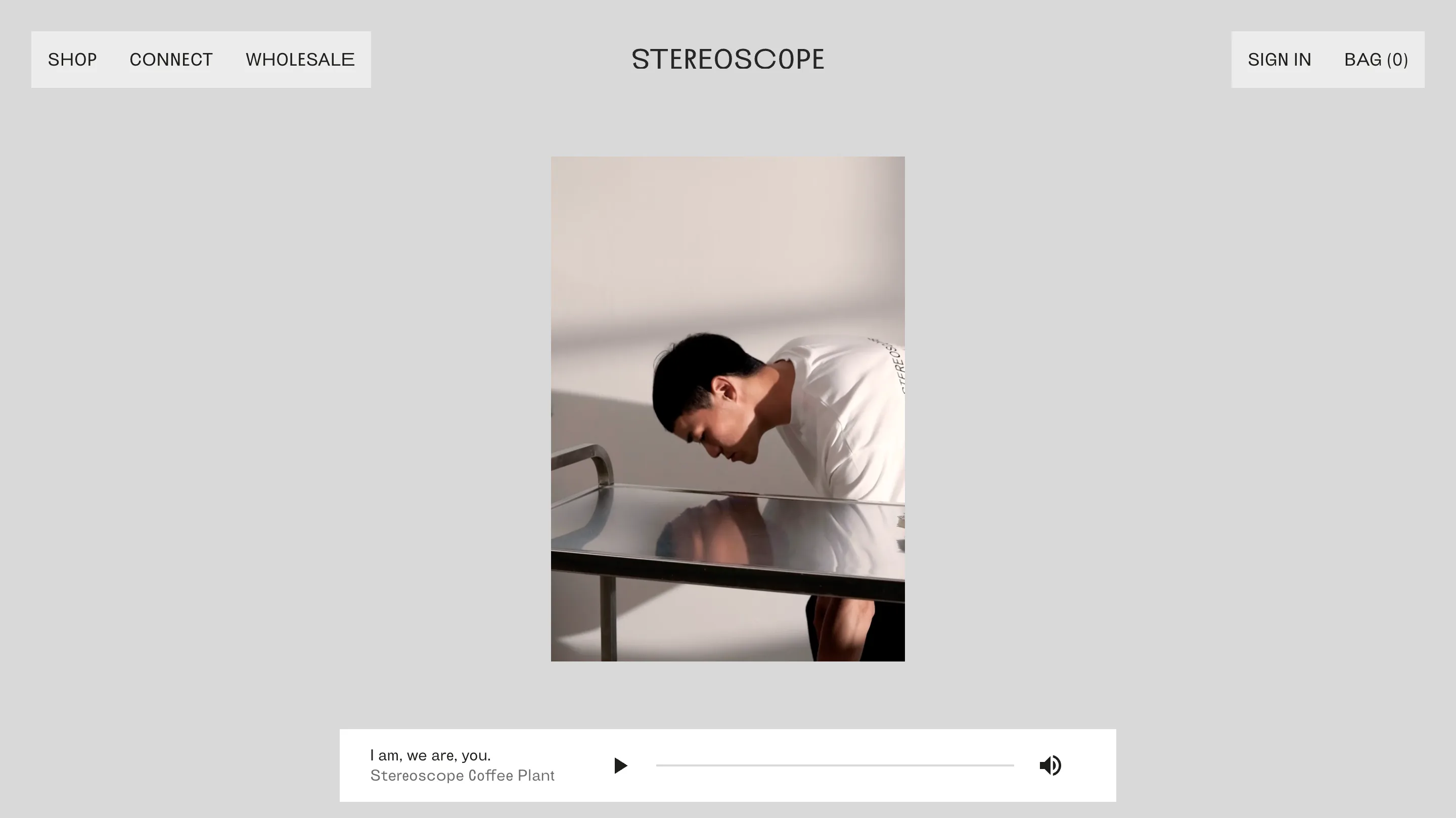
The about page is the quietest screen on the site. A single portrait, small and centred on the grey, a barista leaning over a steel table. The player bar waits below it. Scroll on and the brand's Five Elements unfold one by one, Altitude, Soil, Fauna, Climate, Farmer & Roaster, each a short paragraph with real numbers: arabica grown between 1000 and 2000 metres, an optimum of 15 to 24 degrees.
If you design for a brand that already has strong packaging, start your web project with the bag on the desk. Stereoscope shows how far that goes: the label becomes the product page, the paper becomes the palette, and the site feels like the same object you'll open at home.