Bauhaus Clock nails the single-product landing page
Atilla's Bauhaus Clock sells a $19 Mac screensaver with one big object and near-monochrome restraint. A study in the single-product page.
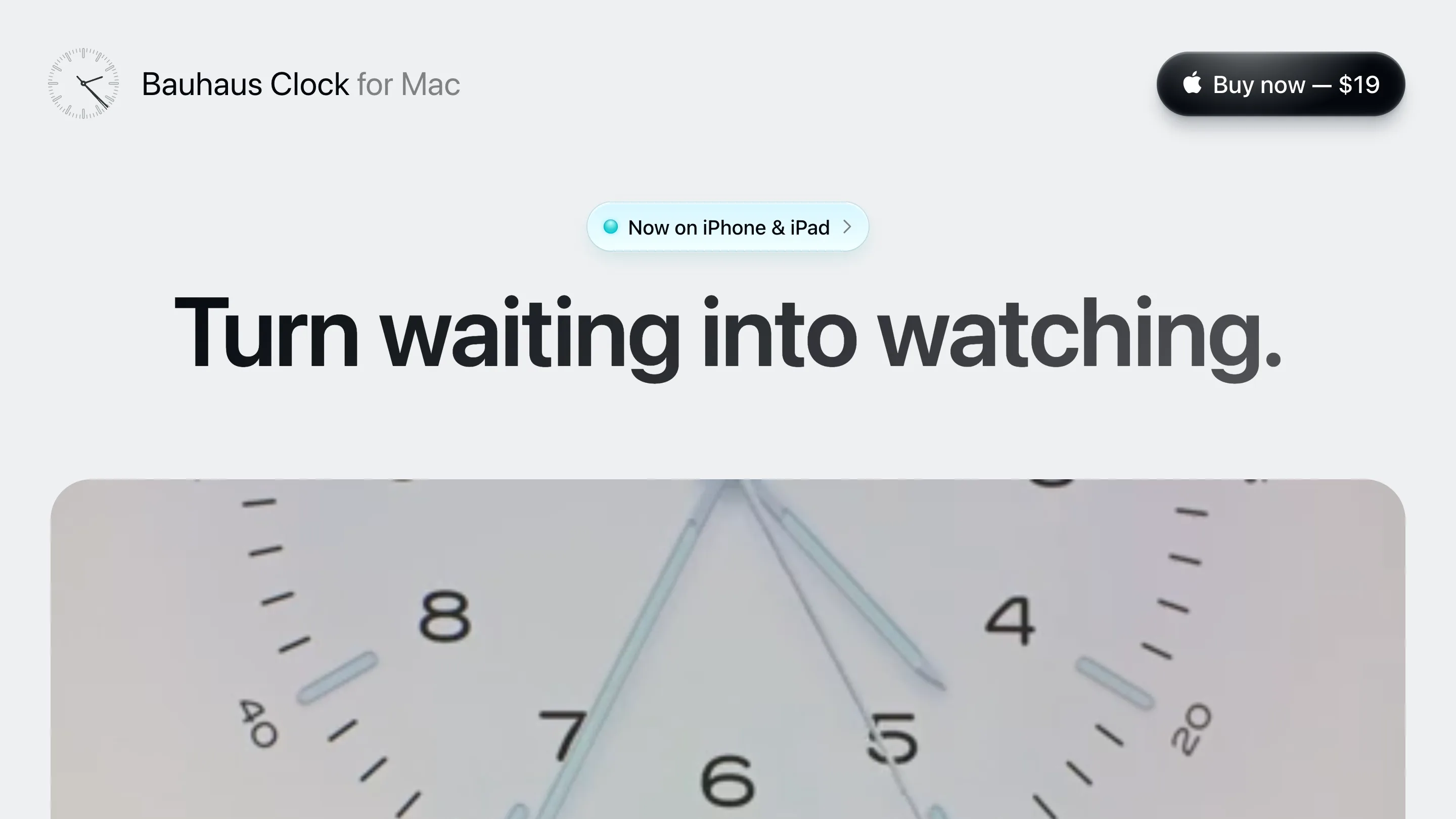
A single-product landing page has one job: sell one thing to one person. Atilla's Bauhaus Clock does it for a $19 Mac screensaver, and the page is worth studying for how little it spends to close the sale. One clock. One price. A headline you read in a second: "Turn waiting into watching."
Most product pages hedge. They stack features, badges, and three competing buttons above the fold. Bauhaus Clock keeps one call to action, a black "Buy now" pill with the $19 price on it, pinned to the top right the whole way down. You always know the price and you always know how to buy. That restraint is the design.
One object carries the page
The hero gives the clock face the full width and lets it dominate. No illustration, no gradient mesh, no stock desk photo. The product is the art. If you're selling one object, show it at full size and trust it to hold attention.
The type does the rest. The headline sits in a heavy neo-grotesque at a size you can't miss, black on a warm near-white grey. Everything else steps down in weight and colour so your eye lands where Atilla wants it. Minimalism here is a sales tool.
Colour lives in the product, not the page
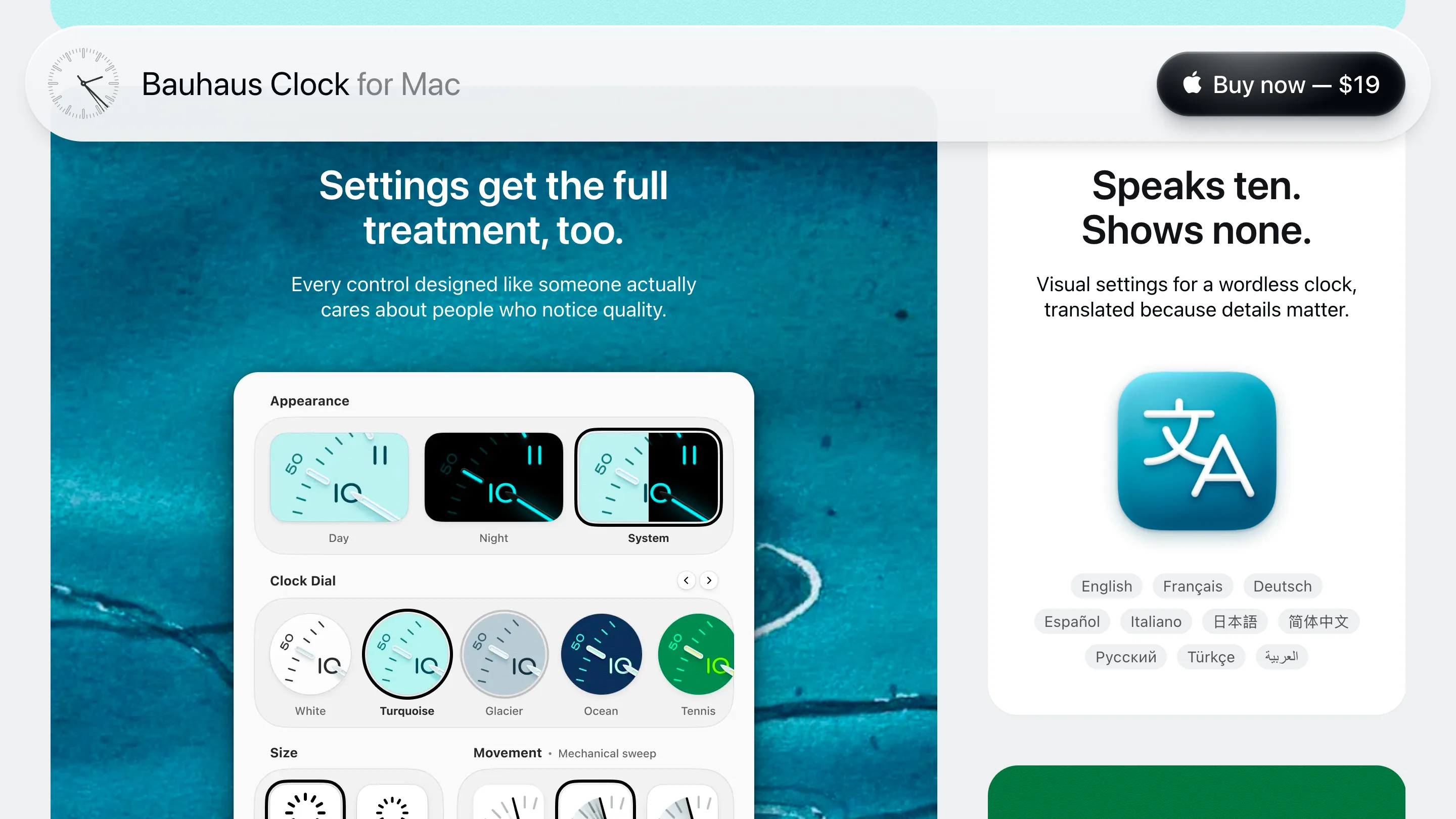
The page stays near-monochrome: warm grey, black text, one teal accent. The colour turns up where it belongs, inside the product. The settings block previews the dials as swatches, White, Turquoise, Glacier, Ocean, Tennis, so you see the range you're buying and the page never goes loud. The chrome stays quiet and the product gets to talk.
That same section sells the detail work. "Settings get the full treatment, too" renders the day, night, and system modes as tiny working dials, next to a localisation panel headed "Speaks ten. Shows none." The copy and the UI say the same thing: someone sweated the small stuff.
Proof you actually read
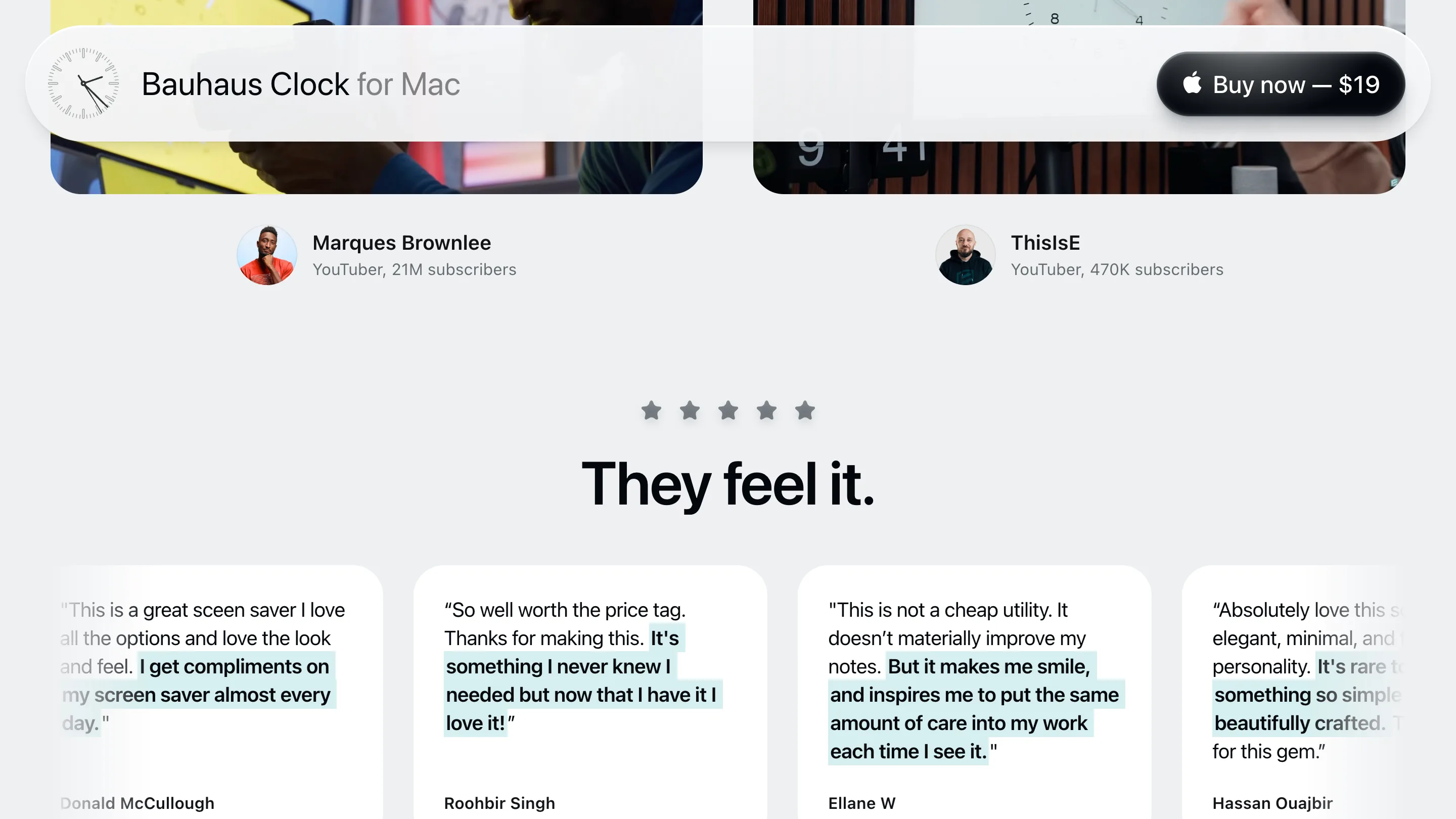
The social proof gets specific. Two named YouTubers with follower counts sit up top, then a row of real review quotes with the best line highlighted in the same teal. "I get compliments on my screen saver almost every day." The highlight walks a scanner straight to the payoff line, which is more than most testimonial walls manage.
The single-product page in one screen
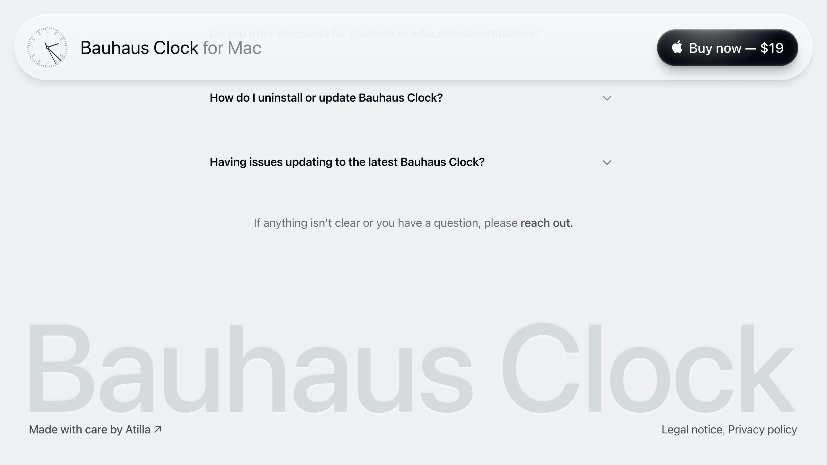
The footer runs the same playbook. A short FAQ, a plain "reach out," and the words "Bauhaus Clock" set enormous and ghosted into the background, with "Made with care by Atilla" tucked in the corner. It reads like the whole pitch in miniature: quiet, sure of itself, finished.
Found via Httpster. If you ever have to design a page that sells one product, keep this one open. One object, one price, one voice, and the discipline to stop there.