Nakagawa Home's Japanese minimalist web design leaves room
A Fukuoka house builder whose site, by Leapy, runs on the same idea it sells: leave half the plan blank. Serif headings, wide margins, one quiet colour.
Nakagawa Home builds custom houses in Fukuoka, Saga and Oita, and has for over 60 years. Its new site, designed by the studio Leapy, is the cleanest case of Japanese minimalist web design we've seen this autumn, because the restraint on screen is the company's pitch said a second way. The home page says it out loud: Nakagawa builds about half of what a family asks for, as asked. The rest it keeps as 余白, blank space, for its own proposals.
You can feel that number in the layout. Every page leaves more empty than it fills.
The hero is one ceiling and two lines
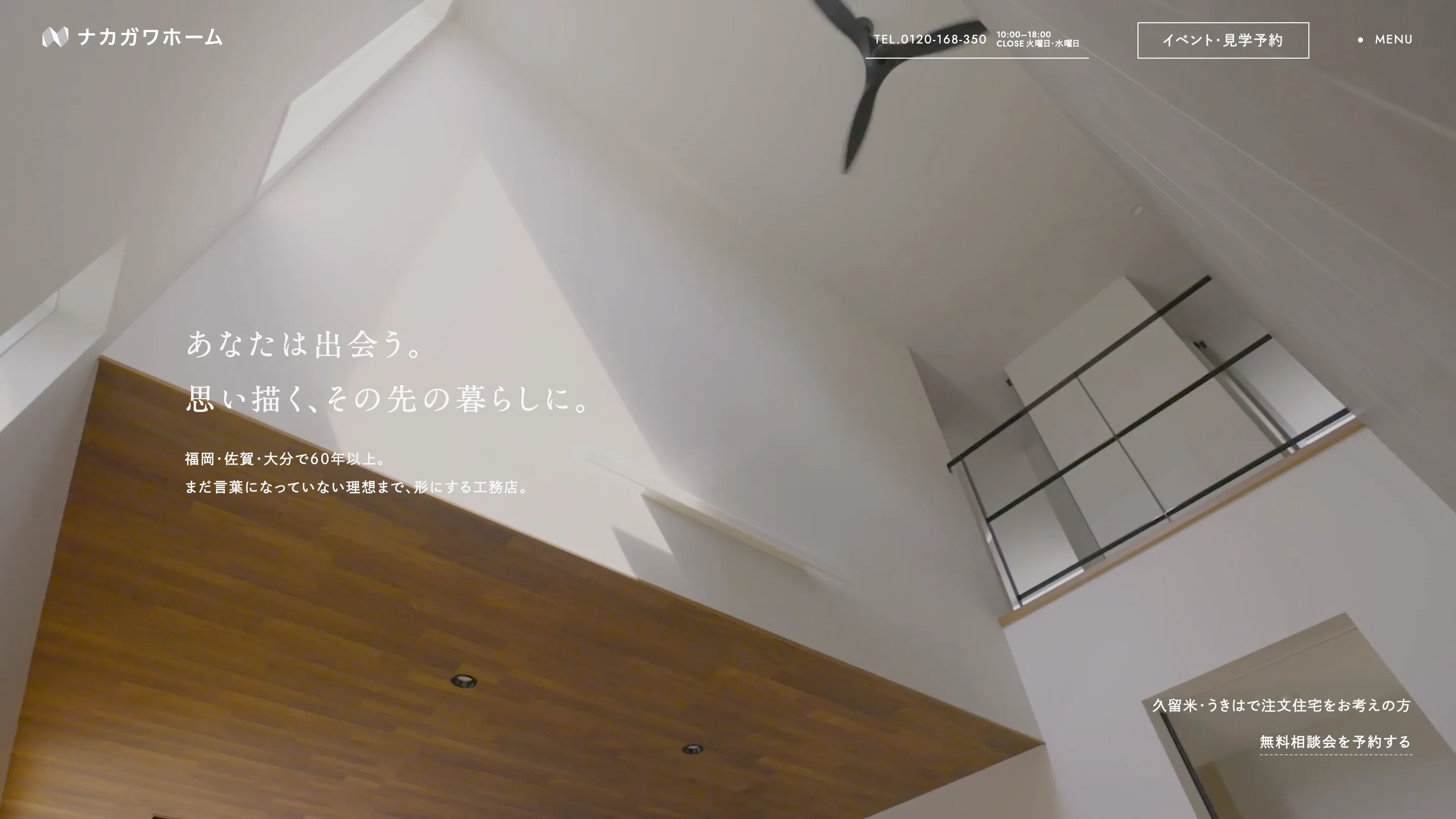
The site opens on black. A small video window, a leaf in morning light, sits in the middle with the tagline under it and a tiny "LOADING ... 100%" counter in Jost. Then the window grows to fill the screen and becomes the hero: a slow shot up a double-height living room, white walls, a ceiling fan, a band of wood.
The type stays small for a hero. Two lines of Noto Serif JP, "You meet. The life you imagined, and what's past it," set in white with wide letter spacing, then two lines of sans: 60 years in three prefectures, and a builder that shapes "ideals that aren't words yet." The only other thing on screen is a booking link, bottom right, underlined with dashes.
Nakagawa Home trusts the photo to carry the room. The words name it and stop.
Japanese minimalist web design runs on two typefaces per script
Leapy pairs a serif and a sans in each language and keeps them to separate jobs. Headings are Noto Serif JP, with Cardo under them for the English name: 私たちについて over "About Us", 徹底したこだわり over "Commitment". Navigation, labels and body copy are Noto Sans JP, and every number on the site is Jost, the phone line and the section indexes included.
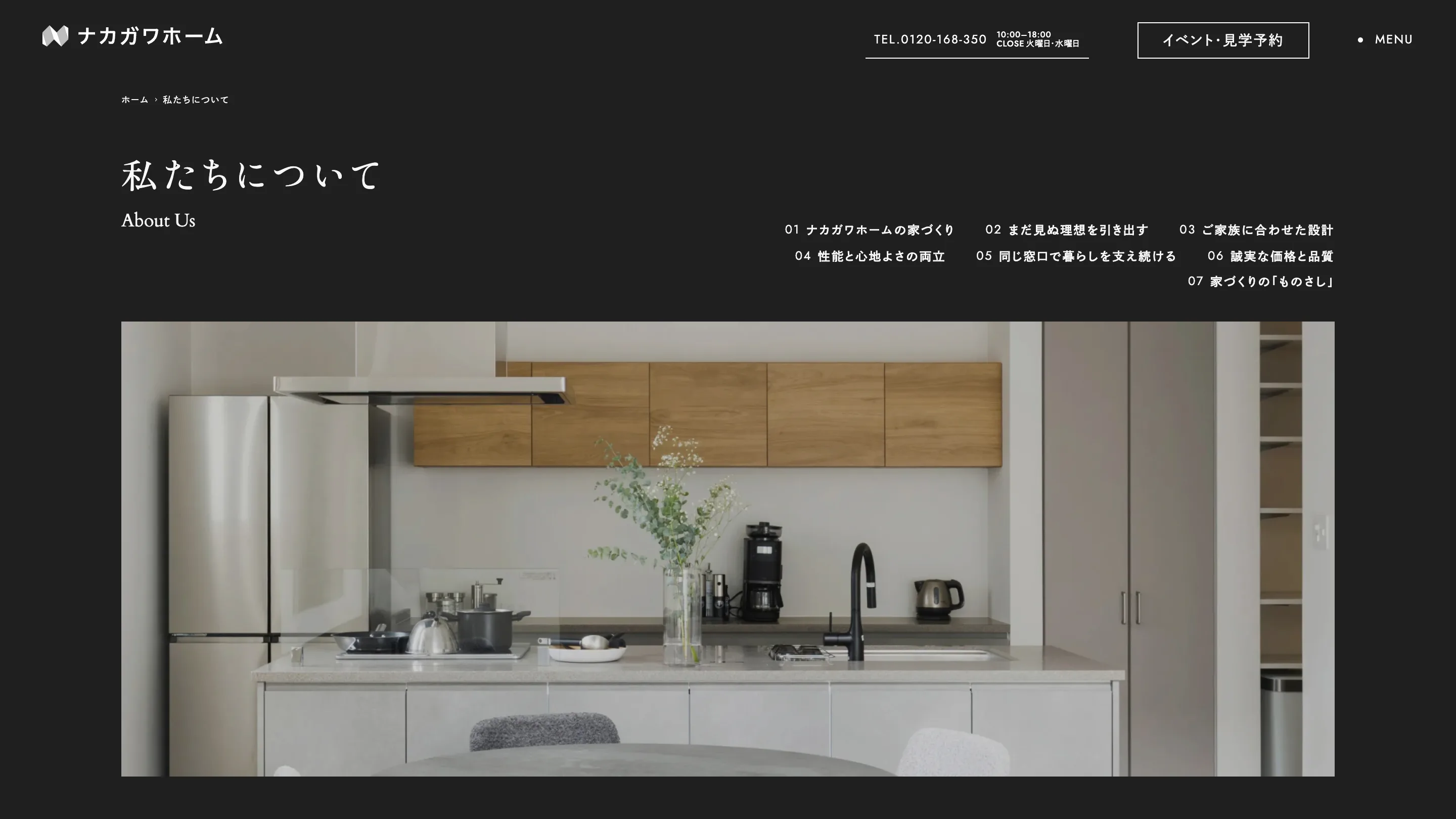
That split does a lot of quiet work. The serif tells you you're at the top of something. The sans tells you you can click it. Jost keeps the digits geometric, so "0120-168-350" in the header reads like a detail of the logo rather than a sticker.
The About page also flips the ground to near-black, the only page that does. It reads as the company speaking for itself, while the pages about houses stay on white.
Each page opens with its own table of contents
Long pages get a numbered index, right-aligned under the heading: seven items on About, five on Commitment. The numbers are real here, since each one is a section you scroll to in order. Below the index sits one full-width photo, cropped wide, and nothing else until you scroll.
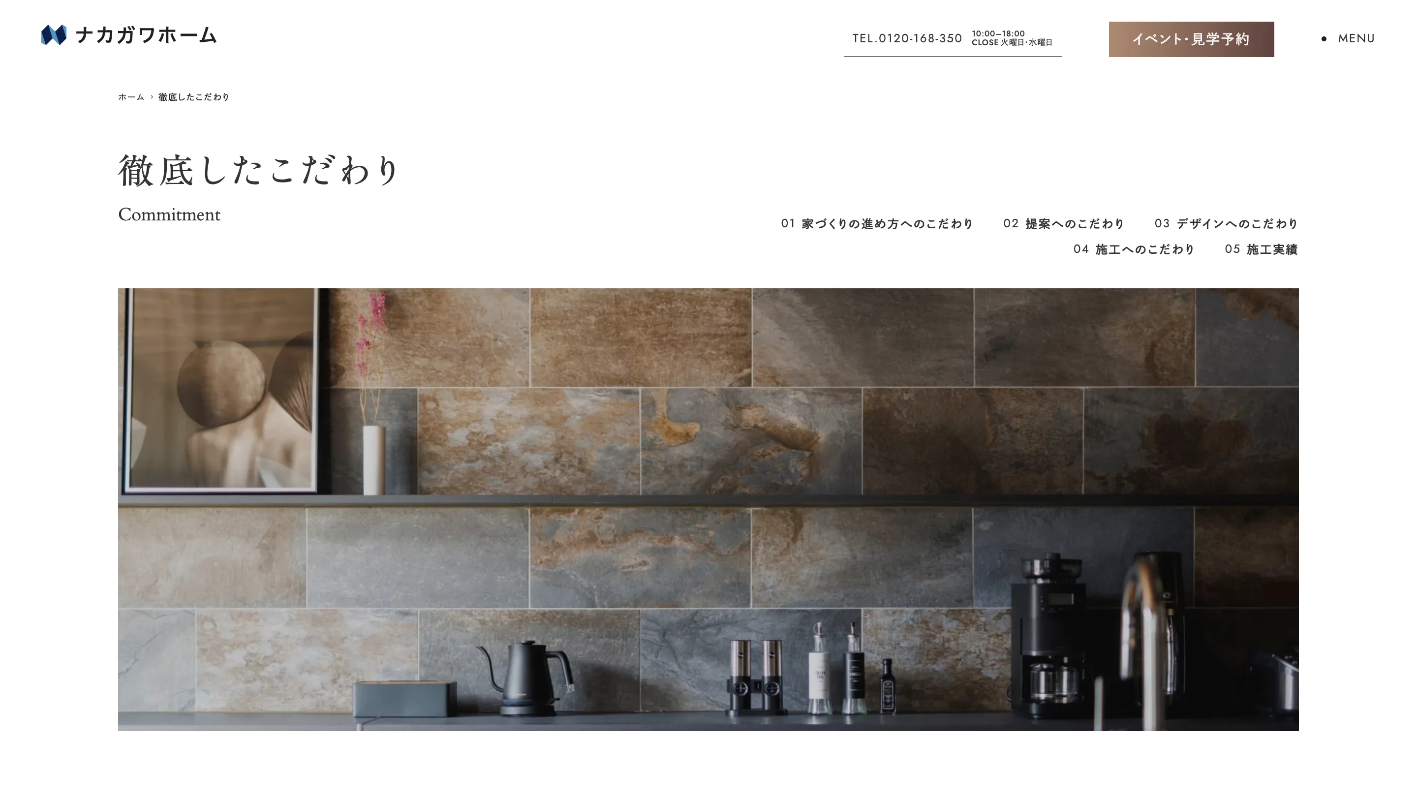
The About copy backs the look with numbers: thermal insulation grade 6, earthquake resistance grade 3, and a design rule the company calls subtraction. The page states each grade in a plain paragraph and lets the white around it do the selling.
The works grid names houses like books
The Works page is a two-column grid with a filter column on the left, by category and by area. Each card shows a straight-on exterior shot, the town and the family's initial, then a one-line title. "A house where art lives." "A house beautiful down to its blank space."
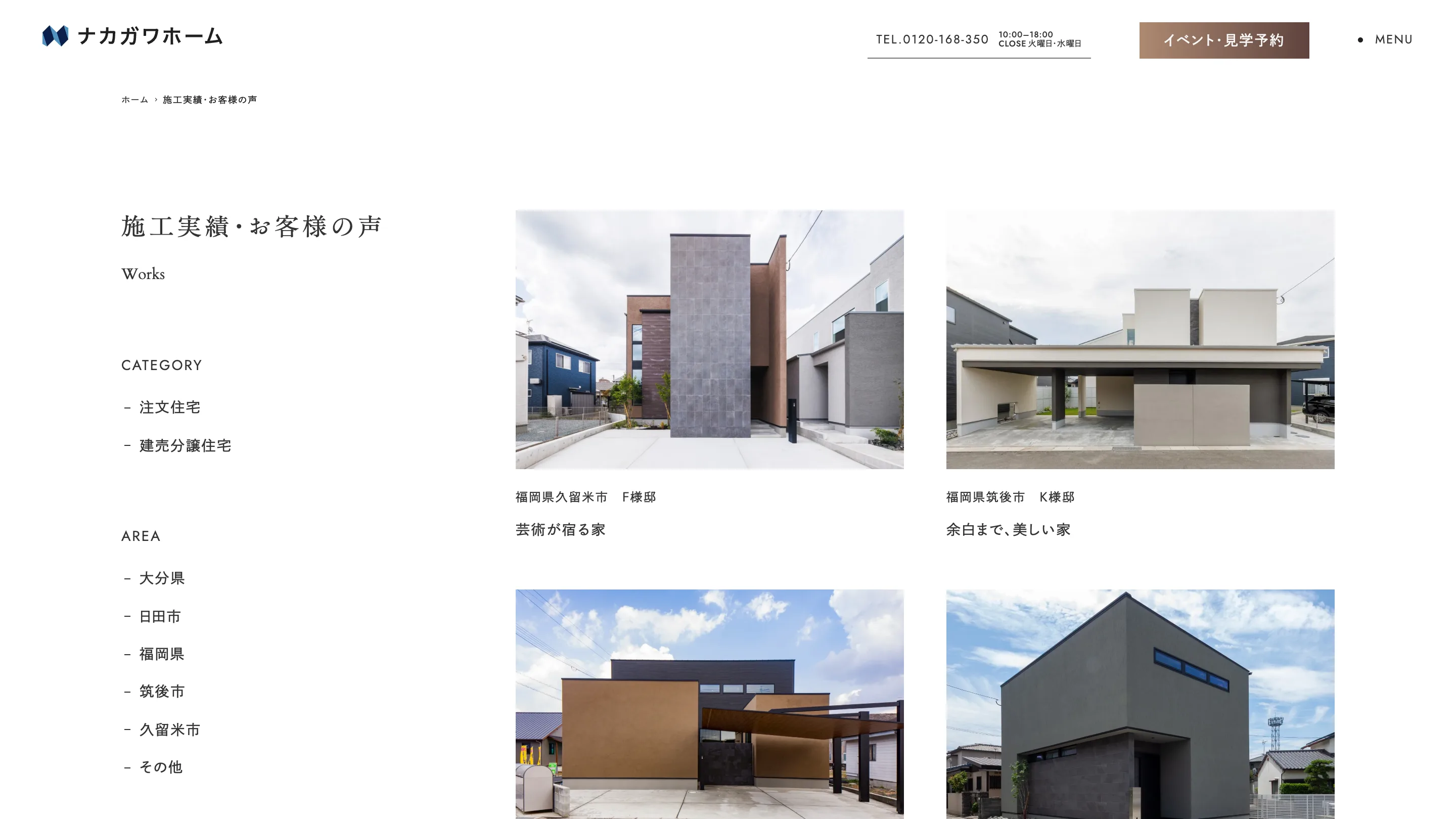
That second title is the whole site in six words. The photos are plain on purpose: overcast skies, the neighbours' houses left in frame, no dusk lighting. Giving each house a title turns a portfolio of real estate into a shelf you want to read.
What to take from it
If you're designing for a client whose craft is restraint, find the number behind it and build the grid around that. Nakagawa's is "about half." Leapy turned it into margins, a type system with one job per face, and a single brown on the booking button as the only colour that isn't in a photo.
We found it on Awwwards, nominated on 30 October 2026, credited to Leapy, Inc. The live site is nakagawa-corp.com.