Liljewall's colour-coded navigation sorts 220 projects
The Swedish practice gives each of its 18 expertise areas a colour, then uses those swatches to label, filter and open 220 architecture projects.
Liljewall files its work by colour. The Swedish architecture practice runs 18 expertise areas, and each one owns a shade: pool blue for bathhouses and swimming halls, apricot for cultural heritage, red for housing. Those shades carry the colour-coded navigation across the entire site. They fill the filter row, they tag every project card, and they open each expertise page as a full-bleed field before a single photograph appears. Lundgren+Lindqvist built the site and the identity it sits on.
Colour-coded navigation, on 220 projects
The index holds 220 projects and three ways to read them: Kort, Lista, Karta. Card, list, map. Above them the whole taxonomy sits as a row of 18 outlined chips, and below, every thumbnail wears one to four small squares beside its name. Tingshöjd, Tingberget takes a single red. Bäckahagens skola takes lilac. Paulig Group Solna takes orange and lilac together. You pick the code up in about ten seconds of scrolling, and after that the filter row is almost redundant, because the swatches have already told you what each project is.
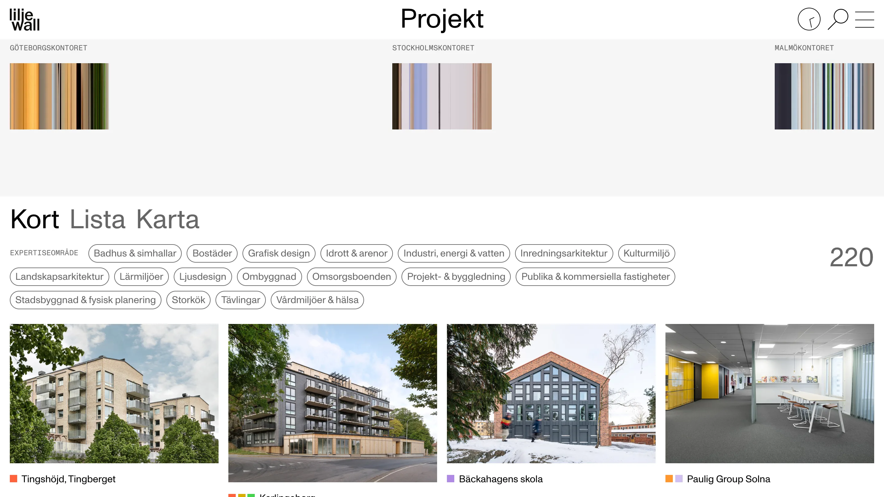
A dropdown would have done the same filing job. It would also have hidden the taxonomy until someone asked for it, and it can only say one thing at a time. Colour puts the whole classification on screen at once, and it lets a project belong to four categories without any of them winning.
Four squares before the title
Open Axel Ebbes Konsthall and the squares run ahead of the project name: peach, yellow, green, red. A restoration and extension of a 1935 art hall in Trelleborg lands in four disciplines at once, and the site says so before it says anything else. The line underneath, set in mono caps, reads RESTAURERING OCH TILLBYGGNAD KONSTHALL / TRELLEBORG. Then the facts arrive in four labelled columns: PLATS, ÅR, KUND, KONTAKT.
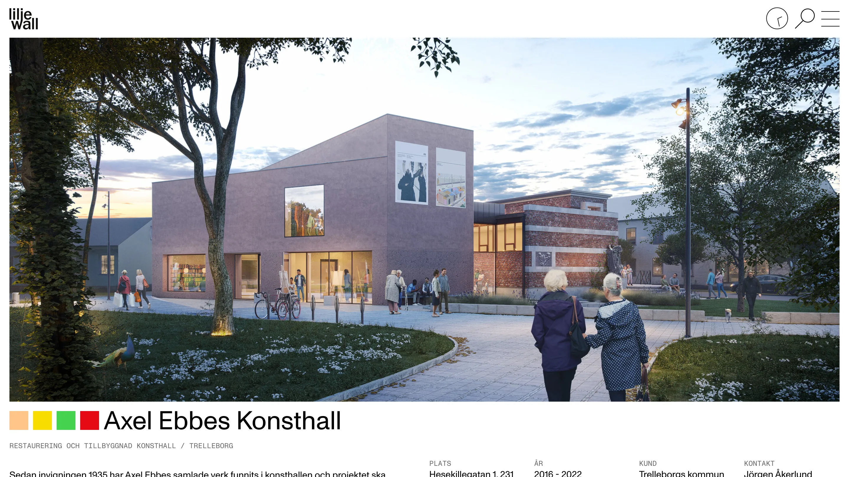
That ordering is the decision worth stealing. Category first, name second, photograph third. It reads like a museum label.
A grotesk for the words, a mono for the data
Two cuts of one family do everything. Monument Grotesk, from Dinamo, sets the titles and the running text. Monument Grotesk Mono sets whatever is factual: GÖTEBORGSKONTORET over a colour strip, the caption under a hero, the field labels above the credits, the temperature in the corner of a video.
The rule is easy to state and easy to hold. Prose in the grotesk, measurements in the mono. It means you can tell which kind of information you're looking at before you read a word of it, which is most of what typographic hierarchy is for.
The everyday, running live
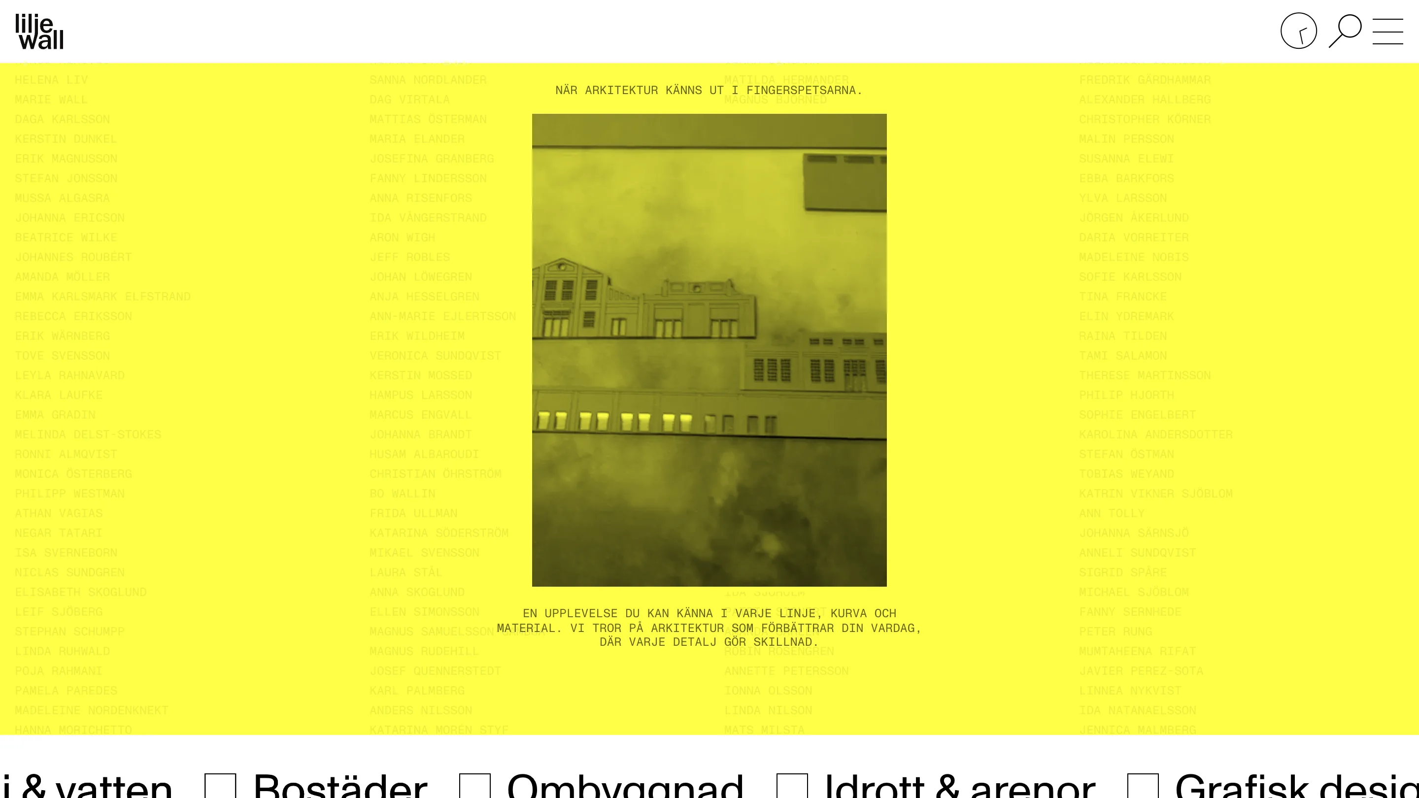
The home page tiles the name of everyone in the practice across a yellow field in mono caps, contrast dropped low enough that the roster reads as texture. A yellow duotone film of a building at dusk sits in the middle, captioned NÄR ARKITEKTUR KÄNNS UT I FINGERSPETSARNA. Below the fold, the 18 expertise areas return at display size with checkboxes.
The projects page opens on three smeared vertical colour strips, labelled Göteborgskontoret, Stockholmskontoret, Malmökontoret. Each one is an office compressed into a band of its own light. On the about page a live sky plays full width with 13°C, 8 m/s set over it in mono, and a small analogue clock ticks in the top right corner of every page.
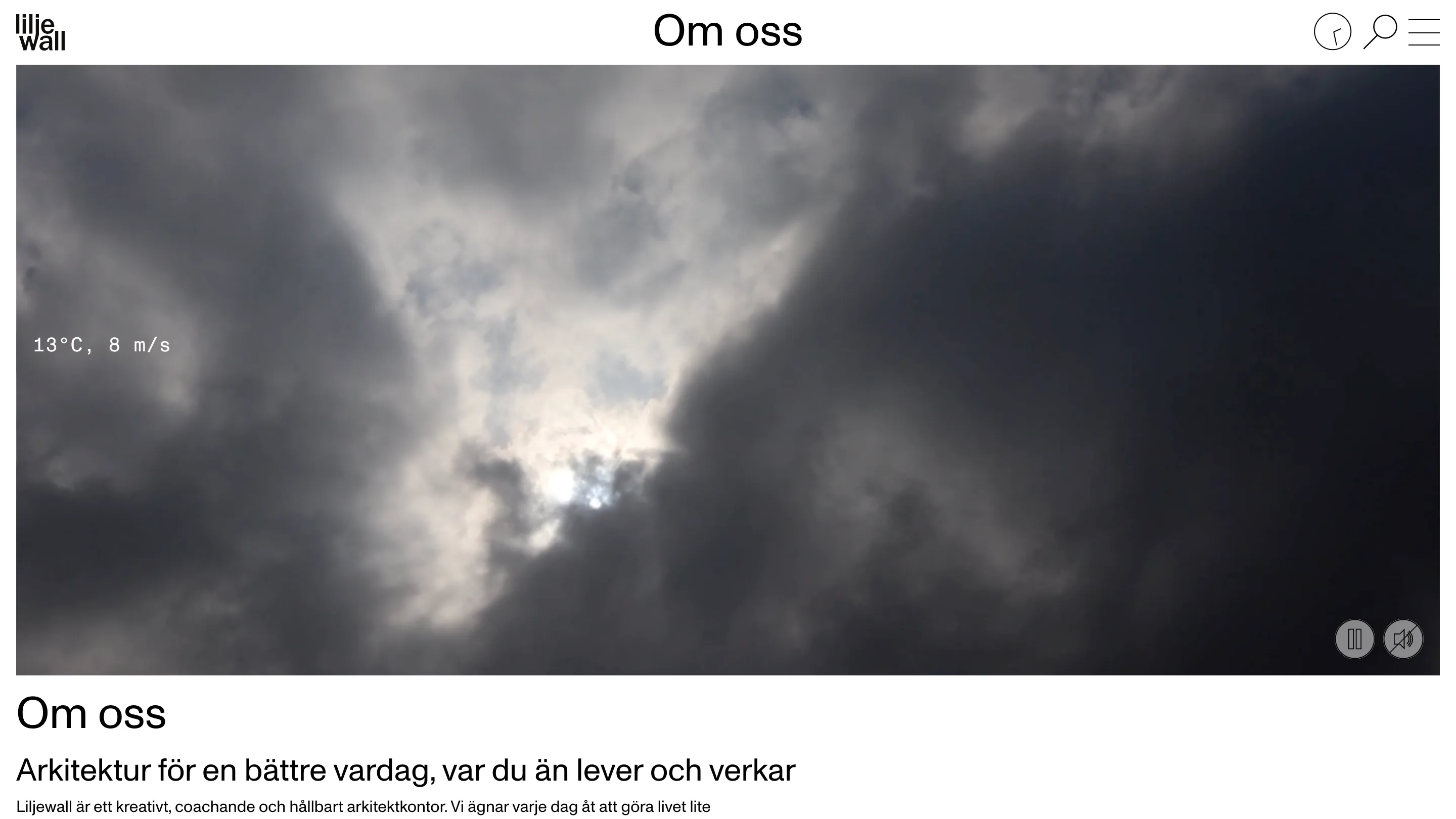
Liljewall's line is architecture for a better everyday, wherever you live and work. Putting the real weather over the real office is a cheap way to mean it, and it works. The colour system organises 220 projects. The clock and the thermometer keep the site from reading like a catalogue.
Found via siteinspire.