&friends builds a soccer archive out of collage web design
Athletics made &friends a scrapbook for New York amateur soccer. Cut-out photos, one acid yellow, and a Notion database holding it all together.
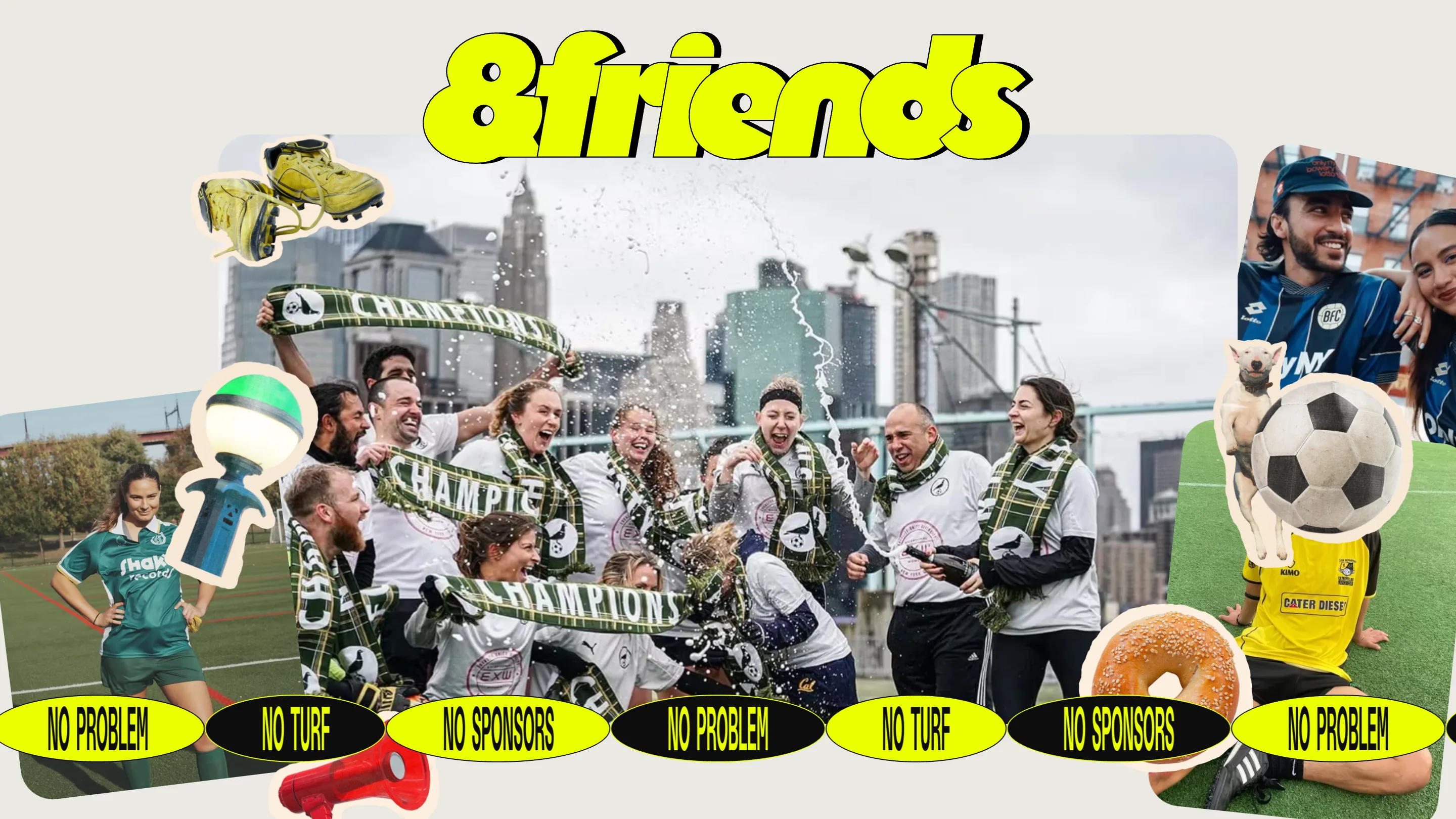
Collage web design usually stops at the homepage. &friends runs it all the way down to the database. It's an archive of New York's amateur soccer scene, built by the studio Athletics, and every screen is cut-out photography, sticker outlines and acid yellow on bone grey.
The home page opens on a squad spraying champagne with the Manhattan skyline behind them, cropped into a rounded card and ringed by floating objects: muddy yellow cleats, a green-topped lamp post, a red megaphone, a bagel, a dog, a soccer ball. Each cut-out carries a cream outline, the kind a die-cut sticker leaves behind. Along the bottom, black and yellow pills cycle three phrases. No sponsors. No problem. No turf.
Collage web design needs a hard palette
Collage falls apart when the palette is loose. This one is nailed down to three values: bone grey (#EAE9E2), near black (#0D0D0D), acid yellow (#EAFF00). Nothing else counts as a brand colour. Every other hue on the page arrives inside a photograph, so kit stripes and turf and a slice of pizza do the work a palette usually has to do, and the yellow stays loud because it never competes with a second accent.
The wordmark helps. Fat bubble letters, hard black outline, small drop shadow, the shape of a sticker stuck on a water bottle. It sits at whatever size the layout wants and never reads as a logo parked in a corner.
Then the noise stops
Open Teams and the collage vanishes.
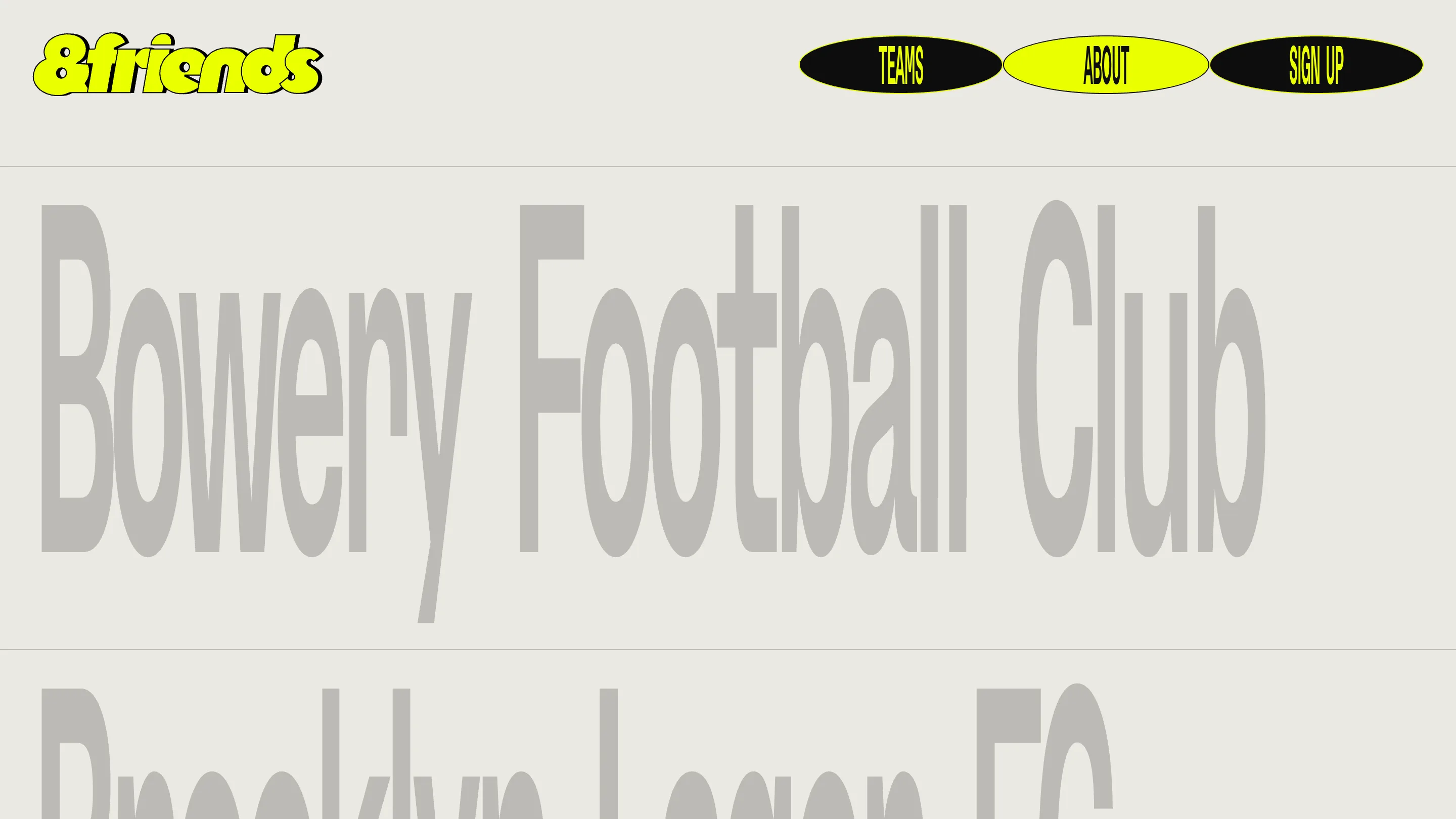
Fourteen clubs, one per row, set enormous in an ultra-condensed grotesque, mid grey on the same bone background, split by hairline rules. Bowery Football Club. Brooklyn Lager FC. ManChestHair United. LIGAFABULOSA. West Village McDonalds. Williamsburg International F.C Women. The names are good enough that the design steps back and lets you read them.
That restraint is what makes the rest survivable. Fourteen collages stacked in a list would be soup. Here the index is quiet and the payoff is one click away.
Click a name and the colour comes back
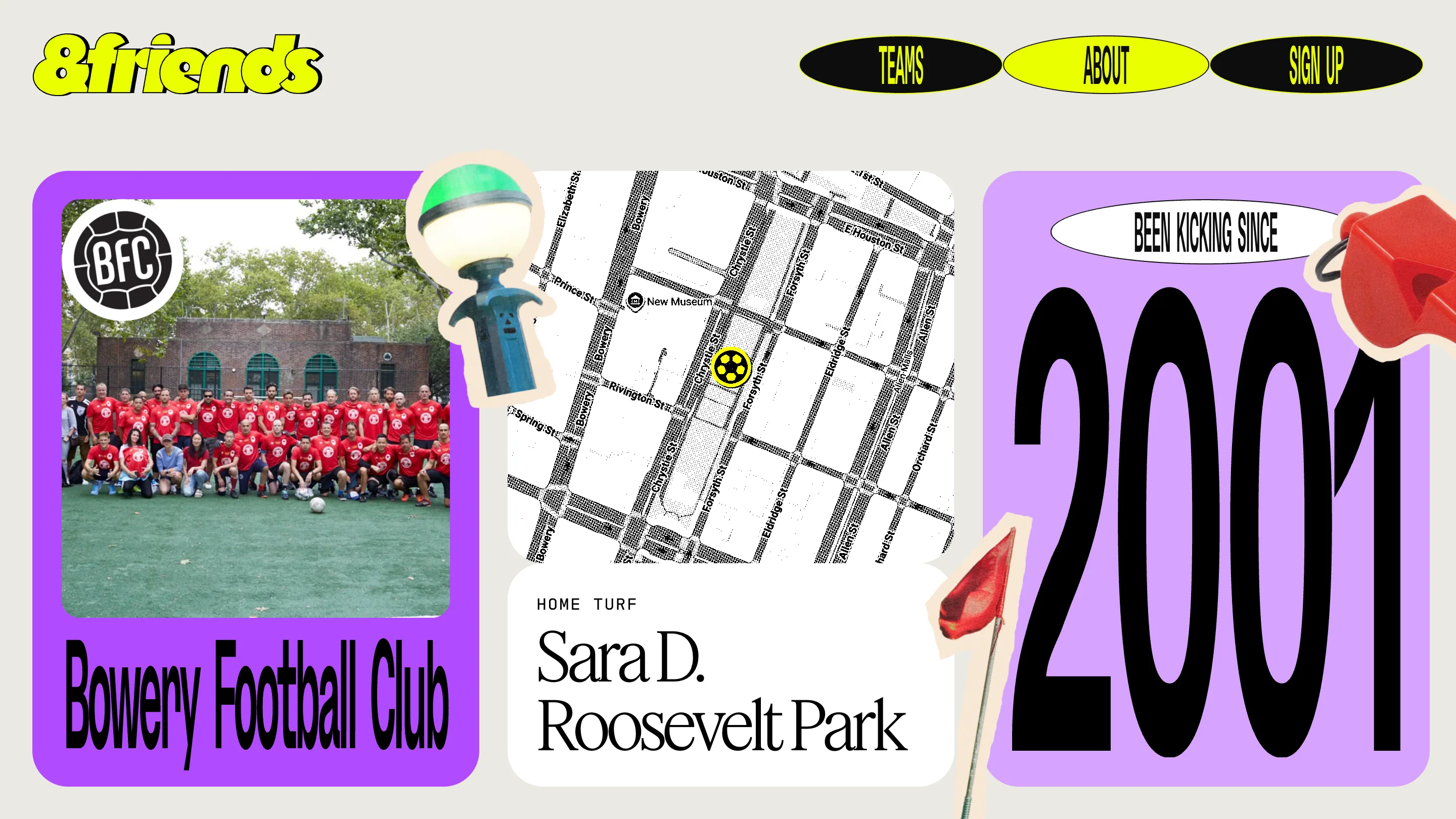
Bowery Football Club opens purple. A squad photo in a rounded card with the BFC crest dropped on it, a halftone street map of Sara D. Roosevelt Park with a yellow ball for a pin, and the founding year set as big as the club name was a second ago: 2001, under a white ellipse reading "been kicking since". A whistle, a corner flag and that lamp post float around the edges.
Five colour themes live in the code (blue, green, orange, purple, pink), each with a saturated tone and a pale tint. Every club draws one. That's how an archive of this shape grows without every entry looking like the last.
Three typefaces, three jobs
The About page runs the mission line in Feature Deck, the high-contrast serif Berton Hasebe and Christian Schwartz drew at Commercial Type for T Magazine, with the load-bearing words in italic: digital archive, celebrates, underground. Above it sits a strip of tilted photo cards, a wheatpaste poster going up on a fence among them.
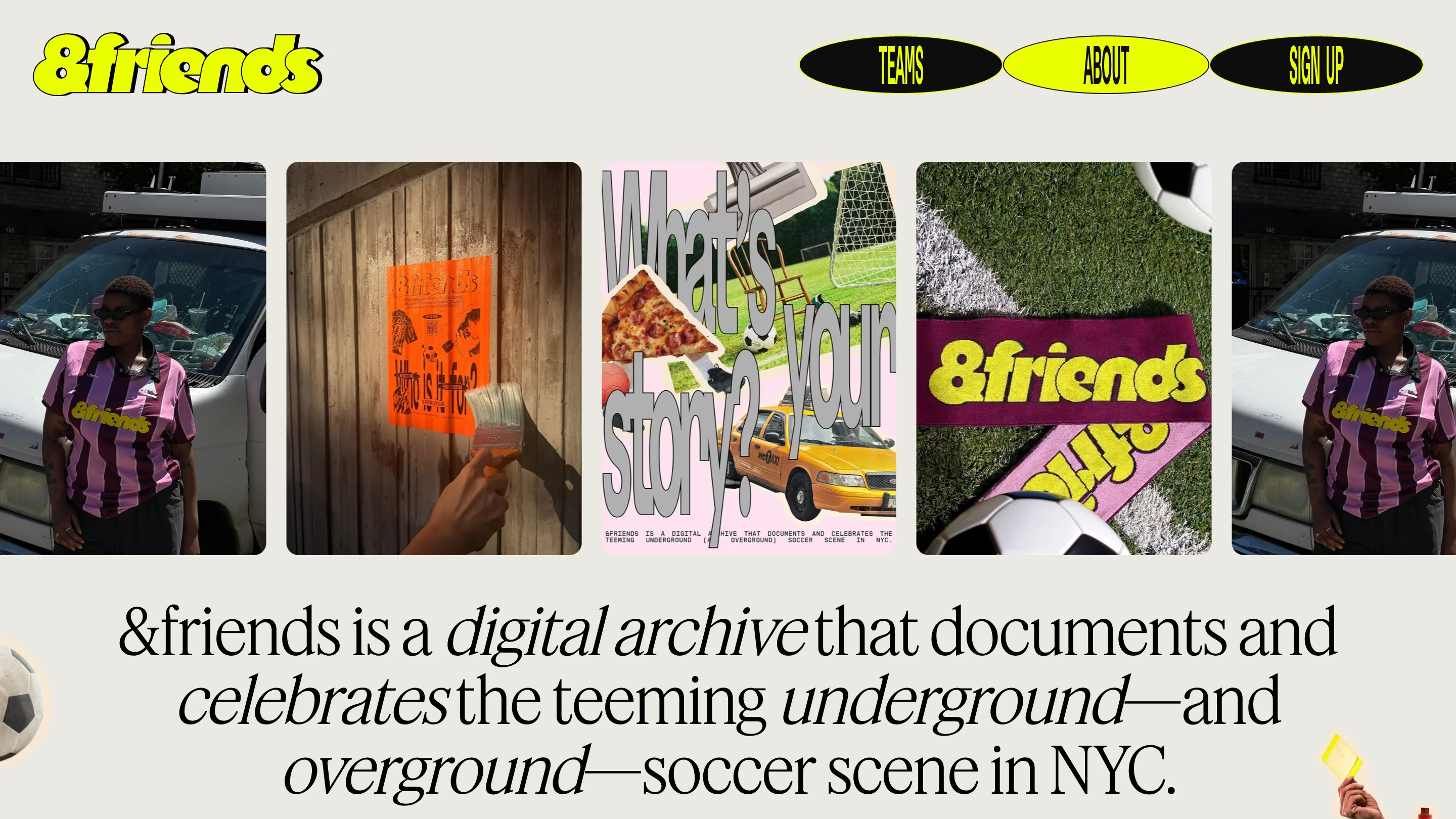
Labels get GD Octio, a squared mono from GD Foundry: HOME TURF, TEAM NAME, letterspaced and tiny. The condensed sans handles everything with a name on it, the nav pills at twelve pixels and the club names at two hundred. Serif for the sentences that matter, mono for metadata, sans for names. Three families, no overlap, no confusion about which one you're reading.
The scrapbook is a schema
Under the collage there's a Notion database. Each club row holds a home turf, a founding year, a crest, kit photography, and answers to prompts the studio wrote: Team Moment, Why We Stay, Greatest Rivals, Team Anthem, Best Snack. The Sign Up page asks for the same fields in a plain mono form, so any pickup side in the city can add itself.
That's the bit worth taking. A site can look like a shoebox of photos and still run on structured content, and the day someone submits the fifteenth club, the design already knows what to do with it.
Found on SiteInspire. Built by Athletics with NYC Footy and Dress Code.