
Apple Music rebrand: a logo filmed in a bath of oil
Apple Music drops red for a black-and-white icon and a bold lowercase wordmark, its first logo change in 11 years, shipping with iOS 27.2.
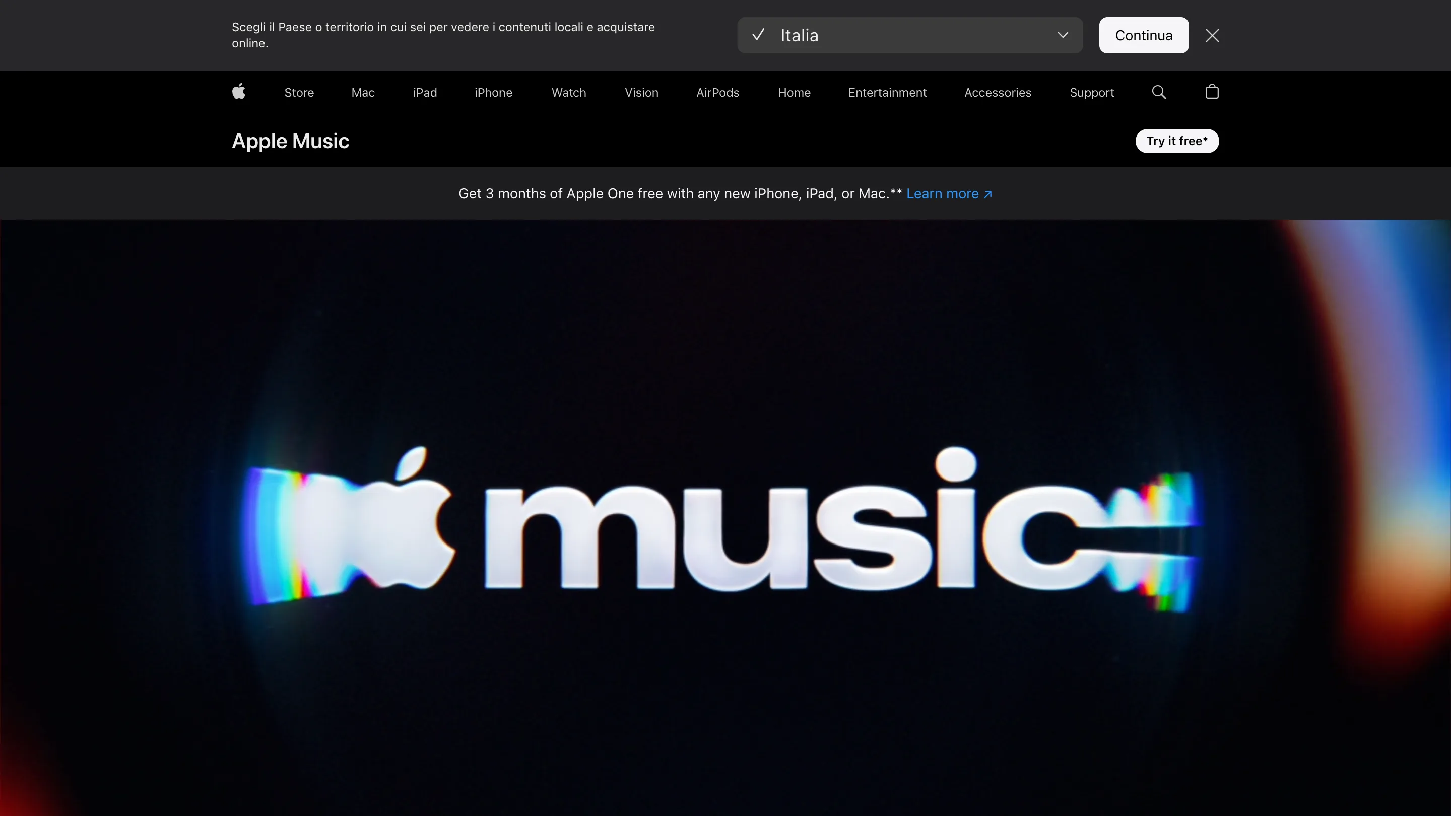
Apple Music has a new identity, and the logo was filmed in a bath of mineral oil. Apple announced the Apple Music rebrand on 21 October 2026: a bold lowercase wordmark, a black-and-white app icon in place of the red one, and a set of visuals Apple calls "made by sound". It's the first logo change since the service launched 11 years ago, and it lands on every iPhone with iOS 27.2, expected next week.
How the Apple Music rebrand was made
The team broke music down to single notes. Each note went through a transducer into a shallow bath of mineral oil, and the vibration moved the surface. A camera filmed the ripples and the way light bent through them, with the brand marks set behind the liquid. Apple says the logo was "captured entirely in camera", with British producer Fred again.. and NEST Acoustics writing the composition that shaped it.
So the shapes you see are a record of a real sound. That gives the brand a source it can go back to. Need a new loop for a campaign, a sting for a live show, a background for a widget? Play another note and film it. The sound and the picture come out of the same session, which is rare in brand work, where the sonic logo usually arrives months after the visual one, from a different supplier.
Apple's behind-the-scenes film runs 1 minute 18 seconds and passed 166,000 views in its first nine hours.
The wordmark is heavier, and lowercase
The new mark pairs the Apple symbol with "music" in a customised cut of SF Pro, Apple's own typeface. The letters are bold, lowercase and set tight, a long way from the light, title-case "Music" of 2015.
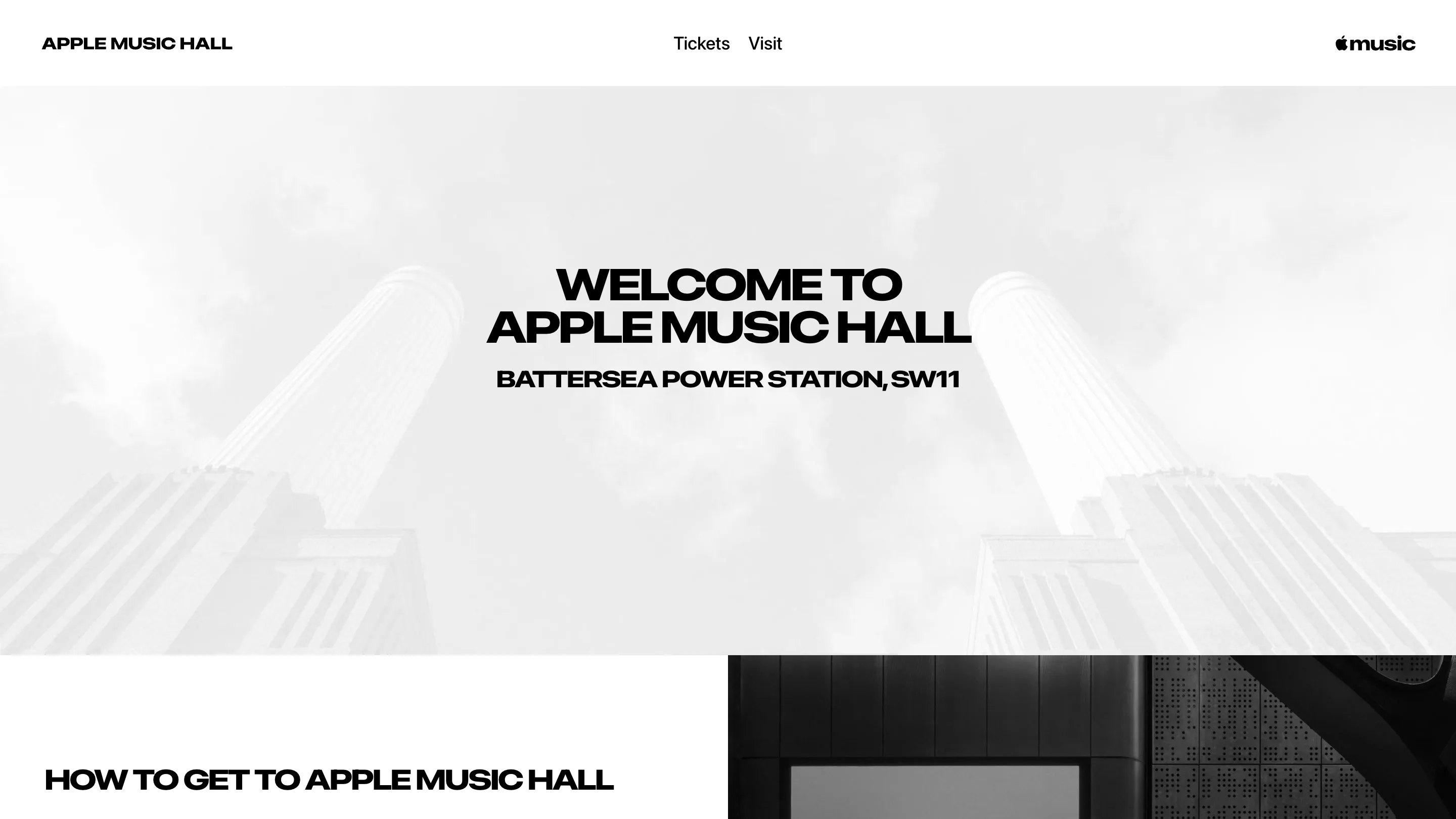
People saw it before the announcement. It first appeared on the site and signage of Apple Music Hall, the 600-capacity venue Apple opened inside London's Battersea Power Station on 28 September. That site is the clearest preview of the whole system: black and white photography, wide extended capitals for headlines, and the compact wordmark top right.

Red leaves the icon
The detail product designers should look at is the colour. The new icon is a black note on white in light mode and white on black in dark mode. Red, Apple Music's colour for a decade, is gone from the home screen.
Early coverage of the iOS 27.2 betas, which carried the icon from mid-October, reports that the app's navigation icons and settings text move from red to blue, and widgets switch to black backgrounds. If that holds in the final release, the brand colour and the interaction colour stop being the same thing. Tappable things wear the system's blue, like most of iOS. The brand moves into the logo, the type and the moving pictures.
That's a decision a lot of product teams face and few make on purpose. A brand colour used as the accent does two jobs: it says who you are and it says "you can press this". When it does both, every rebrand turns into an interface change, and every interface tweak risks the brand. Apple has pulled the two apart.
Why it matters for people who make digital products
A monochrome icon also behaves better in the system Apple built around it. iOS now offers dark, tinted and clear icon styles, and the Liquid Glass interface Apple introduced in 2025 refracts whatever sits behind it. A red square fights all of that. A black or white note adapts. The oil-and-light visuals read as a brand version of Liquid Glass itself, so the identity and the operating system look like they came from one room.
There's a cost. Red made Apple Music easy to find on a crowded home screen, and black and white icons are common. Spotify has kept its green for the same job. Apple is betting the shape of the note and the weight of the wordmark can carry recognition on their own.
The rollout starts with Apple Music's original content and live programming this week, then the app with iOS 27.2 and macOS 27.2. See the identity on Apple Music.