Rillet rebrand: Red Antler makes an ERP look fast
Red Antler gave Rillet a redrawn R, ABC ROM type and a purple streams texture. A lesson in branding B2B software for a cautious buyer.
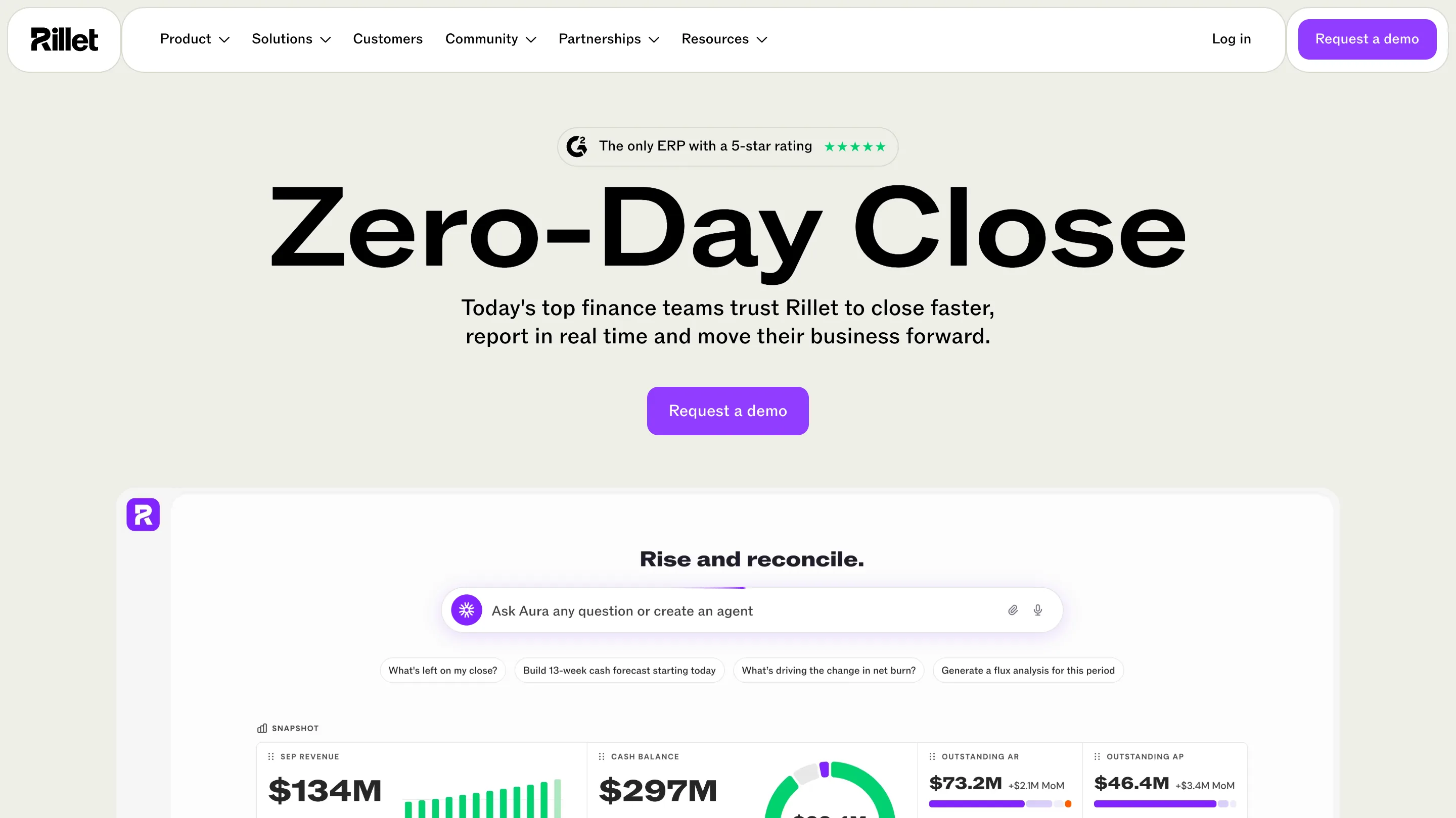
Rillet, the AI-native ERP for finance teams, put a new identity live on 27 October 2026. Red Antler, the New York branding agency, built it. The Rillet rebrand is a useful case for anyone designing B2B software: it shows how a brand for accountants can look quick without looking careless. A redrawn R, one typeface, a purple-led palette and a moving texture called "streams" carry the whole thing.
The timing matters. Rillet shipped the brand on the same day as its biggest product claim yet, a "zero-day close" that posts 99.7% of transactions automatically to a live general ledger. The identity is there to make that claim feel believable.
What Red Antler changed
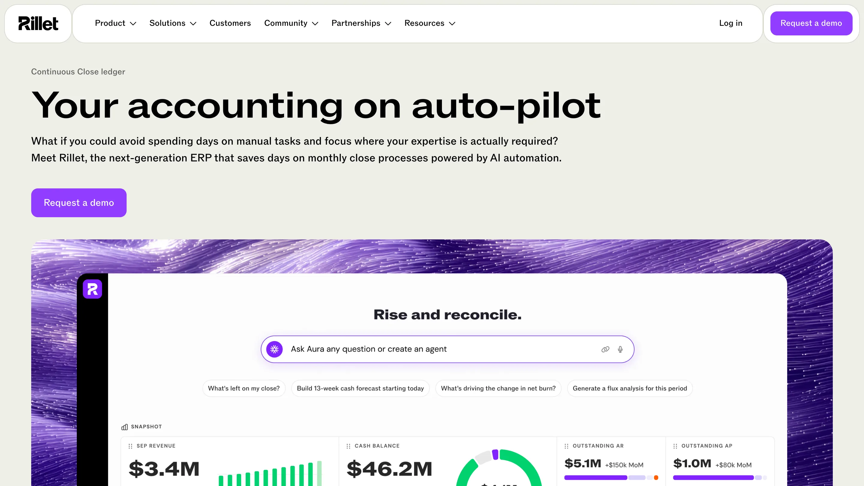
The wordmark keeps its name and gets a custom R. Red Antler redrew the capital, and the same letter stands alone as the app icon: a white R on a purple square. On the site it sits in the corner of every product screenshot, so the mark you see in a subway ad is the mark you click every morning.
The type is ABC ROM, from Dinamo. Its letters are set wide, with a lot of horizontal room. Set at display size, "Zero-Day Close" fills the homepage like a headline on a newspaper front. Wide letters read as calm and solid, which helps a product that asks finance leaders to trust software with their books.
The streams texture
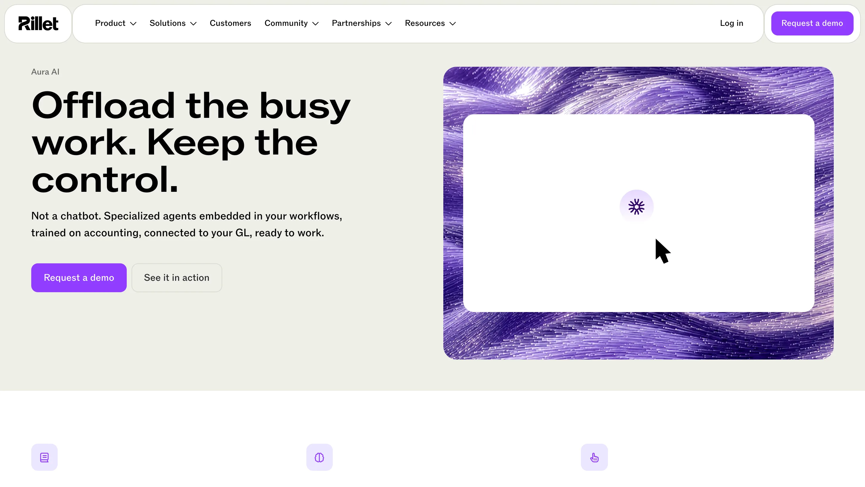
The streams are the part a product designer should look at twice. They're fine purple strands that ripple across a frame, like fibre or wind over grass. Rillet says they reference the continuous data flows behind real-time accounting. On the product pages they sit behind the interface screenshots, so the texture literally holds the product up.
That's a smart division of labour. The interface itself stays almost white: a warm off-white page, black type, purple only on buttons, the Aura assistant's icon and the progress bars. All the energy goes into the frame around the screenshot. The product looks quiet and the brand around it looks alive, which is roughly the promise Rillet sells: busy work in the background, a clean ledger in front.
Why purple works for finance software
Fintech spent a decade in navy and green. Purple is a bet, from an agency whose past clients include Ramp and McKinsey. Here the purple is saturated and digital, close to a screen colour, and it never touches the numbers. Revenue charts stay green, warnings stay orange. The brand colour marks actions and AI, and the data keeps its own colours. Finance users read colour as meaning, so keeping the two apart is the detail that makes the palette usable inside an app.
Built for accountants, said by an accountant
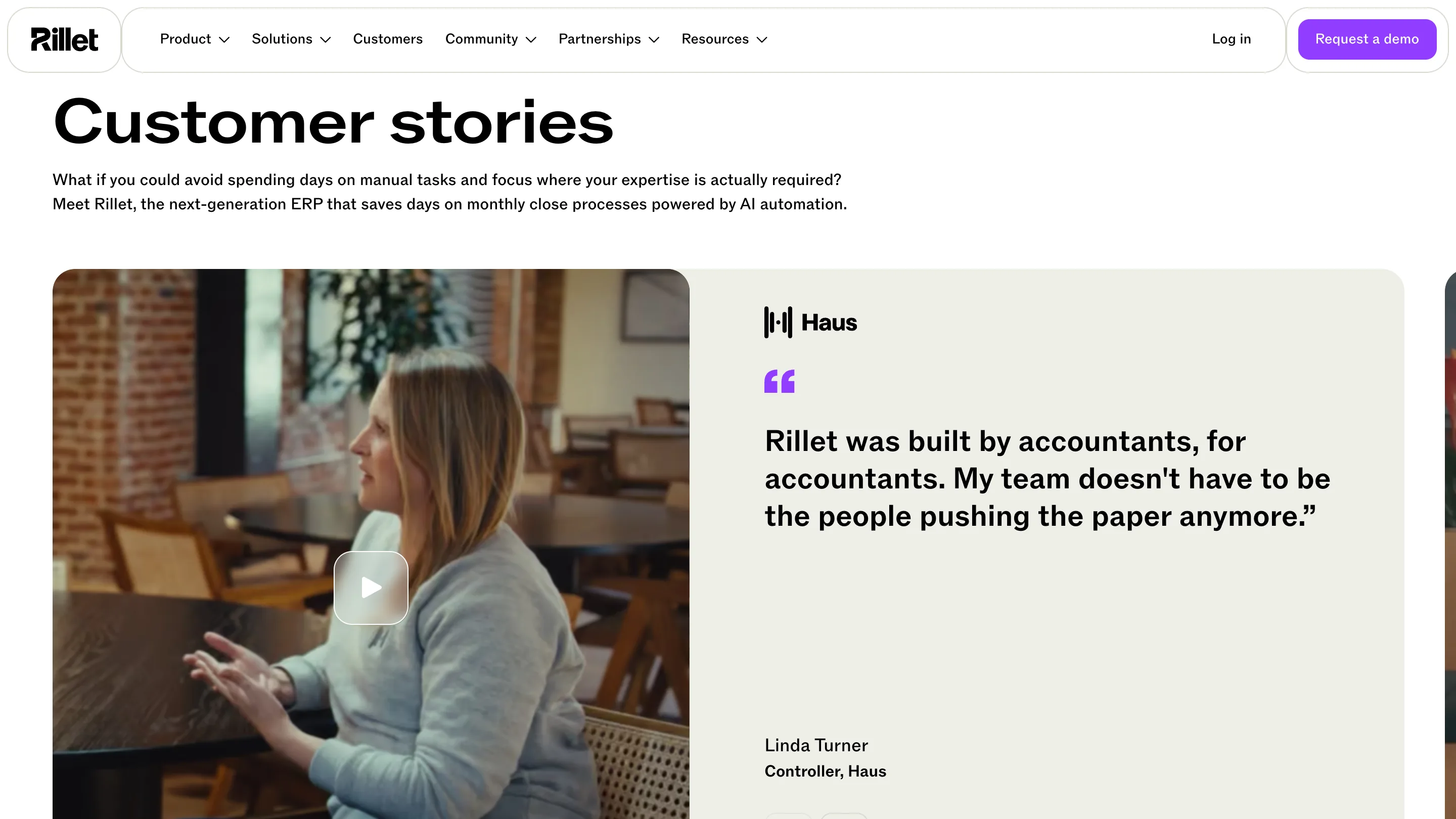
Rillet's senior brand designer, Gerard Zengel, put the brief in one line: "Rillet is built by accountants, for accountants." The same words come back on the customers page from Linda Turner, controller at Haus, next to a video of her talking. When a customer repeats the brand line on camera, the positioning has landed.
The numbers behind the launch explain the push. Rillet says it serves 800 finance teams, that 40% of them work outside tech, and that 47% moved over from SAP, Workday, NetSuite or Oracle Fusion. A brand designed only for startups would scare that second group off. The new one went up in Manhattan subway stations and at Las Vegas airport, aimed at CFOs travelling between conferences.
What to take from it
If you design software for a cautious buyer, look at where Rillet spends its expression. The type is wide and steady, the interface stays plain, and all the motion lives in one texture that frames the product. Anyone can copy the purple. The useful part is the restraint around it.